Bloom
Widget-first Material You with notch-cut pastel widgets on warm paper, a large regular grotesk and black action discs.
On this page
Light and dark
Bloom
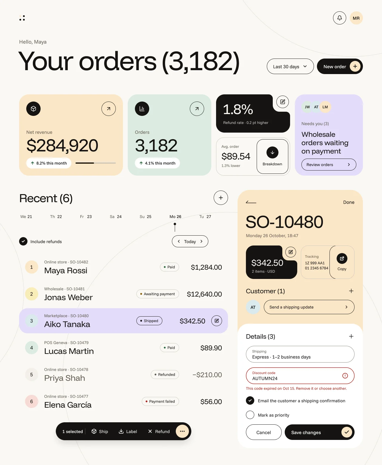
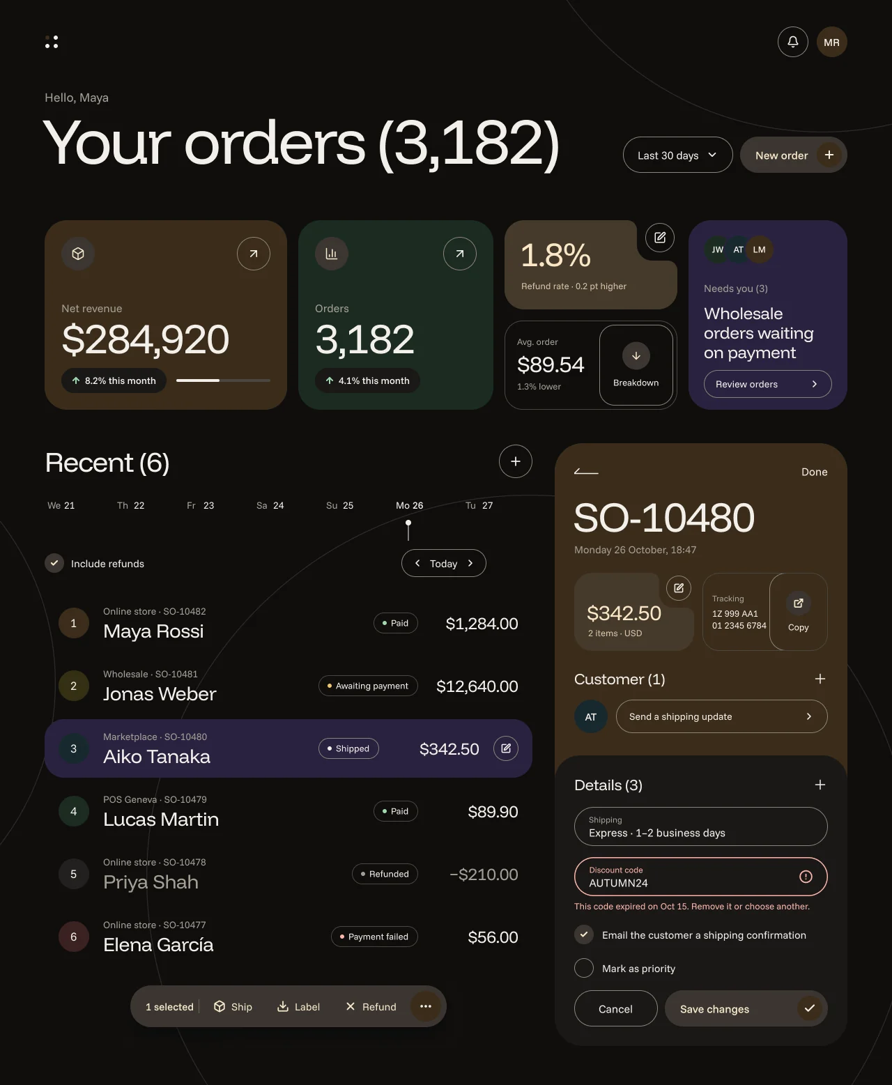
Specification values · alpha
Theme values
Values: Colors
| Property | Value |
|---|---|
bg | #fdfcfd |
bg-dark | #121113 |
fg | #211f26 |
fg-dark | #eeeef0 |
muted-fg | #605e67 |
muted-fg-dark | #bab7c0 |
input-border | #84828e |
input-border-dark | #7c7a85 |
ring | #6550b9 |
ring-dark | #baa7ff |
bloom-canvas | #faf8f4 |
bloom-canvas-dark | #0f0e0d |
bloom-surface | #ffffff |
bloom-surface-dark | #191817 |
bloom-surface-high | #f2efe9 |
bloom-surface-high-dark | #22201e |
bloom-fg | #151413 |
bloom-fg-dark | #f2efea |
bloom-muted | #655f55 |
bloom-muted-dark | #a39e95 |
bloom-outline | #cfc9bf |
bloom-outline-dark | #4a4640 |
bloom-field-edge | #8a8377 |
bloom-field-edge-dark | #8a8377 |
bloom-control-outline | #151413 |
bloom-control-outline-dark | #8a8377 |
bloom-line | #e7e2d9 |
bloom-line-dark | #2c2a27 |
bloom-hero | #151413 |
bloom-hero-dark | #3b3631 |
bloom-on-hero | #ffffff |
bloom-on-hero-dark | #f7e7cb |
bloom-ink-card | #151413 |
bloom-ink-card-dark | #453a2c |
bloom-on-ink-card | #faf8f4 |
bloom-on-ink-card-dark | #fbe6c6 |
bloom-peach | #fbe6c6 |
bloom-peach-dark | #3a2c1a |
bloom-mint | #dcebe0 |
bloom-mint-dark | #1c2b22 |
bloom-lavender | #e4dcfa |
bloom-lavender-dark | #2a2240 |
bloom-sky | #d9e9ee |
bloom-sky-dark | #18292e |
bloom-butter | #f8edb9 |
bloom-butter-dark | #352f14 |
bloom-rose | #f7dad5 |
bloom-rose-dark | #3a2120 |
bloom-success | #2f6b3f |
bloom-success-dark | #9fd9ae |
bloom-warn | #8a5a00 |
bloom-warn-dark | #f0c46a |
bloom-error | #b3261e |
bloom-error-dark | #ffb4ab |
Values: Typography
| Property | Value |
|---|---|
display.fontFamily | Funnel Display |
display.fontSize | 92px |
display.fontWeight | 400 |
display.lineHeight | 96px |
display.letterSpacing | -0.04em |
kpi.fontFamily | Funnel Display |
kpi.fontSize | 60px |
kpi.fontWeight | 400 |
kpi.lineHeight | 64px |
kpi.letterSpacing | -0.03em |
kpi.fontFeature | "tnum" 1 |
notch-value.fontFamily | Funnel Display |
notch-value.fontSize | 48px |
notch-value.fontWeight | 400 |
notch-value.lineHeight | 52px |
notch-value.letterSpacing | -0.03em |
section.fontFamily | Funnel Display |
section.fontSize | 40px |
section.fontWeight | 400 |
section.lineHeight | 48px |
name.fontFamily | Funnel Display |
name.fontSize | 28px |
name.fontWeight | 400 |
name.lineHeight | 32px |
widget-title.fontFamily | Funnel Display |
widget-title.fontSize | 24px |
widget-title.fontWeight | 400 |
widget-title.lineHeight | 28px |
widget-title.letterSpacing | -0.015em |
amount.fontFamily | Funnel Display |
amount.fontSize | 24px |
amount.fontWeight | 400 |
amount.lineHeight | 28px |
amount.fontFeature | "tnum" 1 |
card-title.fontFamily | Funnel Display |
card-title.fontSize | 22px |
card-title.fontWeight | 400 |
card-title.lineHeight | 28px |
greeting.fontFamily | Funnel Sans |
greeting.fontSize | 18px |
greeting.fontWeight | 400 |
greeting.lineHeight | 23px |
control.fontFamily | Funnel Sans |
control.fontSize | 16px |
control.fontWeight | 400 |
control.lineHeight | 21px |
button.fontFamily | Funnel Sans |
button.fontSize | 16px |
button.fontWeight | 500 |
button.lineHeight | 21px |
body.fontFamily | Funnel Sans |
body.fontSize | 15px |
body.fontWeight | 400 |
body.lineHeight | 20px |
meta.fontFamily | Funnel Sans |
meta.fontSize | 14px |
meta.fontWeight | 400 |
meta.lineHeight | 18px |
small.fontFamily | Funnel Sans |
small.fontSize | 13px |
small.fontWeight | 400 |
small.lineHeight | 17px |
caption.fontFamily | Funnel Sans |
caption.fontSize | 12px |
caption.fontWeight | 400 |
caption.lineHeight | 16px |
Values: Radii
| Property | Value |
|---|---|
chip | 15px |
nested-inner | 22px |
nested | 26px |
field | 28px |
row | 28px |
widget | 32px |
sheet | 36px |
panel | 40px |
full | 9999px |
Values: Spacing
| Property | Value |
|---|---|
page-margin | 64px |
widget-gap | 16px |
column-gap | 32px |
widget-padding | 24px |
panel-padding | 28px |
row-height | 84px |
row-gap | 6px |
row-padding-x | 20px |
button-height | 52px |
field-height | 56px |
status-height | 30px |
disc-lg | 48px |
disc-md | 44px |
disc-sm | 36px |
disc-toggle | 28px |
selection-bar-height | 60px |
Values: Component recipes
| Property | Value |
|---|---|
button-hero.backgroundColor | {colors.bloom-hero} |
button-hero.textColor | {colors.bloom-on-hero} |
button-hero.typography | {typography.button} |
button-hero.rounded | {rounded.full} |
button-hero.height | 52px |
button-hero.padding | 0 8px 0 22px |
button-hero-dark.backgroundColor | {colors.bloom-hero-dark} |
button-hero-dark.textColor | {colors.bloom-on-hero-dark} |
button-hero-dark.rounded | {rounded.full} |
button-hero-dark.height | 52px |
button-outline.textColor | {colors.bloom-fg} |
button-outline.typography | {typography.control} |
button-outline.rounded | {rounded.full} |
button-outline.height | 52px |
button-outline.padding | 0 20px |
disc-action.backgroundColor | {colors.bloom-hero} |
disc-action.textColor | {colors.bloom-on-hero} |
disc-action.rounded | {rounded.full} |
disc-action.size | 48px |
disc-action-dark.backgroundColor | {colors.bloom-hero-dark} |
disc-action-dark.textColor | {colors.bloom-on-hero-dark} |
disc-action-dark.rounded | {rounded.full} |
disc-action-dark.size | 48px |
disc-outline.textColor | {colors.bloom-fg} |
disc-outline.rounded | {rounded.full} |
disc-outline.size | 48px |
widget-revenue.backgroundColor | {colors.bloom-peach} |
widget-revenue.textColor | {colors.bloom-fg} |
widget-revenue.typography | {typography.kpi} |
widget-revenue.rounded | {rounded.widget} |
widget-revenue.padding | 24px |
widget-revenue-dark.backgroundColor | {colors.bloom-peach-dark} |
widget-revenue-dark.textColor | {colors.bloom-fg-dark} |
widget-revenue-dark.rounded | {rounded.widget} |
widget-revenue-dark.padding | 24px |
widget-notch.backgroundColor | {colors.bloom-ink-card} |
widget-notch.textColor | {colors.bloom-on-ink-card} |
widget-notch.typography | {typography.notch-value} |
widget-notch-dark.backgroundColor | {colors.bloom-ink-card-dark} |
widget-notch-dark.textColor | {colors.bloom-on-ink-card-dark} |
order-row.textColor | {colors.bloom-fg} |
order-row.typography | {typography.name} |
order-row.rounded | {rounded.row} |
order-row.height | 84px |
order-row.padding | 0 20px |
order-row-selected.backgroundColor | {colors.bloom-lavender} |
order-row-selected.textColor | {colors.bloom-fg} |
order-row-selected.rounded | {rounded.row} |
order-row-selected.height | 84px |
status-chip.textColor | {colors.bloom-fg} |
status-chip.typography | {typography.small} |
status-chip.rounded | {rounded.chip} |
status-chip.height | 30px |
status-chip.padding | 0 12px |
field.backgroundColor | {colors.bloom-surface} |
field.textColor | {colors.bloom-fg} |
field.typography | {typography.control} |
field.rounded | {rounded.field} |
field.height | 56px |
field.padding | 0 20px |
selection-bar.backgroundColor | {colors.bloom-hero} |
selection-bar.textColor | {colors.bloom-on-hero} |
selection-bar.typography | {typography.body} |
selection-bar.rounded | {rounded.full} |
selection-bar.height | 60px |
order-panel.backgroundColor | {colors.bloom-peach} |
order-panel.textColor | {colors.bloom-fg} |
order-panel.rounded | {rounded.panel} |
order-panel.padding | 28px |
details-sheet.backgroundColor | {colors.bloom-surface} |
details-sheet.textColor | {colors.bloom-fg} |
details-sheet.rounded | {rounded.sheet} |
details-sheet.padding | 26px 28px 28px |
Read YAML values and notes
version: alpha
name: Bloom
description: Widget-first Material You with notch-cut pastel widgets on warm paper, a large regular grotesk and black action discs.
colors:
  # Light value, then the Dark twin (`-dark`). Resolved Figma variables of the Light and Dark
  # frames. Bloom components read only the `bloom-*` roles.
  # The core roles below resolve through Bloom's own Theme mode, which is still seeded from
  # Tonal's values (mauve × violet); Bloom never paints them. They are prototype values, not
  # Bloom's palette or contract: the token export (#2414) must include a complete Bloom core-role
  # map (see NetScript Mapping).
  bg: '#fdfcfd'
  bg-dark: '#121113'
  fg: '#211f26'
  fg-dark: '#eeeef0'
  muted-fg: '#605e67'
  muted-fg-dark: '#bab7c0'
  input-border: '#84828e'
  input-border-dark: '#7c7a85'
  ring: '#6550b9'
  ring-dark: '#baa7ff'
  bloom-canvas: '#faf8f4'
  bloom-canvas-dark: '#0f0e0d'
  bloom-surface: '#ffffff'
  bloom-surface-dark: '#191817'
  bloom-surface-high: '#f2efe9'
  bloom-surface-high-dark: '#22201e'
  bloom-fg: '#151413'
  bloom-fg-dark: '#f2efea'
  bloom-muted: '#655f55' # supporting text
  bloom-muted-dark: '#a39e95'
  bloom-outline: '#cfc9bf' # decorative boundaries only
  bloom-outline-dark: '#4a4640'
  bloom-field-edge: '#8a8377' # editable-field boundary
  bloom-field-edge-dark: '#8a8377'
  bloom-control-outline: '#151413' # outlined controls
  bloom-control-outline-dark: '#8a8377'
  bloom-line: '#e7e2d9'
  bloom-line-dark: '#2c2a27'
  bloom-hero: '#151413'
  bloom-hero-dark: '#3b3631'
  bloom-on-hero: '#ffffff'
  bloom-on-hero-dark: '#f7e7cb'
  bloom-ink-card: '#151413'
  bloom-ink-card-dark: '#453a2c'
  bloom-on-ink-card: '#faf8f4'
  bloom-on-ink-card-dark: '#fbe6c6'
  bloom-peach: '#fbe6c6'
  bloom-peach-dark: '#3a2c1a'
  bloom-mint: '#dcebe0'
  bloom-mint-dark: '#1c2b22'
  bloom-lavender: '#e4dcfa'
  bloom-lavender-dark: '#2a2240'
  bloom-sky: '#d9e9ee'
  bloom-sky-dark: '#18292e'
  bloom-butter: '#f8edb9'
  bloom-butter-dark: '#352f14'
  bloom-rose: '#f7dad5'
  bloom-rose-dark: '#3a2120'
  bloom-success: '#2f6b3f'
  bloom-success-dark: '#9fd9ae'
  bloom-warn: '#8a5a00'
  bloom-warn-dark: '#f0c46a'
  bloom-error: '#b3261e'
  bloom-error-dark: '#ffb4ab'
typography:
  display: {
    fontFamily: Funnel Display,
    fontSize: 92px,
    fontWeight: 400,
    lineHeight: 96px,
    letterSpacing: -0.04em,
  }
  kpi: {
    fontFamily: Funnel Display,
    fontSize: 60px,
    fontWeight: 400,
    lineHeight: 64px,
    letterSpacing: -0.03em,
    fontFeature: '"tnum" 1',
  }
  notch-value: {
    fontFamily: Funnel Display,
    fontSize: 48px,
    fontWeight: 400,
    lineHeight: 52px,
    letterSpacing: -0.03em,
  }
  section: { fontFamily: Funnel Display, fontSize: 40px, fontWeight: 400, lineHeight: 48px }
  name: { fontFamily: Funnel Display, fontSize: 28px, fontWeight: 400, lineHeight: 32px }
  widget-title: {
    fontFamily: Funnel Display,
    fontSize: 24px,
    fontWeight: 400,
    lineHeight: 28px,
    letterSpacing: -0.015em,
  }
  amount: {
    fontFamily: Funnel Display,
    fontSize: 24px,
    fontWeight: 400,
    lineHeight: 28px,
    fontFeature: '"tnum" 1',
  }
  card-title: { fontFamily: Funnel Display, fontSize: 22px, fontWeight: 400, lineHeight: 28px }
  greeting: { fontFamily: Funnel Sans, fontSize: 18px, fontWeight: 400, lineHeight: 23px }
  control: { fontFamily: Funnel Sans, fontSize: 16px, fontWeight: 400, lineHeight: 21px }
  button: { fontFamily: Funnel Sans, fontSize: 16px, fontWeight: 500, lineHeight: 21px }
  body: { fontFamily: Funnel Sans, fontSize: 15px, fontWeight: 400, lineHeight: 20px }
  meta: { fontFamily: Funnel Sans, fontSize: 14px, fontWeight: 400, lineHeight: 18px }
  small: { fontFamily: Funnel Sans, fontSize: 13px, fontWeight: 400, lineHeight: 17px }
  caption: { fontFamily: Funnel Sans, fontSize: 12px, fontWeight: 400, lineHeight: 16px }
rounded:
  chip: 15px
  nested-inner: 22px
  nested: 26px
  field: 28px
  row: 28px
  widget: 32px
  sheet: 36px
  panel: 40px
  full: 9999px
spacing:
  page-margin: 64px
  widget-gap: 16px
  column-gap: 32px
  widget-padding: 24px
  panel-padding: 28px
  row-height: 84px
  row-gap: 6px
  row-padding-x: 20px
  button-height: 52px
  field-height: 56px
  status-height: 30px
  disc-lg: 48px
  disc-md: 44px
  disc-sm: 36px
  disc-toggle: 28px
  selection-bar-height: 60px
components:
  button-hero: {
    backgroundColor: '{colors.bloom-hero}',
    textColor: '{colors.bloom-on-hero}',
    typography: '{typography.button}',
    rounded: '{rounded.full}',
    height: 52px,
    padding: 0 8px 0 22px,
  }
  button-hero-dark: {
    backgroundColor: '{colors.bloom-hero-dark}',
    textColor: '{colors.bloom-on-hero-dark}',
    rounded: '{rounded.full}',
    height: 52px,
  }
  button-outline: {
    textColor: '{colors.bloom-fg}',
    typography: '{typography.control}',
    rounded: '{rounded.full}',
    height: 52px,
    padding: 0 20px,
  }
  disc-action: {
    backgroundColor: '{colors.bloom-hero}',
    textColor: '{colors.bloom-on-hero}',
    rounded: '{rounded.full}',
    size: 48px,
  }
  disc-action-dark: {
    backgroundColor: '{colors.bloom-hero-dark}',
    textColor: '{colors.bloom-on-hero-dark}',
    rounded: '{rounded.full}',
    size: 48px,
  }
  disc-outline: { textColor: '{colors.bloom-fg}', rounded: '{rounded.full}', size: 48px }
  widget-revenue: {
    backgroundColor: '{colors.bloom-peach}',
    textColor: '{colors.bloom-fg}',
    typography: '{typography.kpi}',
    rounded: '{rounded.widget}',
    padding: 24px,
  }
  widget-revenue-dark: {
    backgroundColor: '{colors.bloom-peach-dark}',
    textColor: '{colors.bloom-fg-dark}',
    rounded: '{rounded.widget}',
    padding: 24px,
  }
  widget-notch: {
    backgroundColor: '{colors.bloom-ink-card}',
    textColor: '{colors.bloom-on-ink-card}',
    typography: '{typography.notch-value}',
  }
  widget-notch-dark: {
    backgroundColor: '{colors.bloom-ink-card-dark}',
    textColor: '{colors.bloom-on-ink-card-dark}',
  }
  order-row: {
    textColor: '{colors.bloom-fg}',
    typography: '{typography.name}',
    rounded: '{rounded.row}',
    height: 84px,
    padding: 0 20px,
  }
  order-row-selected: {
    backgroundColor: '{colors.bloom-lavender}',
    textColor: '{colors.bloom-fg}',
    rounded: '{rounded.row}',
    height: 84px,
  }
  status-chip: {
    textColor: '{colors.bloom-fg}',
    typography: '{typography.small}',
    rounded: '{rounded.chip}',
    height: 30px,
    padding: 0 12px,
  }
  field: {
    backgroundColor: '{colors.bloom-surface}',
    textColor: '{colors.bloom-fg}',
    typography: '{typography.control}',
    rounded: '{rounded.field}',
    height: 56px,
    padding: 0 20px,
  }
  selection-bar: {
    backgroundColor: '{colors.bloom-hero}',
    textColor: '{colors.bloom-on-hero}',
    typography: '{typography.body}',
    rounded: '{rounded.full}',
    height: 60px,
  }
  order-panel: {
    backgroundColor: '{colors.bloom-peach}',
    textColor: '{colors.bloom-fg}',
    rounded: '{rounded.panel}',
    padding: 28px,
  }
  details-sheet: {
    backgroundColor: '{colors.bloom-surface}',
    textColor: '{colors.bloom-fg}',
    rounded: '{rounded.sheet}',
    padding: 26px 28px 28px,
  }
Overview
- Thesis: widget-first Material You. Bloom is a personal dashboard of pastel widgets on warm paper, set in a large regular grotesk, with ink discs for actions.
- Signature moves:
- Notch-cut widgets that hold a control. A rounded card has a concave top-right notch, and a disc sits in the notch.
- A large regular grotesk. Funnel Display Regular at 92/96 for the page title and 60/64 for values. Size carries hierarchy; weight does not.
- Black action discs and nested outline cards. Ink circles (
bloom-hero) are the actions. Outlined tiles nest inside cards and hold secondary actions.
- Anchor: Material You (dynamic colour, personal widget surfaces), taken widget-first, plus a reference image: soft pastels on warm paper, a large regular-weight grotesk, notch-cut cards holding a button, nested outline cards, black icon discs. Take the widget and personalisation idea. Do not take Material chrome (FAB, navigation rail, filled fields, Material Symbols, Google Sans); with it, a Bloom screen reads as stock Google Material.
- Family: Expressive. Best for: personal and small-business dashboards, consumer apps, small shop back-offices. Avoid for: dense admin and long tables (84px rows, six per column).
- Feel: warm and generous, editorial with some play. The first impression is a stack of paper widgets.
Colors
- Ground: warm paper
bloom-canvas#faf8f4 with three 1.25pxbloom-line(#e7e2d9) backdrop arcs (900, 760 and 1100px circles) behind content. Whitebloom-surfaceis reserved for the details sheet, fields and delta pills. Dark: #0f0e0d with #2c2a27 arcs. - Category and action colours. Pastels mark a widget's category: peach #fbe6c6 (revenue, the
open order), mint #dcebe0 (orders), lavender #e4dcfa (needs-you, the selected row), sky, butter,
rose and
surface-highfor the numbered row discs. Actions are always ink: discs, hero pills and the selection bar arebloom-hero#151413. There is no pastel button and no brand accent. - Status: a 6px dot plus the word in
bloom-fg: Paidbloom-success#2f6b3f, Awaitingbloom-warn#8a5a00, Payment failedbloom-error#b3261e, Refundedbloom-muted. Errors on fields usebloom-errorfor the 1.5px capsule and the helper text. - Dark design notes: pastels become deep tones of the same hue (peach #3a2c1a, mint #1c2b22,
lavender #2a2240). The ink card lifts to warm brown #453a2c with peach text #fbe6c6, and the
action discs lift to #3b3631 with cream #f7e7cb; never a black slab on black. Outlined controls
use
bloom-control-outline#8a8377, not light ink. - Defined but unused:
bloom/primary(#5b2a86 / #d2b6ff),primary-container,lime,lime-strong,tangerine,hero-accentand theiron-*pairs. No component paints them.
Typography
Funnel Display (display, values, names, section heads) and Funnel Sans (UI text), both OFL
on Google Fonts. Fallback: system-ui, sans-serif. Regular weight everywhere; Medium only for hero
button labels, "1 selected" and avatar initials. Tracking tightens with size: −4% at 92px, −3% at
48–60px, −1.5% at 24–32px, 0 for UI text.
- Scale: title 92/96; widget values and order ID 60/64; notch value 48/52; section heads ("Recent (6)") 40/48; row names 28/32; widget headline and amounts 24/28; card titles 22/28; greeting 18/23 muted; controls 16/21; body 15/20; meta 14/18; chips and small 13/17; field labels 12/16.
- Numerals: amounts and counts should be tabular in code (pending in #2414); the Figma design shows proportional figures.
Layout
- Frame 1280×1557, 64px side margins. Header: four-dot menu glyph, bell disc, avatar. Greeting at y128, then the 92px title "Your orders (3,182)" with a right-aligned control pair (Last 30 days outline pill, New order hero pill).
- Widget row (y316, 272px tall, 16px gaps): revenue 348 (peach), orders 280 (mint), a 248-wide stack of two 128px tiles (notched refund rate + nested average order), needs-you 228 (lavender).
- Lower half, 32px column gap: Recent column (700): section head + plus disc, a seven-day strip with a dot-and-stem "today" marker, an "Include refunds" toggle and a Today pill, then six 84px rows with 6px gaps; the selection bar floats at the bottom. Right: the order panel (420×865 peach) with a white details sheet.
- Rhythm: keep 64 margins, 16 widget gaps, 24 widget padding, 28 panel padding and 20px row insets.
Elevation & Depth
Bloom is flat: depth comes from nesting and contrast instead of shadow.
| Level | Recipe | Applied to |
|---|---|---|
| Paper | bloom-canvas + backdrop arcs |
page |
| Widget | pastel or bloom-ink-card fill, no stroke, no shadow |
widgets, order panel |
| Nested | 1px bloom-outline tile inside a widget; inner tile 1px bloom-control-outline |
average order, tracking |
| Sheet | bloom-surface with 36px top corners inside the peach panel |
details |
| Floating | box-shadow: 0 12px 32px -8px #14120d38 (dark #00000080) |
selection bar only |
Shapes
Radii: full (discs, pills, avatars), 40 (order panel), 36 (sheet top), 32 (widgets), 28 (rows, fields, notch outer), 26 (nested card, 52px buttons), 24 (tracking card), 22 (nested inner tile), 15 (status chips). Nested inner tiles are near-concentric (26 outer, 6px inset, 22 inner). Discs: 48, 44, 42, 40, 36, 28px. Strokes 1px; error 1.5px; backdrop arcs 1.25px.
Notch primitive
A rounded rectangle with a concave top-right notch, drawn in Figma as a cubic-arc vector. Two measured instances:
| Instance | Box | Outer r | Notch (w × h) | Inner convex r | Concave r | Disc in notch |
|---|---|---|---|---|---|---|
| Refund rate | 248×128 | 28 | 58 × 58 | 14 | 22 | 42px at (202, 4) |
| Amount | 172×112 | 26 | 50 × 50 | 12 | 20 | 36px at (132, 4) |
The disc sits 4px from the outer top and right edges and 10–12px from the concave edge. The two
notches use different geometry and share no token. The CSS below is for a fixed-size widget (exact
arcs; Figma's cubics match within 0.1px). The two sizes are variants of one declared Bloom part,
selected with data-variant, never a BEM modifier class. The variant names below are provisional
until the component anatomy spec (#2416) registers them:
.ns-bloom-notch[data-variant="248x128"] {
  clip-path: path("M28 0H176A14 14 0 0 1 190 14V36A22 22 0 0 0 212 58H234A14 14 0 0 1 248 72V100A28 28 0 0 1 220 128H28A28 28 0 0 1 0 100V28A28 28 0 0 1 28 0Z");
}
.ns-bloom-notch[data-variant="172x112"] {
  clip-path: path("M26 0H110A12 12 0 0 1 122 12V30A20 20 0 0 0 142 50H160A12 12 0 0 1 172 62V86A26 26 0 0 1 146 112H26A26 26 0 0 1 0 86V26A26 26 0 0 1 26 0Z");
}
- Ownership. The literal paths are owned component anatomy of the Bloom notched widget (part
geometry in the component anatomy spec, #2416), not tokens; keep the measurements unchanged. Every
paint on the widget and its disc is a semantic role (
--ns-bloom-ink-card,--ns-bloom-on-ink-card,--ns-bloom-hero,--ns-bloom-on-hero,--ns-bloom-control-outline), never a literal colour. - For fluid widths, use CSS
shape()withcalc(100% - …)coordinates where supported, or an SVGmask-image/<clipPath>generated from the element box; runtime proof is pending in #2419. clip-pathclips outlines and borders: put the focus ring on the disc, and draw a notched outline (if ever needed) as an SVG stroke. The disc is a sibling positioned in the notch, never clipped by it.
Components
- Hero pill button (New order, Save changes): 52px,
bloom-hero, Medium 16/21 label, padding 0/8/0/22, trailing 36px peach disc with the action icon. One per region. - Outline pill (Last 30 days, Cancel 120×52; Review orders and Today 40px; Send a shipping
update 48px): 1px
bloom-control-outline,bloom-fglabel, chevron where it navigates. - Action disc: 48/40/36/28px
bloom-herocircle with anon-heroicon (bag, chart, arrow, link, check). Outline disc: same sizes, 1pxbloom-control-outline(arrow-up-right, plus, pen). Icons are centred on whole pixels (20 in 48 at 14px, 18 in 44 at 13px). - Widget: r32 pastel, 24px padding; head row = action disc left, outline disc right; label 16/21 muted; value 60/64; foot = white 36px delta pill + 4px progress track. Needs-you adds overlapping 40px avatars (−10px gap, 2px lavender ring) and a 24/28 headline.
- Notched widget: ink card with value 48/52 and caption 13/17 at 80% opacity; the disc in the notch edits it.
- Nested card: 1px
bloom-outliner26 tile holding a value and an inner outlined action tile. - Order row (table): 84px r28 row, 20px insets: 44px numbered pastel disc, meta 14/18 muted,
name 28/32, status chip, amount 24/28 right. Selected = lavender fill, chip outline in
bloom-control-outline, trailing pen disc. Refunded = name and amount inbloom-muted, no strike-through. - Status chip: 30px r15 pill, 1px
bloom-outline, 6px status dot, 13/17 word inbloom-fg. - Toggle disc (replaces checkbox and switch): 28px; on =
bloom-herowith a 12px check; off = 1pxbloom-control-outlinering. - Field: 56px capsule r28, 20px insets, 12/16 muted label inside over a 16/21 value; boundary
1px
bloom-field-edge#8a8377; error = 1.5pxbloom-errorcapsule, label inbloom-error, trailing alert icon and a 13/17 repair sentence below. - Selection bar: 454×60 ink pill, "1 selected", a 1px divider at 25%, three 44px text actions (icon 18 + 15/20 label), a 44px peach "More" disc; one coherent material.
- Order panel / sheet: peach r40 panel (back arrow, Done, 60/64 ID, date, notched amount, nested tracking with Copy, customer row) over a white sheet with fields, toggles and actions.
- Top bar: none; header controls float on the paper. Dialog: not drawn; pending in #2416.
Do's and Don'ts
- Do make widgets play with shape (notches, nested tiles), but never decorate: no stars or other unreadable ornaments. A notch always holds a disc.
- Don't look like stock Material: no FAB, rail, filled fields or Google Sans.
- Do go big and regular: 92/96 title, 60/64 values.
- Do centre every icon on whole pixels inside its disc.
- Do draw the floating selection bar as one ink material, with no second background.
- Do keep the spacing: 64 margins, 16 gaps, 6px row gaps.
- Do keep pastels for categories and ink for actions; never a pastel or violet primary.
- Do use
bloom-muted#655f55 for supporting text in light. The lighter #7d786f is 3.32:1 on lavender. - Do give editable fields a 3:1 boundary with
bloom-field-edgeon the capsule itself. - Don't outline dark controls in light ink; use
bloom-control-outline#8a8377. - Don't strike through a refunded customer; the chip and the negative amount say it.
- Do design dark as deep tones of each pastel; lift the ink card and discs to warm browns.
- Don't use
bloom-outline(#cfc9bf, 1.55:1) as the only boundary of an interactive control.
Iconography & Imagery
The shared icon/* set (Lucide-style strokes, ISC) at 12–20px, always inside a disc or pill. The
menu glyph is four 6px dots, one peach. Avatars are initials (Funnel Sans Medium 15/20) on pastel
circles (40–48px). Backdrop arcs are the only illustration; no photos, stars or blobs.
Motion & States
Bloom has no state sheet yet. Drawn states: selected row, checked/unchecked toggle discs, field error, today marker. Hover, pressed, focus and disabled are pending in #2416. Motion (disc press, row selection, bar entrance) is pending in #2419, with a reduced-motion equivalent and RTL mirroring of the notch (top-left in RTL).
Accessibility
| Pair (light / dark) | Ratio |
|---|---|
bloom-fg on bloom-canvas |
17.35 / 16.81 |
bloom-muted on canvas · peach · lavender |
5.96 · 5.19 · 4.79 / 7.24 · 5.07 · 5.62 |
bloom-on-hero on bloom-hero |
18.40 / 9.81 |
bloom-on-ink-card on bloom-ink-card |
17.35 / 9.10 |
bloom-control-outline on canvas |
17.35 / 5.14 (3.60 on dark peach) |
bloom-field-edge on bloom-surface |
3.75 / 4.72 |
bloom-error on bloom-surface |
6.54 / 10.44 |
bloom-outline on canvas (decorative) |
1.55 / 2.06 |
The bell disc and the refund-rate notch pen disc use bloom-control-outline (measured on rendered
pixels: #151413 on #faf8f4 light, #8a8377 on #0f0e0d dark), never bloom-outline (1.55:1).
No focus indicator is drawn yet (#2416). Hit targets: toggle discs 28px, discs ≥ 36px, buttons 52px.
NetScript Mapping
| Layer | Value |
|---|---|
| Figma Theme mode | Bloom, its own mode in Theme B (set B), still seeded from Tonal's values (prototype only) |
| Base gray × accent | n/a (core roles resolve to the Tonal seed values, mauve × violet) |
| Density | n/a (literal geometry) |
| Flavor | n/a |
data-theme |
bloom |
| Language roles | bloom/{canvas,surface,surface-high,fg,muted,outline,field-edge,control-outline,line,hero,on-hero,ink-card,on-ink-card,peach,mint,lavender,sky,butter,rose,success,warn,error} (+ unused primary*, lime*, tangerine*, hero-accent*, on-*) → --ns-bloom-* |
- The seed values are for the prototype only. Bloom's own Theme mode still holds Tonal's values.
Rendering Bloom under it works in the Figma prototype, but it is not a compatibility contract:
under it the core roles resolve to Tonal's mauve × violet, not to Bloom. The token export (#2414)
must ship a Bloom resolver mode with a complete compatible core-role map (every core role in
both schemes; proposed mapping below) so a shared component rendered under
data-theme="bloom"stays on-theme. - Bindings today. Bloom components bind 22
bloom/*roles and no core roles or Theme variables, so Tonal values never reach a Bloom render. Text sets the Funnel fonts directly (the Themefont/*would resolve Roboto Flex), and every radius and size is a literal value. Roles pending in #2414:font/sans,font/heading,font/kpiand a Bloom shape scale. No primitive bindings, no unbound paints.- Field boundary:
bloom-field-edgestrokes the r28 capsule itself, not its wrapper. The complete capsule boundary measures 3.7543:1 on white (light). - Fonts in use: Funnel Sans Regular, Funnel Sans Medium, Funnel Display Regular.
- Sizes in use: 12, 13, 14, 15, 16, 17, 18, 22, 24, 28, 30, 32, 40, 48, 60, 92.
- Radii in use: 2, 14, 15, 18, 20, 21, 22, 24, 26, 28, 30, 32, 40.
- Field boundary:
- What the token export (#2414) needs for a dedicated Bloom mapping:
- A Bloom resolver mode with:
font/sans= Funnel Sans andfont/heading/font/kpi= Funnel Display;- a type scale for the sizes above;
- a shape scale that collapses the 13 radii (28 for capsules, 22 / 24 for cards).
- Core-role values under that mode:
bg→bloom-canvas,card→bloom-surface,container-high→bloom-surface-high;fg→bloom-fg,muted-fg→bloom-muted;border→bloom-line/bloom-outline,input-border→bloom-field-edge,border-control→bloom-control-outline;primary→bloom-herowithprimary-fg→bloom-on-hero;destructive/success/warningtext →bloom-error/bloom-success/bloom-warn;ring: undefined today (#2416).
- Register the 22 used
bloom/*roles and decide the unused ones:primary*,lime*,tangerine*,hero-accent*,on-*. - Bind all Bloom text to the new font tokens.
- A Bloom resolver mode with:
- Status: values come from the NetScript Figma library. Bloom's own Theme-mode values or
registered
bloom/*roles, Funnel font tokens, shape tokens and numerals are tracked in #2414; the state sheet and focus in #2416; the notch at fluid widths, motion and RTL in #2419.
Sources
- References: Material You (dynamic colour, personal widget surfaces), and a reference image of pastels on warm paper, a large regular grotesk, notch cards, nested outline cards and black icon discs. What to take and what never to copy is listed under Overview → Anchor.
- Fonts and icons: Funnel Display and Funnel Sans (OFL, Google Fonts); Lucide-style icons (ISC).
- Invented fixture content: "Hello, Maya", customers, order numbers, amounts, dates, tracking number, AUTUMN24, "Needs you (3)".