Fluent
Fluent 2 as Windows 11 ships it: a Mica window, NavigationView with the 3×16 accent pill, flat card layers, elevation borders instead of shadows, and WinUI theme brushes.
On this page
- Light and dark
- Theme values
- Values: Colors
- Values: Typography
- Values: Radii
- Values: Spacing
- Values: Component recipes
- Overview
- Colors
- Dark accent #60CDFF: control size only
- Differences from the native WinUI values
- Core roles aligned to WinUI
- Typography
- Layout
- Elevation & Depth
- Shapes
- Components
- Do's and Don'ts
- Iconography & Imagery
- Motion & States
- Accessibility
- NetScript Mapping
- Sources
Light and dark
Fluent
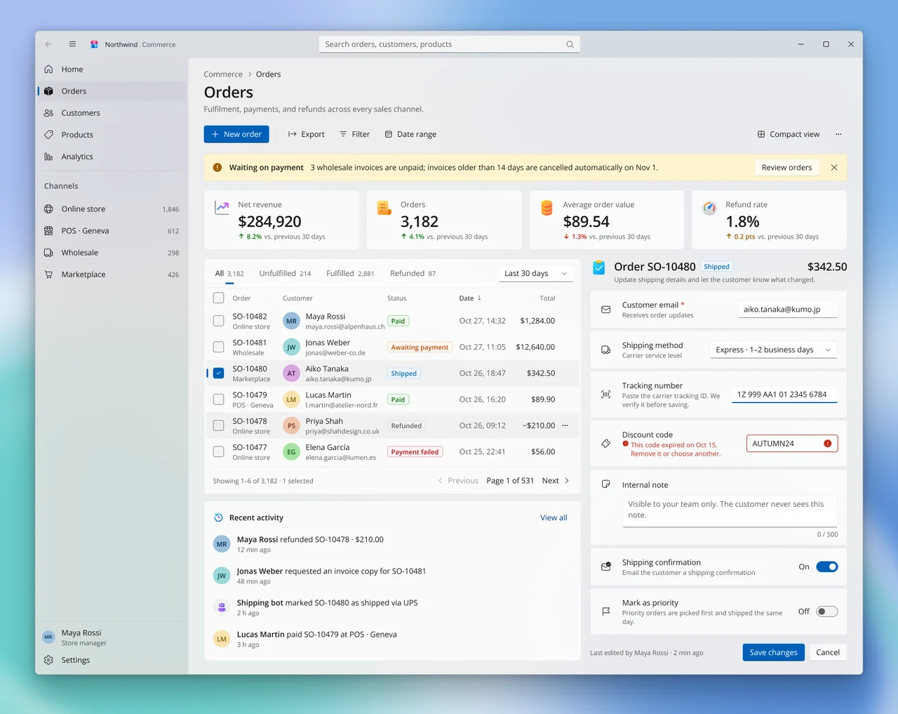
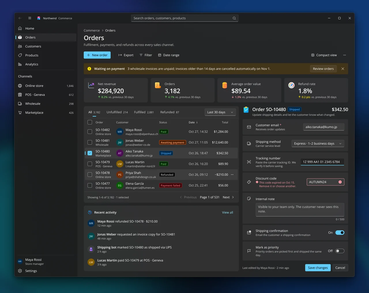
Specification values · alpha
Theme values
Values: Colors
| Property | Value |
|---|---|
bg | #f9f9f9 |
bg-dark | #111111 |
card | #ffffff |
card-dark | #191919 |
fg | #202020 |
fg-dark | #eeeeee |
muted-fg | #646464 |
muted-fg-dark | #b4b4b4 |
input-border | #838383 |
input-border-dark | #7b7b7b |
ring | #000000e4 |
ring-dark | #8d8d8d |
primary | #005fb8 |
primary-dark | #60cdff |
primary-fg | #ffffff |
primary-fg-dark | #000000 |
fluent-text-primary | #000000e4 |
fluent-text-primary-dark | #ffffff |
fluent-text-secondary | #0000009e |
fluent-text-secondary-dark | #ffffffc5 |
fluent-text-tertiary | #00000072 |
fluent-text-tertiary-dark | #ffffff87 |
fluent-text-on-accent | #ffffff |
fluent-text-on-accent-dark | #000000 |
fluent-text-on-accent-secondary | #ffffff |
fluent-text-on-accent-secondary-dark | #000000 |
fluent-text-accent | #003e92 |
fluent-text-accent-dark | #99ebff |
fluent-accent-default | #005fb8 |
fluent-accent-default-dark | #60cdff |
fluent-accent-secondary | #005fb8e5 |
fluent-accent-secondary-dark | #60cdffe5 |
fluent-accent-tertiary | #0054a3 |
fluent-accent-tertiary-dark | #60cdffcc |
fluent-control-default | #ffffffb3 |
fluent-control-default-dark | #ffffff0f |
fluent-control-secondary | #f9f9f980 |
fluent-control-secondary-dark | #ffffff15 |
fluent-control-input-active | #ffffff |
fluent-control-input-active-dark | #1e1e1eb3 |
fluent-subtle-secondary | #00000009 |
fluent-subtle-secondary-dark | #ffffff0f |
fluent-stroke-control | #0000000f |
fluent-stroke-control-dark | #ffffff12 |
fluent-stroke-control-strong | #00000072 |
fluent-stroke-control-strong-dark | #ffffff8b |
fluent-stroke-card | #0000000f |
fluent-stroke-card-dark | #00000019 |
fluent-stroke-divider | #0000000f |
fluent-stroke-divider-dark | #ffffff15 |
fluent-stroke-surface | #75757566 |
fluent-stroke-surface-dark | #75757566 |
fluent-elevation-control-bottom | #0000001c |
fluent-elevation-control-bottom-dark | #ffffff00 |
fluent-elevation-control-top | #00000000 |
fluent-elevation-control-top-dark | #ffffff07 |
fluent-elevation-accent-bottom | #00000066 |
fluent-elevation-accent-bottom-dark | #00000023 |
fluent-focus-outer | #000000e4 |
fluent-focus-outer-dark | #8d8d8d |
fluent-focus-inner | #ffffffb3 |
fluent-focus-inner-dark | #000000b3 |
fluent-card-default | #ffffffb3 |
fluent-card-default-dark | #ffffff0d |
fluent-layer-default | #ffffff80 |
fluent-layer-default-dark | #3a3a3a4c |
fluent-mica-tint | #f3f3f3d1 |
fluent-mica-tint-dark | #202020db |
fluent-system-success | #0f7b0f |
fluent-system-success-dark | #6ccb5f |
fluent-system-caution | #9d5d00 |
fluent-system-caution-dark | #fce100 |
fluent-system-critical | #c42b1c |
fluent-system-critical-dark | #ff99a4 |
fluent-system-caution-bg | #fff4ce |
fluent-system-caution-bg-dark | #433519 |
fluent-badge-brand-bg | #eff6fc |
fluent-badge-brand-bg-dark | #002848 |
fluent-badge-brand-fg | #106ebe |
fluent-badge-brand-fg-dark | #3aa0f3 |
Values: Typography
| Property | Value |
|---|---|
display.fontFamily | Open Sans |
display.fontSize | 68px |
display.fontWeight | 600 |
display.lineHeight | 92px |
display.letterSpacing | -1px |
title-large.fontFamily | Open Sans |
title-large.fontSize | 40px |
title-large.fontWeight | 600 |
title-large.lineHeight | 52px |
title-large.letterSpacing | -0.5px |
title.fontFamily | Open Sans |
title.fontSize | 28px |
title.fontWeight | 600 |
title.lineHeight | 36px |
title.letterSpacing | -0.5px |
subtitle.fontFamily | Open Sans |
subtitle.fontSize | 20px |
subtitle.fontWeight | 600 |
subtitle.lineHeight | 28px |
subtitle.letterSpacing | -0.2px |
body-large.fontFamily | Open Sans |
body-large.fontSize | 18px |
body-large.fontWeight | 400 |
body-large.lineHeight | 24px |
body.fontFamily | Open Sans |
body.fontSize | 14px |
body.fontWeight | 400 |
body.lineHeight | 20px |
body-strong.fontFamily | Open Sans |
body-strong.fontSize | 14px |
body-strong.fontWeight | 600 |
body-strong.lineHeight | 20px |
caption.fontFamily | Open Sans |
caption.fontSize | 12px |
caption.fontWeight | 400 |
caption.lineHeight | 16px |
caption-strong.fontFamily | Open Sans |
caption-strong.fontSize | 12px |
caption-strong.fontWeight | 600 |
caption-strong.lineHeight | 16px |
data.fontFamily | Open Sans |
data.fontSize | 14px |
data.fontWeight | 400 |
data.lineHeight | 20px |
data.fontFeature | "tnum" 1 |
Values: Radii
| Property | Value |
|---|---|
none | 0px |
indicator | 1.5px |
control | 4px |
card | 8px |
toggle | 10px |
full | 9999px |
Values: Spacing
| Property | Value |
|---|---|
titlebar | 48px |
pane | 280px |
nav-item | 36px |
control | 32px |
command-bar | 40px |
header-row | 36px |
row | 48px |
page-x | 28px |
page-y | 20px |
grid | 12px |
card-padding | 16px |
settings-gap | 4px |
Values: Component recipes
| Property | Value |
|---|---|
window.backgroundColor | {colors.fluent-mica-tint} |
window.rounded | {rounded.card} |
window-dark.backgroundColor | {colors.fluent-mica-tint-dark} |
content-layer.backgroundColor | {colors.fluent-layer-default} |
content-layer-dark.backgroundColor | {colors.fluent-layer-default-dark} |
button-accent.backgroundColor | {colors.fluent-accent-default} |
button-accent.textColor | {colors.fluent-text-on-accent} |
button-accent.typography | {typography.body} |
button-accent.rounded | {rounded.control} |
button-accent.height | 32px |
button-accent.padding | 0 12px |
button-accent-dark.backgroundColor | {colors.fluent-accent-default-dark} |
button-accent-dark.textColor | {colors.fluent-text-on-accent-dark} |
button-standard.backgroundColor | {colors.fluent-control-default} |
button-standard.textColor | {colors.fluent-text-primary} |
button-standard.typography | {typography.body} |
button-standard.rounded | {rounded.control} |
button-standard.height | 32px |
button-standard.padding | 0 12px |
button-standard-dark.backgroundColor | {colors.fluent-control-default-dark} |
button-standard-dark.textColor | {colors.fluent-text-primary-dark} |
textbox.backgroundColor | {colors.fluent-control-default} |
textbox.textColor | {colors.fluent-text-primary} |
textbox.typography | {typography.body} |
textbox.rounded | {rounded.control} |
textbox.height | 32px |
textbox.padding | 5px 6px 6px 10px |
textbox-focused.backgroundColor | {colors.fluent-control-input-active} |
textbox-focused.textColor | {colors.fluent-text-primary} |
textbox-focused.rounded | {rounded.control} |
textbox-focused.height | 32px |
nav-item-selected.backgroundColor | {colors.fluent-subtle-secondary} |
nav-item-selected.textColor | {colors.fluent-text-primary} |
nav-item-selected.typography | {typography.body} |
nav-item-selected.rounded | {rounded.control} |
nav-item-selected.height | 36px |
selection-pill.backgroundColor | {colors.fluent-accent-default} |
selection-pill.rounded | {rounded.indicator} |
selection-pill.width | 3px |
selection-pill.height | 16px |
selection-pill-dark.backgroundColor | {colors.fluent-accent-default-dark} |
list-row-selected.backgroundColor | {colors.fluent-subtle-secondary} |
list-row-selected.textColor | {colors.fluent-text-primary} |
list-row-selected.rounded | {rounded.control} |
list-row-selected.height | 48px |
kpi-card.backgroundColor | {colors.fluent-card-default} |
kpi-card.textColor | {colors.fluent-text-primary} |
kpi-card.typography | {typography.title} |
kpi-card.rounded | {rounded.card} |
kpi-card.padding | 16px |
settings-card.backgroundColor | {colors.fluent-card-default} |
settings-card.textColor | {colors.fluent-text-primary} |
settings-card.rounded | {rounded.control} |
settings-card.padding | 16px 16px 16px 18px |
infobar-warning.backgroundColor | {colors.fluent-system-caution-bg} |
infobar-warning.textColor | {colors.fluent-text-primary} |
infobar-warning.rounded | {rounded.control} |
infobar-warning.height | 48px |
infobar-warning-dark.backgroundColor | {colors.fluent-system-caution-bg-dark} |
infobar-warning-dark.textColor | {colors.fluent-text-primary-dark} |
toggle-on.backgroundColor | {colors.fluent-accent-default} |
toggle-on.rounded | {rounded.toggle} |
toggle-on.width | 40px |
toggle-on.height | 20px |
badge-shipped.backgroundColor | {colors.fluent-badge-brand-bg} |
badge-shipped.textColor | {colors.fluent-badge-brand-fg} |
badge-shipped.typography | {typography.caption-strong} |
badge-shipped.rounded | {rounded.control} |
badge-shipped.height | 20px |
badge-shipped.padding | 0 6px |
badge-shipped-dark.backgroundColor | {colors.fluent-badge-brand-bg-dark} |
badge-shipped-dark.textColor | {colors.fluent-badge-brand-fg-dark} |
Read YAML values and notes
version: alpha
name: Fluent
description: 'Fluent 2 as Windows 11 ships it: a Mica window, NavigationView with the 3×16 accent pill, flat card layers, elevation borders instead of shadows, and WinUI theme brushes.'
colors:
  # Resolved from the NetScript Figma library, Light and Dark windows, Theme mode "Fluent".
  # Keys are the --ns-* suffix from each variable's code syntax. The specimen binds only
  # fluent/* roles; the core roles below are what shared components read today.
  # Values are the native WinUI brushes, except the NetScript overrides listed under
  # "Differences from the native WinUI values" in Colors. Dark primary #60cdff is allowed
  # only at control size and on selection indicators.
  bg: '#f9f9f9'
  bg-dark: '#111111'
  card: '#ffffff'
  card-dark: '#191919'
  fg: '#202020'
  fg-dark: '#eeeeee'
  muted-fg: '#646464'
  muted-fg-dark: '#b4b4b4'
  input-border: '#838383'
  input-border-dark: '#7b7b7b'
  ring: '#000000e4'
  ring-dark: '#8d8d8d' # matches fluent-focus-outer dark (NetScript override)
  primary: '#005fb8'
  primary-dark: '#60cdff' # native AccentFill; control size and selection indicators only
  primary-fg: '#ffffff'
  primary-fg-dark: '#000000'
  fluent-text-primary: '#000000e4'
  fluent-text-primary-dark: '#ffffff'
  fluent-text-secondary: '#0000009e'
  fluent-text-secondary-dark: '#ffffffc5'
  fluent-text-tertiary: '#00000072'
  fluent-text-tertiary-dark: '#ffffff87'
  fluent-text-on-accent: '#ffffff'
  fluent-text-on-accent-dark: '#000000'
  fluent-text-on-accent-secondary: '#ffffff' # opaque NetScript override; native white 70%
  fluent-text-on-accent-secondary-dark: '#000000' # opaque NetScript override; native black 50%
  fluent-text-accent: '#003e92'
  fluent-text-accent-dark: '#99ebff'
  fluent-accent-default: '#005fb8'
  fluent-accent-default-dark: '#60cdff'
  fluent-accent-secondary: '#005fb8e5'
  fluent-accent-secondary-dark: '#60cdffe5'
  fluent-accent-tertiary: '#0054a3' # opaque pressed fill, NetScript override; native #005fb8 at 0.8
  fluent-accent-tertiary-dark: '#60cdffcc' # native, #60cdff at 0.8
  fluent-control-default: '#ffffffb3'
  fluent-control-default-dark: '#ffffff0f'
  fluent-control-secondary: '#f9f9f980'
  fluent-control-secondary-dark: '#ffffff15'
  fluent-control-input-active: '#ffffff'
  fluent-control-input-active-dark: '#1e1e1eb3'
  fluent-subtle-secondary: '#00000009'
  fluent-subtle-secondary-dark: '#ffffff0f'
  fluent-stroke-control: '#0000000f'
  fluent-stroke-control-dark: '#ffffff12'
  fluent-stroke-control-strong: '#00000072'
  fluent-stroke-control-strong-dark: '#ffffff8b'
  fluent-stroke-card: '#0000000f'
  fluent-stroke-card-dark: '#00000019'
  fluent-stroke-divider: '#0000000f'
  fluent-stroke-divider-dark: '#ffffff15'
  fluent-stroke-surface: '#75757566'
  fluent-stroke-surface-dark: '#75757566'
  fluent-elevation-control-bottom: '#0000001c'
  fluent-elevation-control-bottom-dark: '#ffffff00'
  fluent-elevation-control-top: '#00000000'
  fluent-elevation-control-top-dark: '#ffffff07'
  fluent-elevation-accent-bottom: '#00000066'
  fluent-elevation-accent-bottom-dark: '#00000023'
  fluent-focus-outer: '#000000e4'
  fluent-focus-outer-dark: '#8d8d8d' # NetScript override: 4.91:1 on #202020; native #ffffff
  fluent-focus-inner: '#ffffffb3'
  fluent-focus-inner-dark: '#000000b3'
  fluent-card-default: '#ffffffb3'
  fluent-card-default-dark: '#ffffff0d'
  fluent-layer-default: '#ffffff80'
  fluent-layer-default-dark: '#3a3a3a4c'
  fluent-mica-tint: '#f3f3f3d1'
  fluent-mica-tint-dark: '#202020db'
  fluent-system-success: '#0f7b0f'
  fluent-system-success-dark: '#6ccb5f'
  fluent-system-caution: '#9d5d00'
  fluent-system-caution-dark: '#fce100'
  fluent-system-critical: '#c42b1c'
  fluent-system-critical-dark: '#ff99a4'
  fluent-system-caution-bg: '#fff4ce'
  fluent-system-caution-bg-dark: '#433519'
  fluent-badge-brand-bg: '#eff6fc'
  fluent-badge-brand-bg-dark: '#002848'
  fluent-badge-brand-fg: '#106ebe'
  fluent-badge-brand-fg-dark: '#3aa0f3'
typography:
  display: {
    fontFamily: Open Sans,
    fontSize: 68px,
    fontWeight: 600,
    lineHeight: 92px,
    letterSpacing: -1px,
  }
  title-large: {
    fontFamily: Open Sans,
    fontSize: 40px,
    fontWeight: 600,
    lineHeight: 52px,
    letterSpacing: -0.5px,
  }
  title: {
    fontFamily: Open Sans,
    fontSize: 28px,
    fontWeight: 600,
    lineHeight: 36px,
    letterSpacing: -0.5px,
  }
  subtitle: {
    fontFamily: Open Sans,
    fontSize: 20px,
    fontWeight: 600,
    lineHeight: 28px,
    letterSpacing: -0.2px,
  }
  body-large: { fontFamily: Open Sans, fontSize: 18px, fontWeight: 400, lineHeight: 24px }
  body: { fontFamily: Open Sans, fontSize: 14px, fontWeight: 400, lineHeight: 20px }
  body-strong: { fontFamily: Open Sans, fontSize: 14px, fontWeight: 600, lineHeight: 20px }
  caption: { fontFamily: Open Sans, fontSize: 12px, fontWeight: 400, lineHeight: 16px }
  caption-strong: { fontFamily: Open Sans, fontSize: 12px, fontWeight: 600, lineHeight: 16px }
  data: {
    fontFamily: Open Sans,
    fontSize: 14px,
    fontWeight: 400,
    lineHeight: 20px,
    fontFeature: '"tnum" 1',
  }
rounded:
  none: 0px
  indicator: 1.5px
  control: 4px
  card: 8px
  toggle: 10px
  full: 9999px
spacing:
  titlebar: 48px
  pane: 280px
  nav-item: 36px
  control: 32px
  command-bar: 40px
  header-row: 36px
  row: 48px
  page-x: 28px
  page-y: 20px
  grid: 12px
  card-padding: 16px
  settings-gap: 4px
components:
  window: { backgroundColor: '{colors.fluent-mica-tint}', rounded: '{rounded.card}' }
  window-dark: { backgroundColor: '{colors.fluent-mica-tint-dark}' }
  content-layer: { backgroundColor: '{colors.fluent-layer-default}' }
  content-layer-dark: { backgroundColor: '{colors.fluent-layer-default-dark}' }
  button-accent: {
    backgroundColor: '{colors.fluent-accent-default}',
    textColor: '{colors.fluent-text-on-accent}',
    typography: '{typography.body}',
    rounded: '{rounded.control}',
    height: 32px,
    padding: 0 12px,
  }
  button-accent-dark: {
    backgroundColor: '{colors.fluent-accent-default-dark}',
    textColor: '{colors.fluent-text-on-accent-dark}',
  }
  button-standard: {
    backgroundColor: '{colors.fluent-control-default}',
    textColor: '{colors.fluent-text-primary}',
    typography: '{typography.body}',
    rounded: '{rounded.control}',
    height: 32px,
    padding: 0 12px,
  }
  button-standard-dark: {
    backgroundColor: '{colors.fluent-control-default-dark}',
    textColor: '{colors.fluent-text-primary-dark}',
  }
  textbox: {
    backgroundColor: '{colors.fluent-control-default}',
    textColor: '{colors.fluent-text-primary}',
    typography: '{typography.body}',
    rounded: '{rounded.control}',
    height: 32px,
    padding: 5px 6px 6px 10px,
  }
  textbox-focused: {
    backgroundColor: '{colors.fluent-control-input-active}',
    textColor: '{colors.fluent-text-primary}',
    rounded: '{rounded.control}',
    height: 32px,
  }
  nav-item-selected: {
    backgroundColor: '{colors.fluent-subtle-secondary}',
    textColor: '{colors.fluent-text-primary}',
    typography: '{typography.body}',
    rounded: '{rounded.control}',
    height: 36px,
  }
  selection-pill: {
    backgroundColor: '{colors.fluent-accent-default}',
    rounded: '{rounded.indicator}',
    width: 3px,
    height: 16px,
  }
  selection-pill-dark: { backgroundColor: '{colors.fluent-accent-default-dark}' }
  list-row-selected: {
    backgroundColor: '{colors.fluent-subtle-secondary}',
    textColor: '{colors.fluent-text-primary}',
    rounded: '{rounded.control}',
    height: 48px,
  }
  kpi-card: {
    backgroundColor: '{colors.fluent-card-default}',
    textColor: '{colors.fluent-text-primary}',
    typography: '{typography.title}',
    rounded: '{rounded.card}',
    padding: 16px,
  }
  settings-card: {
    backgroundColor: '{colors.fluent-card-default}',
    textColor: '{colors.fluent-text-primary}',
    rounded: '{rounded.control}',
    padding: 16px 16px 16px 18px,
  }
  infobar-warning: {
    backgroundColor: '{colors.fluent-system-caution-bg}',
    textColor: '{colors.fluent-text-primary}',
    rounded: '{rounded.control}',
    height: 48px,
  }
  infobar-warning-dark: {
    backgroundColor: '{colors.fluent-system-caution-bg-dark}',
    textColor: '{colors.fluent-text-primary-dark}',
  }
  toggle-on: {
    backgroundColor: '{colors.fluent-accent-default}',
    rounded: '{rounded.toggle}',
    width: 40px,
    height: 20px,
  }
  badge-shipped: {
    backgroundColor: '{colors.fluent-badge-brand-bg}',
    textColor: '{colors.fluent-badge-brand-fg}',
    typography: '{typography.caption-strong}',
    rounded: '{rounded.control}',
    height: 20px,
    padding: 0 6px,
  }
  badge-shipped-dark: {
    backgroundColor: '{colors.fluent-badge-brand-bg-dark}',
    textColor: '{colors.fluent-badge-brand-fg-dark}',
  }
Overview
- Thesis: Fluent 2 as Windows 11 ships it: a Mica window, a NavigationView with the accent pill, flat card layers and WinUI theme brushes. The app should read as a native Windows 11 app.
- Signature moves:
- Mica plus a content layer. The window is Mica tint (
#F3F3F382% /#20202086%) over a 120px-blurred wallpaper. The title bar and NavigationView pane sit directly on Mica. Content lives on one layer (#FFFFFF50% /#3A3A3A30%) with an 8px top-left radius and a 1,1,0,0 CardStroke border. - Accent pills. A 3×16 accent pill (radius 1.5) marks the selected NavigationViewItem and the selected ListView row. A 16×3 pill sits under the selected SelectorBar item. A focused TextBox gets a 2px accent bottom edge.
- Elevation borders, not shadows. Controls carry a 1px stroke with a darker bottom edge in light and a brighter top edge in dark. Cards are flat. Only the window casts a shadow.
- Mica plus a content layer. The window is Mica tint (
- Anchor: WinUI 3 theme resources (
microsoft/microsoft-ui-xaml, MIT), Fluent 2 tokens (@fluentui/tokens, MIT) for badges and avatars, and the Windows Community Toolkit SettingsCard (MIT). Every value traces to a source key in these repositories. Not copied: Segoe UI, Windows wallpapers, Microsoft product logos, Windows app icons. - Family: Platform. Best for: Microsoft-centric enterprise, back-office tools used on
Windows, admin consoles next to Microsoft 365. Avoid for: consumer marketing and expressive
brands; suggest
bloomorbrutal. - Feel: native, quiet, efficient. It should look like an app that ships with Windows.
Colors
- Ground and surface ladder. Wallpaper (
fluent/wallpaper/*) → Mica window → content layer → cards (fluent-card-default, white 70% / white 5%) withfluent-stroke-card→ controls (fluent-control-default, white 70% / white 6%). Text is alpha black or white (fluent-text-primary89% black / white), so it composites correctly on every layer. - Accent policy.
fluent-accent-default(#005FB8/#60CDFF) appears only on the accent Button (New order, Save changes), a checked CheckBox, a ToggleSwitch that is on, the nav and row selection pills, the SelectorBar indicator, and a focused TextBox's bottom edge. The hyperlink "View all" isfluent-text-accent. The accent never fills a surface, header or row. - Status colours. The InfoBar uses
fluent-system-caution-bgwith afluent-system-cautionseverity disc. Badges use the Fluent 2 "tint" Badge styles: Paid green, Awaiting payment orange, Payment failed cranberry, Shipped brand, Refunded neutral. KPI deltas usefluent-system-success/-critical/-cautionwith 12px arrows. - Dark design notes. Mica
#202020, layer#3A3A3A30%, cards white 5%. Elevation is a lighter alpha, never a shadow. The native dark accent is light, so its use is limited (next section).
Dark accent #60CDFF: control size only
WinUI's dark AccentFillColorDefault is SystemAccentColorLight2 (#60CDFF) with black
TextOnAccentFillColorPrimary (11.67:1). It is a saturated accent fill, so this accent policy sets
where it may appear in dark (GUIDELINES §4.5):
- The dark accent
#60CDFFis allowed only at control size (accent buttons up to 32px tall, the 40×20 toggle, the 20px checkbox) and on the native selection indicators (3px pills, the SelectorBar bar). - Never use it as a surface fill: no content slab, card, header, row, banner or other surface larger than a control. Any use outside this scope is a dark-inversion defect.
- The rule applies to Fluent only. Another theme cannot inherit it by citing a platform reference.
Differences from the native WinUI values
The native column is what WinUI ships. The NetScript column is what this theme uses. Ratios are measured on exported pixels.
| Element | Native WinUI value (source key) | NetScript value | Reason |
|---|---|---|---|
| Pressed accent label | TextOnAccentFillColorSecondary (white 70% / black 50%) on AccentFillColorTertiary (accent at 80%): 2.94:1 light, 3.10:1 dark |
fluent/text/on-accent-secondary opaque #ffffff / #000000; fluent/accent/tertiary light opaque #0054a3, dark #60cdff at 0.8 (native). Pressed label: white on #0054a3 7.51:1 light, black on #53aad2 8.05:1 dark |
Contrast: the native translucent label fails AA. Disabled stays exempt |
| ComboBox bottom edge | ControlElevationBorder bottom (fluent/elevation/control-bottom): 1.45:1 light, 1.25:1 dark |
Rest, Hover and Pressed bottom edge = 1px fluent/stroke/control-strong, the TextBox edge. Components 3.66:1 light (#838383 on #fbfbfb), 5.72:1 dark (#a7a7a7 on #2d2d2d); desktops 3.72–3.76:1 light, 4.80:1 dark. Focused keeps its distinct perimeter |
Contrast: the native edge is below 3:1 |
| Dark focus outer | FocusStrokeColorOuter dark #ffffff: a white full outline (16.29:1) |
fluent/focus/outer dark #8d8d8d, keeping the 2px outer + 1px inner anatomy: 4.91:1 on #202020. The inner 1px (black at 0.7) composites to #2a2a2a. Theme-mode Fluent ring/d is #8d8d8d too. Light focus is native |
Dark mode never draws a white outline |
| Dark accent fill | AccentFillColorDefault dark #60CDFF, black text 11.67:1 |
Native value, limited to control size and selection indicators | See Dark accent #60CDFF: control size only |
Core roles aligned to WinUI
The core primary, primary-fg and ring of Theme mode Fluent use the WinUI brushes, so a
shared component under data-theme="fluent" renders WinUI blue:
| Core role | Light / dark | WinUI brush |
|---|---|---|
primary |
#005fb8 / #60cdff (dark: control size only) |
AccentFill |
| hover | 90% alpha | AccentFillSecondary |
primary-fg |
#ffffff / #000000 |
TextOnAccent |
primary-text = accent-text |
#003e92 / #99ebff |
AccentText |
ring |
#000000e4 / #8d8d8d (dark matches fluent/focus/outer) |
FocusStrokeOuter (light); NetScript override (dark) |
- Still Radix: neutrals (
bg#f9f9f9/#111111) and the accent tint steps (primary-subtle,primary-border). - Raw values: the WinUI values are stored in the mode as raw values. No primitive exists for them.
Components still bind the language fluent/* roles; the specimen reads only fluent/*. Aliasing
the core roles to those roles is pending in #2414:
primary→fluent/accent/default;primary-fg→fluent/text/on-accent;ring→fluent/focus/outer;fg→fluent/text/primary;muted-fg→fluent/text/secondary;card→fluent/card/default;input-border→fluent/stroke/control-strong.
Typography
- Family. Open Sans (OFL, Google Fonts) stands in for Segoe UI Variable. It was selected by
visual comparison as the closest available fallback; it shares Segoe UI's designer (Steve
Matteson). Microsoft documents Selawik as an open-source
Segoe UI replacement. That does not imply an Open Sans lineage, and this file claims none. Segoe
UI Variable, Segoe UI and Selawik are not loadable in Figma, and Selawik is not on Google Fonts.
Code stack:
"Open Sans", "Segoe UI Variable Text", "Segoe UI", system-ui, sans-serif. Segoe is never embedded. - Ramp (text styles
Fluent/*, MUX-TYPE sizes, Fluent 2 line heights). Caption 12/16. Body 14/20. Body Strong 14/20 SemiBold. Body Large 18/24. Subtitle 20/28 (−0.2px). Title 28/36 (−0.5px). Title Large 40/52 (−0.5px). Display 68/92 (−1px). The negative tracking approximates Segoe UI Variable Display's optical size. - Use. Page title and KPI values: Title. Editor header and amount: Subtitle. Everything
interactive: Body Regular (WinUI buttons are not bold). Column headers and descriptions: Caption
in
fluent-text-secondary. Badges: Caption Strong.
Layout
- Desktop. 1648×1309 (not about 1440×1080: the fixture must fit unscrolled). Window 1520×1181 at (64, 56).
- Window chrome. TitleBar 48: back and pane toggle (40×32), a 16px app icon, "Northwind Commerce" in Caption, a centred 480×32 AutoSuggestBox, caption buttons 46×48 with 10px glyphs.
- NavigationView. Pane 280. Items 272×36 at a 4px margin, 4px apart. Separators 8. A NavigationViewItemHeader of 40 ("Channels", Body Strong secondary). Profile item 40 and Settings 36 at the bottom.
- Content layer from x281. Page padding 20 top, 28 sides. Breadcrumb → Title → description (gap 4) → CommandBar 40 → InfoBar → KPI row (4 × 286×110, gap 12) → columns (gap 16): left 693 (ListView 432 plus activity 294, gap 12), right 472 (editor; SettingsCards gap 4).
- Rows. ListView header 36, rows 48, pager 48. SettingsCards 70 (86 with a two-line description, 140 for the multi-line note).
Elevation & Depth
| Level | Recipe (CSS) | Who |
|---|---|---|
| Window | background: var(--ns-fluent-mica-tint); backdrop-filter: blur(120px); border: 1px solid var(--ns-fluent-stroke-surface); border-radius: 8px; box-shadow: 0 2px 21px #00000038, 0 32px 64px #00000047 (dark #0000008c, #0000008f) |
The app window only |
| Layer | background: var(--ns-fluent-layer-default); border: solid var(--ns-fluent-stroke-card); border-width: 1px 0 0 1px; border-top-left-radius: 8px |
The content layer |
| Card | background: var(--ns-fluent-card-default); border: 1px solid var(--ns-fluent-stroke-card); no shadow |
KPI, ListView, activity, SettingsCards |
| Control | background: var(--ns-fluent-control-default); border: 1px solid var(--ns-fluent-stroke-control); box-shadow: inset 0 -1px 0 var(--ns-fluent-elevation-control-bottom), inset 0 1px 0 var(--ns-fluent-elevation-control-top) |
Standard Button; ComboBox fill and side strokes (its bottom edge is the Text control edge) |
| Accent control | background: var(--ns-fluent-accent-default); border: 1px solid var(--ns-fluent-stroke-on-accent); box-shadow: inset 0 -1px 0 var(--ns-fluent-elevation-accent-bottom) |
Accent Button |
| Text control | box-shadow: inset 0 -1px 0 var(--ns-fluent-stroke-control-strong); focused: inset 0 -2px 0 var(--ns-fluent-accent-default) and fluent-control-input-active fill |
TextBox, AutoSuggestBox; enabled ComboBox Rest, Hover and Pressed bottom edge (NetScript override) |
| Flyout | Fluent/shadow16: 0 0 2px #0000001f, 0 8px 16px #00000024 |
Menus and popups only (components sheet) |
- In CSS, Mica is static: a tint plus a backdrop blur. Figma has no luminosity blend, so the tint is raised above the API TintOpacity (0.5 / 0.8). Acrylic is for transient surfaces only and is never placed next to another acrylic pane.
- Figma builds the gradient elevation borders from 1px edge bars whose alpha is solved to match
WinUI's composite (light bottom
#29000000, dark top#18FFFFFF). In CSS, use inset shadows.
Shapes
ControlCornerRadius4: buttons, TextBoxes, ComboBoxes, nav items, list rows, SettingsCards, badges, the InfoBar, the checkbox.OverlayCornerRadius8: the window, KPI and list cards, and the content layer's top-left corner. TheFluentTheme mode setsradius/cardto 8 for this.- Indicators: 3×16 or 16×3 at radius 1.5. Toggle track 40×20, radius 10, with a 12px knob. Avatars are circles. Strokes are 1px; the TextBox focus edge is 2px.
Components
| Component | Fluent variant and anatomy | States in Figma |
|---|---|---|
| Button | 32 tall, 12px sides, 16px icon, 8 gap, Body label. Standard = ControlFill plus elevation border; pressed text text-secondary (native). Accent = AccentFill plus white (light) / black (dark) label; the pressed accent label is opaque (#ffffff light / #000000 dark); the light accent-tertiary fill is opaque #0054a3, while dark keeps #60cdff at 80% opacity: 7.51:1 light / 8.05:1 dark (NetScript override, see Differences from the native WinUI values). AppBarButton: label right, no rest fill |
Rest, hover, pressed, disabled, focus |
| TextBox | 32 tall, padding 10/5/6/6, ControlFill, 1px stroke, stroke-control-strong bottom edge; focus: 2px accent bottom plus input-active fill; error: system-critical stroke, error glyph, 1px critical bottom |
Rest, hover, focus, error, disabled |
| ComboBox | 32 tall, ControlFill, 12px chevron in text-secondary. Enabled Rest, Hover and Pressed carry the TextBox bottom edge, 1px stroke-control-strong: 3.66:1 light / 5.72:1 dark (NetScript override; the native elevation edge measures 1.45 / 1.25:1). Focused keeps a distinct perimeter |
Rest, hover, pressed |
| CheckBox | 20×20, radius 4. Unchecked: control-alt-secondary plus stroke-control-strong. Checked: accent plus on-accent tick |
Both |
| ToggleSwitch | 40×20 track, 12px knob, "On"/"Off" label to its left. Off: control-alt-secondary plus strong stroke, knob text-secondary. On: accent, knob on-accent |
Both |
| SelectorBar | 40 tall items, Body label plus Caption count. Selected: text-primary plus a 16×3 accent pill; others text-secondary |
Rest / selected |
| ListView row | 48 tall, radius 4, 12px leading padding: checkbox, order plus channel (two lines), 32px avatar plus name and email, tint badge, date, total, overflow. Hover and selected = subtle-secondary; selected adds the 3×16 accent pill |
Rest, hover, selected |
| Badge | Fluent 2 tint, 20 tall, radius 4, 0/6 padding, Caption Strong, 1px tone border | Five statuses |
| KPI card | 286×110, radius 8, 16 padding, 32px Fluent Color icon, Body label, Title value, Caption delta with a 12px arrow | Rest |
| InfoBar | Warning: min 48, system-caution-bg, CardStroke, 16px severity disc, Body Strong title plus Body message, standard Button, 38px close |
Rest |
| NavigationViewItem | 36 tall, radius 4, 20px icon (Filled when selected), Body label; selected = subtle-secondary plus pill |
Rest, hover, selected |
| SettingsCard | Radius 4, padding 16/16/16/18, 20px icon, Body header plus Caption description, the control trailing | Rest |
| Dialog / flyout | Not in the specimen. Use <dialog> at radius 8 with shadow64 over a Smoke scrim; flyouts shadow16 |
Pending in #2416 |
Do's and Don'ts
- Do implement the WinUI control anatomy and brushes specified here. Don't substitute Fluent 2 web anatomy for the documented WinUI controls; Fluent 2 Web is a separate faithful theme (planned, #2443).
- Do take every colour, size and radius from WinUI theme resources and cite its key. No invented brushes.
- Do keep cards flat. Depth comes from layers and elevation borders, not shadows.
- Do confine the accent to the seven places listed in Colors. Never use it as a surface.
- Do give every text input its
stroke-control-strongbottom edge (3.75:1 light, 4.80:1 dark), with no black override in dark. - Do draw selection and focus indicators in the accent fill, which clears 3:1 against the selected fill (5.58 / 6.06:1). Never use a dark brand stroke on a dark ground.
- Do pair Regular icons with the Filled variant for the selected destination (the icon set
includes
box_20_filled). - Do keep the shared fixture totals (Refunded 87).
- Don't use the dark accent
#60CDFFoutside its scope: control-sized buttons, toggle, checkbox and selection pills only, never content slabs, cards, headers, rows or banners. - Do keep enabled pressed accent labels opaque (
#fffffflight /#000000dark). The lightaccent-tertiaryfill is opaque#0054a3; dark keeps#60cdffat 80% opacity (7.51 / 8.05:1). - Do give enabled ComboBoxes the 1px
stroke-control-strongbottom edge in Rest, Hover and Pressed (3.66 / 5.72:1). - Do keep the WinUI 2px/1px focus visual with the gray
#8d8d8ddark outer, never white (4.91:1). - Don't put informative text in
fluent-text-tertiaryon cards. The "0 / 500" counter usesfluent-text-secondary:#5f5f60light /#d0d0d0dark, 6.10 / 8.45:1. - Don't embed Segoe UI or show Microsoft product logos.
- Don't place acrylic on content, put two acrylic panes edge to edge, or set accent text on acrylic.
Iconography & Imagery
- Fluent System Icons (MIT): Regular 20 for nav and SettingsCards, 16 for commands, 12 for chevrons and arrows; Filled for the selected destination. The Figma library holds 51 of them as components.
- The Fluent Color set (MIT) for KPI tiles (32), the app icon (16), the editor header and activity (24).
- Hand-drawn SVG: caption glyphs (10px, 1px stroke) and the InfoBar severity disc. No logos.
- Avatars: 32px circles in the Fluent 2 colourful palette (light:
tint40bg,shade30fg; dark: reversed). Wallpaper: an original abstract of blurred blobs, never the Windows "Bloom".
Motion & States
- Drawn on the components sheet: Button rest, hover, pressed, disabled and focus; TextBox rest, hover, focus and error; ComboBox rest and hover. ComboBox Pressed exists in the Figma library, but no export shows its bottom edge yet; that proof is pending in #2416.
- Physics:
- hover and press step the ControlFill (Default → Secondary → Tertiary);
- standard pressed text goes to
text-secondary(native); - the pressed accent drops its bottom edge, and its label stays opaque on-accent primary
(NetScript override:
text-on-accent-secondaryis opaque; the native translucent value fails AA).
- Fluent 2 motion tokens, for runtime (#2419): 50–500ms durations,
decelerateMidcubic-bezier(0,0,0,1). Fluent 2 web grows the input focus bar in 200ms and removes it in 50ms; WinUI swaps it instantly. Reduced motion: no growth, instant state.
Accessibility
| Pair (measured on renders or tokens) | Light | Dark |
|---|---|---|
| Accent button label | white/#005FB8 6.31:1 |
black/#60CDFF 11.67:1 (control size only) |
text-secondary on card / layer |
6.17 / 5.90:1 | 9.09 / 9.62:1 |
"0 / 500" counter in text-secondary |
#5f5f60 on #f9fafb 6.10:1 |
#d0d0d0 8.45:1 |
| TextBox bottom edge (pixels) | #838383/#fdfefe 3.75:1 |
#acacad/#3c3d3e 4.80:1 |
| Selection pill on selected fill | 5.58:1 | 6.06:1 |
| Badges (lowest) | brand 4.82:1, marigold avatar 4.77:1 | danger 4.96:1 |
| Pressed accent label | white/#0054A3 7.51:1 |
black/#53AAD2 8.05:1 |
| ComboBox bottom edge | #838383/#fbfbfb 3.66:1 (desktops 3.72–3.76:1) |
#a7a7a7/#2d2d2d 5.72:1 (desktops 4.80:1) |
| Focus outer | black 89% (native) | #8d8d8d/#202020 4.91:1 (NetScript override) |
| Native WinUI values, not used | pressed label 2.94:1; ComboBox edge 1.45:1 | pressed label 3.10:1; ComboBox edge 1.25:1; white focus outer |
- No contrast failure remains in the shown states. Disabled states are exempt.
- Focus: 2px outer plus 1px inner, offset 3 (WinUI focus visual). Light outer is black 89%. The dark
outer is
#8d8d8d(4.91:1 on#202020), a NetScript override of WinUI's white FocusStrokeOuter, because dark mode never draws a white outline; the inner 1px composites to#2a2a2a. Shown on the components sheet. In-context focus is pending in #2416. - Hit targets: buttons 32, nav items 36, rows 48, caption buttons 46×48.
- RTL: mirror the pane, pills, breadcrumbs and chevrons.
NetScript Mapping
| Layer | Value |
|---|---|
| Figma Theme mode | Fluent, with radius/card set to 8. No other theme's frames use this mode |
| Base gray × accent | The specimen binds no ramp. The core roles in this mode resolve to neutral Radix gray × the WinUI accent (the accent tint steps are still Radix blue; see Colors) |
| Density | None bound (WinUI defaults) |
| Flavor | n/a |
data-theme |
fluent |
| Language roles | fluent/*: 79 Scheme roles, --ns-fluent-* (text, control, subtle, accent, stroke, elevation, focus, card, layer, solid, mica, system, badge ×15, avatar ×12, wallpaper ×6) |
- Node-level exceptions: none. Every solid paint in the Light window binds a
fluent/*role, and radii bindradius/controlandradius/card. SettingsCard rows, KPI cards and table rows are frames, not components yet. - Pending in #2414: aliasing the core roles to
fluent/*(see Colors), fonts andtnum. - Status. Values come from the NetScript Figma library and the WinUI theme resources. Token export is tracked in #2414, in-context focus, dialogs and flyouts in #2416, and runtime checks such as the Mica fallback, motion and keyboard in #2419.
Sources
- Repositories and guidance (MIT except Learn):
microsoft/microsoft-ui-xamltheme resources (MUX-*),CommunityToolkit/WindowsSettingsCard,microsoft/fluentuitokens and Badge styles,microsoft/fluentui-system-icons, Microsoft Learn Mica guidance. Each value cites its source key. - Not copied: Segoe UI, Windows wallpapers, Microsoft product logos, Windows app icons.
- Deviations from the native sources: Open Sans, static Mica, a 1648×1309 desktop, edge bars for
gradient borders, a fixed default-blue accent, the web brand tint
#106EBEon Shipped, no filter box, and the values in Differences from the native WinUI values. - Fixture content is invented: Northwind Commerce, every name and order, channel counts (1,846 / 612 / 298 / 426, sum 3,182), "Page 1 of 531", "Last edited by Maya Rossi · 2 min ago", "Store manager", the descriptions on the SettingsCards.