Tonal
Material 3 Expressive for NetScript. Tonal surfaces replace borders, with a saturated hero KPI, shape-morphing connected controls and a floating toolbar with a FAB.
On this page
Light and dark
Tonal
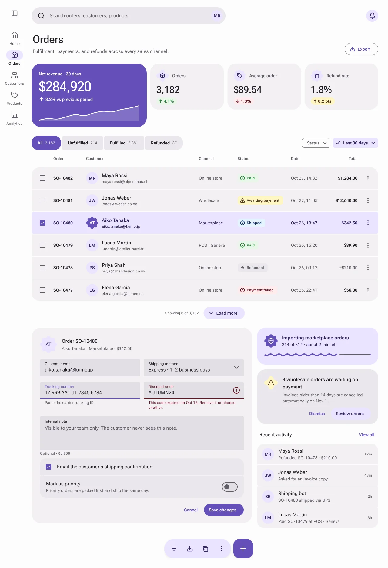
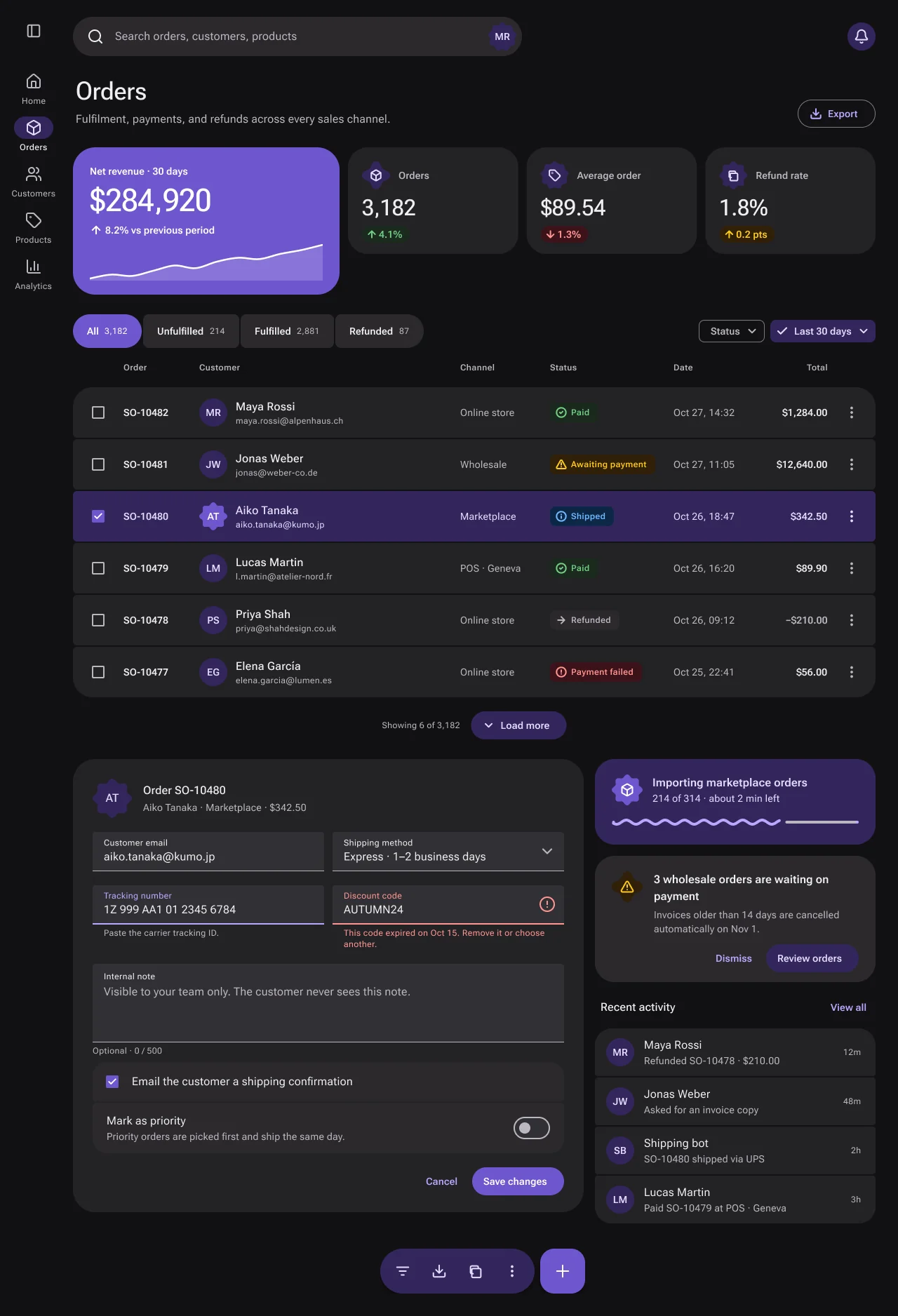
Specification values · alpha
Theme values
Values: Colors
| Property | Value |
|---|---|
bg | #fdfcfd |
bg-dark | #121113 |
surface | #faf9fb |
surface-dark | #1a191b |
card | #faf9fb |
card-dark | #1a191b |
container | #f2eff3 |
container-dark | #232225 |
container-high | #eae7ec |
container-high-dark | #2b292d |
container-highest | #e3dfe6 |
container-highest-dark | #323035 |
selected | #f4f0fe |
selected-dark | #291f43 |
fg | #211f26 |
fg-dark | #eeeef0 |
muted-fg | #605e67 |
muted-fg-dark | #bab7c0 |
border | #dbd8e0 |
border-dark | #3c393f |
input-border | #84828e |
input-border-dark | #7c7a85 |
ring | #6550b9 |
ring-dark | #baa7ff |
primary | #6550b9 |
primary-dark | #6e56cf |
primary-hover | #6550b9 |
primary-hover-dark | #7d66d9 |
primary-fg | #ffffff |
primary-fg-dark | #ffffff |
primary-text | #6550b9 |
primary-text-dark | #baa7ff |
primary-container | #ebe4ff |
primary-container-dark | #33255b |
primary-on-container | #2f265f |
primary-on-container-dark | #e2ddfe |
inverse | #211f26 |
inverse-dark | #eeeef0 |
inverse-fg | #fdfcfd |
inverse-fg-dark | #121113 |
success-subtle | #e9f6e9 |
success-subtle-dark | #1b2a1e |
success-text | #2a7e3b |
success-text-dark | #71d083 |
warning-subtle | #fff7c2 |
warning-subtle-dark | #302008 |
warning-text | #4f3422 |
warning-text-dark | #ffca16 |
destructive-subtle | #feebec |
destructive-subtle-dark | #3b1219 |
destructive-text | #641723 |
destructive-text-dark | #ff9592 |
info-subtle | #e6f4fe |
info-subtle-dark | #0d2847 |
info-text | #113264 |
info-text-dark | #70b8ff |
Values: Typography
| Property | Value |
|---|---|
display.fontFamily | Roboto Flex |
display.fontSize | 57px |
display.fontWeight | 500 |
display.lineHeight | 64px |
display.letterSpacing | -0.25px |
title.fontFamily | Roboto Flex |
title.fontSize | 36px |
title.fontWeight | 500 |
title.lineHeight | 44px |
heading.fontFamily | Roboto Flex |
heading.fontSize | 16px |
heading.fontWeight | 500 |
heading.lineHeight | 24px |
heading.letterSpacing | 0.15px |
kpi.fontFamily | Roboto Flex |
kpi.fontSize | 45px |
kpi.fontWeight | 500 |
kpi.lineHeight | 52px |
kpi.fontFeature | "tnum" 1, "lnum" 1 |
kpi-sm.fontFamily | Roboto Flex |
kpi-sm.fontSize | 32px |
kpi-sm.fontWeight | 500 |
kpi-sm.lineHeight | 40px |
kpi-sm.fontFeature | "tnum" 1, "lnum" 1 |
body-lg.fontFamily | Roboto Flex |
body-lg.fontSize | 16px |
body-lg.fontWeight | 400 |
body-lg.lineHeight | 24px |
body.fontFamily | Roboto Flex |
body.fontSize | 14px |
body.fontWeight | 400 |
body.lineHeight | 20px |
body.letterSpacing | 0.25px |
strong.fontFamily | Roboto Flex |
strong.fontSize | 14px |
strong.fontWeight | 600 |
strong.lineHeight | 20px |
strong.letterSpacing | 0.1px |
label.fontFamily | Roboto Flex |
label.fontSize | 12px |
label.fontWeight | 600 |
label.lineHeight | 16px |
label.letterSpacing | 0.4px |
small.fontFamily | Roboto Flex |
small.fontSize | 12px |
small.fontWeight | 400 |
small.lineHeight | 16px |
small.letterSpacing | 0.4px |
Values: Radii
| Property | Value |
|---|---|
input | 4px |
connected-pressed | 4px |
segment-inner | 6px |
chip | 8px |
connected-inner | 8px |
fab | 20px |
card | 28px |
card-hero | 32px |
full | 9999px |
Values: Spacing
| Property | Value |
|---|---|
button-height | 40px |
icon-button | 40px |
connected-height | 48px |
chip-height | 32px |
field-height | 56px |
search-height | 56px |
list-row-height | 72px |
list-gap | 2px |
rail-width | 96px |
rail-item-width | 80px |
fab-size | 64px |
toolbar-height | 64px |
card-padding | 24px |
Values: Component recipes
| Property | Value |
|---|---|
button-filled.backgroundColor | {colors.primary} |
button-filled.textColor | {colors.primary-fg} |
button-filled.typography | {typography.strong} |
button-filled.rounded | {rounded.full} |
button-filled.height | 40px |
button-filled.padding | 0 24px |
button-filled-dark.backgroundColor | {colors.primary-dark} |
button-filled-dark.textColor | {colors.primary-fg-dark} |
button-filled-dark.rounded | {rounded.full} |
button-filled-dark.height | 40px |
button-outlined.textColor | {colors.primary-text} |
button-outlined.typography | {typography.strong} |
button-outlined.rounded | {rounded.full} |
button-outlined.height | 40px |
button-outlined.padding | 0 24px 0 16px |
button-tonal.backgroundColor | {colors.primary-container} |
button-tonal.textColor | {colors.primary-on-container} |
button-tonal.typography | {typography.strong} |
button-tonal.rounded | {rounded.full} |
button-tonal.height | 40px |
connected-selected.backgroundColor | {colors.primary} |
connected-selected.textColor | {colors.primary-fg} |
connected-selected.typography | {typography.strong} |
connected-selected.rounded | {rounded.full} |
connected-selected.height | 48px |
connected-item.backgroundColor | {colors.container-high} |
connected-item.textColor | {colors.fg} |
connected-item.typography | {typography.strong} |
connected-item.rounded | {rounded.connected-inner} |
connected-item.height | 48px |
chip-selected.backgroundColor | {colors.primary-container} |
chip-selected.textColor | {colors.primary-on-container} |
chip-selected.typography | {typography.strong} |
chip-selected.rounded | {rounded.chip} |
chip-selected.height | 32px |
text-field.backgroundColor | {colors.container-highest} |
text-field.textColor | {colors.fg} |
text-field.typography | {typography.body-lg} |
text-field.rounded | {rounded.input} |
text-field.height | 56px |
search-bar.backgroundColor | {colors.container-high} |
search-bar.textColor | {colors.muted-fg} |
search-bar.typography | {typography.body-lg} |
search-bar.rounded | {rounded.full} |
search-bar.height | 56px |
list-row.backgroundColor | {colors.container} |
list-row.textColor | {colors.fg} |
list-row.typography | {typography.strong} |
list-row.rounded | {rounded.segment-inner} |
list-row.height | 72px |
list-row-selected.backgroundColor | {colors.primary-container} |
list-row-selected.textColor | {colors.primary-on-container} |
list-row-selected.rounded | {rounded.segment-inner} |
list-row-selected.height | 72px |
status-success.backgroundColor | {colors.success-subtle} |
status-success.textColor | {colors.success-text} |
status-success.typography | {typography.label} |
status-success.rounded | {rounded.chip} |
status-success.height | 28px |
kpi-hero.backgroundColor | {colors.primary} |
kpi-hero.textColor | {colors.primary-fg} |
kpi-hero.typography | {typography.kpi} |
kpi-hero.rounded | {rounded.card-hero} |
kpi-hero.padding | 24px 24px 20px |
kpi-hero-dark.backgroundColor | {colors.primary-dark} |
kpi-hero-dark.textColor | {colors.primary-fg-dark} |
kpi-hero-dark.rounded | {rounded.card-hero} |
kpi.backgroundColor | {colors.container} |
kpi.textColor | {colors.fg} |
kpi.typography | {typography.kpi-sm} |
kpi.rounded | {rounded.card} |
kpi.padding | 20px 20px 16px |
floating-toolbar.backgroundColor | {colors.primary-container} |
floating-toolbar.textColor | {colors.primary-on-container} |
floating-toolbar.rounded | {rounded.full} |
floating-toolbar.height | 64px |
floating-toolbar.padding | 8px |
fab.backgroundColor | {colors.primary} |
fab.textColor | {colors.primary-fg} |
fab.rounded | {rounded.fab} |
fab.size | 64px |
Read YAML values and notes
version: alpha
name: Tonal
description: Material 3 Expressive for NetScript. Tonal surfaces replace borders, with a saturated hero KPI, shape-morphing connected controls and a floating toolbar with a FAB.
colors:
  # Theme mode Tonal (aliases gray → Radix mauve, accent → Radix violet). Light, then `-dark`.
  # Resolved Figma variables of the Light and Dark frames.
  bg: '#fdfcfd'
  bg-dark: '#121113'
  surface: '#faf9fb'
  surface-dark: '#1a191b'
  card: '#faf9fb'
  card-dark: '#1a191b'
  container: '#f2eff3'
  container-dark: '#232225'
  container-high: '#eae7ec'
  container-high-dark: '#2b292d'
  container-highest: '#e3dfe6'
  container-highest-dark: '#323035'
  selected: '#f4f0fe'
  selected-dark: '#291f43'
  fg: '#211f26'
  fg-dark: '#eeeef0'
  muted-fg: '#605e67' # also the 1px enabled filled-field and textarea indicator
  muted-fg-dark: '#bab7c0'
  border: '#dbd8e0'
  border-dark: '#3c393f'
  input-border: '#84828e' # outlined buttons, chips, checkbox outlines; not the filled-field indicator
  input-border-dark: '#7c7a85'
  ring: '#6550b9'
  ring-dark: '#baa7ff'
  primary: '#6550b9'
  primary-dark: '#6e56cf'
  primary-hover: '#6550b9'
  primary-hover-dark: '#7d66d9'
  primary-fg: '#ffffff'
  primary-fg-dark: '#ffffff'
  primary-text: '#6550b9'
  primary-text-dark: '#baa7ff'
  primary-container: '#ebe4ff'
  primary-container-dark: '#33255b'
  primary-on-container: '#2f265f'
  primary-on-container-dark: '#e2ddfe'
  inverse: '#211f26'
  inverse-dark: '#eeeef0'
  inverse-fg: '#fdfcfd'
  inverse-fg-dark: '#121113'
  success-subtle: '#e9f6e9'
  success-subtle-dark: '#1b2a1e'
  success-text: '#2a7e3b'
  success-text-dark: '#71d083'
  warning-subtle: '#fff7c2'
  warning-subtle-dark: '#302008'
  warning-text: '#4f3422'
  warning-text-dark: '#ffca16'
  destructive-subtle: '#feebec'
  destructive-subtle-dark: '#3b1219'
  destructive-text: '#641723'
  destructive-text-dark: '#ff9592'
  info-subtle: '#e6f4fe'
  info-subtle-dark: '#0d2847'
  info-text: '#113264'
  info-text-dark: '#70b8ff'
typography:
  display: {
    fontFamily: Roboto Flex,
    fontSize: 57px,
    fontWeight: 500,
    lineHeight: 64px,
    letterSpacing: -0.25px,
  }
  title: { fontFamily: Roboto Flex, fontSize: 36px, fontWeight: 500, lineHeight: 44px }
  heading: {
    fontFamily: Roboto Flex,
    fontSize: 16px,
    fontWeight: 500,
    lineHeight: 24px,
    letterSpacing: 0.15px,
  }
  kpi: {
    fontFamily: Roboto Flex,
    fontSize: 45px,
    fontWeight: 500,
    lineHeight: 52px,
    fontFeature: '"tnum" 1, "lnum" 1',
  }
  kpi-sm: {
    fontFamily: Roboto Flex,
    fontSize: 32px,
    fontWeight: 500,
    lineHeight: 40px,
    fontFeature: '"tnum" 1, "lnum" 1',
  }
  body-lg: { fontFamily: Roboto Flex, fontSize: 16px, fontWeight: 400, lineHeight: 24px }
  body: {
    fontFamily: Roboto Flex,
    fontSize: 14px,
    fontWeight: 400,
    lineHeight: 20px,
    letterSpacing: 0.25px,
  }
  strong: {
    fontFamily: Roboto Flex,
    fontSize: 14px,
    fontWeight: 600,
    lineHeight: 20px,
    letterSpacing: 0.1px,
  }
  label: {
    fontFamily: Roboto Flex,
    fontSize: 12px,
    fontWeight: 600,
    lineHeight: 16px,
    letterSpacing: 0.4px,
  }
  small: {
    fontFamily: Roboto Flex,
    fontSize: 12px,
    fontWeight: 400,
    lineHeight: 16px,
    letterSpacing: 0.4px,
  }
rounded:
  input: 4px # filled field top corners; bottom corners 0
  connected-pressed: 4px
  segment-inner: 6px
  chip: 8px
  connected-inner: 8px
  fab: 20px
  card: 28px
  card-hero: 32px
  full: 9999px
spacing:
  button-height: 40px
  icon-button: 40px
  connected-height: 48px
  chip-height: 32px
  field-height: 56px
  search-height: 56px
  list-row-height: 72px
  list-gap: 2px
  rail-width: 96px
  rail-item-width: 80px
  fab-size: 64px
  toolbar-height: 64px
  card-padding: 24px
components:
  button-filled: {
    backgroundColor: '{colors.primary}',
    textColor: '{colors.primary-fg}',
    typography: '{typography.strong}',
    rounded: '{rounded.full}',
    height: 40px,
    padding: 0 24px,
  }
  button-filled-dark: {
    backgroundColor: '{colors.primary-dark}',
    textColor: '{colors.primary-fg-dark}',
    rounded: '{rounded.full}',
    height: 40px,
  }
  button-outlined: {
    textColor: '{colors.primary-text}',
    typography: '{typography.strong}',
    rounded: '{rounded.full}',
    height: 40px,
    padding: 0 24px 0 16px,
  }
  button-tonal: {
    backgroundColor: '{colors.primary-container}',
    textColor: '{colors.primary-on-container}',
    typography: '{typography.strong}',
    rounded: '{rounded.full}',
    height: 40px,
  }
  connected-selected: {
    backgroundColor: '{colors.primary}',
    textColor: '{colors.primary-fg}',
    typography: '{typography.strong}',
    rounded: '{rounded.full}',
    height: 48px,
  }
  connected-item: {
    backgroundColor: '{colors.container-high}',
    textColor: '{colors.fg}',
    typography: '{typography.strong}',
    rounded: '{rounded.connected-inner}',
    height: 48px,
  }
  chip-selected: {
    backgroundColor: '{colors.primary-container}',
    textColor: '{colors.primary-on-container}',
    typography: '{typography.strong}',
    rounded: '{rounded.chip}',
    height: 32px,
  }
  text-field: {
    backgroundColor: '{colors.container-highest}',
    textColor: '{colors.fg}',
    typography: '{typography.body-lg}',
    rounded: '{rounded.input}',
    height: 56px,
  }
  search-bar: {
    backgroundColor: '{colors.container-high}',
    textColor: '{colors.muted-fg}',
    typography: '{typography.body-lg}',
    rounded: '{rounded.full}',
    height: 56px,
  }
  list-row: {
    backgroundColor: '{colors.container}',
    textColor: '{colors.fg}',
    typography: '{typography.strong}',
    rounded: '{rounded.segment-inner}',
    height: 72px,
  }
  list-row-selected: {
    backgroundColor: '{colors.primary-container}',
    textColor: '{colors.primary-on-container}',
    rounded: '{rounded.segment-inner}',
    height: 72px,
  }
  status-success: {
    backgroundColor: '{colors.success-subtle}',
    textColor: '{colors.success-text}',
    typography: '{typography.label}',
    rounded: '{rounded.chip}',
    height: 28px,
  }
  kpi-hero: {
    backgroundColor: '{colors.primary}',
    textColor: '{colors.primary-fg}',
    typography: '{typography.kpi}',
    rounded: '{rounded.card-hero}',
    padding: 24px 24px 20px,
  }
  kpi-hero-dark: {
    backgroundColor: '{colors.primary-dark}',
    textColor: '{colors.primary-fg-dark}',
    rounded: '{rounded.card-hero}',
  }
  kpi: {
    backgroundColor: '{colors.container}',
    textColor: '{colors.fg}',
    typography: '{typography.kpi-sm}',
    rounded: '{rounded.card}',
    padding: 20px 20px 16px,
  }
  floating-toolbar: {
    backgroundColor: '{colors.primary-container}',
    textColor: '{colors.primary-on-container}',
    rounded: '{rounded.full}',
    height: 64px,
    padding: 8px,
  }
  fab: {
    backgroundColor: '{colors.primary}',
    textColor: '{colors.primary-fg}',
    rounded: '{rounded.fab}',
    size: 64px,
  }
Overview
- Thesis: Material 3 Expressive on NetScript roles. Tonal containers and shape carry the hierarchy, without borders or shadows.
- Signature moves:
- Saturated hero on a tonal ladder. One violet hero KPI (
primary) overcontainer→container-high→container-highestsurfaces; no card borders. - Connected and segmented shapes. Connected button groups (selected = full pill, inner corners 8px, pressed 4px), segmented list rows (outer 28px, inner 6px, 2px gaps), and the Expressive "sunny" shape, used only for the selected order.
- Floating toolbar and FAB at the bottom centre, plus a wavy progress indicator and filled text fields with the label inside.
- Saturated hero on a tonal ladder. One violet hero KPI (
- Anchor: Material 3 Expressive (May 2025, m3.material.io): shape scale, emphasized type, colour roles, state layers, connected button groups, floating toolbar, wavy progress. The Material 3 Design Kit is used for calibration. Do not copy Google marks, the Material Symbols set (use our Lucide-style icons) or Google Sans.
- Family: System. Best for: Android-adjacent and consumer-facing apps, mobile-first admin. Avoid for: dense desktop finance grids (use Studio Ledger).
- Feel: soft and tactile. It must match current Material 3 Expressive, not the 2019-era Material look.
Colors
- Ladder:
bg#fdfcfd →container#f2eff3 (KPIs, form, list rows) →container-high#eae7ec (search, connected items, options, banner) →container-highest#e3dfe6 (filled fields, switch track). Dark: #121113 → #232225 → #2b292d → #323035. - Accent policy: violet
primaryfills only the hero KPI, the selected connected button, the FAB and filled buttons.primary-container(#ebe4ff / #33255b) marks selection: the selected row, the selected chip, the floating toolbar, the sync card, tonal buttons and the rail indicator.primary-text(#6550b9 / #baa7ff) is for text buttons, focused labels and progress. - Status: chips use
*-subtlefills with*-text(success #2a7e3b / #71d083, warning #4f3422 / #ffca16, destructive #641723 / #ff9592, info #113264 / #70b8ff) plus a leading icon. - Dark design notes: the hero, Save and FAB keep a saturated #6e56cf fill with white text (5.39:1), never a pale inverse slab. Selection stays deep (#33255b). Shadows turn to #000 at 50%. Surfaces lighten with height.
Typography
Roboto Flex (OFL, Google Fonts) sets every role except mono, which is Geist Mono (OFL).
Fallback: system-ui, sans-serif. Emphasized scale: display 57/64 Medium −0.25; title 36/44 Medium;
hero KPI 45/52 Medium; secondary KPIs 32/40 Medium (type/kpi-sm); headings and names 16/24 Medium
+0.15; body 14/20 +0.25; strong and button labels 14/20 SemiBold +0.1; field values and search
16/24; field labels and captions 12/16 +0.4. Order IDs and totals are SemiBold 14/20. Numerals must
be tabular lining in code (pending in #2414 and #2416). Sentence case throughout.
Layout
- Frame (1280×1876): a 96px navigation rail (menu icon button, five 80×60 destinations) and a main column (1144px content): search bar (640×56) and notification button → header (title, subtitle, outlined Export) → KPI row (hero 380×210 + three 243×152) → orders section (toolbar with connected group and chips, column labels, six 72px segmented rows, "Load more") → bottom row: order form (728) beside a side column (400: sync card, banner, recent activity).
- Floating toolbar + FAB: 292×64, bottom centre, over content.
- Rhythm: 4px grid; list gaps 2px; card padding 24 (hero) / 20 (KPI); form groups 16. Density defaults to Comfortable, but Tonal controls use the fixed M3 sizes in spacing.
Elevation & Depth
Tonal elevation: a raised surface takes the next container step instead of a shadow.
| Level | Recipe | Applied to |
|---|---|---|
| 0 | bg |
page |
| 1–3 | container / container-high / container-highest fills, no stroke |
cards, rows, fields |
| Floating | box-shadow: 0 3px 8px #0f0f1414 (dark #00000080) |
floating toolbar |
| Floating action | box-shadow: 0 4px 10px #0f0f1414 (dark #00000080) |
FAB |
Focus: 2px ring at a 2px gap ("Focus 2/2" on the state sheets).
Shapes
M3 shape scale, drawn as literal radii: full (buttons, search, floating toolbar, delta pills), 32 (hero, form), 28 (KPIs, sync card, banner, first/last segmented row), 24 (first/last activity item), 20 (FAB, options group ends), 8 (chips, status, connected inner corners), 6 (segmented inner), 4 (field top corners, pressed connected inner corners, activity inner). Expressive shapes: the "sunny" 8-point shape for the selected order's avatar (list and form header, 56px) and shape badges (44px) on the sync card and banner. Strokes: 1px field indicator, 2px focused/error indicator, 1px outlined button.
Components
States come from the Light and Dark state sheets; state layers use the on-colour.
- Buttons: filled (
primary), tonal (primary-container), outlined (1pxinput-border,primary-textlabel), text (primary-text). 40px, full radius, 24px padding (16px on the icon side). Hover 8%, pressed 12% layer behind the label, focus 2/2, disabled =state/disabled-container12% +state/disabled-fg38%, parent opacity 1. - Connected button group: 48px, 2px gaps; selected item becomes a full pill in
primary; otherscontainer-highwith 8px inner corners; pressed inner corners morph to 4px. - Chips: 32px, radius 8. Filter chip = 1px
input-border,muted-fglabel, trailing chevron. Selected chip =primary-containerwith a leading check. - Filled text field: 56px,
container-highest, top corners 4px, label inside (12/16) and value (16/24). Enabled indicator 1pxmuted-fg(text/muted, #605e67 / #bab7c0; measured 4.8459:1 / 6.5985:1 on the field fill); hover indicatorfg; focused 2pxringwith aprimary-textlabel; error 2pxdestructive-text, trailing alert icon and a full repair sentence; error + focus adds the outer ring; disabled 38%. - Text area: 112px container, label inside, 1px
muted-fgbottom indicator, counter "Optional · 0 / 500". - Checkbox / switch: checkbox in a 40px round state target; switch 52×32, off track
container-highestwith a 2pxmuted-fgoutline; on trackprimarywith a check in the thumb. - Segmented list row (table): 72px rows, 2px apart,
container; outer corners 28, inner 6; checkbox, ID, avatar + name/email, channel, status chip, date, total, overflow icon button. Selected =primary-containerwithprimary-on-containertext and the sunny avatar. - Status chip: 28px, radius 8,
*-subtlefill, leading status icon,*-textlabel. - KPI: hero 380×210 r32
primarywith label, 45/52 value, delta and an area sparkline (white at 18% + 2.5px line); secondary 243×152 r28containerwith a shape-badge icon, 32/40 value and a delta pill; no sparklines. - Notice / banner: r28
container-high, shape badge, body, text + tonal actions. - Navigation rail: 80×60 items, 56×32 r16 indicator in
primary-container, 24px icon, 12/16 label (Medium when active). No compose FAB in the rail. - Top bar: 56px pill search in
container-highwith a trailing avatar; tonal bell button. - Floating toolbar + FAB: 220×64 pill in
primary-containerholding four 48px named icon actions (Filter, Export, Copy order ID, More); 64px r20primaryFAB "Create order". - Wavy progress: 4px wave in
primary-textwith a 4px stop dot; remaindermuted-fg. - Dialog/sheet: not drawn in the fixture; pending in #2416 (use r28
container-high).
Do's and Don'ts
- Do match current M3 Expressive anatomy, component by component.
- Don't separate surfaces with borders or shadows; use a higher container step instead.
- Don't paint a pale hero, pale selected segment or pale primary in dark: use #6e56cf with white.
- Do bind enabled field labels to
fg, focused labels toprimary-text, and errors todestructive-textwith a 2px indicator and a full repair sentence. - Do draw outlined buttons, chips, checkboxes and icon buttons with
input-border, and the 1px enabled indicator of filled fields and text areas withmuted-fg(≥ 3:1 on the field fill). - Do compose hover/pressed as 8%/12% on-colour layers behind the label; disabled as 12% container + 38% label at parent opacity 1, never an opaque grey.
- Do morph shape on interaction: pressed connected inner corners 8 → 4.
- Do reserve the sunny shape for the selected order; all other avatars are circles; no decorative blob on the hero.
- Don't add sparklines to secondary KPIs or a second compose FAB in the rail.
- Do give every icon-only action a name ("Filter orders", "Export orders", "Copy order ID", "More order actions", "Create order").
- Do keep the emphasized scale: 36/44 title, 45/52 hero, 32/40 secondary KPIs, 16/24 names; keep
the wave and stop dot in
primary-text. - Do keep the Priority switch off in the fixture, as in every theme.
- Don't treat the floating toolbar as proven: its viewport and scroll behaviour is pending in #2419.
Iconography & Imagery
The shared icon/* set (Lucide-style strokes, ISC): 24px in the rail, search and toolbar, 18px in
buttons and chips, 28px in the FAB. Avatars are 40px circles with initials on primary-container;
the selected order uses the sunny shape. Shape badges (44px) hold product icons. No photos.
Motion & States
Shown statically: hover 8%, pressed 12%, focus 2/2, disabled 12%/38%, selected primary-container,
selected + hover. M3 Expressive spring motion and the shape-morph transition are not specified yet.
They are pending in #2419, with a reduced-motion equivalent (no morph, instant state change) and RTL
mirroring of the rail, chevrons and wavy progress.
Accessibility
| Pair (light / dark) | Ratio |
|---|---|
fg on bg |
15.92 / 16.25 |
muted-fg on container |
5.59 / 8.00 |
muted-fg on container-highest (field placeholder) |
4.85 / 6.60 |
primary-fg on primary (hero, FAB, Save) |
6.17 / 5.39 |
primary-on-container on primary-container |
10.92 / 10.28 |
ring on container-highest |
4.69 / 6.25 |
destructive-text on container-highest |
9.45 / 6.19 |
Enabled field indicator muted-fg on the field fill (#e3dfe6 / #323035), measured |
4.8459 / 6.5985 |
input-border (outlined buttons, chips) on container |
3.31 / 3.75 |
The enabled filled-field indicator meets 3:1 in both schemes, measured on rendered pixels. Disabled fields (38%) are inactive components and are exempt from the contrast minimums; enabled states are not. Hit targets: 40px buttons and checkbox targets, 48px toolbar actions, 72px rows.
NetScript Mapping
| Layer | Value |
|---|---|
| Figma Theme mode | Tonal |
| Base gray × accent | Mauve × Violet (aliased inside the Tonal mode; frames set no Base modes) |
| Density | Comfortable (default); M3 component sizes are fixed |
| Flavor | n/a |
data-theme |
tonal |
| Language roles | none; Tonal reads only core roles (--ns-container*, --ns-primary-container, …) |
- Shape scale: container radii (32, 28, 24, 20, 8, 6, 4) are literal values and do not use the
Theme
radius/card(16). Role pending in #2414: an M3 shape scale. Buttons useradius/control(999). - Field indicator: the enabled active indicator of the filled text field and the text area binds
muted-fg, the M3 on-surface-variant role, notinput-border.- Light:
#605e67on the#e3dfe6field fill, measured 4.8459:1. - Dark:
#bab7c0on the#323035field fill, measured 6.5985:1. - Enabled and Disabled indicators share the colour; Disabled keeps its 38% treatment.
- Light:
- Status: values come from the NetScript Figma library. Fonts, numerals, shape-scale tokens and the contrast matrix are tracked in #2414; the canonical state matrix, tooltips for named actions and the dialog in #2416; floating-toolbar viewport and scroll behaviour and motion in #2419. Runtime behaviour stays unproven until #2419.
Sources
- References: m3.material.io (Material 3 Expressive, May 2025); the Material 3 Design Kit (Figma community) for calibration. What to take and what never to copy is listed under Overview → Anchor.
- Fonts and icons: Roboto Flex (OFL, Google Fonts) and Geist Mono (OFL); Lucide-style icons (ISC).
- Invented fixture content: Northwind data, customers, order IDs, amounts, "Importing marketplace orders · 214 of 314".