Brutal
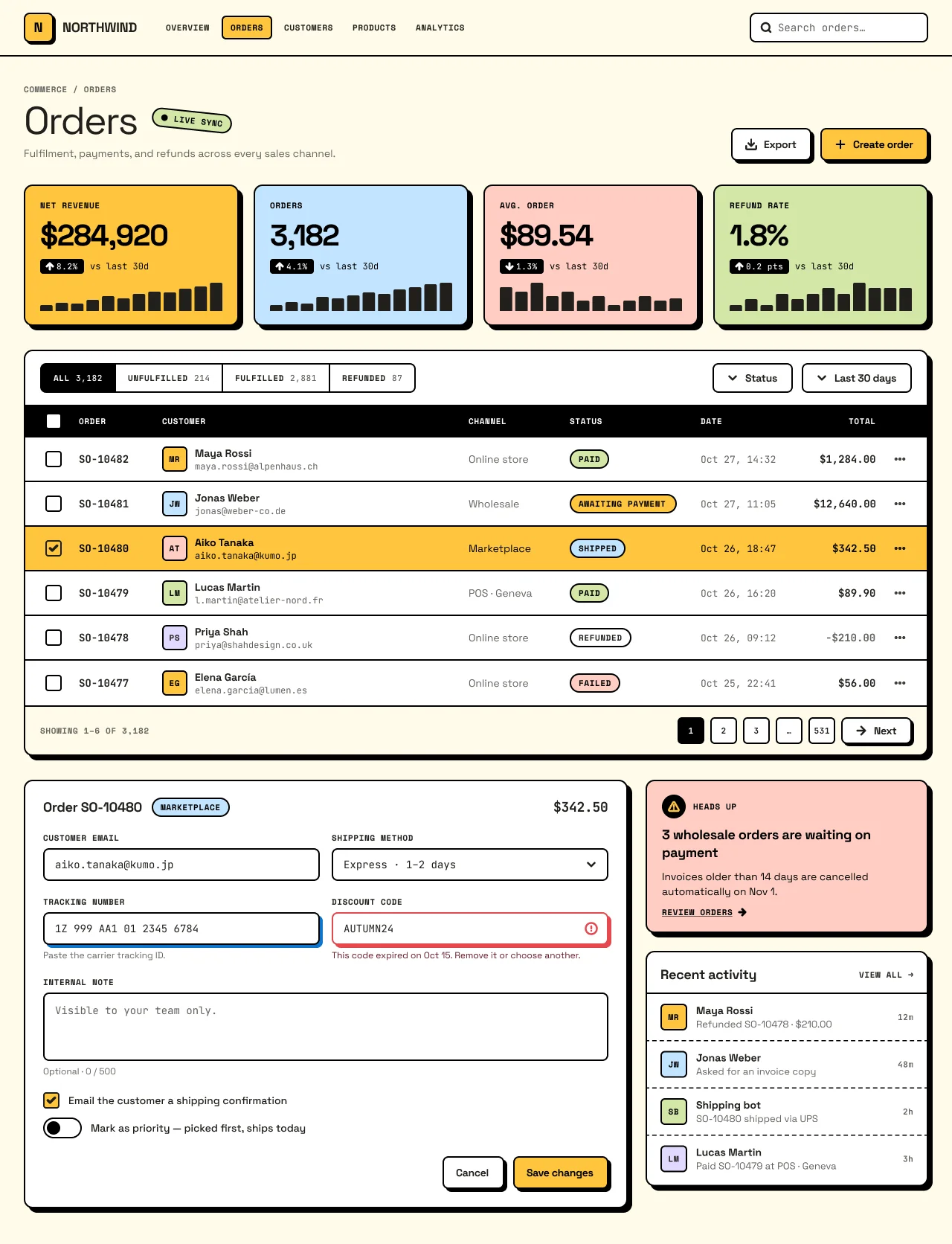
Gumroad-style neo-brutalism. Flat saturated blocks, black ink outlines and hard zero-blur offset shadows that stay black in both schemes.
On this page
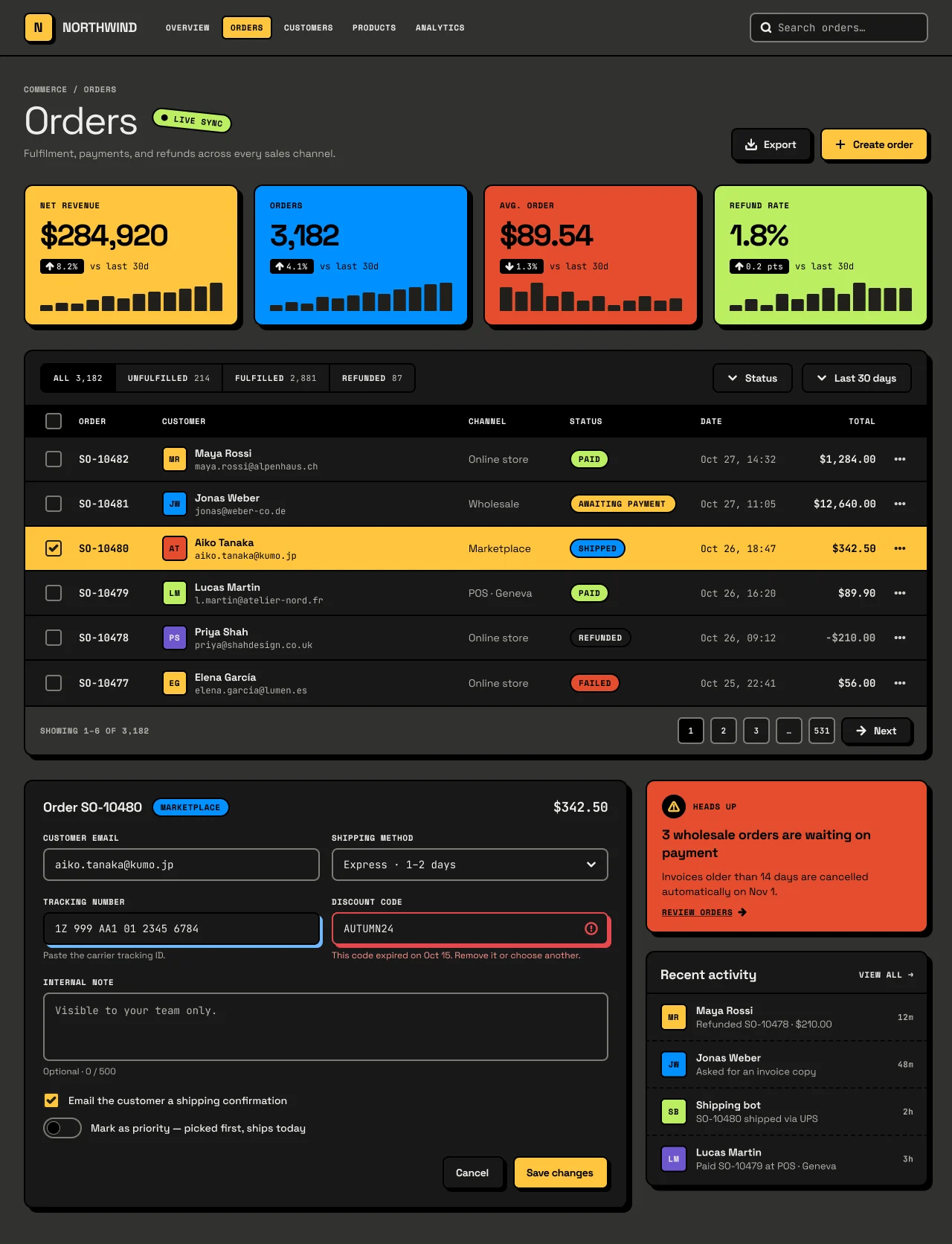
Light and dark
Brutal
Specification values · alpha
Theme values
Values: Colors
| Property | Value |
|---|---|
bg | #fefbe9 |
bg-dark | #31312e |
surface | #f9f9f8 |
surface-dark | #191918 |
card | #ffffff |
card-dark | #191918 |
surface-raised | #ffffff |
surface-raised-dark | #222221 |
muted | #f1f0ef |
muted-dark | #222221 |
selected | #fff7c2 |
selected-dark | #302008 |
overlay | #00000066 |
overlay-dark | #000000a8 |
fg | #21201c |
fg-dark | #eeeeec |
muted-fg | #63635e |
muted-fg-dark | #b5b3ad |
ink-fg | #fdfdfc |
ink-fg-dark | #eeeeec |
border | #dad9d6 |
border-dark | #3b3a37 |
input-border | #82827c |
input-border-dark | #7c7b74 |
border-control | #000000 |
border-control-dark | #7c7b74 |
ink | #000000 |
ink-dark | #000000 |
ring | #0d74ce |
ring-dark | #70b8ff |
primary | #ffc53d |
primary-dark | #ffc53d |
primary-hover | #ffba18 |
primary-hover-dark | #ffd60a |
primary-fg | #21201c |
primary-fg-dark | #21201c |
primary-text | #ab6400 |
primary-text-dark | #ffca16 |
block-yellow | #ffc53d |
block-yellow-dark | #ffc53d |
block-blue | #c2e5ff |
block-blue-dark | #0090ff |
block-green | #d3e7a6 |
block-green-dark | #bdee63 |
block-pink | #ffcdc2 |
block-pink-dark | #e54d2e |
block-purple | #e1d9ff |
block-purple-dark | #6e56cf |
block-fg | #000000 |
block-fg-dark | #000000 |
shadow-color | #000000 |
shadow-color-dark | #000000 |
success | #46a758 |
success-dark | #46a758 |
success-text | #2a7e3b |
success-text-dark | #71d083 |
warning | #ffc53d |
warning-dark | #ffc53d |
warning-text | #4f3422 |
warning-text-dark | #ffca16 |
destructive | #e5484d |
destructive-dark | #e5484d |
destructive-text | #641723 |
destructive-text-dark | #ff9592 |
info | #0090ff |
info-dark | #0090ff |
info-text | #113264 |
info-text-dark | #70b8ff |
Values: Typography
| Property | Value |
|---|---|
title.fontFamily | Space Grotesk |
title.fontSize | 52px |
title.fontWeight | 400 |
title.lineHeight | 52px |
title.letterSpacing | -2px |
kpi.fontFamily | Space Grotesk |
kpi.fontSize | 40px |
kpi.fontWeight | 700 |
kpi.lineHeight | 44px |
kpi.letterSpacing | -1.5px |
heading.fontFamily | Space Grotesk |
heading.fontSize | 18px |
heading.fontWeight | 700 |
heading.lineHeight | 24px |
heading.letterSpacing | -0.3px |
body.fontFamily | Space Grotesk |
body.fontSize | 14px |
body.fontWeight | 400 |
body.lineHeight | 20px |
button.fontFamily | Space Grotesk |
button.fontSize | 14px |
button.fontWeight | 700 |
button.lineHeight | 20px |
button.letterSpacing | -0.3px |
caption.fontFamily | Space Grotesk |
caption.fontSize | 12px |
caption.fontWeight | 400 |
caption.lineHeight | 16px |
label.fontFamily | Space Mono |
label.fontSize | 11px |
label.fontWeight | 700 |
label.lineHeight | 16px |
label.letterSpacing | 0.6px |
data.fontFamily | JetBrains Mono |
data.fontSize | 14px |
data.fontWeight | 700 |
data.lineHeight | 20px |
data.fontFeature | "tnum" 1 |
data-meta.fontFamily | JetBrains Mono |
data-meta.fontSize | 13px |
data-meta.fontWeight | 400 |
data-meta.lineHeight | 18px |
Values: Radii
| Property | Value |
|---|---|
none | 0px |
xs | 4px |
sm | 6px |
md | 8px |
lg | 12px |
full | 9999px |
Values: Spacing
| Property | Value |
|---|---|
xs | 4px |
sm | 8px |
md | 12px |
lg | 16px |
xl | 20px |
2xl | 24px |
3xl | 32px |
Values: Component recipes
| Property | Value |
|---|---|
button-primary.backgroundColor | {colors.block-yellow} |
button-primary.textColor | {colors.block-fg} |
button-primary.typography | {typography.button} |
button-primary.rounded | {rounded.md} |
button-primary.height | 44px |
button-primary-dark.backgroundColor | {colors.block-yellow-dark} |
button-primary-dark.textColor | {colors.block-fg-dark} |
button-primary-dark.typography | {typography.button} |
button-primary-dark.rounded | {rounded.md} |
button-primary-dark.height | 44px |
button-secondary.backgroundColor | {colors.card} |
button-secondary.textColor | {colors.fg} |
button-secondary.rounded | {rounded.md} |
button-secondary.height | 44px |
button-secondary-dark.backgroundColor | {colors.card-dark} |
button-secondary-dark.textColor | {colors.fg-dark} |
button-secondary-dark.rounded | {rounded.md} |
button-secondary-dark.height | 44px |
button-ink.backgroundColor | {colors.ink} |
button-ink.textColor | {colors.ink-fg} |
button-ink.rounded | {rounded.md} |
button-ink.height | 44px |
input.backgroundColor | {colors.card} |
input.textColor | {colors.fg} |
input.rounded | {rounded.md} |
input.height | 44px |
input-dark.backgroundColor | {colors.card-dark} |
input-dark.textColor | {colors.fg-dark} |
input-dark.rounded | {rounded.md} |
input-dark.height | 44px |
checkbox-checked.backgroundColor | {colors.primary} |
checkbox-checked.textColor | {colors.primary-fg} |
checkbox-checked.rounded | {rounded.xs} |
checkbox-checked.size | 22px |
switch-on.backgroundColor | {colors.block-green} |
switch-on.rounded | {rounded.full} |
switch-on.width | 52px |
switch-on.height | 28px |
sticker-success.backgroundColor | {colors.block-green} |
sticker-success.textColor | {colors.block-fg} |
sticker-success.typography | {typography.label} |
sticker-success.rounded | {rounded.full} |
sticker-success.height | 26px |
tab-selected.backgroundColor | {colors.ink} |
tab-selected.textColor | {colors.ink-fg} |
tab-selected.typography | {typography.label} |
tab-selected.height | 40px |
table-header.backgroundColor | {colors.ink} |
table-header.textColor | {colors.ink-fg} |
table-header.typography | {typography.label} |
table-header.height | 44px |
table-header-dark.backgroundColor | {colors.ink-dark} |
table-header-dark.textColor | {colors.ink-fg-dark} |
table-header-dark.typography | {typography.label} |
table-header-dark.height | 44px |
table-row-selected.backgroundColor | {colors.block-yellow} |
table-row-selected.textColor | {colors.block-fg} |
table-row-selected.height | 60px |
kpi-card.backgroundColor | {colors.block-yellow} |
kpi-card.textColor | {colors.block-fg} |
kpi-card.typography | {typography.kpi} |
kpi-card.rounded | {rounded.lg} |
kpi-card.width | 289px |
kpi-card.height | 190px |
kpi-card-dark.backgroundColor | {colors.block-blue-dark} |
kpi-card-dark.textColor | {colors.block-fg-dark} |
kpi-card-dark.typography | {typography.kpi} |
kpi-card-dark.rounded | {rounded.lg} |
notice.backgroundColor | {colors.block-pink} |
notice.textColor | {colors.block-fg} |
notice.rounded | {rounded.lg} |
notice-dark.backgroundColor | {colors.block-pink-dark} |
notice-dark.textColor | {colors.block-fg-dark} |
notice-dark.rounded | {rounded.lg} |
panel.backgroundColor | {colors.card} |
panel.textColor | {colors.fg} |
panel.rounded | {rounded.lg} |
panel-dark.backgroundColor | {colors.card-dark} |
panel-dark.textColor | {colors.fg-dark} |
panel-dark.rounded | {rounded.lg} |
Read YAML values and notes
Plain text
version: alpha
name: Brutal
description: Gumroad-style neo-brutalism. Flat saturated blocks, black ink outlines and hard zero-blur offset shadows that stay black in both schemes.
colors:
  # Resolved from the NetScript Figma library for the Light and Dark Orders screens.
  # Theme = Brutal. Keys are the --ns-* suffix.
  bg: '#fefbe9'
  bg-dark: '#31312e'
  surface: '#f9f9f8'
  surface-dark: '#191918'
  card: '#ffffff'
  card-dark: '#191918'
  surface-raised: '#ffffff'
  surface-raised-dark: '#222221'
  muted: '#f1f0ef'
  muted-dark: '#222221'
  selected: '#fff7c2'
  selected-dark: '#302008'
  overlay: '#00000066'
  overlay-dark: '#000000a8'
  fg: '#21201c'
  fg-dark: '#eeeeec'
  muted-fg: '#63635e'
  muted-fg-dark: '#b5b3ad'
  ink-fg: '#fdfdfc'
  ink-fg-dark: '#eeeeec'
  border: '#dad9d6'
  border-dark: '#3b3a37'
  input-border: '#82827c'
  input-border-dark: '#7c7b74'
  border-control: '#000000'
  border-control-dark: '#7c7b74'
  ink: '#000000'
  ink-dark: '#000000'
  ring: '#0d74ce'
  ring-dark: '#70b8ff'
  primary: '#ffc53d'
  primary-dark: '#ffc53d'
  primary-hover: '#ffba18'
  primary-hover-dark: '#ffd60a'
  primary-fg: '#21201c'
  primary-fg-dark: '#21201c'
  primary-text: '#ab6400'
  primary-text-dark: '#ffca16'
  block-yellow: '#ffc53d'
  block-yellow-dark: '#ffc53d'
  block-blue: '#c2e5ff'
  block-blue-dark: '#0090ff'
  block-green: '#d3e7a6'
  block-green-dark: '#bdee63'
  block-pink: '#ffcdc2'
  block-pink-dark: '#e54d2e'
  block-purple: '#e1d9ff'
  block-purple-dark: '#6e56cf'
  block-fg: '#000000'
  block-fg-dark: '#000000'
  shadow-color: '#000000'
  shadow-color-dark: '#000000'
  success: '#46a758'
  success-dark: '#46a758'
  success-text: '#2a7e3b'
  success-text-dark: '#71d083'
  warning: '#ffc53d'
  warning-dark: '#ffc53d'
  warning-text: '#4f3422'
  warning-text-dark: '#ffca16'
  destructive: '#e5484d'
  destructive-dark: '#e5484d'
  destructive-text: '#641723'
  destructive-text-dark: '#ff9592'
  info: '#0090ff'
  info-dark: '#0090ff'
  info-text: '#113264'
  info-text-dark: '#70b8ff'
typography:
  title: {
    fontFamily: Space Grotesk,
    fontSize: 52px,
    fontWeight: 400,
    lineHeight: 52px,
    letterSpacing: -2px,
  }
  kpi: {
    fontFamily: Space Grotesk,
    fontSize: 40px,
    fontWeight: 700,
    lineHeight: 44px,
    letterSpacing: -1.5px,
  }
  heading: {
    fontFamily: Space Grotesk,
    fontSize: 18px,
    fontWeight: 700,
    lineHeight: 24px,
    letterSpacing: -0.3px,
  }
  body: { fontFamily: Space Grotesk, fontSize: 14px, fontWeight: 400, lineHeight: 20px }
  button: {
    fontFamily: Space Grotesk,
    fontSize: 14px,
    fontWeight: 700,
    lineHeight: 20px,
    letterSpacing: -0.3px,
  }
  caption: { fontFamily: Space Grotesk, fontSize: 12px, fontWeight: 400, lineHeight: 16px }
  label: {
    fontFamily: Space Mono,
    fontSize: 11px,
    fontWeight: 700,
    lineHeight: 16px,
    letterSpacing: 0.6px,
  }
  data: {
    fontFamily: JetBrains Mono,
    fontSize: 14px,
    fontWeight: 700,
    lineHeight: 20px,
    fontFeature: '"tnum" 1',
  }
  data-meta: { fontFamily: JetBrains Mono, fontSize: 13px, fontWeight: 400, lineHeight: 18px }
rounded:
  none: 0px
  xs: 4px
  sm: 6px
  md: 8px
  lg: 12px
  full: 9999px
spacing:
  xs: 4px
  sm: 8px
  md: 12px
  lg: 16px
  xl: 20px
  2xl: 24px
  3xl: 32px
components:
  button-primary: {
    backgroundColor: '{colors.block-yellow}',
    textColor: '{colors.block-fg}',
    typography: '{typography.button}',
    rounded: '{rounded.md}',
    height: 44px,
  }
  button-primary-dark: {
    backgroundColor: '{colors.block-yellow-dark}',
    textColor: '{colors.block-fg-dark}',
    typography: '{typography.button}',
    rounded: '{rounded.md}',
    height: 44px,
  }
  button-secondary: {
    backgroundColor: '{colors.card}',
    textColor: '{colors.fg}',
    rounded: '{rounded.md}',
    height: 44px,
  }
  button-secondary-dark: {
    backgroundColor: '{colors.card-dark}',
    textColor: '{colors.fg-dark}',
    rounded: '{rounded.md}',
    height: 44px,
  }
  button-ink: {
    backgroundColor: '{colors.ink}',
    textColor: '{colors.ink-fg}',
    rounded: '{rounded.md}',
    height: 44px,
  }
  input: {
    backgroundColor: '{colors.card}',
    textColor: '{colors.fg}',
    rounded: '{rounded.md}',
    height: 44px,
  }
  input-dark: {
    backgroundColor: '{colors.card-dark}',
    textColor: '{colors.fg-dark}',
    rounded: '{rounded.md}',
    height: 44px,
  }
  checkbox-checked: {
    backgroundColor: '{colors.primary}',
    textColor: '{colors.primary-fg}',
    rounded: '{rounded.xs}',
    size: 22px,
  }
  switch-on: {
    backgroundColor: '{colors.block-green}',
    rounded: '{rounded.full}',
    width: 52px,
    height: 28px,
  }
  sticker-success: {
    backgroundColor: '{colors.block-green}',
    textColor: '{colors.block-fg}',
    typography: '{typography.label}',
    rounded: '{rounded.full}',
    height: 26px,
  }
  tab-selected: {
    backgroundColor: '{colors.ink}',
    textColor: '{colors.ink-fg}',
    typography: '{typography.label}',
    height: 40px,
  }
  table-header: {
    backgroundColor: '{colors.ink}',
    textColor: '{colors.ink-fg}',
    typography: '{typography.label}',
    height: 44px,
  }
  table-header-dark: {
    backgroundColor: '{colors.ink-dark}',
    textColor: '{colors.ink-fg-dark}',
    typography: '{typography.label}',
    height: 44px,
  }
  table-row-selected: {
    backgroundColor: '{colors.block-yellow}',
    textColor: '{colors.block-fg}',
    height: 60px,
  }
  kpi-card: {
    backgroundColor: '{colors.block-yellow}',
    textColor: '{colors.block-fg}',
    typography: '{typography.kpi}',
    rounded: '{rounded.lg}',
    width: 289px,
    height: 190px,
  }
  kpi-card-dark: {
    backgroundColor: '{colors.block-blue-dark}',
    textColor: '{colors.block-fg-dark}',
    typography: '{typography.kpi}',
    rounded: '{rounded.lg}',
  }
  notice: {
    backgroundColor: '{colors.block-pink}',
    textColor: '{colors.block-fg}',
    rounded: '{rounded.lg}',
  }
  notice-dark: {
    backgroundColor: '{colors.block-pink-dark}',
    textColor: '{colors.block-fg-dark}',
    rounded: '{rounded.lg}',
  }
  panel: { backgroundColor: '{colors.card}', textColor: '{colors.fg}', rounded: '{rounded.lg}' }
  panel-dark: {
    backgroundColor: '{colors.card-dark}',
    textColor: '{colors.fg-dark}',
    rounded: '{rounded.lg}',
  }
Overview
- Thesis: a commerce console styled as a sticker book. Each surface is a flat, saturated block with a black ink outline and a hard offset shadow. The ink stays black in the dark scheme.
- Signature moves:
- Zero-blur offset shadows in
#000000, sized 3/3, 4/4 or 6/6 by object size, in both schemes. - Saturated colour blocks that carry data: the four KPI tiles (yellow, blue, pink, green), the
pink notice and the yellow selected row. Text on them is always black
block-fg. - Sticker labels in Space Mono Bold 11px uppercase with 0.6px tracking, on pill stickers with a
2px ink border. The
LIVE SYNCsticker is rotated −6°.
- Zero-blur offset shadows in
- Anchor: Gumroad UI code (MIT,
antiwork/gumroad) plus neobrutalism.dev (MIT,ekmas/neobrutalism-components). Taken: the hard shadow pinned to black in dark mode, the bordered pill badge, regular-weight headings, colour-block fills without gradients, and the shadow that collapses on press. Not copied: Gumroad's name, coin illustrations, pink#ff90e8trade dress and the commercial ABC Favorit font (replaced by Space Grotesk). Figma's 2024 brand is not an anchor because it dropped heavy outlines. - Family: Expressive.
- Best for / avoid for: creator tools, storefront admin, marketing consoles. Avoid long data sessions and dense analytics, because every row has a 2px rule and every panel a 6px slab.
- Feel: loud and tactile, like a printed zine used to run a shop.
Colors
- Ground and surface ladder.
- Light: canvas
bg#fefbe9(amber/l/2, warm cream) → panelscard#ffffff→ blocks. - Dark: canvas
bg-dark#31312e(sand/d/5) is lighter than the panelscard-dark#191918(sand/d/2). The panels read as dark slabs on a mid-dark ground, so the black outlines and shadows still separate them from the canvas.
- Light: canvas
- Accent policy. Colour appears only in
block/*fills: KPI tiles, the notice, avatars, stickers, the selected nav item and the selected row (block-yellow). Text on a block isblock-fg(#000000), except on the dark violetblock-purple, where text usestext/fgbecause black on it is 3.9:1. Accent never tints text, outlines or shadows. - Ink.
border/inkandeffect/shadoware#000000in both schemes. The table header, the selected filter tab, the delta pills and page key 1 are filled withborder/inkand labelled withink/fg(#fdfdfclight,#eeeeecdark). - Status colours. Stickers map Paid →
block-green, Awaiting payment →block-yellow, Shipped →block-blue, Failed →block-pink, Refunded →card(neutral). Error text and outlines usedestructive(#e5484d) anddestructive-text. - Dark design notes. The blocks change ramp in dark: blue goes from blue/l/5
#c2e5ffto blue/d/9#0090ff, pink from tomato/l/5 to tomato/d/9#e54d2e, green from lime/l/5 to lime/d/9#bdee63. They stay saturated so black text keeps ≥5.4:1. Control boundaries change from ink toborder/control= sand/d/10#7c7b74, because black on#31312eis only 1.61:1.
Typography
| Role | Family | Size / line | Weight | Tracking | Used for |
|---|---|---|---|---|---|
| title | Space Grotesk | 52/52 | Regular 400 | −2px | Page title "Orders" (bound to type/title) |
| kpi | Space Grotesk | 40/44 | Bold 700 | −1.5px | KPI values |
| heading | Space Grotesk | 18/24 | Bold 700 | −0.3px | Brand, panel titles, notice heading |
| button | Space Grotesk | 14/20 | Bold 700 | −0.3px | Button labels, customer names |
| body | Space Grotesk | 14/20 (13/18 small) | Regular 400 | 0 | Subtitle, channel, activity text |
| label | Space Mono | 11/16 | Bold 700, UPPERCASE | +0.6px | Nav, column headers, stickers, KPI labels |
| data | JetBrains Mono | 14/20 Bold; 13/18 Regular | 700 / 400 | 0 | Order IDs, totals, dates, field values |
- All three families are OFL on Google Fonts. Fallbacks:
"Space Grotesk", ui-sans-serif, system-ui;"Space Mono", "JetBrains Mono", ui-monospace. - Headings are regular weight at display size, following Gumroad. Only the KPI numerals are bold.
- Field values and placeholders are mono (
JetBrains Mono Regular 14/20), so inputs read as typed data. - Tabular numerals: the mono faces are fixed-width.
"tnum"for Space Grotesk numerals is pending in #2414 and #2416, because Figma cannot set or verify it.
Layout
- Canvas: 1280 wide. Top bar 76px tall (padding 0/32, gap 28) with a 2px ink bottom rule. Body padding 36px top and 32px sides; vertical rhythm between regions is 32px.
- Orders fixture composition:
- Header: breadcrumb label, 52px title with the rotated sticker, subtitle; Export and Create order buttons right.
- KPI row: four 289×190 tiles, gap 20, padding 18/20, internal gap 10, each with a 12-bar ink bar chart.
- Orders panel (1216 wide): toolbar 72 (padding 16/20) with joined filter tabs, header row 44, six rows of 60 with a 2px ink bottom rule, footer 66 with 36px page keys.
- Bottom row (gap 24): order form 812 wide (padding 22/24/24/24, gap 20, two-column field rows with gap 16) and a 380-wide side column (notice, then recent activity; gap 24).
- Table columns: select 52px, order 112px, customer
minmax(0, 1fr), channel 136px, status 176px, date 132px, total 120px, actions 48px. Cells have 0/8 padding inside their track. The customer track gets the rest of the 1216px panel after subtracting its 2px borders, row padding and column gaps. A fixed 412px customer width, and totals derived from it, do not fit once padding and borders are counted; compute the track from the layout instead. Never shrink the type or clip a column to force the arithmetic. - Density: Brutal sets no density mode and binds no density variable; its geometry is fixed. The effective density is between Comfortable and Chunky (44px controls, 60px rows). Treat these numbers as Brutal's own until the density mapping lands in #2414.
Elevation & Depth
Brutal shows depth only with a hard offset slab. It uses no blur, gradient or tint.
| Level | Recipe (CSS) | Applied to | Why |
|---|---|---|---|
| Flat | box-shadow: none |
Rows, nav items, stickers, inputs at rest, tabs, avatars | Printed on the block; not an object |
| Slab S | 3px 3px 0 0 #000 |
Logo tile 40×40, "Next" page button 36px | Small objects get a short throw |
| Slab M | 4px 4px 0 0 #000 |
Buttons 44px (Export, Create order, Cancel, Save) | Pressable controls |
| Slab L | 6px 6px 0 0 #000 |
KPI tiles, Orders panel, order form, notice, activity panel | Regions |
| Focus | 4px 4px 0 0 var(--ns-ring) |
Focused field | Replaces nothing; the 2px ink border stays |
| Invalid | 4px 4px 0 0 var(--ns-destructive) |
Invalid field | Paired with icon and helper text |
| Pressed | none, content translated +4/+4 |
Button State=Pressed |
The slab collapses into the page |
- The shadow colour is
effect/shadow=#000000in both schemes. A pale offset in dark is an error. - Pressed keeps the hit area. The pressed variant changes padding from 0/18/0/16 to 4/14/0/20.
Shapes
- Radius scale:
rounded.xs4 (checkbox, delta pill),sm6 (nav item, page key, avatar),md8 (button, input, search, logo),lg12 (tiles, panels),full(stickers, switch). Theme variables:radius/control8,radius/input8,radius/card12,radius/badge999. - Strokes: 2px inside strokes everywhere: panels, buttons, inputs, stickers, avatars, checkbox,
switch, row rules. Activity dividers are 1.5px dashed
[6, 4]. - Joined tabs: the filter tabs overlap by 2px (gap −2) so neighbouring borders merge; only the outer corners are rounded.
- Tilt: one sticker per screen may rotate (−6° on
LIVE SYNC). Never rotate controls.
Components
| Component | Variant used | Anatomy and states |
|---|---|---|
| Button | Brutal/Button Kind = Primary (block-yellow), Secondary (card), Ink (ink fill) |
44 tall, radius 8, 2px border/ink, Slab M. Pressed: no shadow, content +4/+4. Toolbar instances are 40 tall without shadow. Kind=Ink (not used on the Orders screens): border/ink fill with the label and "+" glyph in ink/fg, measured at #eeeeec on #000000 (18.08:1) in dark and #fdfdfc (20.63:1) in light; matches the YAML button-ink entry. |
| Input / select | Brutal/Input Default, Focus, Error |
Label (Space Mono 11) above a 44px field with radius 8 and a mono value. Default border is border/control; Focus keeps a 2px ink border and adds the 4/4 ring slab; Error uses a destructive border, 4/4 destructive slab, trailing alert icon and helper "This code expired on Oct 15. Remove it or choose another." |
| Textarea | One-off frame; no library component yet | 92px field, radius 8, border/control, counter helper "Optional · 0 / 500". |
| Checkbox | Brutal/Checkbox 22×22, radius 4 |
Unchecked: card fill, border/control. Checked: primary fill, primary-fg check, 2px primary-fg keyline. |
| Switch | Brutal/Switch 52×28 pill |
Off: card fill, border/control, black thumb with a 1px border/control inner contour. On: block-green, ink border. |
| Tabs | Brutal/Tab |
Joined row, 40 tall. Selected: ink fill, ink-fg label and count. Unselected: card fill. |
| Table row | Frames Row — * |
60 tall, 2px ink bottom rule. Selected: block-yellow fill, checked box. Header: ink fill, ink-fg Space Mono labels. |
| Sticker (badge) | Brutal/Sticker Tone = Success, Warning, Error, Info, Neutral |
26 tall pill, 2px ink border, Space Mono Bold 11 uppercase. "AWAITING PAYMENT" is spelled out (min width 144). |
| KPI tile | Frames KPI — * |
289×190, radius 12, Slab L, block fill, label, 40px value, ink delta pill (radius 4) with ink-fg arrow and %, 12 ink bars. |
| Notice | Notice frame |
block-pink slab, ink alert disc, Space Grotesk 18 heading, underlined mono "REVIEW ORDERS" link. |
| Nav item | Nav — * |
28 tall, radius 6, no fill. Selected: block-yellow, 2px ink border, 32 tall. |
| Top bar | Top bar frame |
Logo tile with Slab S, nav, 240×40 search with border/control. |
| Page keys | Page * |
36×36, radius 6, border/control; current page ink-filled. |
| Dialog / sheet | Not drawn | Overlay roles exist (overlay 40% / 66% black). Anatomy is pending in #2416. |
Hover, disabled and focus-visible states for buttons, tabs and rows are not drawn yet; they are pending in #2416.
Do's and Don'ts
- Do keep outlines and hard shadows
#000000in dark. Symptom to avoid: the dark scheme is the light scheme with its colours inverted, and it becomes unreadable. - Don't let any header, tab or slab turn white in dark. The table header and selected tab are ink-filled in both schemes.
- Do keep the dark canvas (
#31312e) lighter than the dark panels (#191918) so slabs still read as objects. - Do use
border/controlfor every boundary a user has to find: inputs, search, checkbox, switch track and thumb contour, page keys. Black on dark measures 1.61:1. - Don't use
border/controlon decorative panel outlines; those stay ink. - Do pair the colour blocks with black text and check each pair. Dark blue, pink and green give 6.43, 5.43 and 15.57:1.
- Don't put black text on the dark violet block (3.9:1). Avatar labels on
block-purpleusetext/fg: 4.64:1 dark, 12.09:1 light. - Do bind chart bars and delta arrows to ink roles (
primary/fg,ink/fg), never to the block colour. - Don't label an ink-filled surface with
text/inverse; it flips to near-black in dark, where an Ink button label bound to it measures 1.05:1. Useink/fg, as the table header, selected tab, delta pills and Ink button do. - Do show focus as a separate hard 4/4 offset in
border/ringwhile keeping the ink border. Never signal focus by border colour alone. - Do collapse the slab on press (shadow 0, content +4/+4) and keep the hit area.
- Do use one label per command ("Create order" everywhere) and spell statuses in full.
- Don't add blur, gradients or soft shadows; Brutal's depth is only the offset slab.
- Don't make headings bold. Display and title are Space Grotesk Regular.
- Don't add a second accent family. Blocks come from
block/*only.
Iconography & Imagery
- Stroke icons come from
icon/*instances named after Lucide (ISC) glyphs: search, chevron, arrow, alert. They are 16–18px and ink coloured. - Avatars are 34×34 colour blocks with radius 6, a 2px ink border and Space Mono Bold initials. No photos.
- No illustration or backdrop. Gumroad's coins and mascots must not be used.
Motion & States
- Pressed: the slab collapses (shadow 0) and content moves +4/+4. Hover (anchor behaviour,
not drawn): neobrutalism.dev moves the element toward its shadow; Gumroad lifts with
translate(-0.25rem). The choice between them is pending in #2416; either way the hit area stays fixed. - Easing: the anchor animates
transformonly withease-out; no colour fades. Durations are pending in #2419. - Reduced motion: drop the translation and keep the shadow change.
- Selection: a selected row fills with
block-yellow; a selected tab fills with ink. Both also change the checkbox or label, so selection never relies on colour alone.
Accessibility
Ratios are (token) arithmetic from the resolved tokens. Dark values were also measured on rendered pixels.
| Pair | Light | Dark |
|---|---|---|
fg on bg / on card |
15.67 / 16.30 | 11.23 / 15.14 |
muted-fg on card |
6.04 | 8.39 |
block-fg on blue / pink / green block |
15.95 / 14.76 / 15.75 | 6.43 / 5.43 / 15.57 |
ink-fg on ink header |
20.63 | 18.08 |
| Control boundary on canvas | ink 20.19 | #7c7b74 on #31312e 3.07 (3.0710 on rendered pixels) |
Focus offset ring on bg |
4.58 | 6.21 |
- Hit targets: buttons 44, fields 44, page keys 36, checkbox 22 (row cell is 52 wide), switch 52×28.
- Known exceptions: black panel outlines on dark panels measure 1.19:1. They are decorative;
border/controlprovides the 3:1 boundary. - RTL: mirror the slab offset (
-4px 4px) and the pressed translation. Pending in #2419.
NetScript Mapping
| Layer | Value |
|---|---|
| Figma Theme mode | Brutal |
| Base gray × accent | Neutral × Ink by default. Brutal's Theme mode aliases its own sand gray and amber accent, so neither base mode changes the output |
| Density | none set (Comfortable by default); no Density variable bound |
| Flavor | n/a |
data-theme |
brutal |
| Language roles | none. Brutal uses core roles plus the shared block/*, border/ink, border/control and ink/fg |
- Primitive bindings: none known. Brutal binds semantic roles only.
- Ink button: the
Brutal/ButtonKind=Ink label and its "+" icon bindink/fg, in the rest and pressed states. - Status. Values come from the NetScript Figma library. Role and mode names, including the
shared
block/*names, are provisional until the token export in #2414. Hover, disabled and focus-visible states on buttons and tabs, dialog anatomy and the pressed state are pending in #2416. Keyboard, viewport, reduced-motion and RTL behaviour are pending in #2419.
Sources
- References: Gumroad (
github.com/antiwork/gumroad, MIT;app/javascript/components/ui/*), neobrutalism.dev (MIT,ekmas/neobrutalism-components). What is taken and what must not be copied is listed under Overview → Anchor. - Demo content: the "Northwind" store, orders SO-10477…SO-10482, customer names and emails, all amounts, KPI values and deltas, activity entries and the AUTUMN24 code are invented demo data from the shared Orders fixture.