Filigrane
Minimal, thin and legible. Light Newsreader numerals over a calm Hanken Grotesk UI, held together by hairlines instead of boxes or shadows.
On this page
Light and dark
Filigrane
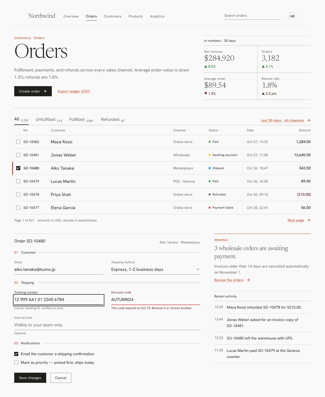
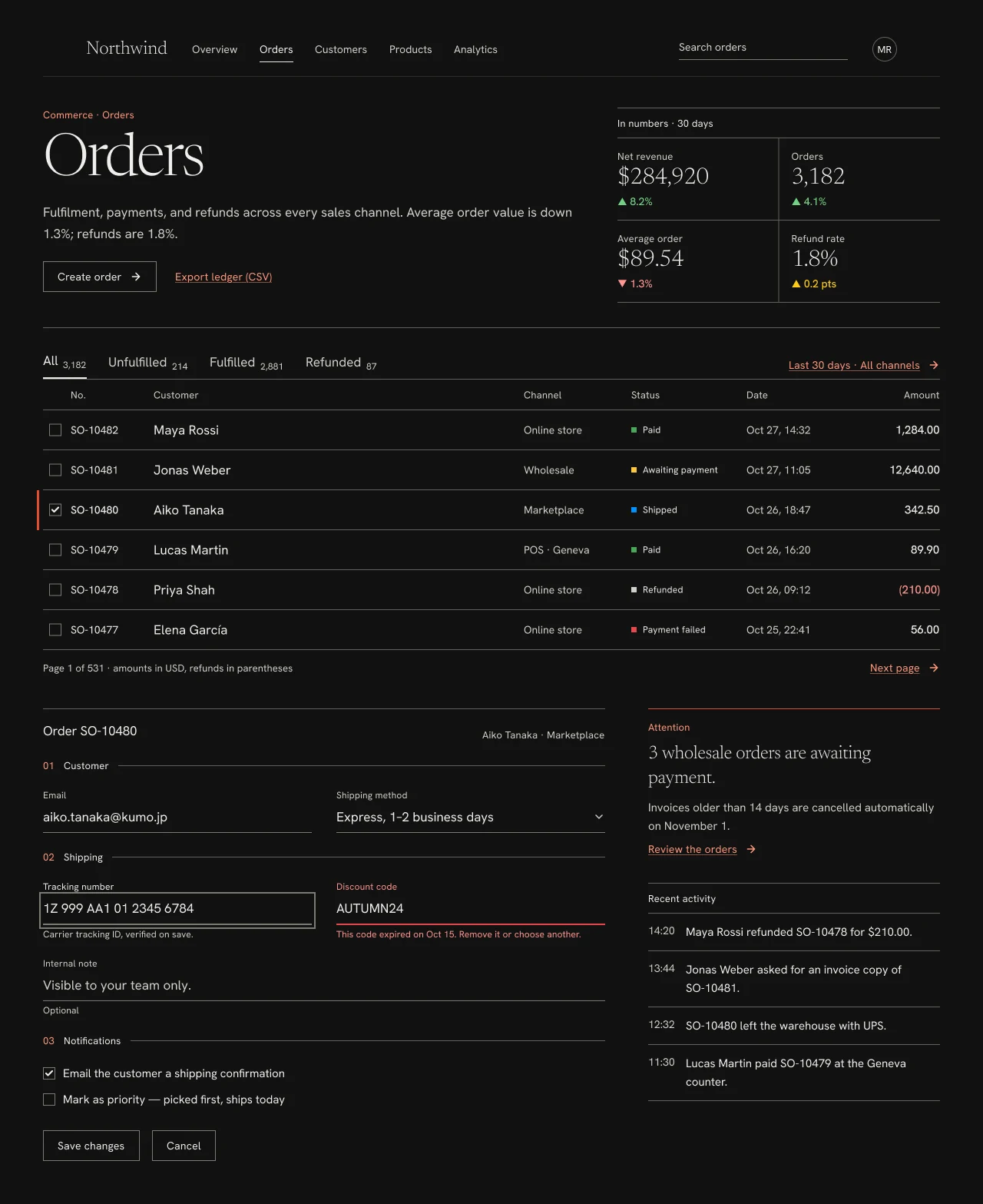
Specification values · alpha
Theme values
Values: Colors
| Property | Value |
|---|---|
bg | #f9f9f8 |
bg-dark | #111110 |
surface | #f9f9f8 |
surface-dark | #191918 |
card | #fdfdfc |
card-dark | #191918 |
muted | #f1f0ef |
muted-dark | #222221 |
selected | #feebe7 |
selected-dark | #391714 |
fg | #21201c |
fg-dark | #eeeeec |
muted-fg | #63635e |
muted-fg-dark | #d2d0ca |
fg-subtle | #63635e |
fg-subtle-dark | #d2d0ca |
inverse-fg | #fdfdfc |
inverse-fg-dark | #111110 |
border | #dad9d6 |
border-dark | #62605b |
border-subtle | #e9e8e6 |
border-subtle-dark | #2a2a28 |
border-strong | #bcbbb5 |
border-strong-dark | #62605b |
input-border | #82827c |
input-border-dark | #7c7b74 |
ring | #21201c |
ring-dark | #7c7b74 |
border-control | #21201c |
border-control-dark | #7c7b74 |
primary | #d13415 |
primary-dark | #e54d2e |
primary-fg | #ffffff |
primary-fg-dark | #111110 |
primary-text | #d13415 |
primary-text-dark | #ff977d |
action-primary-bg | #21201c |
action-primary-bg-dark | #00000000 |
action-primary-fg | #fdfdfc |
action-primary-fg-dark | #eeeeec |
action-primary-border | #21201c |
action-primary-border-dark | #7c7b74 |
success | #46a758 |
success-dark | #46a758 |
success-text | #2a7e3b |
success-text-dark | #71d083 |
warning | #ffc53d |
warning-dark | #ffc53d |
warning-text | #4f3422 |
warning-text-dark | #ffca16 |
destructive | #e5484d |
destructive-dark | #e5484d |
destructive-text | #641723 |
destructive-text-dark | #ff9592 |
info | #0090ff |
info-dark | #0090ff |
Values: Typography
| Property | Value |
|---|---|
display.fontFamily | Newsreader |
display.fontSize | 76px |
display.fontWeight | 300 |
display.lineHeight | 76px |
display.letterSpacing | -2.4px |
kpi.fontFamily | Newsreader |
kpi.fontSize | 30px |
kpi.fontWeight | 300 |
kpi.lineHeight | 36px |
kpi.letterSpacing | -0.6px |
kpi.fontFeature | "lnum" 1, "tnum" 1 |
heading.fontFamily | Newsreader |
heading.fontSize | 24px |
heading.fontWeight | 300 |
heading.lineHeight | 32px |
heading.letterSpacing | -0.2px |
lead.fontFamily | Hanken Grotesk |
lead.fontSize | 17px |
lead.fontWeight | 400 |
lead.lineHeight | 28px |
body.fontFamily | Hanken Grotesk |
body.fontSize | 15px |
body.fontWeight | 400 |
body.lineHeight | 24px |
data.fontFamily | Hanken Grotesk |
data.fontSize | 14px |
data.fontWeight | 400 |
data.lineHeight | 20px |
data.fontFeature | "tnum" 1 |
amount.fontFamily | Hanken Grotesk |
amount.fontSize | 15px |
amount.fontWeight | 500 |
amount.lineHeight | 24px |
amount.fontFeature | "tnum" 1 |
button.fontFamily | Hanken Grotesk |
button.fontSize | 14px |
button.fontWeight | 400 |
button.lineHeight | 16px |
button.letterSpacing | 0.2px |
label.fontFamily | Hanken Grotesk |
label.fontSize | 13px |
label.fontWeight | 400 |
label.lineHeight | 18px |
label.letterSpacing | 0.2px |
caption.fontFamily | Hanken Grotesk |
caption.fontSize | 12px |
caption.fontWeight | 400 |
caption.lineHeight | 16px |
caption.letterSpacing | 0.2px |
Values: Radii
| Property | Value |
|---|---|
none | 0px |
full | 9999px |
Values: Spacing
| Property | Value |
|---|---|
xs | 4px |
sm | 8px |
md | 14px |
lg | 22px |
xl | 28px |
2xl | 40px |
3xl | 56px |
Values: Component recipes
| Property | Value |
|---|---|
button-solid.backgroundColor | {colors.action-primary-bg} |
button-solid.textColor | {colors.action-primary-fg} |
button-solid.typography | {typography.button} |
button-solid.rounded | {rounded.none} |
button-solid.height | 40px |
button-solid-dark.backgroundColor | {colors.action-primary-bg-dark} |
button-solid-dark.textColor | {colors.action-primary-fg-dark} |
button-solid-dark.typography | {typography.button} |
button-solid-dark.rounded | {rounded.none} |
button-solid-dark.height | 40px |
button-outline.textColor | {colors.fg} |
button-outline.typography | {typography.button} |
button-outline.rounded | {rounded.none} |
button-outline.height | 40px |
button-outline-dark.textColor | {colors.fg-dark} |
button-outline-dark.typography | {typography.button} |
button-outline-dark.rounded | {rounded.none} |
button-outline-dark.height | 40px |
link.textColor | {colors.primary-text} |
link.typography | {typography.button} |
link-dark.textColor | {colors.primary-text-dark} |
link-dark.typography | {typography.button} |
field.textColor | {colors.fg} |
field.typography | {typography.lead} |
field.rounded | {rounded.none} |
field.height | 37px |
field-dark.textColor | {colors.fg-dark} |
field-dark.typography | {typography.lead} |
field-dark.rounded | {rounded.none} |
field-dark.height | 37px |
field-focus.backgroundColor | {colors.bg} |
field-focus.textColor | {colors.fg} |
field-focus.height | 38px |
field-focus-dark.backgroundColor | {colors.bg-dark} |
field-focus-dark.textColor | {colors.fg-dark} |
field-focus-dark.height | 38px |
checkbox-checked.backgroundColor | {colors.action-primary-bg} |
checkbox-checked.textColor | {colors.action-primary-fg} |
checkbox-checked.rounded | {rounded.none} |
checkbox-checked.size | 16px |
checkbox-checked-dark.backgroundColor | {colors.action-primary-bg-dark} |
checkbox-checked-dark.textColor | {colors.action-primary-fg-dark} |
checkbox-checked-dark.rounded | {rounded.none} |
checkbox-checked-dark.size | 16px |
tab-selected.textColor | {colors.fg} |
tab-selected.typography | {typography.lead} |
tab-selected.height | 38px |
tab.textColor | {colors.muted-fg} |
tab.typography | {typography.lead} |
tab.height | 36px |
table-row.textColor | {colors.fg} |
table-row.typography | {typography.data} |
table-row.height | 52px |
table-row-dark.textColor | {colors.fg-dark} |
table-row-dark.typography | {typography.data} |
table-row-dark.height | 52px |
status-paid.backgroundColor | {colors.success} |
status-paid.textColor | {colors.fg} |
status-paid.typography | {typography.caption} |
status-paid.size | 7px |
kpi.textColor | {colors.fg} |
kpi.typography | {typography.kpi} |
kpi-dark.textColor | {colors.fg-dark} |
kpi-dark.typography | {typography.kpi} |
avatar.textColor | {colors.fg} |
avatar.typography | {typography.label} |
avatar.rounded | {rounded.full} |
avatar.size | 32px |
Read YAML values and notes
Plain text
version: alpha
name: Filigrane
description: Minimal, thin and legible. Light Newsreader numerals over a calm Hanken Grotesk UI, held together by hairlines instead of boxes or shadows.
colors:
  # Resolved from the NetScript Figma library for the Light and Dark Orders screens.
  # Theme = Filigrane. Keys are the --ns-* suffix.
  bg: '#f9f9f8'
  bg-dark: '#111110'
  surface: '#f9f9f8'
  surface-dark: '#191918'
  card: '#fdfdfc'
  card-dark: '#191918'
  muted: '#f1f0ef'
  muted-dark: '#222221'
  selected: '#feebe7'
  selected-dark: '#391714'
  fg: '#21201c'
  fg-dark: '#eeeeec'
  muted-fg: '#63635e'
  muted-fg-dark: '#d2d0ca'
  fg-subtle: '#63635e'
  fg-subtle-dark: '#d2d0ca'
  inverse-fg: '#fdfdfc'
  inverse-fg-dark: '#111110'
  border: '#dad9d6'
  border-dark: '#62605b'
  border-subtle: '#e9e8e6'
  border-subtle-dark: '#2a2a28'
  border-strong: '#bcbbb5'
  border-strong-dark: '#62605b'
  input-border: '#82827c'
  input-border-dark: '#7c7b74'
  ring: '#21201c'
  ring-dark: '#7c7b74'
  border-control: '#21201c'
  border-control-dark: '#7c7b74'
  primary: '#d13415'
  primary-dark: '#e54d2e'
  primary-fg: '#ffffff'
  primary-fg-dark: '#111110'
  primary-text: '#d13415'
  primary-text-dark: '#ff977d'
  action-primary-bg: '#21201c'
  action-primary-bg-dark: '#00000000'
  action-primary-fg: '#fdfdfc'
  action-primary-fg-dark: '#eeeeec'
  action-primary-border: '#21201c'
  action-primary-border-dark: '#7c7b74'
  success: '#46a758'
  success-dark: '#46a758'
  success-text: '#2a7e3b'
  success-text-dark: '#71d083'
  warning: '#ffc53d'
  warning-dark: '#ffc53d'
  warning-text: '#4f3422'
  warning-text-dark: '#ffca16'
  destructive: '#e5484d'
  destructive-dark: '#e5484d'
  destructive-text: '#641723'
  destructive-text-dark: '#ff9592'
  info: '#0090ff'
  info-dark: '#0090ff'
typography:
  display: {
    fontFamily: Newsreader,
    fontSize: 76px,
    fontWeight: 300,
    lineHeight: 76px,
    letterSpacing: -2.4px,
  }
  kpi: {
    fontFamily: Newsreader,
    fontSize: 30px,
    fontWeight: 300,
    lineHeight: 36px,
    letterSpacing: -0.6px,
    fontFeature: '"lnum" 1, "tnum" 1',
  }
  heading: {
    fontFamily: Newsreader,
    fontSize: 24px,
    fontWeight: 300,
    lineHeight: 32px,
    letterSpacing: -0.2px,
  }
  lead: { fontFamily: Hanken Grotesk, fontSize: 17px, fontWeight: 400, lineHeight: 28px }
  body: { fontFamily: Hanken Grotesk, fontSize: 15px, fontWeight: 400, lineHeight: 24px }
  data: {
    fontFamily: Hanken Grotesk,
    fontSize: 14px,
    fontWeight: 400,
    lineHeight: 20px,
    fontFeature: '"tnum" 1',
  }
  amount: {
    fontFamily: Hanken Grotesk,
    fontSize: 15px,
    fontWeight: 500,
    lineHeight: 24px,
    fontFeature: '"tnum" 1',
  }
  button: {
    fontFamily: Hanken Grotesk,
    fontSize: 14px,
    fontWeight: 400,
    lineHeight: 16px,
    letterSpacing: 0.2px,
  }
  label: {
    fontFamily: Hanken Grotesk,
    fontSize: 13px,
    fontWeight: 400,
    lineHeight: 18px,
    letterSpacing: 0.2px,
  }
  caption: {
    fontFamily: Hanken Grotesk,
    fontSize: 12px,
    fontWeight: 400,
    lineHeight: 16px,
    letterSpacing: 0.2px,
  }
rounded:
  none: 0px
  full: 9999px
spacing:
  xs: 4px
  sm: 8px
  md: 14px
  lg: 22px
  xl: 28px
  2xl: 40px
  3xl: 56px
components:
  button-solid: {
    backgroundColor: '{colors.action-primary-bg}',
    textColor: '{colors.action-primary-fg}',
    typography: '{typography.button}',
    rounded: '{rounded.none}',
    height: 40px,
  }
  button-solid-dark: {
    backgroundColor: '{colors.action-primary-bg-dark}',
    textColor: '{colors.action-primary-fg-dark}',
    typography: '{typography.button}',
    rounded: '{rounded.none}',
    height: 40px,
  }
  button-outline: {
    textColor: '{colors.fg}',
    typography: '{typography.button}',
    rounded: '{rounded.none}',
    height: 40px,
  }
  button-outline-dark: {
    textColor: '{colors.fg-dark}',
    typography: '{typography.button}',
    rounded: '{rounded.none}',
    height: 40px,
  }
  link: { textColor: '{colors.primary-text}', typography: '{typography.button}' }
  link-dark: { textColor: '{colors.primary-text-dark}', typography: '{typography.button}' }
  field: {
    textColor: '{colors.fg}',
    typography: '{typography.lead}',
    rounded: '{rounded.none}',
    height: 37px,
  }
  field-dark: {
    textColor: '{colors.fg-dark}',
    typography: '{typography.lead}',
    rounded: '{rounded.none}',
    height: 37px,
  }
  field-focus: { backgroundColor: '{colors.bg}', textColor: '{colors.fg}', height: 38px }
  field-focus-dark: {
    backgroundColor: '{colors.bg-dark}',
    textColor: '{colors.fg-dark}',
    height: 38px,
  }
  checkbox-checked: {
    backgroundColor: '{colors.action-primary-bg}',
    textColor: '{colors.action-primary-fg}',
    rounded: '{rounded.none}',
    size: 16px,
  }
  checkbox-checked-dark: {
    backgroundColor: '{colors.action-primary-bg-dark}',
    textColor: '{colors.action-primary-fg-dark}',
    rounded: '{rounded.none}',
    size: 16px,
  }
  tab-selected: { textColor: '{colors.fg}', typography: '{typography.lead}', height: 38px }
  tab: { textColor: '{colors.muted-fg}', typography: '{typography.lead}', height: 36px }
  table-row: { textColor: '{colors.fg}', typography: '{typography.data}', height: 52px }
  table-row-dark: { textColor: '{colors.fg-dark}', typography: '{typography.data}', height: 52px }
  status-paid: {
    backgroundColor: '{colors.success}',
    textColor: '{colors.fg}',
    typography: '{typography.caption}',
    size: 7px,
  }
  kpi: { textColor: '{colors.fg}', typography: '{typography.kpi}' }
  kpi-dark: { textColor: '{colors.fg-dark}', typography: '{typography.kpi}' }
  avatar: {
    textColor: '{colors.fg}',
    typography: '{typography.label}',
    rounded: '{rounded.full}',
    size: 32px,
  }
Overview
- Thesis: an operations screen typeset like a printed page. Numerals use a light serif, everything you read or operate uses a grotesk, and hairlines provide all the structure.
- Signature moves:
- Newsreader Light at display size: a 76px "Orders" title and 30px KPI numerals in a hairline grid ("In numbers · 30 days").
- Hairlines instead of boxes: underline fields, 1px row rules, numbered form sections ("01 Customer") with a rule that runs to the edge, and square controls without shadows.
- One vermilion accent:
primarytomato marks the eyebrow, section numerals, links, the selected row's 3px margin bar and the attention rule. Nothing else is coloured.
- Anchor: minimal thin type, built from FT Origami o3 (MIT tokens) and Guardian Source (Apache-2.0). Taken: the Origami double-ring focus, right-aligned numerals, accounting parentheses for refunds, one accent. Left out, so the screen does not read as a newspaper: masthead, dateline, double rules, italic standfirst, all-caps labels and a news-wire feed. Not copied: FT salmon paper, Financier and Metric (proprietary), Guardian pillar colours.
- Family: Editorial.
- Best for / avoid for: reporting, finance and content back offices, low-frequency admin. Avoid control-dense tools (many toggles, nested toolbars), where underline fields and square outline buttons get lost among the controls.
- Feel: quiet and precise, like an annual report you can edit.
Colors
- Ground and surface ladder. Light
bg#f9f9f8(sand/l/2) is the only surface; there are no cards. Darkbgis#111110(sand/d/1). Regions are separated by hairlines and whitespace, never by fills. - Hairline ladder.
border-subtle(header rule),border(row rules, panel top rules),border-strong(tab baseline, stat grid, section rules),input-border(field underlines, outline buttons, unchecked boxes). In dark,borderandborder-strongare both sand/d/8#62605b, one step stronger than in light, so the structure stays readable. - Accent policy.
primary(tomato/l/11#d13415, dark tomato/d/9#e54d2e) appears only as a 3px margin bar or a 1px top rule.primary-text(#d13415/#ff977d) is used for the eyebrow, section numerals, "Attention" and links. Primary actions do not use the accent; they use theaction/primary-*roles (ink fill in light, hairline outline in dark). - Status colours. A 7×7 square glyph in
success,warning,info,destructiveorfg-subtle(refunded), always followed by the word. Deltas usesuccess-text,destructive-textandwarning-textwith ▲/▼ glyphs. Refunds read "(210.00)" indestructive-text. - Dark design notes. Muted text is brightened to sand/d/11-bright
#d2d0ca(12.25:1). The primary button is transparent with a#7c7b74hairline, never a light slab. The focus ring and every interactive edge use sand/d/10#7c7b74.
Typography
| Role | Family | Size / line | Weight | Tracking | Used for |
|---|---|---|---|---|---|
| display | Newsreader | 76/76 | Light 300 | −2.4px | Page title |
| kpi | Newsreader | 30/36 | Light 300 | −0.6px | KPI numerals |
| heading | Newsreader | 24/32 | Light 300 | −0.2px | Brand, notice sentence |
| lead | Hanken Grotesk | 17/28 | Regular | 0 | Intro, tab labels, field values, form title |
| body | Hanken Grotesk | 15/24 | Regular (Medium for amounts) | 0 | Checkbox labels, notice body, activity |
| data | Hanken Grotesk | 14/20 | Regular | 0 | Table cells, nav |
| button | Hanken Grotesk | 14/16 | Regular | +0.2px | Buttons and links |
| label | Hanken Grotesk | 13/18 | Regular | +0.2px | Eyebrow, stat and field labels, footnotes |
| caption | Hanken Grotesk | 12/16 | Regular | +0.1–0.2px | Status words, tab counts, helpers |
- Newsreader and Hanken Grotesk are OFL (Google Fonts). Fallbacks:
Newsreader, "Source Serif 4", Georgia, serif;"Hanken Grotesk", ui-sans-serif, system-ui. - The serif is reserved for numbers and one-sentence statements. Anything you scan or operate is set in the grotesk. No italics or all-caps; use sentence case everywhere.
- Icons: arrows at 16px with a 1.5px stroke, the checkbox check at 12px with a 2px stroke.
- Nothing in the UI is below 12px, so labels stay readable in dark.
- The display weight is Light, for readability. The Theme variable
type/display/stylestill says ExtraLight, but nothing binds it; don't use it. - Lining tabular numerals for KPIs and amounts are intended (
"lnum","tnum") and pending in #2414, because Figma cannot set them.
Layout
- Canvas: 1280 wide, padding 28/56/56/56. Content width 1168.
- App header: 72 tall with a 1px
border-subtlerule: Newsreader brand, nav (gap 28, selected item infgover a 1pxfgunderline, othersmuted-fg), a 220px underline search, a 32px circular avatar. - Lead block (padding 40/0/32, gap 56): a 692px column (eyebrow, display title, 17/28 intro
sentence, actions) beside a 420px "In numbers" grid of four 210×106 cells divided by
border-stronghairlines. - Tabs row 67 tall (28 top padding, gap 28): label with a subscript count, 2px underline on the selected tab; a link action on the right.
- Table: header 40, rows 52 with a 1px
borderrule. Columns: mark 36px, No. 108px, customerminmax(0, 1fr), channel 140px, status 150px, date 132px, amount 120px (right aligned). The customer track is flexible. The 482px figure assumes no additional row padding, borders or column gaps; recompute the customer track from the final content box. Never shrink the type or clip a column to force the arithmetic. Footnote row 36: "Page 1 of 531 · amounts in USD, refunds in parentheses". - Bottom (padding 40, gap 56): a 732px form (1px top rule, gap 22) and a 380px side column (gap 36) with the attention notice and recent activity.
- Density: Filigrane sets no density mode and binds no density variable. Its rhythm is fixed and generous (row 52, field 37, gaps 22–56). The Comfortable values match the 52px row by coincidence.
Elevation & Depth
Filigrane is flat. effect/shadow is transparent and the Theme mode sets shadow/blur 0 and
shadow/y 0.
- Depth comes from line weight: a heavier hairline (
border-strong) marks a structural boundary, and a lighter one (border) separates rows. - Focus is the only stacked effect:
box-shadow: 0 0 0 3px var(--ns-bg), 0 0 0 5px var(--ns-ring)plus a 2pxringbottom border. The result is a 2px ring with a 3px paper gap, the Origami double ring. - Never add drop shadows, cards or tinted panels.
Shapes
- Radius: 0 everywhere (buttons, fields, checkboxes, status glyphs, tab underlines). The only circle is the 32px avatar.
- Unused Theme radii: the Filigrane Theme mode still defines
radius/control999,radius/input10 andradius/card16. No Filigrane component uses them, so the radius stays 0. They do not drive Studio's Atelier flavor either, which defines its own radii (0/0/0/0) on Theme modeStudio. - Strokes: 1px hairlines for rules, field underlines, outline buttons and unchecked boxes; 2px for the selected-tab underline, focused and invalid underlines and the focus ring; 3px for the selected-row margin bar.
Components
| Component | Variant used | Anatomy and states |
|---|---|---|
| Button | Filigrane/Button Solid, Outline, Link |
Solid: 40 tall, square, padding 0/18, gap 10, action/primary-* fill and 1px border, arrow icon 16. Outline: 1px input-border, fg label. Link: primary-text, underlined, arrow. |
| Field | Filigrane/Field Default, Focus, Error |
Label 13/18 muted-fg above, value 17/28, 1px input-border underline (field 37 tall). Focus: label goes fg, 2px ring underline, bg fill, double ring. Error: label, underline (2px destructive) and helper in destructive-text; the helper states the repair. |
| Header search | Search frame |
220×28, one opaque 1px input-border bottom fill on a whole pixel. |
| Checkbox | Filigrane/Checkbox |
16×16 square. Unchecked: 1px input-border. Checked: fill action/primary-bg, 1px stroke action/primary-border, check action/primary-fg. Light: ink square with a #fdfdfc check. Dark: transparent box, #7c7b74 edge (4.45:1 on #111110) and #eeeeec check (16.26:1). |
| Tabs | Filigrane/Tab |
Lead-size label + caption count. Selected: fg label, 2px fg underline. Unselected: muted-fg. |
| Table row | Frames Row — * |
52 tall, 1px border rule, checkbox at x+8. Selected: checked box plus a 3px primary margin bar outside the cell. No fill. |
| Status | Filigrane/Status Paid, Awaiting, Shipped, Failed, Refunded |
7×7 square glyph, gap 8, fg word at 12/16. |
| KPI | "In numbers" grid | label caption, Newsreader 30/36 numeral, delta 14/20 Medium with ▲/▼. |
| Notice | "Attention" block | 1px primary top rule, primary-text label, Newsreader 24/32 sentence, muted-fg body, link action. |
| Activity | List | label timestamp column + 15/24 sentence, 1px border rules. |
| Nav item | Header nav | 14/20, 34 tall; selected item fg with a 1px fg underline, others muted-fg with an empty underline slot. |
| Top bar | App header frame |
Described in Layout. |
| Dialog / sheet | Not drawn | Pending in #2416; keep it square, hairline, no shadow, solid overlay. |
Hover, pressed and disabled states are not drawn yet; they are pending in #2416.
Do's and Don'ts
- Do keep it minimal, thin and legible.
- Don't add newspaper apparatus (masthead, dateline, double rules, italic standfirst, all-caps kickers). Symptom: the screen reads as a newspaper page.
- Do keep dark text bright:
muted-fg#d2d0ca(12.25:1) and no label below 12px. Symptom to avoid: dark labels too dim to read. - Don't use ExtraLight in the UI. Display and numerals are Newsreader Light.
- Do draw every interactive edge in
input-border(3.67:1 light, 4.45:1 dark). Decorative rules may have lower contrast. - Do bind the focus ring to
border/ringin both schemes:#21201clight,#7c7b74dark. Never paint a white#eeeeecperimeter in dark. - Do paint underlines as one opaque 1px fill on an integer y and seed bound paints with their
resolved colour. Symptom: a stale paint plus a 0.5px offset renders the dark search underline as
#080808. - Do snap every hairline to a whole pixel, so each 1px rule renders as one row. Each "01/02/03"
section rule renders as one
border-strongrow: measured#bcbbb5(1.83:1) light and#62605b(3.01:1) dark. They are decorative, so they don't need 3:1. Symptom: a 1px rect centred in an 18px row sits on y + 0.5 and splits into two half-intensity rows. - Do draw the checked checkbox with
action/primary-bg(fill),action/primary-border(stroke) andaction/primary-fg(check). In dark it is a transparent box with a#7c7b74edge, never a light#eeeeecsquare. - Do keep the checkbox in every row, including the selected one; mark selection with the 3px margin bar outside the cell.
- Do write copy from the fixture's facts and give every error its repair.
- Don't fill the primary button with the accent or a light slab in dark; use
action/primary-*. - Don't add shadows, cards, radii or tinted panels.
- Do pair every status glyph with its word; the amber glyph is only 1.5:1 on the paper.
Iconography & Imagery
- Thin stroke icons appear in three places only: a 16px arrow on buttons and links, a check in the checkbox and a chevron in the select. Use Lucide (ISC) at 1.5px stroke.
- The avatar is a 32px hairline circle with initials. No photos or illustration.
Motion & States
- Nothing animates. States are shown with lines and ink. Proposed state matrix: text-action hover thickens the underline to 2px; focus adds the double ring; field focus is a 2px underline plus caret. Only field focus and error are drawn today. The rest is pending in #2416.
- Selection: a checked box plus the 3px margin bar; never a row fill.
- Reduced motion: no change, because there is no animated transform.
Accessibility
| Pair | Light | Dark |
|---|---|---|
fg on bg |
15.48 | 16.26 |
muted-fg on bg |
5.73 | 12.25 |
primary-text on bg |
4.73 | 8.97 |
success-text / destructive-text on bg |
4.81 / 11.80 | 9.94 / 8.97 |
Field underline input-border |
3.67 (measured, #82827c) |
4.45 (measured, #7c7b74) |
Focus ring ring |
15.48 | 4.45 (measured, #7c7b74) |
Selected margin bar primary |
4.73 | 4.89 |
Values marked measured are sampled on rendered pixels; the dark focus ring and search edge measure 4.4466:1. The other ratios are (token) arithmetic.
- Hit targets: buttons 40 tall, checkbox 16 inside a 24px label row (meets the 24px minimum with the label), tabs 36–38.
- Known exceptions: decorative rules (
border1.34:1 light) are not boundaries. Status glyphs rely on their words. - RTL: mirror the margin bar to the right edge and the arrow icons. Pending in #2419.
NetScript Mapping
| Layer | Value |
|---|---|
| Figma Theme mode | Filigrane |
| Base gray × accent | Neutral × Ink by default; the Filigrane Theme mode aliases sand gray and a tomato accent directly |
| Density | none set; no Density variable bound |
| Flavor | n/a |
data-theme |
filigrane |
| Language roles | none. Uses core roles plus action/primary-* |
- Relation to Studio Atelier. Studio documents every flavor, Atelier included, on Theme mode
Studio(studio/DESIGN.md→ Flavors). Atelier gets Filigrane-like thin type (Newsreader Light over Hanken Grotesk) from Studio flavor values. No shared Theme-mode binding is known, so don't assume that a Filigrane mode change reaches Atelier, or the reverse. - Primitive bindings: none known. Filigrane binds semantic roles only.
- Status. Values come from the NetScript Figma library. Names, including the Filigrane Theme mode, are provisional until the token export in #2414. The hover, pressed, disabled, checkbox and row state matrix is pending in #2416. Numeral features are pending in #2414; keyboard, viewport and RTL behaviour in #2419.
Sources
- References: FT Origami o3 (
@financial-times/o3-foundation, MIT) and Guardian Source (@guardian/source, Apache-2.0). What is taken and what is not copied is listed under Overview → Anchor. - Demo content: the "Northwind" store, orders SO-10477…SO-10482, customers and emails, amounts, KPI values, the intro sentence, activity entries and the AUTUMN24 code are invented demo data from the shared Orders fixture.