Studio
Seven product flavors that share one component anatomy and differ in ground, shape, type, density and component variants, built on shadcn/ui and Linear conventions. Utility is the NetScript default.
On this page
- Studio flavors
- Theme values
- Values: Colors
- Values: Typography
- Values: Radii
- Values: Spacing
- Values: Component recipes
- Overview
- Colors
- Typography
- Layout
- Elevation & Depth
- Shapes
- Components
- Do's and Don'ts
- Flavors
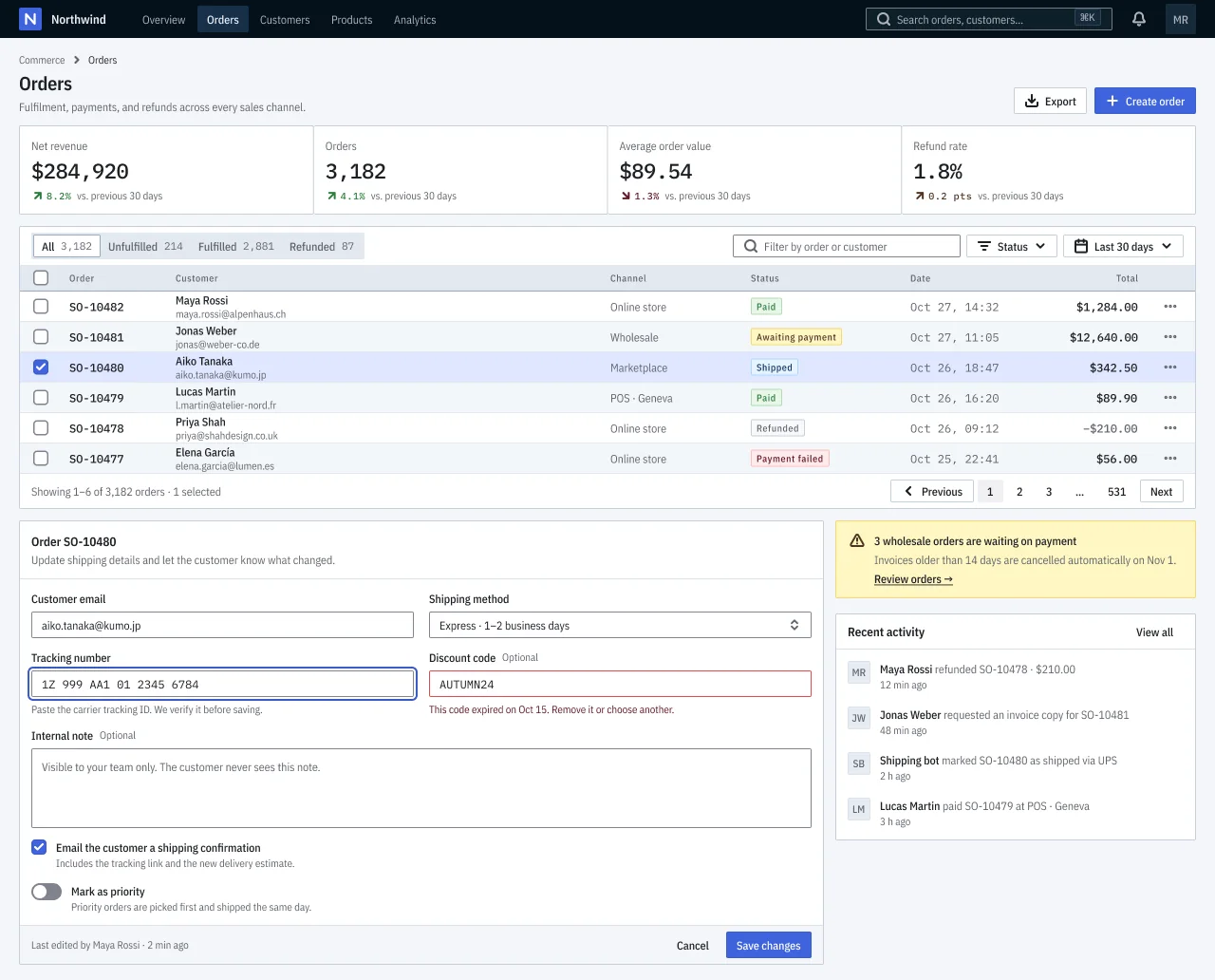
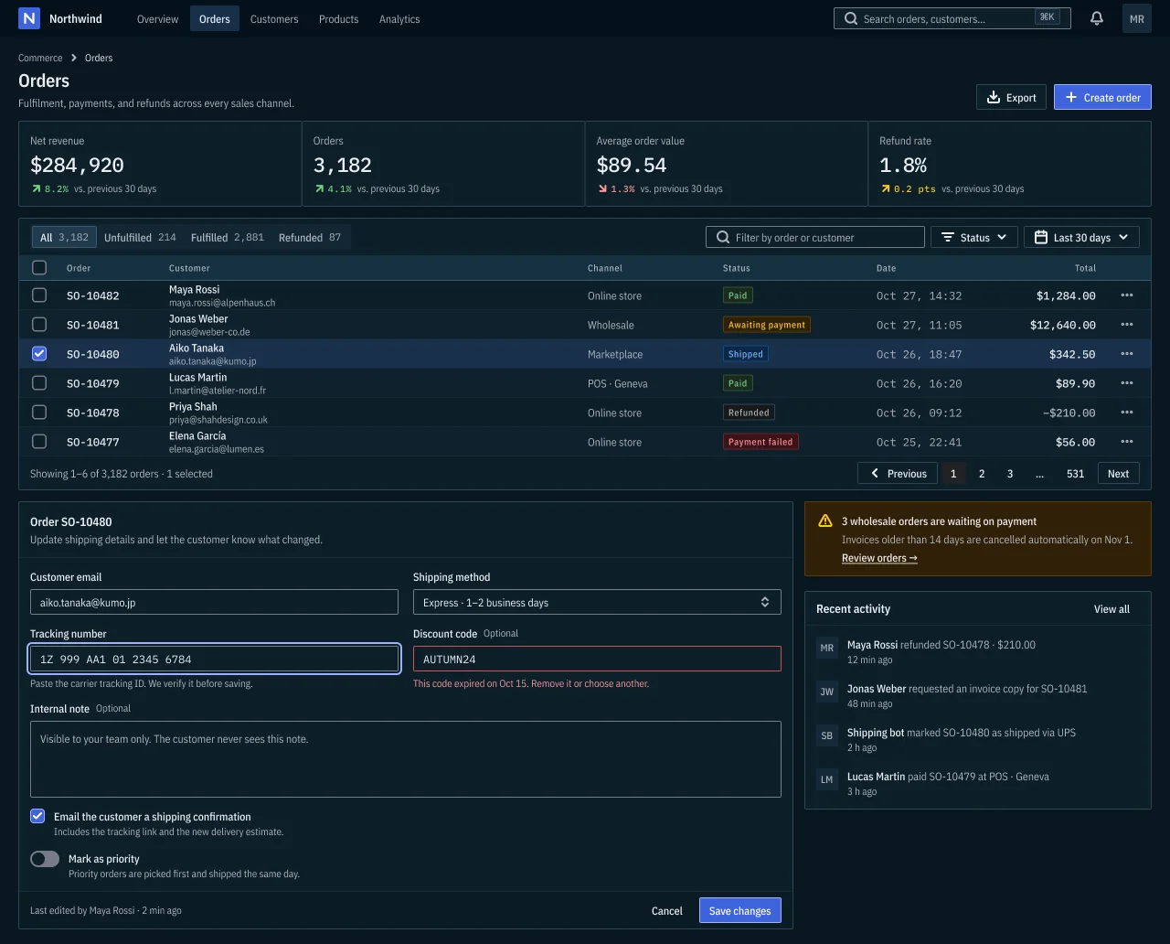
- Utility (neutral-ink) · NetScript default · Neutral × Ink, Compact
- Cloud (slate-blue) · Slate × Blue, Comfortable
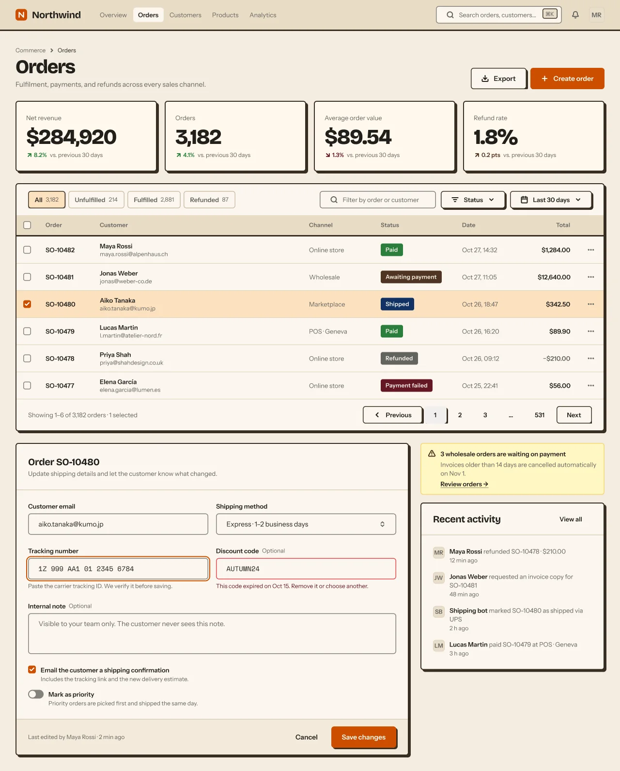
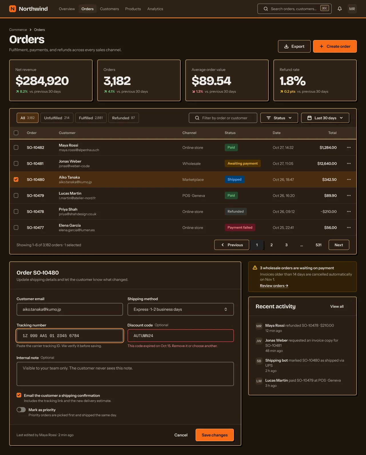
- Workshop (sand-orange) · Sand × Orange, Chunky
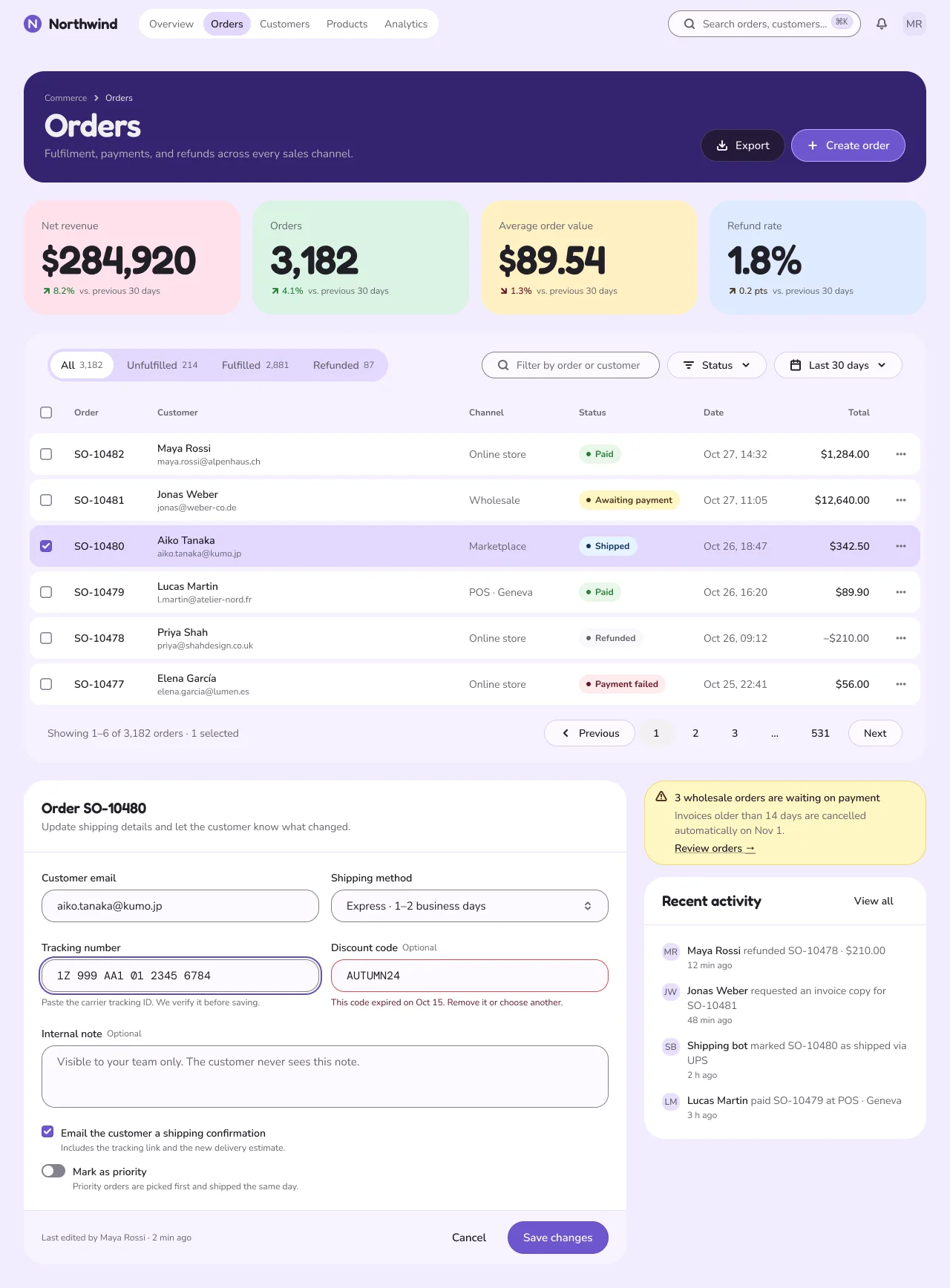
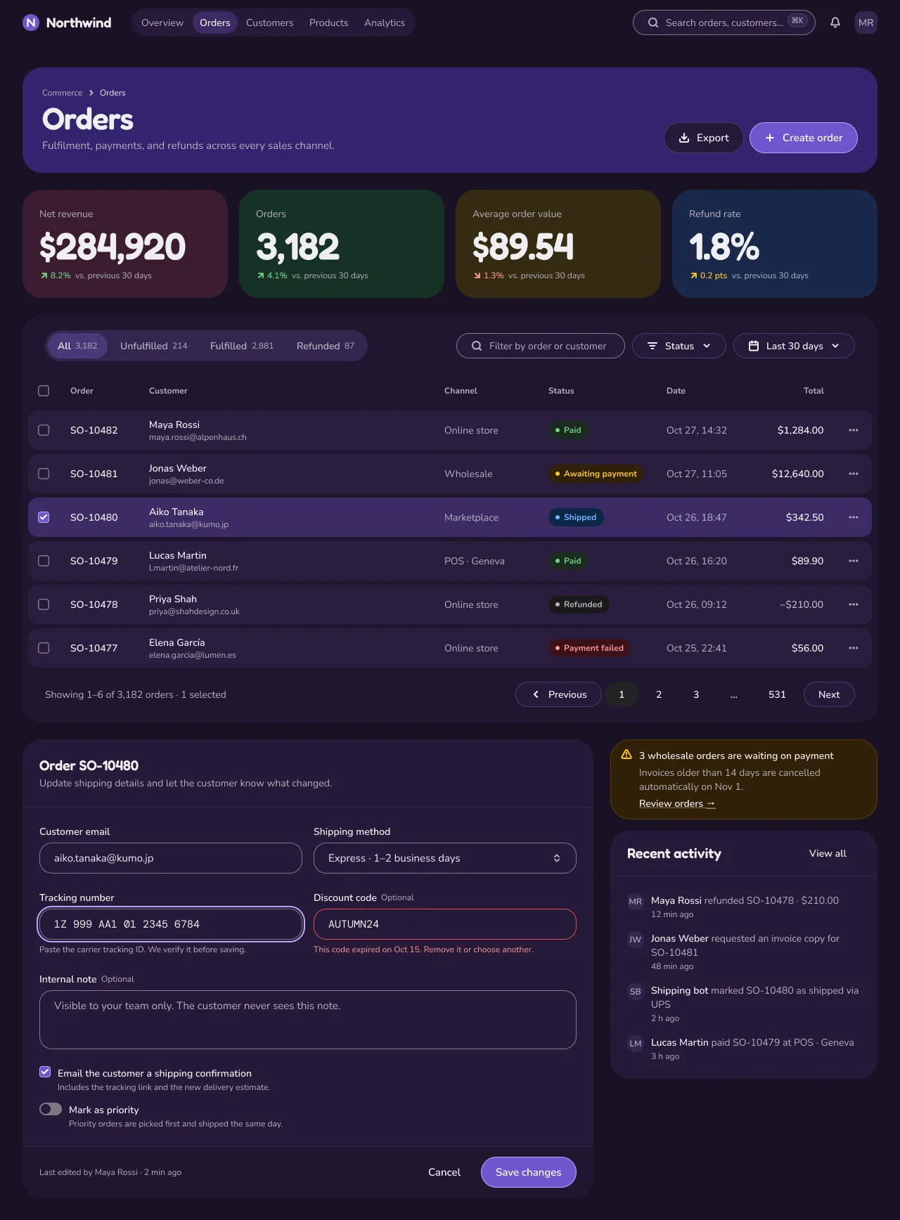
- Playful (mauve-violet) · Mauve × Violet, Chunky
- Ledger (ledger) · Slate × Indigo, Dense
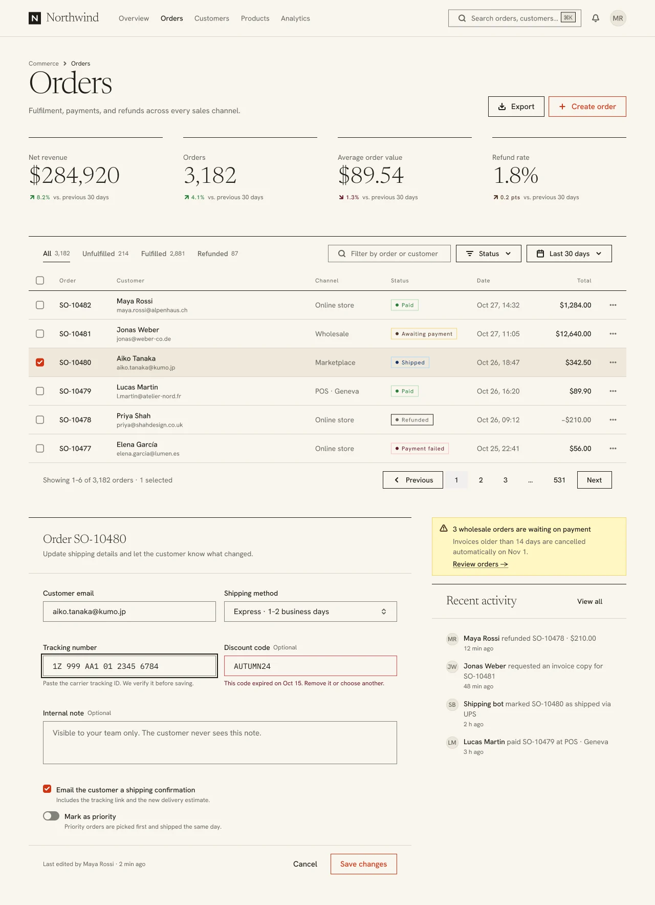
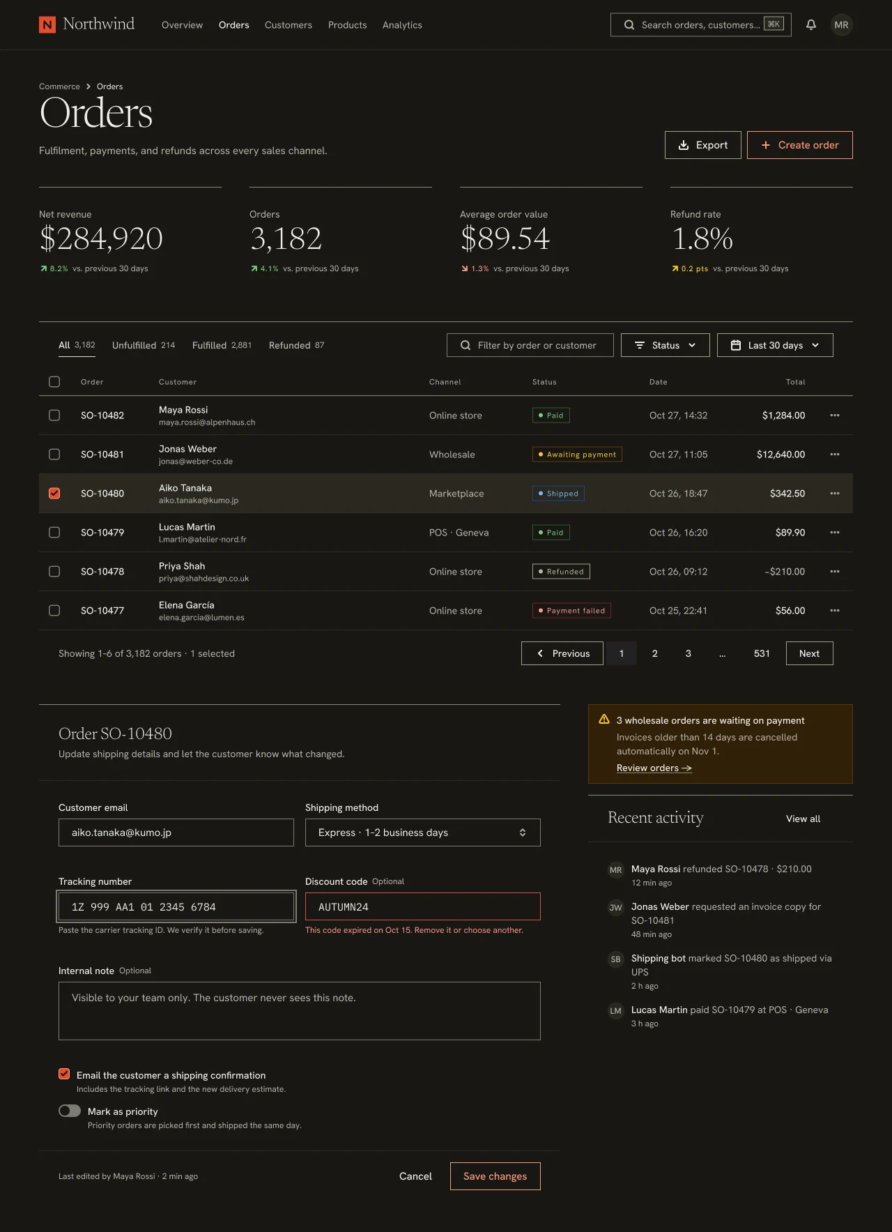
- Atelier (atelier) · Sand × Tomato, Airy
- Signal (signal) · Neutral × Lime, Dense
- Iconography & Imagery
- Motion & States
- Accessibility
- NetScript Mapping
- Sources
Studio flavors
Studio · Utility · NetScript default
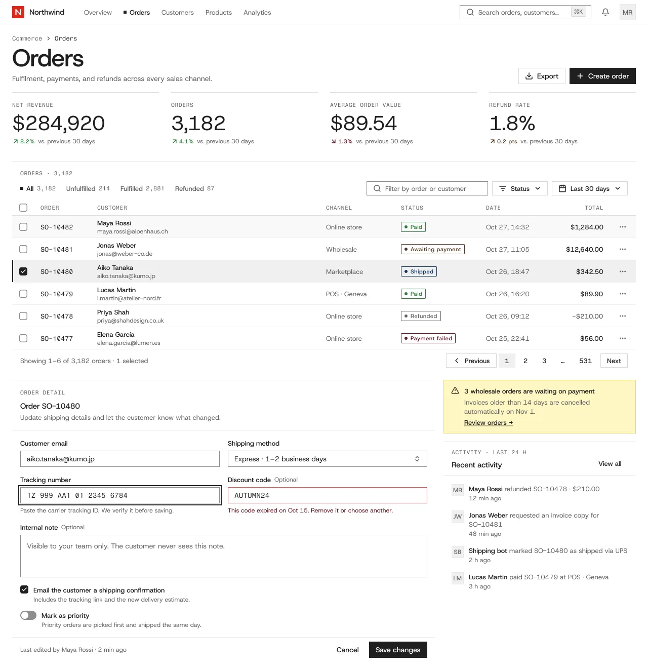
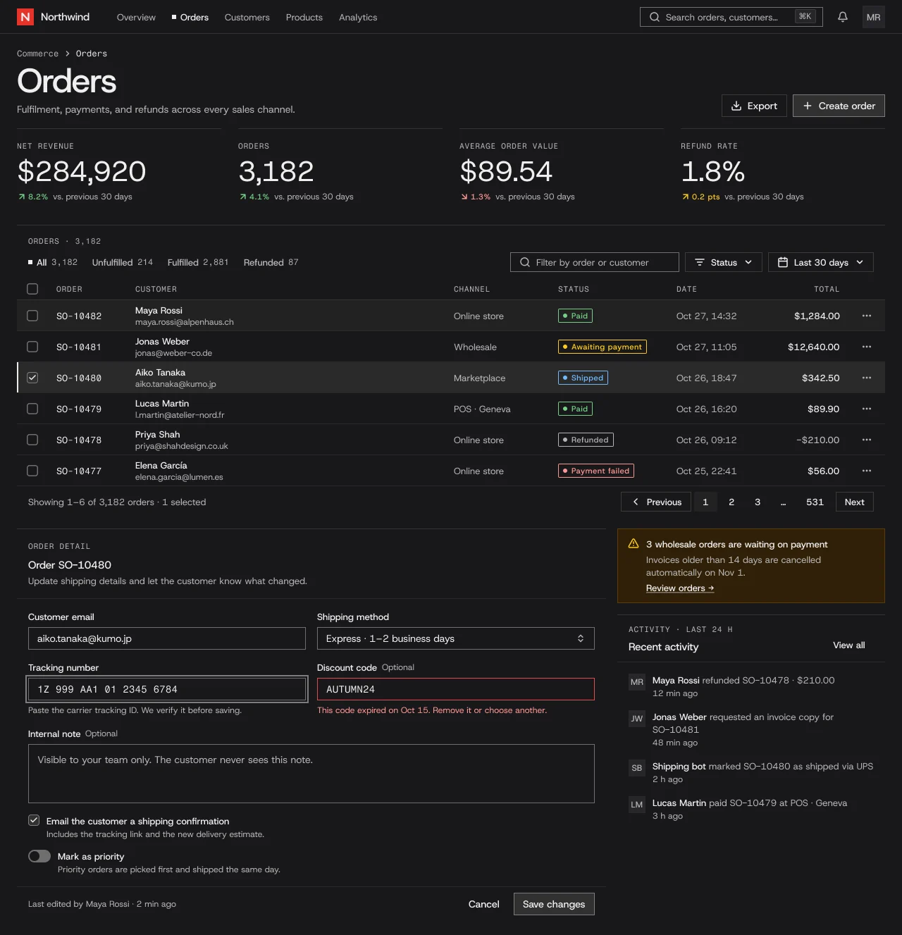
Studio · Cloud
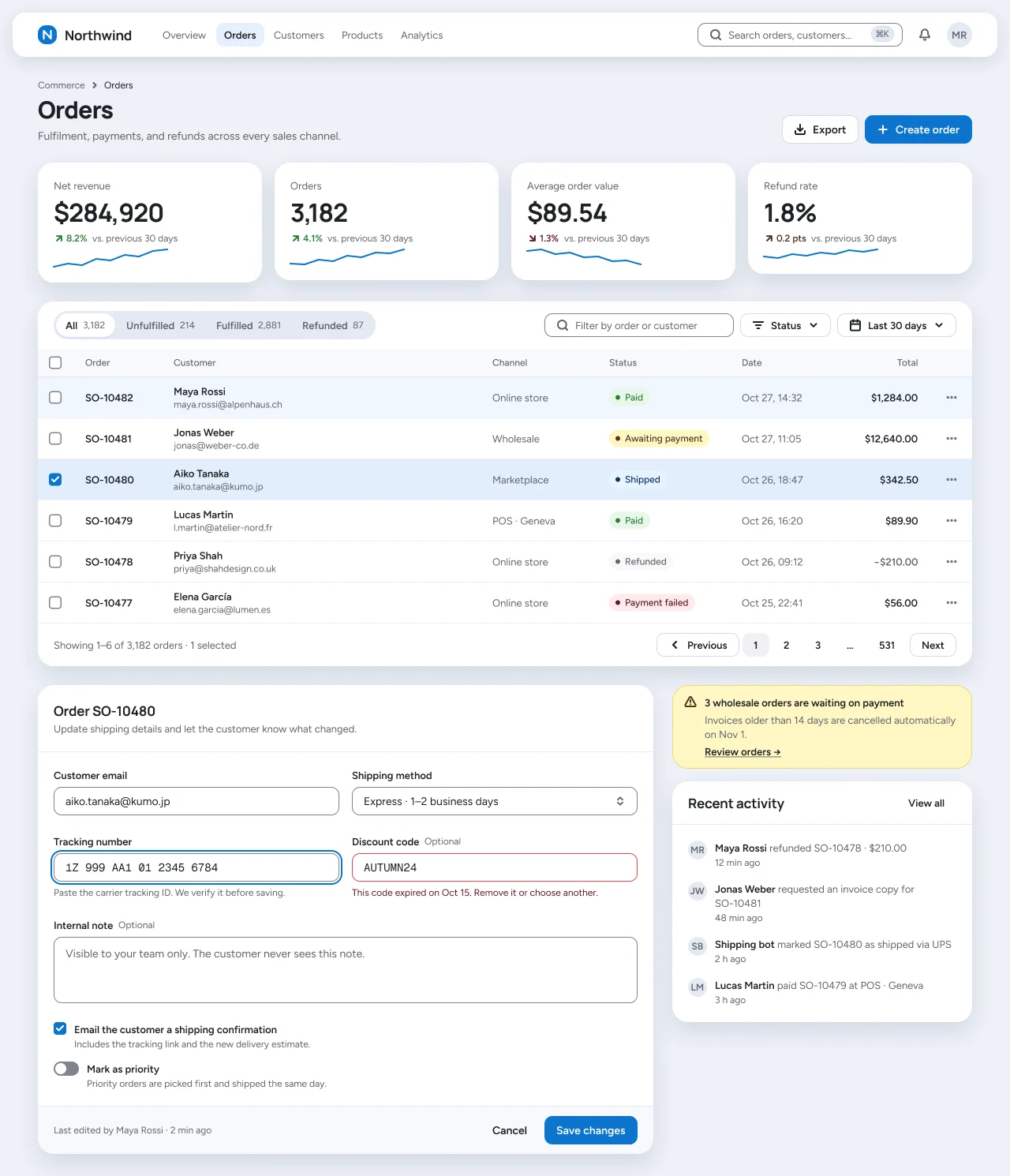
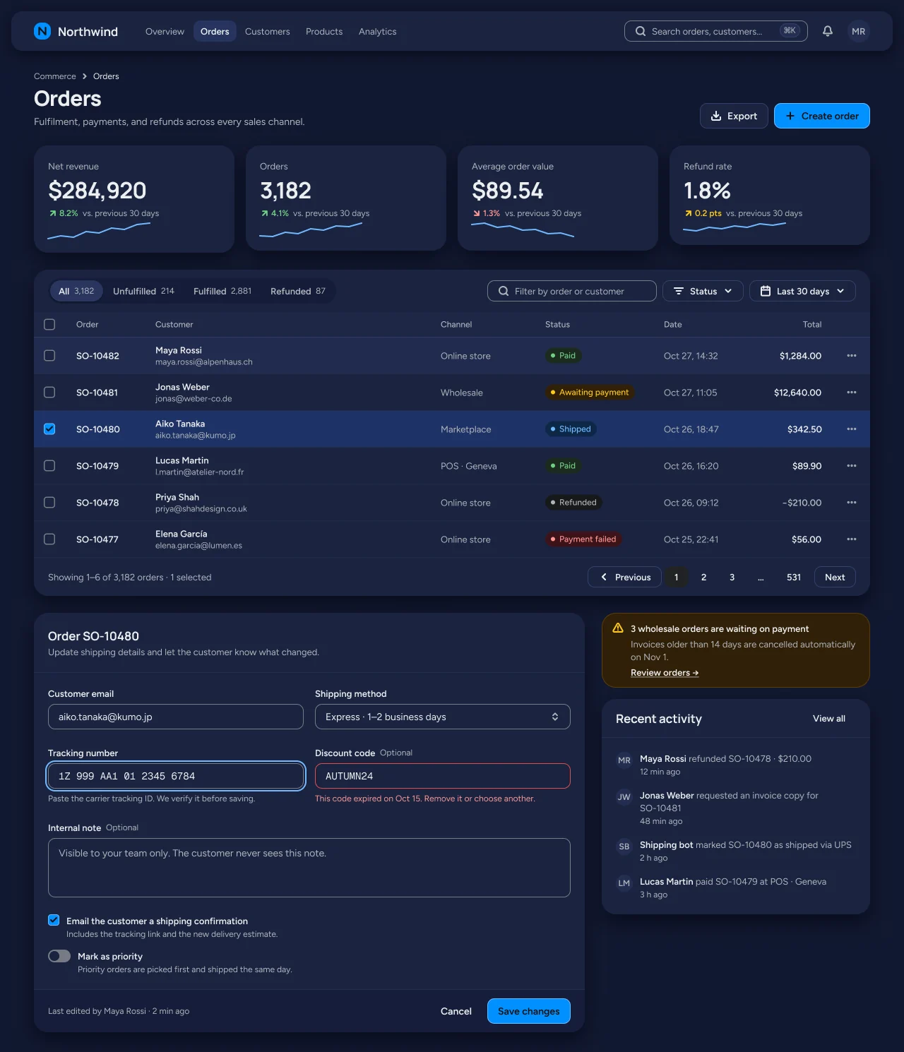
Studio · Workshop
Studio · Playful
Studio · Ledger
Studio · Atelier
Studio · Signal
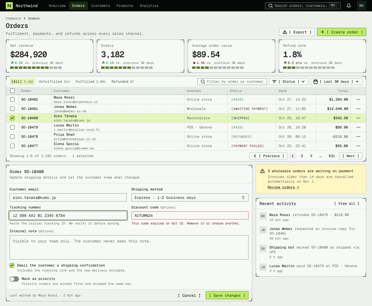
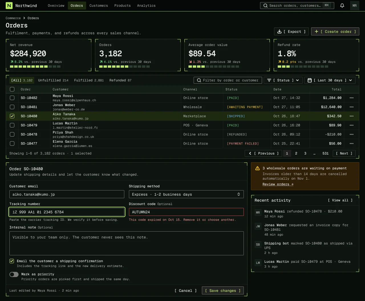
Specification values · alpha
Theme values
Values: Colors
| Property | Value |
|---|---|
bg | #ffffff |
bg-dark | #18181a |
surface | #f6f6f6 |
surface-dark | #1e1e21 |
card | #ffffff |
card-dark | #18181a |
surface-raised | #ffffff |
surface-raised-dark | #222225 |
muted | #f0f0f0 |
muted-dark | #26262a |
selected | #f0f0f0 |
selected-dark | #2a2a2a |
fg | #202020 |
fg-dark | #eeeeee |
muted-fg | #646464 |
muted-fg-dark | #b4b4b4 |
border | #d9d9d9 |
border-dark | #3a3a3a |
border-subtle | #e4e4e4 |
border-subtle-dark | #2c2c30 |
input-border | #838383 |
input-border-dark | #7b7b7b |
ring | #202020 |
ring-dark | #7b7b7b |
primary | #202020 |
primary-dark | #313131 |
primary-hover | #3f3f3f |
primary-hover-dark | #3a3a3a |
primary-fg | #fcfcfc |
primary-fg-dark | #eeeeee |
success-text | #2a7e3b |
success-text-dark | #71d083 |
warning-subtle | #fff7c2 |
warning-subtle-dark | #302008 |
warning-text | #4f3422 |
warning-text-dark | #ffca16 |
destructive | #e5484d |
destructive-text | #641723 |
destructive-text-dark | #ff9592 |
info-text | #113264 |
info-text-dark | #70b8ff |
studio-signal-brand | #da291c |
studio-signal-brand-dark | #e5332a |
studio-signal-marker | #202020 |
studio-signal-marker-dark | #eeeeee |
studio-signal-underline | #bbbbbb |
studio-signal-underline-dark | #606060 |
studio-input-border | #8d8d8d |
studio-input-border-dark | #6e6e6e |
studio-primary-bg | #202020 |
studio-primary-bg-dark | #313131 |
studio-primary-fg | #fcfcfc |
studio-primary-fg-dark | #eeeeee |
studio-primary-stroke | #202020 |
studio-primary-stroke-dark | #7b7b7b |
studio-topbar-rule | #e0e0e0 |
studio-topbar-rule-dark | #313131 |
studio-table-head-rule | #e0e0e0 |
studio-table-head-rule-dark | #313131 |
studio-table-row-rule | #f0f0f0 |
studio-table-row-rule-dark | #2a2a2a |
studio-card-border | #e0e0e0 |
studio-card-border-dark | #313131 |
studio-code-scroll-thumb | #838383 |
studio-code-scroll-thumb-dark | #7b7b7b |
studio-topbar-bg | #ffffff |
studio-topbar-bg-dark | #18181a |
Values: Typography
| Property | Value |
|---|---|
title.fontFamily | Host Grotesk |
title.fontSize | 48px |
title.fontWeight | 500 |
title.lineHeight | 52px |
title.letterSpacing | -0.025em |
heading.fontFamily | Host Grotesk |
heading.fontSize | 15px |
heading.fontWeight | 600 |
heading.lineHeight | 22px |
heading.letterSpacing | -0.2px |
kpi.fontFamily | Host Grotesk |
kpi.fontSize | 40px |
kpi.fontWeight | 400 |
kpi.lineHeight | 44px |
kpi.letterSpacing | -0.025em |
kpi.fontFeature | "tnum" 1, "lnum" 1 |
body.fontFamily | Host Grotesk |
body.fontSize | 14px |
body.fontWeight | 400 |
body.lineHeight | 22px |
strong.fontFamily | Host Grotesk |
strong.fontSize | 14px |
strong.fontWeight | 500 |
strong.lineHeight | 22px |
small.fontFamily | Host Grotesk |
small.fontSize | 13px |
small.fontWeight | 400 |
small.lineHeight | 18px |
label.fontFamily | Fragment Mono |
label.fontSize | 11px |
label.fontWeight | 400 |
label.lineHeight | 16px |
label.letterSpacing | 0.6px |
data.fontFamily | Fragment Mono |
data.fontSize | 13px |
data.fontWeight | 400 |
data.lineHeight | 18px |
data.fontFeature | "tnum" 1 |
prose-body.fontFamily | Host Grotesk |
prose-body.fontSize | 16px |
prose-body.fontWeight | 400 |
prose-body.lineHeight | 26px |
prose-lede.fontFamily | Host Grotesk |
prose-lede.fontSize | 19px |
prose-lede.fontWeight | 400 |
prose-lede.lineHeight | 30px |
prose-h1-sm.fontFamily | Host Grotesk |
prose-h1-sm.fontSize | 36px |
prose-h1-sm.fontWeight | 500 |
prose-h1-sm.lineHeight | 40px |
prose-h2.fontFamily | Host Grotesk |
prose-h2.fontSize | 26px |
prose-h2.fontWeight | 500 |
prose-h2.lineHeight | 34px |
prose-h2.letterSpacing | -0.4px |
prose-h3.fontFamily | Host Grotesk |
prose-h3.fontSize | 19px |
prose-h3.fontWeight | 500 |
prose-h3.lineHeight | 28px |
prose-h3.letterSpacing | -0.2px |
prose-h4.fontFamily | Host Grotesk |
prose-h4.fontSize | 16px |
prose-h4.fontWeight | 500 |
prose-h4.lineHeight | 24px |
prose-code.fontFamily | Fragment Mono |
prose-code.fontSize | 13px |
prose-code.fontWeight | 400 |
prose-code.lineHeight | 22px |
Values: Radii
| Property | Value |
|---|---|
control | 0px |
input | 0px |
card | 0px |
badge | 2px |
checkbox | 2px |
full | 9999px |
Values: Spacing
| Property | Value |
|---|---|
control-height | 32px |
control-height-sm | 28px |
control-padding-x | 12px |
inline-gap | 8px |
section-gap | 16px |
card-padding | 16px |
page-padding-x | 24px |
table-row-height | 44px |
topbar-height | 48px |
badge-height | 20px |
kpi-gap | 24px |
marker-size | 6px |
marker-gap | 8px |
selected-bar-width | 2px |
focus-ring-width | 2px |
focus-ring-offset | 2px |
icon-stroke | 1.5px |
prose-measure | 544px |
prose-wide | 720px |
Values: Component recipes
| Property | Value |
|---|---|
button-primary.backgroundColor | {colors.studio-primary-bg} |
button-primary.textColor | {colors.studio-primary-fg} |
button-primary.typography | {typography.strong} |
button-primary.rounded | {rounded.control} |
button-primary.height | 32px |
button-primary.padding | 0 12px |
button-primary-dark.backgroundColor | {colors.studio-primary-bg-dark} |
button-primary-dark.textColor | {colors.studio-primary-fg-dark} |
button-primary-dark.rounded | {rounded.control} |
button-primary-dark.height | 32px |
button-secondary.backgroundColor | {colors.card} |
button-secondary.textColor | {colors.fg} |
button-secondary.typography | {typography.strong} |
button-secondary.rounded | {rounded.control} |
button-secondary.height | 32px |
input.backgroundColor | {colors.card} |
input.textColor | {colors.fg} |
input.typography | {typography.body} |
input.rounded | {rounded.input} |
input.height | 32px |
input.padding | 0 12px |
input-dark.backgroundColor | {colors.card-dark} |
input-dark.textColor | {colors.fg-dark} |
input-dark.rounded | {rounded.input} |
input-dark.height | 32px |
nav-item-active.textColor | {colors.fg} |
nav-item-active.typography | {typography.strong} |
nav-item-active.height | 30px |
nav-item-active.padding | 6px 10px |
location-marker.backgroundColor | {colors.studio-signal-marker} |
location-marker.rounded | {rounded.control} |
location-marker.width | {spacing.marker-size} |
location-marker.height | {spacing.marker-size} |
location-marker-dark.backgroundColor | {colors.studio-signal-marker-dark} |
location-marker-dark.rounded | {rounded.control} |
location-marker-dark.width | {spacing.marker-size} |
location-marker-dark.height | {spacing.marker-size} |
eyebrow.textColor | {colors.muted-fg} |
eyebrow.typography | {typography.label} |
link.textColor | {colors.fg} |
link.typography | {typography.strong} |
table-header.textColor | {colors.muted-fg} |
table-header.typography | {typography.label} |
table-header.height | 32px |
table-row-selected.backgroundColor | {colors.selected} |
table-row-selected.textColor | {colors.fg} |
table-row-selected.typography | {typography.small} |
table-row-selected.height | 44px |
table-row-selected-dark.backgroundColor | {colors.selected-dark} |
table-row-selected-dark.textColor | {colors.fg-dark} |
table-row-selected-dark.typography | {typography.small} |
table-row-selected-dark.height | 44px |
file-path-chip.backgroundColor | {colors.surface} |
file-path-chip.textColor | {colors.fg} |
file-path-chip.typography | {typography.data} |
file-path-chip.rounded | {rounded.badge} |
badge-success.textColor | {colors.success-text} |
badge-success.typography | {typography.label} |
badge-success.rounded | {rounded.badge} |
badge-success.height | 20px |
badge-success.padding | 0 6px |
kpi-value.textColor | {colors.fg} |
kpi-value.typography | {typography.kpi} |
notice-warning.backgroundColor | {colors.warning-subtle} |
notice-warning.textColor | {colors.fg} |
notice-warning.rounded | {rounded.card} |
notice-warning.padding | 12px 14px |
topbar.backgroundColor | {colors.studio-topbar-bg} |
topbar.textColor | {colors.fg} |
topbar.height | 48px |
Read YAML values and notes
version: alpha
name: Studio
description: Seven product flavors that share one component anatomy and differ in ground, shape, type, density and component variants, built on shadcn/ui and Linear conventions. Utility is the NetScript default.
colors:
  # Flavor Utility = Theme Studio × Base gray Neutral × Base accent Ink × Density Compact, the
  # NetScript default. Light value, then the Dark twin (`-dark`). "measured" = sampled on rendered
  # pixels; other values are resolved Figma variables.
  bg: '#ffffff'
  bg-dark: '#18181a'
  surface: '#f6f6f6'
  surface-dark: '#1e1e21'
  card: '#ffffff'
  card-dark: '#18181a'
  surface-raised: '#ffffff'
  surface-raised-dark: '#222225'
  muted: '#f0f0f0'
  muted-dark: '#26262a'
  selected: '#f0f0f0' # selected-row fill, measured
  selected-dark: '#2a2a2a'
  fg: '#202020'
  fg-dark: '#eeeeee'
  muted-fg: '#646464' # text/subtle resolves to the same value
  muted-fg-dark: '#b4b4b4'
  border: '#d9d9d9' # gray 6: soft borders on toolbar buttons, kbd and chips, measured
  border-dark: '#3a3a3a'
  border-subtle: '#e4e4e4' # resolved variable; not sampled on pixels
  border-subtle-dark: '#2c2c30'
  input-border: '#838383' # core role (gray 10); Utility fields read studio-input-border
  input-border-dark: '#7b7b7b'
  ring: '#202020' # 2px ink focus ring with a 2px gap, measured
  ring-dark: '#7b7b7b'
  primary: '#202020'
  primary-dark: '#313131'
  primary-hover: '#3f3f3f'
  primary-hover-dark: '#3a3a3a'
  primary-fg: '#fcfcfc'
  primary-fg-dark: '#eeeeee'
  success-text: '#2a7e3b'
  success-text-dark: '#71d083'
  warning-subtle: '#fff7c2'
  warning-subtle-dark: '#302008'
  warning-text: '#4f3422'
  warning-text-dark: '#ffca16'
  destructive: '#e5484d' # error boundary; with destructive-text, the only red besides the logo
  destructive-text: '#641723'
  destructive-text-dark: '#ff9592'
  info-text: '#113264'
  info-text-dark: '#70b8ff'
  studio-signal-brand: '#da291c' # Swiss red, logo square only, measured
  studio-signal-brand-dark: '#e5332a'
  studio-signal-marker: '#202020' # 6px location square and 2px selected-row bar, measured
  studio-signal-marker-dark: '#eeeeee'
  studio-signal-underline: '#bbbbbb' # link underline, gray 8
  studio-signal-underline-dark: '#606060'
  studio-input-border: '#8d8d8d' # gray 9: field, checkbox and switch boundaries, measured (3.32:1)
  studio-input-border-dark: '#6e6e6e' # measured, 3.48:1 on #18181a
  studio-primary-bg: '#202020'
  studio-primary-bg-dark: '#313131'
  studio-primary-fg: '#fcfcfc'
  studio-primary-fg-dark: '#eeeeee'
  studio-primary-stroke: '#202020'
  studio-primary-stroke-dark: '#7b7b7b' # dark primary keyline
  studio-topbar-rule: '#e0e0e0' # gray 5 structural hairline, 1px, measured
  studio-topbar-rule-dark: '#313131'
  studio-table-head-rule: '#e0e0e0' # measured
  studio-table-head-rule-dark: '#313131'
  studio-table-row-rule: '#f0f0f0' # quiet row rule, measured
  studio-table-row-rule-dark: '#2a2a2a'
  studio-card-border: '#e0e0e0' # 1px top hairline on cards and KPI columns, measured
  studio-card-border-dark: '#313131'
  studio-code-scroll-thumb: '#838383' # docs code-block scrollbar thumb, gray 10: 3.51:1 on #f6f6f6
  studio-code-scroll-thumb-dark: '#7b7b7b' # 3.93:1 on #1e1e21
  studio-topbar-bg: '#ffffff'
  studio-topbar-bg-dark: '#18181a'
typography:
  title: {
    fontFamily: Host Grotesk,
    fontSize: 48px,
    fontWeight: 500,
    lineHeight: 52px,
    letterSpacing: -0.025em,
  }
  heading: {
    fontFamily: Host Grotesk,
    fontSize: 15px,
    fontWeight: 600,
    lineHeight: 22px,
    letterSpacing: -0.2px,
  }
  kpi: {
    fontFamily: Host Grotesk,
    fontSize: 40px,
    fontWeight: 400,
    lineHeight: 44px,
    letterSpacing: -0.025em,
    fontFeature: '"tnum" 1, "lnum" 1',
  }
  body: { fontFamily: Host Grotesk, fontSize: 14px, fontWeight: 400, lineHeight: 22px }
  strong: { fontFamily: Host Grotesk, fontSize: 14px, fontWeight: 500, lineHeight: 22px }
  small: { fontFamily: Host Grotesk, fontSize: 13px, fontWeight: 400, lineHeight: 18px }
  label: {
    fontFamily: Fragment Mono,
    fontSize: 11px,
    fontWeight: 400,
    lineHeight: 16px,
    letterSpacing: 0.6px,
  }
  data: {
    fontFamily: Fragment Mono,
    fontSize: 13px,
    fontWeight: 400,
    lineHeight: 18px,
    fontFeature: '"tnum" 1',
  }
  prose-body: { fontFamily: Host Grotesk, fontSize: 16px, fontWeight: 400, lineHeight: 26px }
  prose-lede: { fontFamily: Host Grotesk, fontSize: 19px, fontWeight: 400, lineHeight: 30px }
  prose-h1-sm: { fontFamily: Host Grotesk, fontSize: 36px, fontWeight: 500, lineHeight: 40px }
  prose-h2: {
    fontFamily: Host Grotesk,
    fontSize: 26px,
    fontWeight: 500,
    lineHeight: 34px,
    letterSpacing: -0.4px,
  }
  prose-h3: {
    fontFamily: Host Grotesk,
    fontSize: 19px,
    fontWeight: 500,
    lineHeight: 28px,
    letterSpacing: -0.2px,
  }
  prose-h4: { fontFamily: Host Grotesk, fontSize: 16px, fontWeight: 500, lineHeight: 24px }
  prose-code: { fontFamily: Fragment Mono, fontSize: 13px, fontWeight: 400, lineHeight: 22px }
rounded: { control: 0px, input: 0px, card: 0px, badge: 2px, checkbox: 2px, full: 9999px }
spacing:
  control-height: 32px
  control-height-sm: 28px
  control-padding-x: 12px
  inline-gap: 8px
  section-gap: 16px
  card-padding: 16px
  page-padding-x: 24px
  table-row-height: 44px
  topbar-height: 48px
  badge-height: 20px
  kpi-gap: 24px
  marker-size: 6px
  marker-gap: 8px
  selected-bar-width: 2px
  focus-ring-width: 2px
  focus-ring-offset: 2px
  icon-stroke: 1.5px
  prose-measure: 544px
  prose-wide: 720px
components:
  button-primary: {
    backgroundColor: '{colors.studio-primary-bg}',
    textColor: '{colors.studio-primary-fg}',
    typography: '{typography.strong}',
    rounded: '{rounded.control}',
    height: 32px,
    padding: 0 12px,
  }
  button-primary-dark: {
    backgroundColor: '{colors.studio-primary-bg-dark}',
    textColor: '{colors.studio-primary-fg-dark}',
    rounded: '{rounded.control}',
    height: 32px,
  }
  button-secondary: {
    backgroundColor: '{colors.card}',
    textColor: '{colors.fg}',
    typography: '{typography.strong}',
    rounded: '{rounded.control}',
    height: 32px,
  }
  input: {
    backgroundColor: '{colors.card}',
    textColor: '{colors.fg}',
    typography: '{typography.body}',
    rounded: '{rounded.input}',
    height: 32px,
    padding: 0 12px,
  }
  input-dark: {
    backgroundColor: '{colors.card-dark}',
    textColor: '{colors.fg-dark}',
    rounded: '{rounded.input}',
    height: 32px,
  }
  nav-item-active: {
    textColor: '{colors.fg}',
    typography: '{typography.strong}',
    height: 30px,
    padding: 6px 10px,
  }
  location-marker: {
    backgroundColor: '{colors.studio-signal-marker}',
    rounded: '{rounded.control}',
    width: '{spacing.marker-size}',
    height: '{spacing.marker-size}',
  }
  location-marker-dark: {
    backgroundColor: '{colors.studio-signal-marker-dark}',
    rounded: '{rounded.control}',
    width: '{spacing.marker-size}',
    height: '{spacing.marker-size}',
  }
  eyebrow: { textColor: '{colors.muted-fg}', typography: '{typography.label}' }
  link: { textColor: '{colors.fg}', typography: '{typography.strong}' }
  table-header: { textColor: '{colors.muted-fg}', typography: '{typography.label}', height: 32px }
  table-row-selected: {
    backgroundColor: '{colors.selected}',
    textColor: '{colors.fg}',
    typography: '{typography.small}',
    height: 44px,
  }
  table-row-selected-dark: {
    backgroundColor: '{colors.selected-dark}',
    textColor: '{colors.fg-dark}',
    typography: '{typography.small}',
    height: 44px,
  }
  file-path-chip: {
    backgroundColor: '{colors.surface}',
    textColor: '{colors.fg}',
    typography: '{typography.data}',
    rounded: '{rounded.badge}',
  }
  badge-success: {
    textColor: '{colors.success-text}',
    typography: '{typography.label}',
    rounded: '{rounded.badge}',
    height: 20px,
    padding: 0 6px,
  }
  kpi-value: { textColor: '{colors.fg}', typography: '{typography.kpi}' }
  notice-warning: {
    backgroundColor: '{colors.warning-subtle}',
    textColor: '{colors.fg}',
    rounded: '{rounded.card}',
    padding: 12px 14px,
  }
  topbar: { backgroundColor: '{colors.studio-topbar-bg}', textColor: '{colors.fg}', height: 48px }
Overview
- Thesis: seven flavors share one component anatomy. Each flavor changes the ground, shape, type pairing, density and component variants of the same Orders screen, so that it reads as a different product at a 480px thumbnail.
- Utility is the NetScript default theme. The docs site is the first product to use it. Its
chrome is monochrome and sharp, with one red mark; its content keeps semantic colour:
- radius 0 on controls, inputs and cards; 2px on badges, kbd, chips and checkboxes;
- 1px hairlines: structural rules #e0e0e0 / #313131 (gray 5), row rules #f0f0f0 / #2a2a2a;
- a 6px ink square marks the active nav lane, tab, segment and filter, and a 2px ink bar marks the selected row;
- a 2px ink focus ring with a 2px gap (#202020 / #7b7b7b);
- field, checkbox and switch boundaries in gray 9 (#8d8d8d / #6e6e6e, ≥ 3:1);
- red only in the logo (#DA291C / #E5332A) and in the
destructivetone (errors, destructive actions, CAUTION callouts); - status tones in callouts, alerts, badges, toasts and inline notices; syntax colours in code; coloured kind tags in API references (see Content colour);
- a Medium title and Regular KPI numerals, both at −2.5% tracking;
- Fragment Mono for eyebrows, IDs, column heads, breadcrumbs, kbd and chips;
- 1.5px icon strokes, and file-path and
data-*attribute chips as copy-source cues.
- Signature moves:
- Variant-by-variable. Card, KPI, tabs, table, badge and top bar change anatomy through the
Studio flavorcollection (border sides, row gap and radius, tab track, corner ticks, hard offsets, signal and prose variables), not through forked components. - Exact detailing. 1px-exact rules, one neutral ramp with step roles, a restrained accent, a
complete 2px/2px focus ring and
⌘Kkey hints, following the shadcn and Linear anchors. - Tinted dark grounds. Each flavor has its own dark ground hue (graphite, navy, roasted brown, aubergine, teal-black, olive-black, green-black). Dark primaries are graphite or deep keys with an accent edge or ink, never a pale slab.
- Variant-by-variable. Card, KPI, tabs, table, badge and top bar change anatomy through the
- Anchor: shadcn/ui 2026 styles (MIT) and Linear (observed only), with Geist (OFL fonts) and AlignUI (MIT code only). Take ring borders, one neutral ramp with step roles, label/mono pairs, restrained accent, key hints. Never copy the Vercel marks, Linear chrome or AlignUI's Figma Pro.
- Family: System. Best for: SaaS, admin and docs (Utility). Avoid: Playful for formal finance, Ledger for consumer onboarding. Feel (Utility): exact and quiet, Swiss, like a printed spec sheet you can interact with.
Colors
-
Ladder (Utility): canvas
bg#ffffff →surface#f6f6f6 →muted#f0f0f0 →container-highest#e0e0e0. Cards have no fill (studio/card/bgtransparent); structure comes from rules. Dark: #18181a → #1e1e21 → #26262a → #313131; raised #222225. -
Accent policy (Utility): Base accent Ink sets
primaryto ink (#202020, dark #313131). Location, selection, links and focus also use ink:studio/signal/marker#202020 / #eeeeee. Red appears only in the logo and in thedestructivetone (errors, destructive actions, CAUTION callouts). There are no red markers, links, hairlines or focus rings. Monochrome applies to the chrome: header, navigation, rules, markers, links, focus and selection. Content primitives keep their semantic colour (next bullet). -
Content colour (Utility). A callout, status badge or code block that drops its tone loses meaning and contrast, so Utility colours its content primitives. Neutral stays correct where nothing is signalled: plain identifiers, punctuation, module and namespace kinds, neutral badges.
-
Status tones. Callouts, alerts, toasts and inline notices use
info,success,warninganddestructive:*-subtlefill,*-borderedge,*-texticon and title, body infg. -
Status badges keep Utility's badge anatomy (see Components): no fill, a 1px outline and a 6px square dot in the tone's
*-textcolour, radius 2. -
Docs callouts map GitHub alert types to tones: NOTE
info, TIPsuccess, IMPORTANTimportant(violet), WARNINGwarning, CAUTIONdestructive.Role Light Dark important/subtle#f4f0fe violet 3 #291f43 violet 3 important/border#d4cafe violet 6 #473876 violet 6 important/text#2f265f violet 12 #baa7ff violet 11 -
Syntax colours. Code blocks sit on
code/bg(#ffffff / #191919) under asurfaceheader. Every token colour reaches 4.5:1 oncode/bg. No syntax role is red.Role Tokens Light Dark code/syntax/keywordkeywords, this, modifiers#6550b9 violet 11 #baa7ff violet 11 code/syntax/functionfunction and method names #0d74ce blue 11 #70b8ff blue 11 code/syntax/typetypes, classes, built-ins, shell commands #008573 teal 11 #0bd8b6 teal 11 code/syntax/stringstrings, template literals #2a7e3b grass 11 #71d083 grass 11 code/syntax/numbernumbers, literals, regexps, variables #cc4e00 orange 11 #ffa057 orange 11 code/syntax/commentcomments (italic) #646464 gray 11 #b4b4b4 gray 11 code/syntax/punctuationoperators, punctuation #646464 gray 11 #b4b4b4 gray 11 Properties, attributes and plain identifiers stay
fg. -
Kind tags. API references tag each symbol's kind with the badge anatomy (1px outline, 6px square dot, radius 2, Fragment Mono 11) in its syntax colour: function and method
function, classtype, interface and type aliaskeyword, variable, constant and enumnumber, module and namespacefg. Names and types read at fullfgcontrast, with types in syntax colours. The owner-authorized docs adapter generates--ns-studio-api-kind-{keyword,function,type,number}-textfrom those same exported ramps. Keep step 11 when it reaches 4.5:1 on both canvas andsurface; otherwise use step 12 for tag text, dot and outline. Light function, type and number need step 12; light keyword and all dark tags keep step 11. Code syntax roles stay unchanged. This docs-adapter exception remains under token-consolidation debt #2450.
-
-
Logo red and error red are separate roles that differ in form as well as hue:
Role Light Dark Use studio/signal/brand(--ns-studio-signal-brand, primitivecolor/swiss-red/{l,d}/9)#DA291C #E5332A Logo only: a filled 24px square carrying the N (4.87:1 on #ffffff, 4.09:1 on #18181a; logos are exempt) destructive#E5484D #E5484D Invalid field boundary, destructive solid destructive-text#641723 #FF9592 Error message text, always with an icon and a message -
Accent policy (other flavors): the accent appears on primary actions, the focus ring, the selected-row tint and the brand mark. It fills large surfaces only in Playful's KPI tiles and hero.
-
Status (Radix, shared by all flavors): text roles are step 12 light / step 11 dark (
success-text#2a7e3b / #71d083,warning-text#4f3422 / #ffca16,destructive-text#641723 / #ff9592,info-text#113264 / #70b8ff). Field error borders usedestructive#e5484d. -
Dark design notes: grounds are tinted, never #000. Elevation uses a lighter tint (
surface-raised) instead of a shadow. Utility dark primary is graphite #313131 with a #7b7b7b keyline; dark markers and the selected-row bar are light ink #eeeeee, and the dark focus ring is gray #7b7b7b. Signal dark primary is a #222222 key with lime #bde56c ink, and Signal's coreprimaryuses the same #222222 key. Workshop dark solid badges use deep-tone pairs (e.g. #25482d with #71d083).
Typography
Each flavor has one type pairing (see Flavors), bound through
font/{sans,heading,label,data,kpi,mono}. Every family is OFL on Google Fonts (Host Grotesk,
Fragment Mono, Figtree, Manrope, Instrument Sans, Bricolage Grotesque, Nunito, Fredoka, IBM Plex
Sans Condensed/Mono, Hanken Grotesk, Newsreader, Geist Mono, Space Mono, DM Mono). Fallbacks:
system-ui, sans-serif; ui-monospace, monospace.
-
Utility scale: title 48/52 Medium at −2.5% (−1.2px); KPI 40/44 Regular at −2.5% (−1px); heading 15/22 SemiBold; body 14/22; small 13/18 (table cells, nav); caption 12/16.
-
Utility mono: Fragment Mono for eyebrows and column heads (11/16, +0.6px, uppercase,
muted-fg), IDs, paths, commands, breadcrumbs, kbd and chips (13px in table cells; 12/16 for chips and breadcrumbs). Utility does not use JetBrains Mono. -
Prose scale (
--ns-studio-prose-*, identical in every flavor; the docs site uses it):Role Size / line / tracking Weight Token Body 16 / 26 Regular --ns-studio-prose-body-{size,line}Lede 19 / 30 Regular --ns-studio-prose-lede-{size,line}H1, mobile 36 / 40 Medium --ns-studio-prose-h1-sm-{size,line}H2 26 / 34 / −0.4px Medium --ns-studio-prose-h2-{size,line,tracking}H3 19 / 28 / −0.2px Medium --ns-studio-prose-h3-*H4 16 / 24 Medium --ns-studio-prose-h4-*Code Fragment Mono 13 / 22 Regular --ns-studio-prose-code-{size,line}Measure / wide column 544px (≈ 72 characters) / 720px — --ns-studio-prose-measure,--ns-studio-prose-wide -
Numerals: KPI, totals and IDs must be tabular lining figures (
font-variant-numeric: tabular-nums lining-nums). Figma cannot set this; the code tokens are pending in #2414 and #2416. -
Label case: sentence case for UI labels. Utility eyebrows and column heads are uppercase mono; Signal uppercases badge words inside brackets (
[PAID]).
Layout
- Fixture (1280px): top bar → page header (breadcrumb, title, subtitle, two actions) → four KPIs → orders table card (segmented filter, filter input, Status, date range; 6 rows; footer with pagination) → bottom row: order form card (≈ 2/3) beside a side column with a warning notice and a recent-activity card.
- Density is set per flavor (Density collection): Utility Compact (control 32, row 44, card padding 16, page padding 24/20); Cloud Comfortable (36/52/20/32); Workshop and Playful Chunky (44/56/24/32); Ledger and Signal Dense (28/32/12/20); Atelier Airy (40/56/28/56).
- Rhythm: 4px grid. Utility KPI gap 24, tab gap 20, field rows 78 (label 18 + 6 + input 32 + 6 + helper 16). Vertical lists reserve a 6px marker slot plus an 8px gap, so labels never shift when the marker appears. Cloud adds a 16px frame inset so the top bar floats.
Elevation & Depth
Depth is set per flavor. Only elements that float or press get a shadow; everything else is separated by rules or tint.
| Flavor | Recipe (CSS) | Applied to |
|---|---|---|
| Utility, Ledger, Atelier, Signal | none (shadow/blur 0) |
nothing; structure is rules and tints |
| Cloud | 0 12px 32px #1428501f (dark #02041099); top bar 0 6px 24px; tab thumb 0 1px 2px |
white platters, floating top bar, selected tab |
| Workshop | hard offset 4px 4px 0 #3a2e22 (dark #050301f2); buttons 3px 3px 0 |
cards, KPIs, table, buttons |
| Playful | none; depth by pastel tint and the dark-pinned hero | KPI tiles, hero |
Focus (all flavors): a 2px ring at a 2px offset, drawn as
box-shadow: 0 0 0 2px var(--ns-card), 0 0 0 4px var(--ns-ring) (or
outline: 2px solid var(--ns-ring); outline-offset: 2px), with sharp corners in Utility. It covers
all four sides of the control and is never clipped. Utility's ring is ink #202020 in light and gray
#7b7b7b in dark. Atelier's ring is ink/gray through the flavor ring/{l,d} variables.
Shapes
- Radius sets (control / input / card / badge): Utility 0/0/0/2, Cloud 10/10/20/999, Workshop 6/6/6/4, Playful 999/18/28/999, Ledger 2/2/2/2, Atelier 0/0/0/0, Signal 2/2/2/0. Checkboxes are 4px and switches full in every flavor.
- Strokes:
border/width1px (Workshop 1.5px). Utility separates surfaces with quiet 1px hairlines:- structural rules (top bar, card and KPI top rules, table head rule) in
studio/topbar/rule,studio/card/borderandstudio/table/head-rule: #e0e0e0 / #313131 (gray 5); - row rules in
studio/table/row-rule: #f0f0f0 / #2a2a2a; - no black rules. Ink strokes are reserved for state: the 2px selected-row bar, the 6px location marker and the 2px focus ring.
- structural rules (top bar, card and KPI top rules, table head rule) in
- Utility checkboxes render at about a 2px radius; badges, kbd and chips use
--ns-radius-badge(2px). - Concentricity: Cloud's tab track (r999, pad 3) holds r999 thumbs. Playful's table (r28, inset 8) holds r14 rows, which is not strictly concentric (28 − 8 = 20); keep it as drawn.
Components
Shared anatomy for all flavors; per-flavor variants are in Flavors. States come from each flavor's Light and Dark state sheets.
- Buttons (Primary, Secondary, Outline, Ghost): Primary =
studio/primary/bg+ 1px insidestudio/primary/stroke, hover swaps tobg-hover; other kinds hover with an 8% layer clipped to the button shape. Focus 2/2 ring; disabled 38%. - Input, select, textarea:
cardfill, 1px boundary instudio/input/border(--ns-studio-input-border: gray 9 #8d8d8d / #6e6e6e in Utility, gray 10 in the other flavors); hover = stroke only; invalid = 1pxdestructive+destructive-texthelper; invalid + focus keeps both; disabled =mutedfill. IDs and codes infont/data. Textarea hugs content, 12/12 padding, min 80. Toolbar buttons that only open a menu (Status, date range) use the softborder(#d9d9d9 / #3a3a3a), not the field boundary. - Checkbox 16px (Utility radius 2; other flavors radius 4), boundary in
studio/input/border; checked =primary+ 1pxprimary-text(Utility dark keyline #7b7b7b). Switch 32×18, off track edge instudio/input/border, 14px thumb. - Tabs and segmented filters: Utility marks the selected item with the 6px ink marker, a Medium label and a mono count; there is no underline, track or fill. Other flavors use the variants in Flavors, never fill alone. Disabled 0.38, no hover. Focus is the complete 2px/2px perimeter around the segment's bounds: #202020 16.29:1 light, #7b7b7b 4.19:1 dark. The marker wrapper must not clip the ring; a clipping wrapper leaves the ring visible on one side only.
- Table row: Utility hover fill #f9f9f9 / #222222 (measured); selected =
selectedfill (#f0f0f0 / #2a2a2a) + a 2px ink bar on the left (studio/signal/marker) + checked box. Other flavors hover at 4%. Nav item: 30px, 6/10 padding; Utility active = 6px ink marker + Mediumfg, no fill; other flavors usestudio/nav/active. Notice:warning-subtle, 1pxwarning-border, 12/14 padding, action infg+ underline. Badge, KPI, card and top bar are flavor variants. - Links (Utility): ink, Medium, with a 1px underline at a 4px offset in
studio/signal/underline(gray 8, #bbbbbb / #606060); on hover the underline becomesstudio/signal/marker. The text colour never changes; the underline and the weight are the non-colour cues. - Copy-source cues (Utility): file-path chips (Fragment Mono 12, copy icon 14px,
surfacefill, 1pxborder-subtle, radius 2) anddata-*attribute chips (data-variant=inmuted-fg,"value"infg). Kbd: mono 11/16muted-fg, 1pxborder,cardfill, radius 2, 20px high. - Dialog/sheet: not drawn. Use the flavor card plus
overlay(#000 @ 40% / 66%); anatomy pending in #2416. - Signature objects: Utility's ink location marker, red square N and copy-source chips; Signal ticks and block bars, Workshop offsets, Cloud floating bar, Playful hero and pastel tiles, Ledger joined KPI strip, Atelier serif numerals.
Do's and Don'ts
- Do keep Utility's chrome monochrome: red only in the logo and in the
destructivetone. - Do give content primitives their semantic colour: status tones on callouts, alerts, notices and status badges; syntax colours in code; coloured kind tags in API references.
- Don't drop the tone from a callout, alert, notice or status badge, or render highlighted code without its syntax colours. Neutral identifiers, punctuation, module and namespace kinds and neutral badges are correct.
- Do keep Utility sharp and quiet: radii 0–2px, 1px gray-5 structural hairlines, quiet row rules, no shadows. Separations must not read stronger than the content they separate.
- Don't use 2px ink rules, underline tabs, a Bold title, Medium KPI numerals or JetBrains Mono in Utility.
- Do mark location with the 6px ink square (reserve its slot) and selection with the 2px ink bar; never with red or colour alone.
- Do vary ground, shapes, sizes, type and component variants per flavor. Symptom to avoid: flavors that look too close to tell apart.
- Do design each dark ground with its own hue; dark is not pure black. Symptom to avoid: every flavor's dark mode looks the same.
- Don't outline a dark primary in white. Utility dark keyline is
studio/primary/stroke#7b7b7b on #313131. - Don't fill a dark primary with a pale accent. Signal dark is #222222 / hover #2a2a2a, label #bde56c, 1px #7b7b7b edge; lime stays for selection, checkmarks and focus.
- Don't reuse light saturated solid badges in dark; Workshop dark uses the deep-tone
studio/badge-solid/*pairs. - Do hover Primary by changing its fill; give other buttons an 8% layer at inset 0, below the label, clipped to the button radius.
- Do draw input, checkbox and switch boundaries with
studio/input/border(≥ 3:1: Utility gray 9, 3.32:1 / 3.48:1 measured; other flavors gray 10), neverborderorborder-subtle;fg-subtleis step 11. - Do use accent step 11 for light rings and for blue/orange/tomato solids carrying white text.
Utility and Atelier rings are ink/gray instead (flavor
ring/*). - Do keep the focus ring complete on four sides; no ancestor may clip it.
- Don't let disabled nav items or segments look enabled, or mark a selected segment by colour alone. Let textareas grow; render numerals tabular.
- Don't ship a flavor that differs only in hue at 480px (GUIDELINES §4.3 thumbnail test).
- Do seed every bound paint with its resolved colour after any mode change (Figma). An unseeded
paint can keep a stale value: a primary button bound to
primary/textcan paint a #ffffff perimeter.
Flavors
All flavors: Theme mode Studio, data-flavor = flavor name (provisional). The id in parentheses
is the flavor's config id. "L / D" = light / dark.
Utility (neutral-ink) · NetScript default · Neutral × Ink, Compact
| Property | Value |
|---|---|
| Ground L / D · dark hue | #ffffff / #18181a · graphite |
| Radius | 0 / 0 / 0 / 2 (checkbox about 2) |
| Type pairing | Host Grotesk (title 48/52 Medium −2.5%, KPI 40/44 Regular −2.5%, body 14/22) + Fragment Mono (eyebrows, column heads, IDs, breadcrumbs, kbd, chips) |
| Card | no fill, 1px gray-5 top hairline (#e0e0e0 / #313131) |
| Button | square, 32px; ink primary #202020 (dark #313131 + #7b7b7b keyline); secondary and toolbar buttons 1px #d9d9d9 / #3a3a3a |
| Tabs | 6px ink marker before the selected label, Medium label, mono counts; no underline, no track; gap 20 |
| Table | no fill; mono uppercase head; 1px #e0e0e0 / #313131 head rule; #f0f0f0 / #2a2a2a row rules; 44px rows; selected row = #f0f0f0 / #2a2a2a fill + 2px ink left bar |
| Badge | 1px outline in the status text colour, 6px square dot, radius 2, 11px +0.6 |
| KPI | open column under a 1px #e0e0e0 / #313131 hairline; mono uppercase eyebrow; 40/44 Regular value |
| Top bar | white / #18181a, 48px, 1px #e0e0e0 / #313131 bottom hairline; active lane = 6px ink marker + Medium; red square "N" mark (#DA291C / #E5332A) |
| Inputs | 1px gray 9 boundary #8d8d8d / #6e6e6e (3.32:1 / 3.48:1) |
| Icons | Lucide, 1.5px stroke (--ns-studio-icon-stroke) |
| Accent / ring | ink; 2px ring with a 2px gap, #202020 / #7b7b7b |
Cloud (slate-blue) · Slate × Blue, Comfortable
| Property | Value |
|---|---|
| Ground L / D · dark hue | #edf1f7 / #111830 · navy |
| Radius | 10 / 10 / 20 / 999 |
| Type pairing | Manrope (heading, KPI 32/38 Bold) + Figtree (body, labels) + Geist Mono |
| Card | white platter r20, no border, 0 12px 32px #1428501f; footer #f7f9fc |
| Button | r10, 36px; primary #0d74ce (dark #0090ff, ink #111113) |
| Tabs | pill track #e4eaf3 (pad 3) with a white thumb and 0 1px 2px shadow |
| Table | white r20 card; header #f7f9fc; row hover #f1f6fe; 52px rows |
| Badge | pill, *-subtle fill + 6px dot |
| KPI | white platter r20 with sparkline |
| Top bar | floating white bar r16, 16px inset, 0 6px 24px |
| Accent / ring | blue; ring #0d74ce / #70b8ff |
| Page header | Not clipped. Never clip a header container that carries a card radius: with the 20px radius/card and 0 padding, the clip cuts the leading glyphs of the header text (the C of "Commerce", the F of "Fulfilment"). Unclipped, they render in full at the x48 anchor, and Create order shows its own r10 corner |
Workshop (sand-orange) · Sand × Orange, Chunky
| Property | Value |
|---|---|
| Ground L / D · dark hue | #f4ede1 / #1f160e · roasted brown |
| Radius | 6 / 6 / 6 / 4 |
| Type pairing | Bricolage Grotesque ExtraBold (title 40/44, KPI 44/48) + Instrument Sans + Space Mono |
| Card | paper #fbf6ee, 2px #3a2e22 border, hard 4px 4px 0 shadow |
| Button | radius 6, 44px, 1.5px border, 3px 3px 0 shadow; primary #cc4e00 (dark #f76b15, ink #111110) |
| Tabs | separate chips: 1.5px #cdbfa7 idle; selected #fce1c0 + 1.5px ink |
| Table | header band #e9dcc4 with 3px rule; 56px rows |
| Badge | solid, radius 4: e.g. #2a7e3b + #fbf6ee; dark deep tone #25482d + #71d083 |
| KPI | cream #fff8ec card, 2px border, 4/4 offset |
| Top bar | #e9dcc4 band, 64px, 3px rule (dark #2e2217 with orange #e07b2a rule) |
| Accent / ring | orange; ring #cc4e00 / #ffa057 |
Playful (mauve-violet) · Mauve × Violet, Chunky
| Property | Value |
|---|---|
| Ground L / D · dark hue | #f1ecfd / #1a1226 · aubergine |
| Radius | 999 / 18 / 28 / 999 |
| Type pairing | Fredoka SemiBold (title 44/48, KPI 54/58) + Nunito + DM Mono |
| Card | white r28, no border, no shadow |
| Button | pill, 44px; primary #6e56cf with white label |
| Tabs | pill track #e3d8ff (pad 4), white thumb |
| Table | rows are separate white r14 pills, 6px apart, 8px inset on #f6f2fe; no rules |
| Badge | pill, *-subtle fill + dot, Nunito Bold 12 |
| KPI | four pastel tiles r28: #ffe1ec, #d9f4e3, #fff0c2, #dceaff (dark #3a1d30, #173126, #352a12, #18284a) |
| Top bar | transparent, 64px; nav on a white pill track |
| Accent / ring | violet; ring #6550b9 / #baa7ff; page header is a violet hero #33236e, pinned to Scheme Dark in both schemes |
Ledger (ledger) · Slate × Indigo, Dense
| Property | Value |
|---|---|
| Ground L / D · dark hue | #f4f6f9 / #08171f · teal-black |
| Radius | 2 / 2 / 2 / 2 |
| Type pairing | IBM Plex Sans Condensed (title 20/26) + IBM Plex Mono for data and KPI 22/26 |
| Card | white, 1px #c5cfdc border all sides |
| Button | radius 2, 28px, 12px condensed label; primary #3e63dd |
| Tabs | radius-2 track #e3e9f1; selected white + 1px #9aa8bc |
| Table | header #e3e9f1, zebra #f3f6fa (dark #0f222d), 32px rows |
| Badge | *-subtle fill + 1px *-border, radius 2, no dot, 10/14 |
| KPI | one joined strip: 0 gap, shared 1px borders |
| Top bar | navy #04101a, 40px, pinned to Scheme Dark in both schemes |
| Accent / ring | indigo; ring #3a5bc7 / #9eb1ff |
Atelier (atelier) · Sand × Tomato, Airy
| Property | Value |
|---|---|
| Ground L / D · dark hue | #f8f5ee / #191813 · olive-black |
| Radius | 0 / 0 / 0 / 0 |
| Type pairing | Newsreader Light (title 60/64, KPI 44/48) + Hanken Grotesk (body 15/24) + IBM Plex Mono |
| Card | no fill, 1px ink top rule (#1f1c18; dark #8f8778) |
| Button | radius 0, 40px; primary is text + 1px outline in primary-text (#d13415 / #ff977d), fill hidden |
| Tabs | 1px underline, gap 24 |
| Table | no fill, #ded7ca row rules, 56px rows |
| Badge | 1px success-border-style outline, radius 0, dot, Regular 11 |
| KPI | open, 1px top rule, 40px gap |
| Top bar | transparent, 72px, 1px #ded7ca hairline |
| Accent / ring | tomato accent (primary outline #d13415 / #ff977d); focus ring ink #21201c / gray #7c7b74 through the flavor ring/{l,d} variables (measured 14.97:1 / 4.18:1) |
Signal (signal) · Neutral × Lime, Dense
| Property | Value |
|---|---|
| Ground L / D · dark hue | #ecf0ec / #090e0a · green-black |
| Radius | 2 / 2 / 2 / 0 |
| Type pairing | Geist Mono throughout (title 22/28, KPI 28/32 SemiBold) |
| Card | #f7f9f6, 1px #a9b4aa border, 12px corner ticks (#1b1f1c; dark lime #bdee63) |
| Button | radius 2, 28px, bracket labels [ Create order ]; light lime #bdee63 + #37401c ink + #5c7c2f edge; dark #222222 + #bde56c + #7b7b7b |
| Tabs | bracketed [All], selected #e4f5bd fill, no track |
| Table | header #e3e9e3, row and vertical cell rules #d3dcd3, 32px rows |
| Badge | no box: uppercase bracket text [PAID] in the status text colour |
| KPI | bordered cell, corner ticks, 8px segmented block-bar meter |
| Top bar | black #050806, 40px, 1px lime #9be22d rule, pinned to Scheme Dark |
| Accent / ring | lime; ring #5c7c2f / #bdee63. Core primary dark is #222222 |
| Logo glyph | The N binds studio/brand/on (--ns-studio-brand-on) = #0b0f0b in both schemes: 14.32:1 on the lime tile, where lime #bde56c would be 1.07:1. This is a logo legibility rule, not a WCAG requirement. The other flavors' glyphs bind primary/fg; their brand-on values mirror that chain |
Iconography & Imagery
Lucide stroke icons (ISC), 16px (icon/plus, icon/bell); 24px only in the Tonal language. The
stroke comes from the flavor icon/stroke variable (--ns-studio-icon-stroke): 1.5px in Utility,
2px in the other flavors. Avatars are initials on muted, shaped by studio/avatar/radius (0
Utility, Signal; 2 Ledger; 6 Workshop; 10 Playful; 999 Cloud, Atelier). Brand mark: a 24px square in
studio/signal/brand (which aliases the flavor brand) with a letter (Northwind is invented
fixture branding). No illustration or photo.
Motion & States
From the state sheets: hover = 8% layer (row 4%), Primary hover = fill swap, focus = 2/2 ring,
disabled = 38%, selected = selected tint plus a non-colour marker. Durations and easing are not
specified yet; the anchor's 100ms and translate-y-px press are a starting point only. Motion,
reduced motion (no translate) and RTL are pending in #2419.
Accessibility
WCAG 2.x ratios from resolved variables (token), except where marked measured on rendered pixels:
| Flavor L / D | fg on bg |
muted-fg on card |
primary-fg on primary |
input-border on card |
ring on bg |
|---|---|---|---|---|---|
| Utility | 16.29 / 15.28 | 5.92 / 8.55 | 15.88 / 11.21 | 3.32 / 3.48 (gray 9, studio/input/border, measured) |
16.29 / 4.19 (measured) |
| Cloud | 14.46 / 15.11 | 5.94 / 7.42 | 4.77 / 5.78 | 3.78 / 3.64 | 4.20 / 8.34 |
| Workshop | 14.01 / 15.33 | 5.61 / 7.67 | 4.51 / 6.36 | 3.59 / 3.79 | 3.88 / 8.83 |
| Playful | 14.09 / 15.64 | 5.69 / 7.84 | 5.39 / 5.39 | 3.64 / 3.88 | 5.34 / 8.68 |
| Ledger | 15.14 / 15.69 | 5.94 / 8.10 | 5.21 / 5.21 | 3.78 / 3.98 | 5.54 / 8.84 |
| Atelier | 14.97 / 15.30 | 5.55 / 8.48 | 4.98 / 4.89 | 3.55 / 4.18 | 14.97 / 4.18 (ink/gray ring, measured) |
| Signal | 14.15 / 16.78 | 5.59 / 8.94 | 8.14 / 11.05 | 3.58 / 4.38 | 4.17 / 14.44 |
Signal light's lime fill is 1.17:1 on its ground; its 1px #5c7c2f edge (4.17:1) is the boundary. Utility link underlines are #bbbbbb / #606060 (1.92:1 / 2.82:1); the underline's presence and the Medium weight are the non-colour cues, and hover turns it ink. The logo reds are 4.87:1 / 4.09:1 (logotypes are exempt). Hit targets: Dense flavors use 28px controls and 24px small controls (meets the 24px minimum; use Comfortable or larger for touch). A full contrast matrix is pending in #2414.
NetScript Mapping
| Layer | Value |
|---|---|
| Figma Theme mode | Studio |
| Base gray × accent | per flavor (Utility Neutral × Ink) |
| Density | per flavor (Utility Compact) |
| Flavor | Studio flavor: Utility, Cloud, Workshop, Playful, Ledger, Atelier, Signal |
data-theme |
studio (+ data-flavor, provisional) |
| Language roles | Role manifest (GUIDELINES §2.4): studio/{card,kpi,table,tabs,topbar,nav,hero,brand,button,deco,primary}/*, studio/badge-solid/{success,warning,info,destructive,neutral}/{bg,fg}, studio/signal/{brand,marker,underline}, studio/input/border, studio/brand/on, studio/code/scroll-thumb, docs-adapter studio/api-kind/{keyword,function,type,number}/text (exported step 11/12 AA policy above, #2450) → --ns-studio-*; scheme-independent flavor variables --ns-studio-prose-* and --ns-studio-icon-stroke; flavor ring/{l,d} (Utility and Atelier ink/gray rings) |
- Code syntax: every
studio/*Scheme role, and every scheme-independent, non-boolean Studio flavor variable without a Theme twin, has the code syntaxvar(--ns-studio-<path>). Thestudio-*keys in the front matter follow that rule. All of them must be registered in the tokens build (#2414). Flavor geometry booleans (border sides, ticks, sparkline, block bars) exist only in the flavor collection for now. - Studio variables: primitives
color/swiss-red/{l,d}/9; flavor variablessignal/{l,d}/{brand,marker,underline},input/{l,d}/border,icon/stroke,prose/*andring/{l,d}, with values in all seven flavor modes; Scheme rolesstudio/signal/*,studio/input/border,studio/brand/on(flavorbrand-on/{l,d}: Signal #0b0f0b, the other flavors mirror theirprimary/fgchain) andstudio/code/scroll-thumb(→gray/{l,d}/10). - Docs-site roles (Utility): the dark primary keyline binds
studio/primary/stroke#7b7b7b, 3.07:1 on the #313131 fill and 4.19:1 on the page. The code-block scrollbar thumb bindsstudio/code/scroll-thumb: gray/l/10 #838383, 3.51:1 on #f6f6f6; gray/d/10 #7b7b7b, 3.93:1 on #1e1e21. The thumb geometry is 3px. - Status: values come from the NetScript Figma library. Token export, fonts, numerals and the contrast matrix are tracked in #2414; canonical states, dialog and sheet anatomy and semantics in #2416; runtime checks (keyboard, motion, RTL) in #2419. Runtime behaviour stays unproven until #2419.
Sources
- References: ui.shadcn.com (MIT), vercel.com/geist (OFL fonts), linear.app (observed only), alignui.com (MIT code only). What to take from them and what never to copy is listed under Overview → Anchor.
- Fonts and icons: the families listed under Typography (OFL, Google Fonts); Lucide icons (ISC).
- Invented fixture content: Northwind, the six customers, SO-10477…10482, amounts, emails, the tracking number and AUTUMN24.