Cupertino
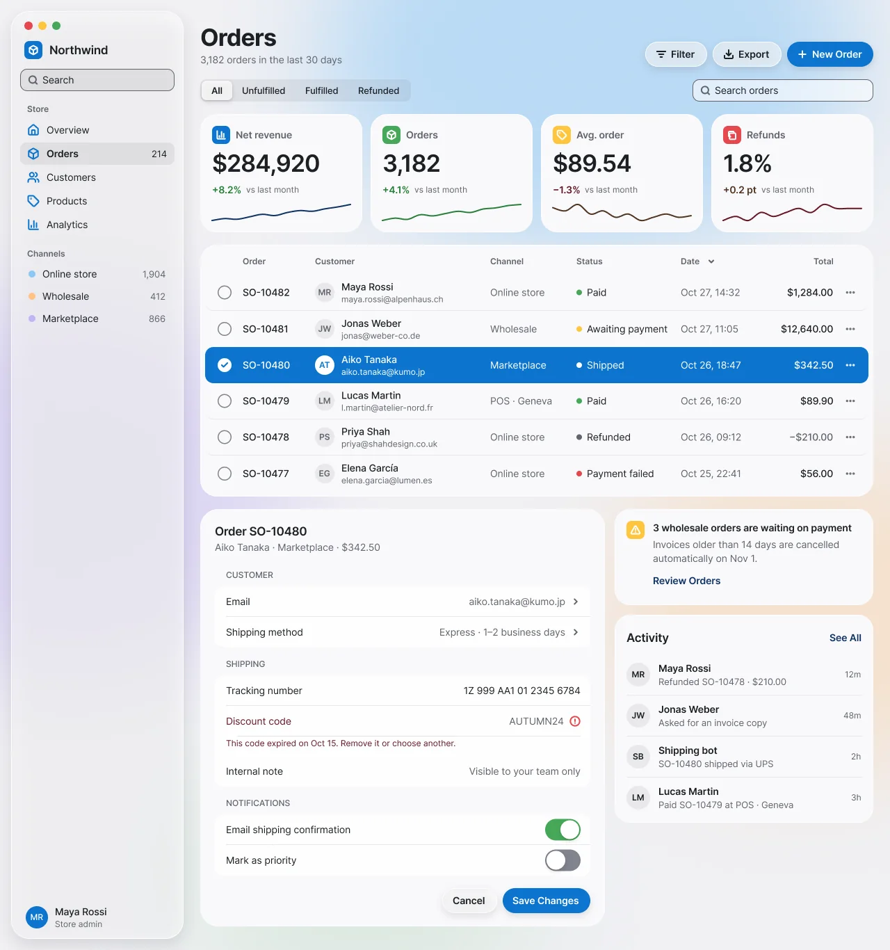
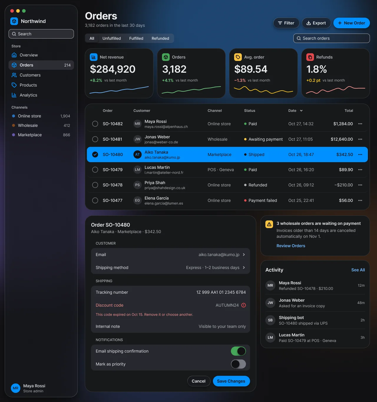
Apple-inspired classic: a translucent floating sidebar, a large-title header, capsule buttons, inset grouped lists and blur-only materials, with full-row system-blue selection on opaque slate content cards.
On this page
Light and dark
Cupertino
Specification values · alpha
Theme values
Values: Colors
| Property | Value |
|---|---|
bg | #f0f0f3 |
bg-dark | #111113 |
card | #f9f9fb |
card-dark | #18191b |
surface-raised | #ffffffd1 |
surface-raised-dark | #2b2e36c7 |
muted | #f0f0f3 |
muted-dark | #212225 |
selected | #e6f4fe |
selected-dark | #0d2847 |
overlay | #00000066 |
overlay-dark | #000000a8 |
fg | #1c2024 |
fg-dark | #edeef0 |
muted-fg | #60646c |
muted-fg-dark | #b0b4ba |
inverse-fg | #fcfcfd |
inverse-fg-dark | #111113 |
border | #d9d9e0 |
border-dark | #363a3f |
border-subtle | #e8e8ec |
border-subtle-dark | #272a2d |
border-strong | #b9bbc6 |
border-strong-dark | #5a6169 |
input-border | #80838d |
input-border-dark | #777b84 |
ring | #0d74ce |
ring-dark | #0090ff |
primary | #0d74ce |
primary-dark | #0090ff |
primary-hover | #0d6fc6 |
primary-hover-dark | #3b9eff |
primary-fg | #ffffff |
primary-fg-dark | #111113 |
primary-text | #113264 |
primary-text-dark | #70b8ff |
success | #46a758 |
success-dark | #46a758 |
success-text | #2a7e3b |
success-text-dark | #71d083 |
warning | #ffc53d |
warning-dark | #ffc53d |
warning-text | #4f3422 |
warning-text-dark | #ffca16 |
destructive | #e5484d |
destructive-dark | #e5484d |
destructive-text | #641723 |
destructive-text-dark | #ff9592 |
info | #0090ff |
info-dark | #0090ff |
material-fill | #ffffff94 |
material-fill-dark | #1f21298c |
material-fill-strong | #ffffffd1 |
material-fill-strong-dark | #2b2e36c7 |
material-stroke | #ffffffb8 |
material-stroke-dark | #ffffff21 |
material-track | #7575801f |
material-track-dark | #7575803d |
shadow-color | #0d0f1f1f |
shadow-color-dark | #00000073 |
aurora-1 | #8ec8f6 |
aurora-1-dark | #2870bd |
aurora-2 | #c2b5f5 |
aurora-2-dark | #6958ad |
aurora-3 | #ffc182 |
aurora-3-dark | #7e451d |
aurora-4 | #b2ddb5 |
aurora-4-dark | #435db1 |
switch-thumb | #ffffff |
switch-thumb-dark | #111113 |
Values: Typography
| Property | Value |
|---|---|
large-title.fontFamily | Inter |
large-title.fontSize | 34px |
large-title.fontWeight | 700 |
large-title.lineHeight | 40px |
large-title.letterSpacing | -0.9px |
kpi.fontFamily | Inter |
kpi.fontSize | 34px |
kpi.fontWeight | 600 |
kpi.lineHeight | 40px |
kpi.letterSpacing | -1px |
heading.fontFamily | Inter |
heading.fontSize | 17px |
heading.fontWeight | 600 |
heading.lineHeight | 22px |
heading.letterSpacing | -0.3px |
body.fontFamily | Inter |
body.fontSize | 14px |
body.fontWeight | 400 |
body.lineHeight | 20px |
body.letterSpacing | -0.1px |
strong.fontFamily | Inter |
strong.fontSize | 14px |
strong.fontWeight | 500 |
strong.lineHeight | 20px |
strong.letterSpacing | -0.1px |
button.fontFamily | Inter |
button.fontSize | 14px |
button.fontWeight | 600 |
button.lineHeight | 20px |
segment.fontFamily | Inter |
segment.fontSize | 13px |
segment.fontWeight | 500 |
segment.lineHeight | 18px |
small.fontFamily | Inter |
small.fontSize | 13px |
small.fontWeight | 400 |
small.lineHeight | 18px |
small.letterSpacing | -0.05px |
caption.fontFamily | Inter |
caption.fontSize | 12px |
caption.fontWeight | 400 |
caption.lineHeight | 16px |
label.fontFamily | Inter |
label.fontSize | 12px |
label.fontWeight | 500 |
label.lineHeight | 16px |
data.fontFamily | Inter |
data.fontSize | 14px |
data.fontWeight | 400 |
data.lineHeight | 20px |
data.fontFeature | "tnum" 1 |
Values: Radii
| Property | Value |
|---|---|
none | 0px |
xs | 7px |
sm | 9px |
input | 10px |
md | 12px |
card | 22px |
lg | 24px |
xl | 26px |
full | 9999px |
Values: Spacing
| Property | Value |
|---|---|
inset | 16px |
gutter | 24px |
stack | 18px |
grid | 12px |
card-padding | 16px |
form-padding | 20px |
control | 36px |
field | 32px |
grouped-row | 44px |
row | 52px |
Values: Component recipes
| Property | Value |
|---|---|
button-prominent.backgroundColor | {colors.primary} |
button-prominent.textColor | {colors.primary-fg} |
button-prominent.typography | {typography.button} |
button-prominent.rounded | {rounded.full} |
button-prominent.height | 36px |
button-prominent.padding | 0 16px 0 14px |
button-prominent-dark.backgroundColor | {colors.primary-dark} |
button-prominent-dark.textColor | {colors.primary-fg-dark} |
button-capsule.backgroundColor | {colors.material-fill} |
button-capsule.textColor | {colors.fg} |
button-capsule.typography | {typography.button} |
button-capsule.rounded | {rounded.full} |
button-capsule.height | 36px |
button-capsule-dark.backgroundColor | {colors.material-fill-dark} |
button-capsule-dark.textColor | {colors.fg-dark} |
button-plain.textColor | {colors.primary-text} |
button-plain.typography | {typography.button} |
search-field.backgroundColor | {colors.material-track} |
search-field.textColor | {colors.fg} |
search-field.rounded | {rounded.input} |
search-field.height | 32px |
segmented-track.backgroundColor | {colors.material-track} |
segmented-track.rounded | {rounded.sm} |
segmented-track.height | 32px |
segmented-track.padding | 2px |
segment-selected.backgroundColor | {colors.material-fill-strong} |
segment-selected.textColor | {colors.fg} |
segment-selected.typography | {typography.segment} |
segment-selected.rounded | {rounded.xs} |
segment-selected.height | 28px |
sidebar.backgroundColor | {colors.material-fill} |
sidebar.rounded | {rounded.xl} |
sidebar.width | 248px |
sidebar-item-selected.backgroundColor | {colors.material-track} |
sidebar-item-selected.textColor | {colors.fg} |
sidebar-item-selected.rounded | {rounded.sm} |
sidebar-item-selected.height | 32px |
kpi-card.backgroundColor | {colors.card} |
kpi-card.textColor | {colors.fg} |
kpi-card.rounded | {rounded.lg} |
kpi-card.padding | 16px 16px 14px |
list-row-selected.backgroundColor | {colors.primary} |
list-row-selected.textColor | {colors.primary-fg} |
list-row-selected.rounded | {rounded.md} |
list-row-selected.height | 52px |
list-row-selected-dark.backgroundColor | {colors.primary-dark} |
list-row-selected-dark.textColor | {colors.primary-fg-dark} |
grouped-group.backgroundColor | {colors.material-fill-strong} |
grouped-group.rounded | {rounded.md} |
toggle-on.backgroundColor | {colors.success} |
toggle-on.rounded | {rounded.full} |
toggle-on.width | 51px |
toggle-on.height | 31px |
toggle-off.backgroundColor | {colors.input-border} |
toggle-off.rounded | {rounded.full} |
toggle-off.width | 51px |
toggle-off.height | 31px |
notice.backgroundColor | {colors.card} |
notice.textColor | {colors.fg} |
notice.rounded | {rounded.card} |
notice.padding | 16px |
Read YAML values and notes
version: alpha
name: Cupertino
description: 'Apple-inspired classic: a translucent floating sidebar, a large-title header, capsule buttons, inset grouped lists and blur-only materials, with full-row system-blue selection on opaque slate content cards.'
colors:
  # Resolved from the NetScript Figma library, Theme mode "Glass" (the seed of Cupertino's own
  # mode), Light and Dark frames.
  # Keys are the --ns-* suffix from each variable's code syntax.
  bg: '#f0f0f3'
  bg-dark: '#111113'
  card: '#f9f9fb'
  card-dark: '#18191b'
  surface-raised: '#ffffffd1'
  surface-raised-dark: '#2b2e36c7'
  muted: '#f0f0f3'
  muted-dark: '#212225'
  selected: '#e6f4fe'
  selected-dark: '#0d2847'
  overlay: '#00000066'
  overlay-dark: '#000000a8'
  fg: '#1c2024'
  fg-dark: '#edeef0'
  muted-fg: '#60646c'
  muted-fg-dark: '#b0b4ba'
  inverse-fg: '#fcfcfd'
  inverse-fg-dark: '#111113'
  border: '#d9d9e0'
  border-dark: '#363a3f'
  border-subtle: '#e8e8ec'
  border-subtle-dark: '#272a2d'
  border-strong: '#b9bbc6'
  border-strong-dark: '#5a6169'
  input-border: '#80838d'
  input-border-dark: '#777b84'
  ring: '#0d74ce'
  ring-dark: '#0090ff'
  primary: '#0d74ce'
  primary-dark: '#0090ff'
  primary-hover: '#0d6fc6'
  primary-hover-dark: '#3b9eff'
  primary-fg: '#ffffff'
  primary-fg-dark: '#111113'
  primary-text: '#113264'
  primary-text-dark: '#70b8ff'
  success: '#46a758'
  success-dark: '#46a758'
  success-text: '#2a7e3b'
  success-text-dark: '#71d083'
  warning: '#ffc53d'
  warning-dark: '#ffc53d'
  warning-text: '#4f3422'
  warning-text-dark: '#ffca16'
  destructive: '#e5484d'
  destructive-dark: '#e5484d'
  destructive-text: '#641723'
  destructive-text-dark: '#ff9592'
  info: '#0090ff'
  info-dark: '#0090ff'
  material-fill: '#ffffff94'
  material-fill-dark: '#1f21298c'
  material-fill-strong: '#ffffffd1'
  material-fill-strong-dark: '#2b2e36c7'
  material-stroke: '#ffffffb8'
  material-stroke-dark: '#ffffff21'
  material-track: '#7575801f'
  material-track-dark: '#7575803d'
  shadow-color: '#0d0f1f1f'
  shadow-color-dark: '#00000073'
  aurora-1: '#8ec8f6'
  aurora-1-dark: '#2870bd'
  aurora-2: '#c2b5f5'
  aurora-2-dark: '#6958ad'
  aurora-3: '#ffc182'
  aurora-3-dark: '#7e451d'
  aurora-4: '#b2ddb5'
  aurora-4-dark: '#435db1'
  # Switch knob role, pending in #2414. It has the same values as primary-fg today;
  # bind this role, not primary-fg. A white knob in dark would be a design change.
  switch-thumb: '#ffffff'
  switch-thumb-dark: '#111113'
typography:
  large-title: {
    fontFamily: Inter,
    fontSize: 34px,
    fontWeight: 700,
    lineHeight: 40px,
    letterSpacing: -0.9px,
  }
  kpi: { fontFamily: Inter, fontSize: 34px, fontWeight: 600, lineHeight: 40px, letterSpacing: -1px }
  heading: {
    fontFamily: Inter,
    fontSize: 17px,
    fontWeight: 600,
    lineHeight: 22px,
    letterSpacing: -0.3px,
  }
  body: {
    fontFamily: Inter,
    fontSize: 14px,
    fontWeight: 400,
    lineHeight: 20px,
    letterSpacing: -0.1px,
  }
  strong: {
    fontFamily: Inter,
    fontSize: 14px,
    fontWeight: 500,
    lineHeight: 20px,
    letterSpacing: -0.1px,
  }
  button: { fontFamily: Inter, fontSize: 14px, fontWeight: 600, lineHeight: 20px }
  segment: { fontFamily: Inter, fontSize: 13px, fontWeight: 500, lineHeight: 18px }
  small: {
    fontFamily: Inter,
    fontSize: 13px,
    fontWeight: 400,
    lineHeight: 18px,
    letterSpacing: -0.05px,
  }
  caption: { fontFamily: Inter, fontSize: 12px, fontWeight: 400, lineHeight: 16px }
  label: { fontFamily: Inter, fontSize: 12px, fontWeight: 500, lineHeight: 16px }
  data: {
    fontFamily: Inter,
    fontSize: 14px,
    fontWeight: 400,
    lineHeight: 20px,
    fontFeature: '"tnum" 1',
  }
rounded:
  none: 0px
  xs: 7px
  sm: 9px
  input: 10px
  md: 12px
  card: 22px
  lg: 24px
  xl: 26px
  full: 9999px
spacing:
  inset: 16px
  gutter: 24px
  stack: 18px
  grid: 12px
  card-padding: 16px
  form-padding: 20px
  control: 36px
  field: 32px
  grouped-row: 44px
  row: 52px
components:
  button-prominent: {
    backgroundColor: '{colors.primary}',
    textColor: '{colors.primary-fg}',
    typography: '{typography.button}',
    rounded: '{rounded.full}',
    height: 36px,
    padding: 0 16px 0 14px,
  }
  button-prominent-dark: {
    backgroundColor: '{colors.primary-dark}',
    textColor: '{colors.primary-fg-dark}',
  }
  button-capsule: {
    backgroundColor: '{colors.material-fill}',
    textColor: '{colors.fg}',
    typography: '{typography.button}',
    rounded: '{rounded.full}',
    height: 36px,
  }
  button-capsule-dark: {
    backgroundColor: '{colors.material-fill-dark}',
    textColor: '{colors.fg-dark}',
  }
  button-plain: { textColor: '{colors.primary-text}', typography: '{typography.button}' }
  search-field: {
    backgroundColor: '{colors.material-track}',
    textColor: '{colors.fg}',
    rounded: '{rounded.input}',
    height: 32px,
  }
  segmented-track: {
    backgroundColor: '{colors.material-track}',
    rounded: '{rounded.sm}',
    height: 32px,
    padding: 2px,
  }
  segment-selected: {
    backgroundColor: '{colors.material-fill-strong}',
    textColor: '{colors.fg}',
    typography: '{typography.segment}',
    rounded: '{rounded.xs}',
    height: 28px,
  }
  sidebar: { backgroundColor: '{colors.material-fill}', rounded: '{rounded.xl}', width: 248px }
  sidebar-item-selected: {
    backgroundColor: '{colors.material-track}',
    textColor: '{colors.fg}',
    rounded: '{rounded.sm}',
    height: 32px,
  }
  kpi-card: {
    backgroundColor: '{colors.card}',
    textColor: '{colors.fg}',
    rounded: '{rounded.lg}',
    padding: 16px 16px 14px,
  }
  list-row-selected: {
    backgroundColor: '{colors.primary}',
    textColor: '{colors.primary-fg}',
    rounded: '{rounded.md}',
    height: 52px,
  }
  list-row-selected-dark: {
    backgroundColor: '{colors.primary-dark}',
    textColor: '{colors.primary-fg-dark}',
  }
  grouped-group: { backgroundColor: '{colors.material-fill-strong}', rounded: '{rounded.md}' }
  toggle-on: {
    backgroundColor: '{colors.success}',
    rounded: '{rounded.full}',
    width: 51px,
    height: 31px,
  }
  toggle-off: {
    backgroundColor: '{colors.input-border}',
    rounded: '{rounded.full}',
    width: 51px,
    height: 31px,
  }
  notice: {
    backgroundColor: '{colors.card}',
    textColor: '{colors.fg}',
    rounded: '{rounded.card}',
    padding: 16px,
  }
Overview
- Thesis: Apple-inspired classic: a translucent floating sidebar, a large-title header with capsule buttons, inset grouped lists, blur-only materials and full-row system-blue selection. Opaque slate content cards sit over a soft aurora. It is a hand-built composition, not a strict macOS 15 / iOS 18 reproduction.
- Signature moves:
- Inset grouped editor. 12px Medium uppercase section captions over 12px-radius groups of 44px rows: label left, muted value right, a trailing chevron. It applies the iOS Settings layout to a desktop form.
- Full-row system-blue selection. The selected order row fills edge to edge with
primary. Every glyph on it turnsprimary-fg(white in light,#111113in dark), including the check circle (primary-fgdisc, blue tick) and the avatar (primary-fgdisc, blue initials). It follows the macOS table highlight. - One vibrancy plane. Only the floating sidebar and the header command capsules are
translucent. Every content surface (KPI widgets, orders list, form, notice, activity) is opaque
cardwith a 1pxmaterial-strokerim.
- Anchor: grouped-list and typography cues from the iOS 18 / macOS 15 design resources. Taken: large titles, inset grouped lists, 51×31 switches, edit-mode selection circles, the segmented control (track plus raised thumb), traffic lights in a full-height sidebar, system-blue selection. The floating sidebar and capsule buttons are NetScript's own composition, not macOS 15 anatomy. Not copied: SF Pro, SF Symbols, Apple wallpapers, any Apple asset. Icons are Lucide.
- Family: Platform.
- Best for: Mac-like tools, settings-heavy admin, small-team back offices. Avoid for: nothing in the catalogue. Choose it over Liquid when glass would distract.
- Feel: calm, familiar, tidy. It should look like a Mac app the user already knows.
Composition boundary
Cupertino keeps the composition above: a floating sidebar, capsule buttons, a large title and an inline grouped editor. Strict macOS 15 / iOS 18 anatomy (an attached 208px sidebar, 6px-corner 28px bordered push buttons, a docked inspector) belongs to the faithful Apple Classic theme (planned, #2443), not to Cupertino.
Cupertino never takes lensing, specular rims, a detached sheet, a floating selection bar, glass on
content or the macOS 27 toolbar groups from Liquid. The Figma frames carry a GLASS effect on the
sidebar and capsules (refraction 0.50–0.55). The web theme proposes dropping that lensing and
shipping blur plus tint only (classic vibrancy). This approximation stays proposed until a
side-by-side comparison against the Figma frames in #2419 (GUIDELINES §3).
Colors
- Ground and surface ladder. Canvas
bg#f0f0f3/#111113(Radix slate 3 / slate-dark step 1) under four blurred aurora ellipses (aurora-1…4, LAYER_BLUR 170). Content cards arecard#f9f9fb/#18191b. Grouped rows sit onmaterial-fill-strong(white 82% /#2b2e3678%). Vibrancy ismaterial-fill(white 58% /#1f212955%). The specimen has no overlay; theoverlayrole is#00000066/#000000a8. - Accent policy.
primary(blue l11#0d74ce/ blue d9#0090ff) appears only as: the prominent capsule (New Order, Save Changes), the selected list row, a checked selection circle, the brand and avatar discs. Links and plain buttons (Review Orders, See All) useprimary-text(#113264/#70b8ff), never the fill colour. - Status colours. Status is a dot plus a word: 8px
success/warning/destructive/infodot, label infg. Tinted text uses the*-textroles: positive deltassuccess-text, the expired codedestructive-text. Sparklines are 2px strokes inprimary-text,success-text,warning-textanddestructive-text. - Dark design notes. The ground is tinted slate, not black. Raised surfaces get a lighter tint
(
card#18191b, grouped rows#2b2e3678%). The aurora uses deep tones (#2870bd,#6958ad,#7e451d,#435db1). The dark primary is saturated#0090ffwith dark ink#111113(5.78:1). White text on#0090ffis 3.26:1, so labels on it use#111113. The white tick on a checked selection circle is a graphical object and meets the 3:1 non-text minimum at 3.26:1. Inside a selected row the circle inverts to a#111113disc with a blue tick. Rims drop to white 13%.
Typography
- Families. Inter (OFL, Google Fonts) stands in for SF Pro, which cannot be embedded and renders
blank from the Figma Plugin API. The theme uses one family; size and weight set the hierarchy.
Code stack:
Inter, -apple-system, BlinkMacSystemFont, "SF Pro Text", system-ui, sans-serif. - Scale (
Glassseed values, bound on the frames). Large title 34/40 Bold −0.9px ("Orders"). KPI 34/40 Semi Bold −1px. Heading 17/22 Semi Bold −0.3px (the iOS headline size, used for "Order SO-10480" and "Activity"). Body 14/20 −0.1px. Strong 14/20 Medium. Small 13/18 −0.05px. Caption 12/16. Label 12/16 Medium. - Literal styles (not yet tokens). Buttons 14/20 Semi Bold. Segments 13/18: Medium at rest, Semi
Bold when selected. Section captions are 12/16 Medium uppercase in
muted-fg; sidebar section titles are 12/16 Semi Bold, title case. - Numerals. Money, counts and dates use tabular figures (
data). The Figma Plugin API cannot settnum, so tabular figures are pending in #2414.
Layout
- Window. 1280×1366 specimen. Sidebar floats at x16/y16, 248×1334. Main column x288, 968 wide, 24px right inset. Main stacks with an 18px gap and 18px top/bottom padding.
- Header. Large title plus a 14/20 muted subtitle on the left; three 36px capsules on the right (Filter, Export, New Order, 8px gap). Below them: segmented control left, 260×32 search right.
- Grid. Four KPI widgets 233×170, 12px gaps (4 × 233 + 3 × 12 = 968). Orders list full width. The bottom row is the order form (582) plus a side column (372) with a 14px gap (582 + 14 + 372 = 968); side items stack with 14px.
- Orders list columns. Resolve the row grid from the container inward, never from a pixel total.
In the light specimen, the 968px list card insets its rows by 7px per side (rows span x295–1248,
954 wide). Each row then has 8px side padding, leaving 938px. The fixed tracks are 40 + 104 +
124 + 150 + 128 + 104 + 36 = 686, and there is no column gap, so the customer track
minmax(0,1fr)resolves to 252 at this width. The list does not use the 16pxcard-padding; with 16px it would leave 234 for the customer. Keep the type sizes. At narrower widths the customer track shrinks and its email truncates; the fixed columns never shrink. Re-resolve the customer width after a fresh layout export instead of copying 252. - Rows and fields (Density Comfortable; no Density variable is bound, the sizes equal its values). Table rows 52, header 38. Grouped rows 44, or 64 with an error helper. Capsules 36. Search fields and the segmented track 32. Sidebar items 32 with 2px gaps; channel rows 30.
- Orders fixture. KPIs → segmented filter and search → orders list → order form beside the payment notice and activity feed. The editor is inline in the content flow, never a sheet.
Elevation & Depth
Only two planes get depth.
| Level | Recipe (CSS) | Who gets it |
|---|---|---|
| 0 Canvas | background: var(--ns-bg) plus four blurred aurora discs (filter: blur(170px)), hidden under Reduce Transparency |
The window ground |
| 1 Content | Opaque var(--ns-card), border: 1px solid var(--ns-material-stroke), no shadow |
KPI widgets, orders list, form, notice, activity |
| 2 Vibrancy | background: var(--ns-material-fill); backdrop-filter: blur(18px) (sidebar) or blur(10px) (capsules); border: 1px solid var(--ns-material-stroke); box-shadow: 0 10px 28px var(--ns-shadow-color) (sidebar) or 0 4px 14px (capsules) |
The sidebar and the Filter/Export capsules only |
| Thumb | box-shadow: 0 1px 3px, 0 3px 8px at 12% black on material-fill-strong |
Selected segment |
| Knob | 0 3px 8px, 0 1px 1px at 12% black |
Switch knob |
- In Figma, the sidebar
GLASSeffect has radius 18, refraction 0.50, depth 16 and dispersion 0.20. The capsules have radius 10 (prominent 4), refraction 0.55, depth 14 and dispersion 0.25. The proposed web approximation keeps only the radius, as the blur above. Whether blur-only matches the frames stays unproven until the comparison in #2419. - The prominent capsule is opaque
primary; the proposal drops its FigmaGLASSeffect in CSS. - Accessibility preferences (not the default look). Reduce Transparency: the aurora is hidden,
the sidebar falls back to opaque
card, and capsules becomesurface-raised. Increase Contrast: every card, capsule and sidebar rim becomesborder-strong#b9bbc6.
Shapes
- Radii step by role, not by a concentric formula. Sidebar and order form 26. KPI widgets and orders
list 24. Notice and activity 22 (
radius/card). Grouped groups and table rows 12. Search 10 (radius/input). Sidebar items and segmented track 9. Segment thumb and icon tiles 7. Capsules, switches, selection circles and avatars are full pills (radius/control999). - Strokes are 1px inside. Grouped-row separators are 1px
border-subtle, inset 16px from the leading edge. Table rows divide with a 1px bottomborder-subtle. - No notches, steps or hard offsets.
Components
| Component | Cupertino variant and anatomy | States shown in Figma |
|---|---|---|
| Buttons | Glass/Button: Prominent (primary fill, primary-fg label), Glass (material-fill, 1px material-stroke, fg label), Plain (primary-text label, no fill). 36 tall, full pill, 16/14 padding, 16px icon, 6px gap |
Rest only |
| Search field | 32 tall, radius 10, material-track (sidebar) or material-fill (header), 1px muted-fg boundary, 15px magnifier, fg placeholder |
Rest only |
| Segmented control | 32 track, material-track, radius 9, 2px inset; 28px segments, radius 7; the selected thumb is material-fill-strong with two soft shadows |
Selected / unselected |
| Selection circle | 20px; unchecked: 1.5px input-border ring; checked: primary disc with a white tick; inside a selected row: primary-fg disc (white light, #111113 dark), blue tick |
Checked / unchecked |
| Switch | 51×31, 27px knob in its own switch-thumb role (pending in #2414): white #ffffff in light, #111113 in dark. Don't bind the knob to primary-fg, even though the values match today. On: success. Off: input-border track |
On / off |
| Table row | 52 tall, radius 12, 8px side padding, 1px bottom border-subtle, no column gap. Tracks: 40px 104px minmax(0,1fr) 124px 150px 128px 104px 36px (select, order, customer with a 28px avatar plus name/email, channel, status, date, total, overflow). See Layout for the arithmetic |
Rest / selected |
| Status | 8px tone dot plus 14px fg word: Paid, Awaiting payment, Shipped, Refunded, Payment failed |
Five tones |
| KPI widget | 233×170, radius 24, 26px tinted icon tile (radius 7), label 14 Semi Bold, value kpi, delta 14 Semi Bold in success-text/destructive-text plus 12/16 "vs last month", 2px sparkline 28 tall |
Rest |
| Grouped list | Section caption (12px uppercase, 16px leading inset) over a radius-12 group of 44px rows; value rows show muted value plus chevron; the toggle row has a 51×31 switch | Value, input, toggle, error |
| Error row | Label and value in destructive-text, a trailing alert icon, then a full-width 12/16 helper below the value: "This code expired on Oct 15. Remove it or choose another." |
Error |
| Notice | Opaque card, radius 22, 16 padding; 26px warning icon tile; 14 Semi Bold title, 14 muted body, Plain "Review Orders" button |
Rest |
| Nav item | 32 tall, radius 9, 10px gap, 16px Lucide icon in primary-text; selected = material-track fill plus Semi Bold label and fg count |
Rest / selected |
| Top bar | No toolbar strip. A large title in the content column; capsules on the same row. Traffic lights live in the sidebar: 12px at a 20px pitch | — |
| Dialog / sheet | Not in the specimen. Use native <dialog> as an opaque card panel at radius 26 over overlay; never a glass sheet (that is Liquid) |
Pending in #2416 |
| Signature | The inset grouped editor and the full-row blue selection | — |
Hover, pressed, focus and disabled are not drawn for any Cupertino component. They are pending in #2416. Until then, use the platform physics in Motion & States.
Do's and Don'ts
- Do keep the hand-built composition, including the capsules and the floating sidebar.
- Don't turn Cupertino into a strict macOS 15 / iOS 18 reproduction (opaque attached sidebar, bordered push buttons). That is the faithful Apple Classic theme (planned, #2443); Cupertino keeps its own composition.
- Don't ship lensing, refraction, dispersion or specular rims. Those belong to Liquid, and the two themes stay visually distinct. Blur-only CSS is the proposed approximation of the Figma frames, pending the comparison in #2419.
- Don't put material on content. KPI widgets, the list, the form, the notice and activity stay
opaque
card. - Do give every editable boundary
muted-fgat 1px, including search on the vibrancy plane (4.10, 4.87 and 5.22:1). - Do paint unchecked circles and off-switch tracks in
input-border. - Do draw sparklines at 2px in the
*-textroles, never in rawsuccess/warningfills (a rawwarningline measures 1.26:1). - Do keep the editable value and its error apart: value
AUTUMN24, then a 12/16 helper line. - Do align to the 16/24 outer grid: inset 16, sidebar 248, gap 24, content at x288.
- Don't put white text on dark
#0090ff. Useprimary-fg#111113. The switch knob is not text, so give it theswitch-thumbrole instead ofprimary-fg. - Don't show a white header, white slab or white perimeter in dark. Rims stay at 13% white.
- Do ship the Reduce Transparency and Increase Contrast variants with every screen.
- Don't import the unused
cupertino/*roles into new screens (see NetScript Mapping).
Iconography & Imagery
- Lucide (ISC), 1.5–2px stroke: 16px in nav and buttons, 15px in tiles and search, 14px chevrons.
Nav icons are
primary-text. KPI icons sit white on a 26px tinted tile (primary,success,warning,destructive). - Avatars: 28px circles with 12px Semi Bold initials. Neutral in rows; white with blue initials on
the selected row. The profile avatar is a 32px
primarydisc. - Backdrop: four blurred aurora discs on
bg, never a photo or an Apple wallpaper. Remove it under Reduce Transparency.
Motion & States
- Not drawn in Figma. States are pending in #2416 and runtime checks in #2419. Until then, use these
platform-inspired defaults:
- hover lifts a capsule one material step (
material-fill→material-fill-strong); - press darkens 8% without movement;
- row selection fills instantly;
- the switch knob travels in 150–200ms ease-out;
- the segmented thumb slides.
- hover lifts a capsule one material step (
- Focus: 2px
ringoutline, 2px offset, following the capsule or row radius. - Reduced motion: no thumb or knob travel. Reduce Transparency removes blur and aurora.
Accessibility
Measured on rendered pixels and resolved tokens (WCAG 2.2):
| Pair | Light | Dark |
|---|---|---|
| Label on primary (row, New Order, Save) | #ffffff/#0d74ce 4.77:1 |
#111113/#0090ff 5.78:1 |
muted-fg on card |
5.65:1 | 8.45:1 |
success-text delta on card |
4.82:1 | #71d083 9.26:1 |
primary-text link on card |
12.00:1 | 8.37:1 |
Off-switch track input-border vs group |
#80838d/white 3.78:1 |
#777b84/#2b2e36 3.20:1 |
| Header search boundary | 4.10:1 | 4.87:1 (preferences 5.22:1) |
- Hit targets: capsules 36, rows 52, grouped rows 44, segments 28, switches 31. The 20px circle hits through its 40×52 cell.
- Focus indicators are not drawn yet (#2416).
- RTL: mirror the sidebar, chevrons and trailing values; keep the traffic lights on the leading edge.
NetScript Mapping
| Layer | Value |
|---|---|
| Figma Theme mode | Cupertino, its own mode in Theme B (set B), still seeded from Glass's values |
| Base gray × accent | Radix slate × blue. The mode's own gray/* and accent/*, seeded from Glass, alias them directly (surface/bg → surface/l/canvas → slate/l/3) instead of the default Neutral × Ink |
| Density | Comfortable (default; not bound) |
| Flavor | n/a |
data-theme |
cupertino |
| Language roles | cupertino/*: 27 Scheme roles, --ns-cupertino-*. The current design binds none of them; every paint binds a core role |
- Roles pending in #2414:
switch-thumbfor the switch knob (#fffffflight,#111113dark). It has the same values asprimary-fgtoday. A white knob in both schemes would be a design change.- Container radii 24 and 26 are literal values that differ from
radius/card22. #2414 either adds a 24 / 26 container tier or snaps them toradius/card; the second option changes the look. - Reduce Transparency capsules use
surface-raised(82% alpha), not an opaque role. cupertino/*: delete it, or use its values in Cupertino's own Theme mode, which still holds theGlassseed values. Don't bind only some of its roles.
- Status. Values come from the NetScript Figma library. Token names and export, fonts, tabular figures and the full contrast matrix are pending in #2414. Component states, focus and accessible names are pending in #2416, and runtime checks such as motion, keyboard, scroll, live preferences and glass rendering in #2419. The blur-only vibrancy stays proposed until the #2419 comparison.
Sources
- Apple Design Resources (the iOS 18 and iPadOS 18 kit; used for cues, not as a fidelity target); HIG Materials; WWDC20 Adopt the new look of macOS.
- Not copied: SF Pro, SF Symbols, Apple wallpapers and any other Apple asset.
- Fixture content is invented: the Northwind store, all names and emails, SO-10477 to SO-10482,
amounts, channel counts (1,904 / 412 / 866; other themes show different splits), the synthetic
30-day sparkline series, the tracking number and
AUTUMN24.