Tactile
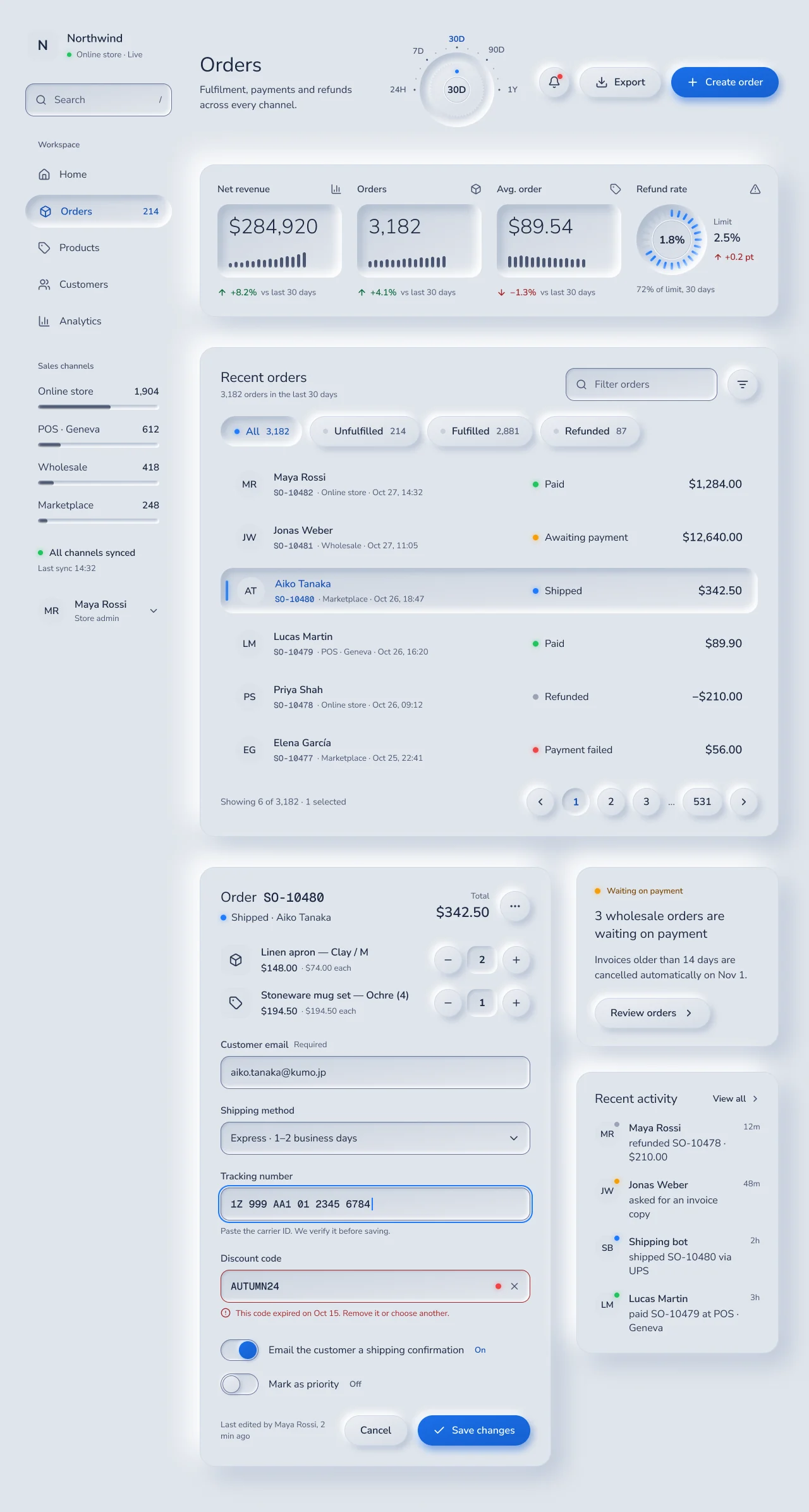
Guideline-based neumorphism. One material lit from the top left, four heights, convex keys that rise, concave wells that sink, and selection that sinks.
On this page
- Light and dark
- Theme values
- Values: Colors
- Values: Typography
- Values: Radii
- Values: Spacing
- Values: Component recipes
- Overview
- Colors
- Typography
- Layout
- Elevation & Depth
- The physical model (applies to every node)
- Effect styles (CSS)
- Audit
- Shapes
- Components
- Do's and Don'ts
- Iconography & Imagery
- Motion & States
- Accessibility
- NetScript Mapping
- Sources
Light and dark
Tactile
Specification values · alpha
Theme values
Values: Colors
| Property | Value |
|---|---|
tactile-surface-base | #e0e5ec |
tactile-surface-base-dark | #2a2d32 |
tactile-surface-tone | #dbe1e9 |
tactile-surface-tone-dark | #27292e |
tactile-surface-well | #d7dde6 |
tactile-surface-well-dark | #23262a |
tactile-surface-disabled | #dae0e8 |
tactile-surface-disabled-dark | #2f3238 |
tactile-convex-start | #ebeef3 |
tactile-convex-start-dark | #32363c |
tactile-convex-end | #d5dce5 |
tactile-convex-end-dark | #222428 |
tactile-concave-start | #ccd4df |
tactile-concave-start-dark | #1b1d20 |
tactile-concave-end | #e2e6ed |
tactile-concave-end-dark | #2b2f34 |
tactile-surface-accent-start | #1a6fe8 |
tactile-surface-accent-start-dark | #1a6fe8 |
tactile-surface-accent-end | #1560cf |
tactile-surface-accent-end-dark | #1560cf |
tactile-shadow-highlight | #ffffff |
tactile-shadow-highlight-dark | #34383e |
tactile-shadow-shade | #a3b1c699 |
tactile-shadow-shade-dark | #1c1e21 |
tactile-inset-highlight | #ffffff |
tactile-inset-highlight-dark | #34383e |
tactile-inset-shade | #a3b1c6bf |
tactile-inset-shade-dark | #1c1e21 |
tactile-edge-border | #d1d9e6 |
tactile-edge-border-dark | #24272b |
tactile-edge-control | #6a759e |
tactile-edge-control-dark | #7a8498 |
tactile-groove-dark | #a3b1c699 |
tactile-groove-dark-dark | #1c1e21 |
tactile-groove-light | #ffffff |
tactile-groove-light-dark | #34383e |
tactile-text-strong | #1b2840 |
tactile-text-strong-dark | #f1f3f7 |
tactile-text-body | #2b3852 |
tactile-text-body-dark | #c8ced8 |
tactile-text-muted | #4a5672 |
tactile-text-muted-dark | #9aa3b2 |
tactile-text-disabled | #9aa3b8 |
tactile-text-disabled-dark | #5c6477 |
tactile-text-accent | #1550b5 |
tactile-text-accent-dark | #79b0ff |
tactile-text-on-accent | #ffffff |
tactile-text-on-accent-dark | #ffffff |
tactile-text-danger | #a1262a |
tactile-text-danger-dark | #ff8a8a |
tactile-text-success | #0e6a3b |
tactile-text-success-dark | #4ade80 |
tactile-text-warning | #7c4a08 |
tactile-text-warning-dark | #fbbf24 |
tactile-accent | #1e7bff |
tactile-accent-dark | #3b8bff |
tactile-glow-accent | #1e7bff73 |
tactile-glow-accent-dark | #3b8bff8c |
tactile-led-off | #c7cfdb |
tactile-led-off-dark | #1c1e21 |
tactile-led-green | #22c55e |
tactile-led-green-dark | #34d399 |
tactile-led-amber | #f59e0b |
tactile-led-amber-dark | #fbbf24 |
tactile-led-blue | #1e7bff |
tactile-led-blue-dark | #3b8bff |
tactile-led-red | #ef4444 |
tactile-led-red-dark | #f87171 |
tactile-led-grey | #9aa3b8 |
tactile-led-grey-dark | #6b7387 |
tactile-glow-blue | #1e7bff80 |
tactile-glow-blue-dark | #3b8bff8c |
Values: Typography
| Property | Value |
|---|---|
title.fontFamily | Nunito Sans |
title.fontSize | 32px |
title.fontWeight | 400 |
title.lineHeight | 40px |
kpi.fontFamily | Nunito Sans |
kpi.fontSize | 32px |
kpi.fontWeight | 300 |
kpi.lineHeight | 38px |
kpi.fontFeature | "tnum" 1 |
section.fontFamily | Nunito Sans |
section.fontSize | 22px |
section.fontWeight | 400 |
section.lineHeight | 28px |
heading.fontFamily | Nunito Sans |
heading.fontSize | 20px |
heading.fontWeight | 400 |
heading.lineHeight | 28px |
money.fontFamily | Nunito Sans |
money.fontSize | 18px |
money.fontWeight | 600 |
money.lineHeight | 24px |
money.fontFeature | "tnum" 1 |
body.fontFamily | Nunito Sans |
body.fontSize | 16px |
body.fontWeight | 400 |
body.lineHeight | 22px |
label.fontFamily | Nunito Sans |
label.fontSize | 16px |
label.fontWeight | 600 |
label.lineHeight | 22px |
caption.fontFamily | Nunito Sans |
caption.fontSize | 13px |
caption.fontWeight | 400 |
caption.lineHeight | 18px |
data.fontFamily | Geist Mono |
data.fontSize | 13px |
data.fontWeight | 500 |
data.lineHeight | 18px |
data-field.fontFamily | Geist Mono |
data-field.fontSize | 16px |
data-field.fontWeight | 500 |
data-field.lineHeight | 22px |
Values: Radii
| Property | Value |
|---|---|
meter | 4px |
field | 14px |
readout | 18px |
tile | 20px |
plateau | 24px |
full | 9999px |
Values: Spacing
| Property | Value |
|---|---|
xs | 4px |
sm | 8px |
md | 12px |
lg | 16px |
xl | 24px |
plateau | 28px |
region | 40px |
page | 48px |
Values: Component recipes
| Property | Value |
|---|---|
plateau.backgroundColor | {colors.tactile-surface-base} |
plateau.textColor | {colors.tactile-text-body} |
plateau.rounded | {rounded.plateau} |
plateau-dark.backgroundColor | {colors.tactile-surface-base-dark} |
plateau-dark.textColor | {colors.tactile-text-body-dark} |
plateau-dark.rounded | {rounded.plateau} |
key.backgroundColor | {colors.tactile-convex-start} |
key.textColor | {colors.tactile-text-strong} |
key.typography | {typography.label} |
key.rounded | {rounded.full} |
key.height | 48px |
key-dark.backgroundColor | {colors.tactile-convex-start-dark} |
key-dark.textColor | {colors.tactile-text-strong-dark} |
key-dark.typography | {typography.label} |
key-dark.rounded | {rounded.full} |
key-dark.height | 48px |
key-primary.backgroundColor | {colors.tactile-surface-accent-start} |
key-primary.textColor | {colors.tactile-text-on-accent} |
key-primary.typography | {typography.label} |
key-primary.rounded | {rounded.full} |
key-primary.height | 48px |
key-primary-dark.backgroundColor | {colors.tactile-surface-accent-start-dark} |
key-primary-dark.textColor | {colors.tactile-text-on-accent-dark} |
key-primary-dark.typography | {typography.label} |
key-primary-dark.rounded | {rounded.full} |
key-primary-dark.height | 48px |
key-pressed.backgroundColor | {colors.tactile-concave-start} |
key-pressed.textColor | {colors.tactile-text-accent} |
key-pressed.typography | {typography.label} |
key-pressed.rounded | {rounded.full} |
key-pressed.height | 48px |
key-pressed-dark.backgroundColor | {colors.tactile-concave-start-dark} |
key-pressed-dark.textColor | {colors.tactile-text-accent-dark} |
key-pressed-dark.typography | {typography.label} |
key-pressed-dark.rounded | {rounded.full} |
key-pressed-dark.height | 48px |
field.backgroundColor | {colors.tactile-concave-start} |
field.textColor | {colors.tactile-text-strong} |
field.typography | {typography.body} |
field.rounded | {rounded.field} |
field.height | 52px |
field-dark.backgroundColor | {colors.tactile-concave-start-dark} |
field-dark.textColor | {colors.tactile-text-strong-dark} |
field-dark.typography | {typography.body} |
field-dark.rounded | {rounded.field} |
field-dark.height | 52px |
kpi-readout.backgroundColor | {colors.tactile-concave-start} |
kpi-readout.textColor | {colors.tactile-text-strong} |
kpi-readout.typography | {typography.kpi} |
kpi-readout.rounded | {rounded.readout} |
kpi-readout.height | 116px |
order-tile-selected.backgroundColor | {colors.tactile-concave-start} |
order-tile-selected.textColor | {colors.tactile-text-accent} |
order-tile-selected.rounded | {rounded.tile} |
order-tile-selected.height | 72px |
order-tile-selected-dark.backgroundColor | {colors.tactile-concave-start-dark} |
order-tile-selected-dark.textColor | {colors.tactile-text-accent-dark} |
order-tile-selected-dark.rounded | {rounded.tile} |
order-tile-selected-dark.height | 72px |
nav-item-selected.backgroundColor | {colors.tactile-concave-start} |
nav-item-selected.textColor | {colors.tactile-text-accent} |
nav-item-selected.typography | {typography.label} |
nav-item-selected.rounded | {rounded.full} |
nav-item-selected.height | 52px |
switch-track.backgroundColor | {colors.tactile-concave-start} |
switch-track.rounded | {rounded.full} |
switch-track.width | 60px |
switch-track.height | 34px |
switch-knob-on.backgroundColor | {colors.tactile-surface-accent-start} |
switch-knob-on.rounded | {rounded.full} |
switch-knob-on.size | 28px |
status-led.backgroundColor | {colors.tactile-led-blue} |
status-led.rounded | {rounded.full} |
status-led.size | 8px |
disabled.backgroundColor | {colors.tactile-surface-disabled} |
disabled.textColor | {colors.tactile-text-disabled} |
Read YAML values and notes
version: alpha
name: Tactile
description: Guideline-based neumorphism. One material lit from the top left, four heights, convex keys that rise, concave wells that sink, and selection that sinks.
colors:
  # Resolved from the NetScript Figma library (Light and Dark schemes) with
  # variable.resolveForConsumer. Keys are the --ns-* suffix.
  # Tactile components read ONLY the tactile/* roles (--ns-tactile-*). 0 core-role bindings.
  tactile-surface-base: '#e0e5ec'
  tactile-surface-base-dark: '#2a2d32'
  tactile-surface-tone: '#dbe1e9'
  tactile-surface-tone-dark: '#27292e'
  tactile-surface-well: '#d7dde6'
  tactile-surface-well-dark: '#23262a'
  tactile-surface-disabled: '#dae0e8'
  tactile-surface-disabled-dark: '#2f3238'
  tactile-convex-start: '#ebeef3'
  tactile-convex-start-dark: '#32363c'
  tactile-convex-end: '#d5dce5'
  tactile-convex-end-dark: '#222428'
  tactile-concave-start: '#ccd4df'
  tactile-concave-start-dark: '#1b1d20'
  tactile-concave-end: '#e2e6ed'
  tactile-concave-end-dark: '#2b2f34'
  tactile-surface-accent-start: '#1a6fe8'
  tactile-surface-accent-start-dark: '#1a6fe8'
  tactile-surface-accent-end: '#1560cf'
  tactile-surface-accent-end-dark: '#1560cf'
  tactile-shadow-highlight: '#ffffff'
  tactile-shadow-highlight-dark: '#34383e'
  tactile-shadow-shade: '#a3b1c699'
  tactile-shadow-shade-dark: '#1c1e21'
  tactile-inset-highlight: '#ffffff'
  tactile-inset-highlight-dark: '#34383e'
  tactile-inset-shade: '#a3b1c6bf'
  tactile-inset-shade-dark: '#1c1e21'
  tactile-edge-border: '#d1d9e6'
  tactile-edge-border-dark: '#24272b'
  tactile-edge-control: '#6a759e'
  tactile-edge-control-dark: '#7a8498'
  tactile-groove-dark: '#a3b1c699'
  tactile-groove-dark-dark: '#1c1e21'
  tactile-groove-light: '#ffffff'
  tactile-groove-light-dark: '#34383e'
  tactile-text-strong: '#1b2840'
  tactile-text-strong-dark: '#f1f3f7'
  tactile-text-body: '#2b3852'
  tactile-text-body-dark: '#c8ced8'
  tactile-text-muted: '#4a5672'
  tactile-text-muted-dark: '#9aa3b2'
  tactile-text-disabled: '#9aa3b8'
  tactile-text-disabled-dark: '#5c6477'
  tactile-text-accent: '#1550b5'
  tactile-text-accent-dark: '#79b0ff'
  tactile-text-on-accent: '#ffffff'
  tactile-text-on-accent-dark: '#ffffff'
  tactile-text-danger: '#a1262a'
  tactile-text-danger-dark: '#ff8a8a'
  tactile-text-success: '#0e6a3b'
  tactile-text-success-dark: '#4ade80'
  tactile-text-warning: '#7c4a08'
  tactile-text-warning-dark: '#fbbf24'
  tactile-accent: '#1e7bff'
  tactile-accent-dark: '#3b8bff'
  tactile-glow-accent: '#1e7bff73'
  tactile-glow-accent-dark: '#3b8bff8c'
  tactile-led-off: '#c7cfdb'
  tactile-led-off-dark: '#1c1e21'
  tactile-led-green: '#22c55e'
  tactile-led-green-dark: '#34d399'
  tactile-led-amber: '#f59e0b'
  tactile-led-amber-dark: '#fbbf24'
  tactile-led-blue: '#1e7bff'
  tactile-led-blue-dark: '#3b8bff'
  tactile-led-red: '#ef4444'
  tactile-led-red-dark: '#f87171'
  tactile-led-grey: '#9aa3b8'
  tactile-led-grey-dark: '#6b7387'
  tactile-glow-blue: '#1e7bff80'
  tactile-glow-blue-dark: '#3b8bff8c'
  # Core roles (bg, fg, primary, ring, ...) are omitted because no Tactile node reads them.
  # Theme = Tactile resolves them to the build:
  #   bg / card / raised #e0e5ec / #2a2d32, primary #1a6fe8, primary-fg #ffffff,
  #   ring #1e7bff / #3b8bff, primary-text #1550b5 / #79b0ff, input-border #6a759e / #7a8498,
  #   fg #1c2024 / #edeef0.
typography:
  title: { fontFamily: Nunito Sans, fontSize: 32px, fontWeight: 400, lineHeight: 40px }
  kpi: {
    fontFamily: Nunito Sans,
    fontSize: 32px,
    fontWeight: 300,
    lineHeight: 38px,
    fontFeature: '"tnum" 1',
  }
  section: { fontFamily: Nunito Sans, fontSize: 22px, fontWeight: 400, lineHeight: 28px }
  heading: { fontFamily: Nunito Sans, fontSize: 20px, fontWeight: 400, lineHeight: 28px }
  money: {
    fontFamily: Nunito Sans,
    fontSize: 18px,
    fontWeight: 600,
    lineHeight: 24px,
    fontFeature: '"tnum" 1',
  }
  body: { fontFamily: Nunito Sans, fontSize: 16px, fontWeight: 400, lineHeight: 22px }
  label: { fontFamily: Nunito Sans, fontSize: 16px, fontWeight: 600, lineHeight: 22px }
  caption: { fontFamily: Nunito Sans, fontSize: 13px, fontWeight: 400, lineHeight: 18px }
  data: { fontFamily: Geist Mono, fontSize: 13px, fontWeight: 500, lineHeight: 18px }
  data-field: { fontFamily: Geist Mono, fontSize: 16px, fontWeight: 500, lineHeight: 22px }
rounded:
  meter: 4px
  field: 14px
  readout: 18px
  tile: 20px
  plateau: 24px
  full: 9999px
spacing:
  xs: 4px
  sm: 8px
  md: 12px
  lg: 16px
  xl: 24px
  plateau: 28px
  region: 40px
  page: 48px
components:
  plateau: {
    backgroundColor: '{colors.tactile-surface-base}',
    textColor: '{colors.tactile-text-body}',
    rounded: '{rounded.plateau}',
  }
  plateau-dark: {
    backgroundColor: '{colors.tactile-surface-base-dark}',
    textColor: '{colors.tactile-text-body-dark}',
    rounded: '{rounded.plateau}',
  }
  key: {
    backgroundColor: '{colors.tactile-convex-start}',
    textColor: '{colors.tactile-text-strong}',
    typography: '{typography.label}',
    rounded: '{rounded.full}',
    height: 48px,
  }
  key-dark: {
    backgroundColor: '{colors.tactile-convex-start-dark}',
    textColor: '{colors.tactile-text-strong-dark}',
    typography: '{typography.label}',
    rounded: '{rounded.full}',
    height: 48px,
  }
  key-primary: {
    backgroundColor: '{colors.tactile-surface-accent-start}',
    textColor: '{colors.tactile-text-on-accent}',
    typography: '{typography.label}',
    rounded: '{rounded.full}',
    height: 48px,
  }
  key-primary-dark: {
    backgroundColor: '{colors.tactile-surface-accent-start-dark}',
    textColor: '{colors.tactile-text-on-accent-dark}',
    typography: '{typography.label}',
    rounded: '{rounded.full}',
    height: 48px,
  }
  key-pressed: {
    backgroundColor: '{colors.tactile-concave-start}',
    textColor: '{colors.tactile-text-accent}',
    typography: '{typography.label}',
    rounded: '{rounded.full}',
    height: 48px,
  }
  key-pressed-dark: {
    backgroundColor: '{colors.tactile-concave-start-dark}',
    textColor: '{colors.tactile-text-accent-dark}',
    typography: '{typography.label}',
    rounded: '{rounded.full}',
    height: 48px,
  }
  field: {
    backgroundColor: '{colors.tactile-concave-start}',
    textColor: '{colors.tactile-text-strong}',
    typography: '{typography.body}',
    rounded: '{rounded.field}',
    height: 52px,
  }
  field-dark: {
    backgroundColor: '{colors.tactile-concave-start-dark}',
    textColor: '{colors.tactile-text-strong-dark}',
    typography: '{typography.body}',
    rounded: '{rounded.field}',
    height: 52px,
  }
  kpi-readout: {
    backgroundColor: '{colors.tactile-concave-start}',
    textColor: '{colors.tactile-text-strong}',
    typography: '{typography.kpi}',
    rounded: '{rounded.readout}',
    height: 116px,
  }
  order-tile-selected: {
    backgroundColor: '{colors.tactile-concave-start}',
    textColor: '{colors.tactile-text-accent}',
    rounded: '{rounded.tile}',
    height: 72px,
  }
  order-tile-selected-dark: {
    backgroundColor: '{colors.tactile-concave-start-dark}',
    textColor: '{colors.tactile-text-accent-dark}',
    rounded: '{rounded.tile}',
    height: 72px,
  }
  nav-item-selected: {
    backgroundColor: '{colors.tactile-concave-start}',
    textColor: '{colors.tactile-text-accent}',
    typography: '{typography.label}',
    rounded: '{rounded.full}',
    height: 52px,
  }
  switch-track: {
    backgroundColor: '{colors.tactile-concave-start}',
    rounded: '{rounded.full}',
    width: 60px,
    height: 34px,
  }
  switch-knob-on: {
    backgroundColor: '{colors.tactile-surface-accent-start}',
    rounded: '{rounded.full}',
    size: 28px,
  }
  status-led: { backgroundColor: '{colors.tactile-led-blue}', rounded: '{rounded.full}', size: 8px }
  disabled: {
    backgroundColor: '{colors.tactile-surface-disabled}',
    textColor: '{colors.tactile-text-disabled}',
  }
Overview
- Thesis: one soft material lit from the top left. Pressable things rise out of it as convex keys. Things that hold a value sink into it as concave wells. A selected thing is pressed in.
- Signature moves:
- Four heights: printed ground, raised plateaus, convex keys and concave wells. Every shadow comes from one top-left light.
- Selection sinks: the current nav item, filter key, order tile and page key go concave, take accent ink, shift their content 1px down-right and light a blue LED.
- Instrument objects: a 56-tooth knurled range dial in its bezel, a 24-segment LED refund gauge, recessed KPI readouts with ink bar meters, LED status lights.
- Anchor: guideline-based neumorphism. Sources separates the source classes.
- Themesberg Neumorphism UI (MIT, pinned
_variables.scss; verified upstream): shadow pairs, inset recipe, in-hue control border, type weights, radii. - flutter_neumorphic (Apache-2.0; verified upstream): convex, concave and flat shapes,
top-left light,
surfaceIntensity0.25. - setproduct's neumorphism guide (adopted local parameters, upstream unverified): base/highlight/shade, dark values, type minimums, "shadow alone is not a state", advice against dense tables. Tactile adopts these as local parameters, not as verified standards.
- A reference-image recipe (blur 50 at ±28,
#0D275016% plus white) for large objects. - Not copied: Themesberg's
#e6e7eepalette and components, Polaris tokens (licence restricts look-alikes outside Shopify apps).
- Themesberg Neumorphism UI (MIT, pinned
- Family: Expressive.
- Best for / avoid for: commerce and order consoles with few records per view, IoT and device panels, widgets, settings. Avoid dense tables, many-field forms and data-dense dashboards. This is Tactile's adopted design rule, taken from setproduct's guide (upstream unverified). It is not a universal neumorphism standard.
- Feel: soft, physical and calm.
Colors
- One material. Light
tactile-surface-base#e0e5ec, dark#2a2d32, hue ≈ 215°. The canvas, every plateau and every key use it. Height comes from light, not from a different fill. Never use pure white or black as a surface. - Height ladder.
surface/tone#dbe1e9/#27292e: printed chips (avatars, thumbnails, brand mark).surface/well#d7dde6/#23262a: one tone darker than ground.- Convex keys run
convex/start → end(#ebeef3 → #d5dce5; dark#32363c → #222428). - Concave wells and pressed states run
concave/start → end(#ccd4df → #e2e6ed; dark#1b1d20 → #2b2f34). - Both gradients run top-left to bottom-right at ≈145° with ±3.5% lightness. They must read as curvature, not as a gradient.
- Light and shade. Highlight
#ffffff/#34383e, shade#a3b1c6at 60% /#1c1e21; inset shade at 75% in light. The dark highlight is a lighter tint of the material, never white. - Accent policy. Blue appears only on the primary key (
surface/accent#1a6fe8 → #1560cf), pressed, selected and on ink (text/accent#1550b5/#79b0ff), lit LEDs, the ON switch knob and the focus ring (accent#1e7bff/#3b8bff). Only the primary key, lit LEDs and the ON knob glow. - Status colours. LEDs:
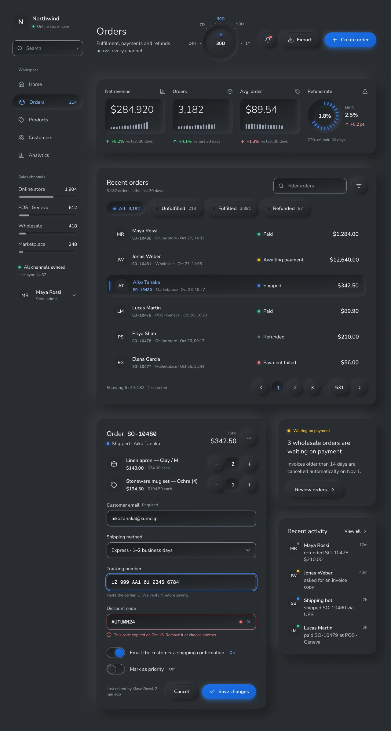
led/greenpaid,led/amberawaiting,led/blueshipped,led/redfailed,led/greyrefunded,led/offunlit. Text:text/success,text/warning,text/danger. A status always pairs an LED with a word. - Dark design notes. Dark has its own values instead of inverted light ones: a mid-dark material
(
#2a2d32), a highlight one step lighter (#34383e), a near-black shade (#1c1e21), and the same saturated blue keys with white text. No pale hero, pale slab or white outer shadow. The three dark hexes are Tactile's adopted local parameters (from setproduct's guide, upstream unverified), not a neumorphism standard. - Core roles. Current Tactile components read only
tactile/*. Under Theme = Tactile, the core--ns-*compatibility roles resolve to the build values (ground#e0e5ec/#2a2d32, primary#1a6fe8, ring#1e7bff/#3b8bff, input border#6a759e/#7a8498; see NetScript Mapping). Export validation of these values is pending in the token export (#2414).
Typography
| Role | Size / line | Weight | Used for |
|---|---|---|---|
| title | 32/40 | Regular 400 | Page title "Orders" |
| kpi | 32/38 | Light 300 | KPI numerals in readouts |
| section | 22/28 | Regular | Plateau titles ("Recent orders", "Order") |
| heading | 20/28 | Regular | Notice sentence, "Recent activity" |
| money | 18 | SemiBold 600 | Totals, brand name |
| label | 16 | SemiBold | Keys, names, nav selected, values |
| body | 16 | Regular | Nav, field values, descriptions |
| caption | 13 | Regular | Meta, sub-labels, helpers (smallest size) |
| data | 13 (16 in fields) | Geist Mono Medium | Order IDs, tracking and discount codes |
- Nunito Sans (OFL) everywhere, sentence case, no mono caps. Geist Mono (OFL) only for IDs
and codes. Fallbacks:
"Nunito Sans", ui-rounded, system-ui;"Geist Mono", ui-monospace. - Body is 16 Regular, not Themesberg's Light 300, because Light at 16px loses stroke contrast on a soft ground. Light is used only for the 32px KPI numerals.
- Smallest text is 13px (audited). Many Figma text nodes use auto line height; the YAML values are the rendered box heights (22 at 16px, 18 at 13px). Exact line heights are pending in #2414.
- Text is not bound to
type/*variables. The Theme modeTactilelists Nunito Sans (font/*) and Geist Mono (font/mono), but itstype/*sizes are older values that do not match this table. The fonts set on the text nodes, as listed above, are the source of truth until the tokens build (#2414).
Layout
- Canvas: 1280 wide, padding 48, columns gap 44: a 232px unboxed sidebar and a 916px main column. Regions stack with 48px gaps.
- Sidebar (H0): brand, a 52px search well, 52px nav rows (gap 6), sales-channel meters (8px wells), sync status LED, profile ghost key.
- Header: title and subtitle; the range dial (212×164); bell, Export and Create order keys (48px, gap 16).
- KPI plateau (916×241, padding 28, gap 24): three readouts (197×116 wells) and a refund gauge (112px bezel). The side padding is 27px, not 28px, because the plateau's 1px stroke counts in layout. This keeps the four columns 197 wide on whole pixels, so the readout edges render hard.
- Orders plateau (916×774, padding 32, gap 24): title, filter well and filter key; status key bank (gap 12); six order tiles of 850×72 with 12px spacing and no rules; pagination keys.
- Detail row (gap 40): order editor plateau 556 wide (padding 32, gap 32: line items with steppers, four 52px fields with labels above and 24px between fields, two switches, actions) and a 320px column with the payment notice and activity plateaus (gap 40).
- Density: none set or bound. Hit sizes come from the adopted guidelines: wells 52, keys 44–48, nav 52.
Elevation & Depth
The physical model (applies to every node)
-
Single light. The light comes from the top left (135°). Raised things cast a highlight up-left and a shade down-right. Wells show the shade on their top-left inner edge and the highlight on their bottom-right inner edge. No per-element angles.
-
Four heights.
Height Meaning Who H0 ground Printed, no effect Text, icons, avatars, chips, LEDs (glow only), grooves, unselected tiles, ghost controls H+1 plateau Low organizing regions, one level only, never pressable KPI group, Orders, Order editor, Payment notice, Recent activity H+2 key Only things you can press Buttons, icon keys, status keys, pagination, stepper ±, dial knob, switch knob H−1 well Receives input or holds a value Fields, search, meters, switch tracks, KPI readouts, gauge and dial bezels H−1 pressed A key in its pressed, selected or on state Selected nav, active status key, selected tile, current page -
Touch semantics. A state change is a height change, H+2 → H−1. A pressed element's content moves 1px down-right (padding 1/19 instead of 0/20) and takes
text/accentink. -
Nesting budget. ground → plateau → (key or well), never deeper. The one exception is a control's own thumb in its own well: the dial knob in its bezel, the switch knob in its track. Inside a plateau, group with spacing, printed grooves and one tone step. A plateau organizes a region and is the only raised object that cannot be pressed. A key is raised because it can be pressed. Never make a plateau look like a key, and never raise a non-pressable element to key height.
-
Throw scales with size. Keys use three bands (
key-s3/6,key-m6/12,key-l12/24). The 2× rule (blur = twice the offset) applies to those key bands and to the symmetricpressed-*,well-sandwell-linsets. Two named recipes are exceptions; use them exactly as listed and do not re-derive them:Tactile/plateau±18 / blur 44, andTactile/well-minset 2px 2px 5px+inset -3px -3px 7px(Themesberg$shadow-inset). -
Convex and concave. Every key at rest is convex; every well and pressed state is concave; plateaus are flat material. No sheen, no bands.
Effect styles (CSS)
| Style | CSS box-shadow (light; dark swaps in the dark highlight and shade) |
Used by |
|---|---|---|
Tactile/plateau |
18px 18px 44px var(--shade), -18px -18px 44px var(--hi) |
All H+1 |
Tactile/key-s |
3px 3px 6px var(--shade), -3px -3px 6px var(--hi) |
Keys ≤ 30px (switch knob 28) |
Tactile/key-m |
6px 6px 12px …, -6px -6px 12px … |
Keys 44–48px |
Tactile/key-l |
12px 12px 24px …, -12px -12px 24px … |
Dial knob 88px |
Tactile/key-primary-m |
key-m + 0 6px 16px var(--ns-tactile-glow-accent) |
Primary keys |
Tactile/knob-on |
key-s + 0 0 10px var(--ns-tactile-glow-accent) |
ON switch knob |
Tactile/well-s |
inset 2px 2px 4px var(--ishade), inset -2px -2px 4px var(--ihi) |
Tracks 8–34px |
Tactile/well-m |
inset 2px 2px 5px …, inset -3px -3px 7px … (Themesberg) |
Fields, search, qty window |
Tactile/well-l |
inset 8px 8px 16px …, inset -8px -8px 16px … |
Readouts, bezels |
Tactile/pressed-s |
inset 3px 3px 6px …, inset -3px -3px 6px … |
Current page key 44 |
Tactile/pressed-m |
inset 6px 6px 12px …, inset -6px -6px 12px … |
Nav, status key, selected tile |
Tactile/pressed-xs |
inset 2px 2px 4px …, inset -2px -2px 4px … |
Defined for keys ≤ 30px; currently unused (steppers are 44px) |
Tactile/led-glow/* |
0 0 10px var(--ns-tactile-glow-*) |
Lit LEDs only |
--shade/--hi = tactile/shadow/{shade,highlight}; --ishade/--ihi =
tactile/inset/{shade,highlight}. Six older styles (Tactile/surface, control, solid,
pressed, well, thumb) belong to superseded components and must not be used.
Audit
Counts of effect-bearing nodes per design in the Figma library. They are not yet verified by an export (#2414).
| Frame | Plateau | Key | Well | Pressed | LED | Rims (control + danger) | In-hue borders | Ad-hoc effects |
|---|---|---|---|---|---|---|---|---|
| Orders · Light | 5 | 23 | 19 | 4 | 18 | 8 + 1 | 27 | 0 |
| Orders · Dark | 5 | 23 | 19 | 4 | 18 | 8 + 1 | 27 | 0 |
| Components | 2 | 38 | 42 | 14 | 20 | 32 + 2 | 38 | 0 |
All 23 keys per Orders frame are convex, every effect comes from a Tactile/* style matching the
node's class prefix, and there are 0 nesting breaches.
Shapes
- Shape by role. Circles for round keys (bell, filter, pagination, stepper ±, dial knob, switch knob) and printed discs; pills for action keys, status keys, nav rows and tracks; rounded rectangles for plateaus (r24), tiles (r20), readouts (r18) and fields (r14).
- Concentric radii: switch track r17 with 3px padding → knob 28 (r14); focus ring r18 around an r14 field with a 2px gap.
- Borders:
- In-hue border
tactile/edge/border(1px inside,#d1d9e6/#24272b) on plateaus, keys and pressed elements: decorative, 1.12:1 / 1.09:1. - Rim
tactile/edge/control(1px inside,#6a759e/#7a8498) only on text inputs, checkbox, radio, switch track, the off switch knob and the slider knob. It is a separate top layer (H0 rim (edge/control)) above the well's surface layer, on integer edges, so the inset shadow cannot cover it. - Primary keys have no border.
- In-hue border
- No hairline rules inside plateaus; separate content with spacing. The only printed lines are the lens rings (grooves) on the dial and gauge.
Components
| Component | Variant used | Anatomy and states |
|---|---|---|
| Key | H+2 key/* |
Convex pill or circle, 44–48px, in-hue border, key-m. Pressed: concave, pressed-m, accent ink, content +1px ↘. Disabled: flat surface/disabled, no effect, text/disabled. |
| Primary key | H+2 key/Create order (primary), Save changes |
Accent convex fill, white text (4.68–5.82:1), key-primary-m glow. |
| Field / select | H0 control/* input |
52px r14: concave surface layer (well-m) + rim layer. Focus: 2px accent ring, 2px gap (r18). Invalid: rim becomes text/danger, red LED inside, helper with icon in text/danger. |
| Switch | H0 control/switch track |
60×34 r17 well-s + rim. Off knob: convex key-s with rim. On knob: accent, knob-on glow, "On" caption in text/accent. |
| Checkbox / radio | Components sheet (H0 control/checkbox check, radio check) |
28px well-s (checkbox radius 8, radio r14) with rim; checked prints an accent check or a 12px dot, no glow. Disabled: flat, no rim. |
| Stepper | Quantity stepper |
− and + as 44px round keys (key-m), value in a 48×44 well-m window. |
| Slider | Components sheet | Track well-s, fill printed in strong ink, convex knob key-s with rim. |
| Status filter | Status keys |
A bank of keys, not a segmented track: the active key sinks (pressed-m), takes accent ink and lights its LED; inactive keys show an unlit LED. |
| Order list | Order tiles |
Six 72px tiles, gap 12, no rules. Unselected: flat H0. Selected: pressed-m, accent ink on name and ID, 4×32 blue LED edge. |
| KPI | H-1 well/KPI readout |
197×116 well-l: Light 32 numeral + 14 ink bars (5px, radius 2.5, gap 4, all text/muted at 100%, trend by height only). Delta below in success/danger text. |
| Refund gauge | H-1 well/gauge bezel |
112px bezel; 24 radial LED segments, 17 lit in blue (72% of the 2.5% limit); printed lens rings and value. |
| Range dial | Range dial · 30D |
118px bezel (well-l) holding an 88px 56-tooth convex knob (key-l); ticks and labels printed; selected range in accent ink; blue pointer LED. |
| Nav item | H0 nav/* |
52px pill, printed at rest; selected = pressed-m, accent ink. |
| Notice | H+1 plateau/Payment notice |
Plateau with an amber LED label, 20/28 sentence, convex "Review orders" key. |
| Activity | H+1 plateau/Recent activity |
Printed rows: tone avatar disc with status LED, name, text, time. |
| Dialog / sheet | Not drawn | Would be one plateau over the ground; pending in #2416. |
Do's and Don'ts
- Do derive every shadow from the one top-left light and the effect styles above. Symptom to avoid: depth applied at random, with no consistent surface shape, shadow direction or sense of touch.
- Do weight each neumorphism source (Themesberg, setproduct, flutter_neumorphic) by its source class in Sources.
- Don't shade keys with a visible linear gradient. Symptom: in dark mode the keys look like dated gradient buttons. Curvature is ±3.5% lightness at 145°.
- Don't raise anything to key height (H+2) that cannot be pressed. The H+1 plateaus are the only raised non-pressable objects: low, one-level organizing regions. Cards, rows and tiles inside them are printed (H0) at rest.
- Do show selection as sunk: concave, accent ink, 1px content shift, and an LED or label. Shadow alone is not a state.
- Don't nest deeper than ground → plateau → key/well, except a control's own thumb.
- Do scale key throw with size: 3/6 small, 6/12 medium, 12/24 large (blur = 2 × offset for the
key bands). Keep the named exceptions exact: plateau ±18 / blur 44 and the
well-minset 2/5 + −3/7. - Do put the 3:1 rim only on inputs, checkbox, radio, switch track and knobs, as a top layer on whole pixels. Don't outline keys, cards or labelled actions with it.
- Do keep history bars at full
text/mutedwith no per-bar fade: 4.82–5.58:1 light and 5.34–5.66:1 dark on the readout floor. - Don't build dense tables or many-field forms in Tactile. Use soft tiles, spacing and few fields per view. This is Tactile's adopted design rule, taken from setproduct's guide (upstream unverified). It is not a universal neumorphism standard. Order lists use tiles instead of a seven-column table for this reason.
- Don't use type below 13px, mono caps or Light weight for body text.
- Do design dark with a mid-dark material and a one-step highlight; never a pale hero, pale primary or white outer shadow.
Iconography & Imagery
- Lucide-named stroke icons (
icon/house,icon/package,icon/tag,icon/users,icon/chart-column,icon/bell,icon/download,icon/plus,icon/triangle-alert), 18–20px, printed in text inks. Lucide is ISC. - Avatars and product thumbnails are printed
surface/tonediscs and chips (44 r22, 40 r20, 48 r14) with initials or a glyph. No photos. - LEDs are the only colour imagery: 6–9px dots, a 4×32 bar on the selected tile, gauge segments.
Motion & States
- Pressing is a height change: rest (key-m) → pressed (pressed-m) with the content shifted 1px
down-right. Releasing reverses it. Durations and easing are pending in #2419; animate
box-shadowandtransformonly. - Selection persists as the pressed height plus accent ink and LED. Focus adds the 2px accent ring without changing height.
- Reduced motion: switch heights instantly; keep the ink and LED changes.
- Forced colors and
prefers-contrast: more: box-shadows disappear, so keep transparent borders that become visible and swap to the rims. Pending in #2419.
Accessibility
| Pair | Light | Dark |
|---|---|---|
text/strong / text/body on base |
11.65 / 9.27 | 12.44 / 8.73 |
text/muted on base |
5.79 | 5.43 |
text/body on darkest concave tone |
7.85 | 10.68 |
text/accent on darkest concave tone |
4.94 | 7.62 |
| White on primary key (start / end) | 4.68 / 5.82 | 4.68 / 5.82 |
Rim edge/control on ground outside |
3.57 (pixel #6a759e) |
3.67 (pixel #7a8498) |
| Rim against the shaded inner edge | 2.73 (#c0cad8) |
4.29 (#1f2125) |
| Off knob rim on knob face / on track | 3.73 / 3.43 | 3.64 / 3.84 |
| KPI bars on readout floor | 4.82–5.58 | 5.34–5.66 |
Focus ring accent on base |
3.11 | 4.16 |
These values were sampled on pixels of 1x exports of the Light and Dark Orders designs. A second
measurement on rendered pixels gives the rim against the common material as measured #6a759e /
#e0e5ec 3.5666:1 and #7a8498 / #2a2d32 3.6723:1, and the history ink against the common
material as measured 5.7895:1 light and 5.4319:1 dark.
- Known exceptions: the in-hue border (1.12:1) is decorative; disabled text (2.0:1) is exempt; unlit LEDs (1.24:1) always sit next to a word.
- Hit targets: keys 44–48, fields 52, nav rows 52, switch 60×34.
- RTL: the light direction stays top-left (physical); mirror layout and the 1px pressed shift. Pending in #2419.
NetScript Mapping
| Layer | Value |
|---|---|
| Figma Theme mode | Tactile. Tactile components bind no Theme variables. The mode's core roles match the build (see below); its type/* sizes and shadow recipe are older values that do not match this file |
| Base gray × accent | not used; the language lives in tactile/* Scheme roles |
| Density | none set or bound |
| Flavor | n/a |
data-theme |
tactile |
| Language roles | tactile/* → --ns-tactile-* (40 roles). Surfaces: surface/{base,tone,well,disabled,accent,accent-start,accent-end}, convex/{start,end}, concave/{start,end}. Light: shadow/{highlight,shade}, inset/{highlight,shade}, groove/{light,dark}. Edges: edge/{border,control}. Text: text/{strong,body,muted,disabled,accent,on-accent,danger,success,warning}. Accent: accent, glow/{accent,green,amber,blue,red}, led/{off,green,amber,blue,grey,red} |
- Node-level exceptions: none. No Tactile node binds a primitive.
- Core compatibility roles under Theme = Tactile. Tactile components don't read them, but they
resolve to the build:
- the material ground
#e0e5ec/#2a2d32for bg, card and raised; primary#1a6fe8(hover#1560cf), with whiteprimary-fg(4.68:1);ring#1e7bff/#3b8bff(3.11 / 4.16:1 on the ground);primary-text#1550b5/#79b0ff(5.83 / 6.23:1);input-border#6a759e/#7a8498(3.57 / 3.67:1);- Nunito Sans, with Geist Mono for mono;
- radii control 999, input 14 and card 24.
- the material ground
- How the mode is built. It uses a slate neutral ramp and a blue accent ramp. The ground, the solid accent, the ring, accent step 11 and gray step 10 are raw values in the mode, because no primitive exists for them.
- Status. Values come from the NetScript Figma library. Names are provisional until the tokens
build (#2414), including all 40
tactile/*roles; the Theme mode's raw values duplicatetactile/*today, and the tokens build owns the aliasing. Line heights, hover, the full state matrix for every component and dialog anatomy are pending in #2416. Press animation, forced-colors and contrast-preference behaviour and RTL are pending in #2419; runtime behaviour is unproven until then.
Sources
- Source classes. Every number in this file belongs to one of four classes:
- Verified upstream (checked against the pinned upstream files on 2026-10-28):
- Themesberg Neumorphism UI, MIT,
_variables.scssatd17658d(unchanged since0ba4d96):$shadow-insetinset 2px 2px 5px,inset -3px -3px 7px(L146);$box-shadow-soft6/12 and$box-shadow-light3/6 (L147–L148);$gray-400#D1D9E6as$input-border-colorat$border-width.0625rem (L32, L61, L217, L484–L485);$card-border-colorrgba($gray-100, .05)(L827); Nunito Sans, base weight Light, headings Normal (L252–L279); radius .55rem and pill 2rem (L224, L229). Themesberg's rule that hover and active use the inset shadow was not checked upstream. - flutter_neumorphic, Apache-2.0, at
57f2b1f:theme.dartdefaultLightSource.topLeft(L25) andsurfaceIntensity0.25 (L375);shape.dartconcave,convex,flat(L5–L8).
- Themesberg Neumorphism UI, MIT,
- Reference-image recipe: taken from a reference image, not from a published source. Large
objects drop a shadow of blur 50 at ±28,
#0D275016% plus white; inner shadows blur 43–48 at ±26–31. - Adopted local parameters, upstream unverified: everything attributed to setproduct's
neumorphism guide, and the plateau range "±16–20 / 36–50", comes from secondary notes; the
original pages were not checked. That covers the
#E0E5ECbase and#A3B1C6shade, the dark#2A2D32/#34383E/#1C1E21, raised ±8/16 and pressed 6/12, radii 12–20, body ≥ 16px at ≥ 7:1, the H1–caption sizes, 44px hit targets, "shadow alone is not a state" and the advice against dense tables. Tactile uses them as its own parameters; none is a universal neumorphism standard. - Adopted design judgement: the four-height model and nesting budget, the size bands, the
plateau 18/44, the ±3.5% lightness curvature at ≈145° (a local reading of
surfaceIntensity), the 60% same-hue shade, the rim values, body Regular instead of Light, and tiles instead of a table. The rims are#6A759E/#7A8498rather than the lighter#707BA4/#707A8F, because those measure 2.78:1 on the concave floor and 2.82:1 on the convex knob.
- Verified upstream (checked against the pinned upstream files on 2026-10-28):
- Not copied: Themesberg's
#e6e7eepalette and components; Polaris tokens (the licence restricts look-alikes outside Shopify apps). - Invented fixture content: the "Northwind" store, orders SO-10477…SO-10482, customers, amounts, KPI values, sales-channel counts (1,904 / 612 / 418 / 248), line items ("Linen apron — Clay / M", "Stoneware mug set — Ochre (4)"), the 2.5% refund limit, activity entries and the AUTUMN24 code are demo data. Counts must match the shared fixture (Refunded 87 of 3,182).