Liquid
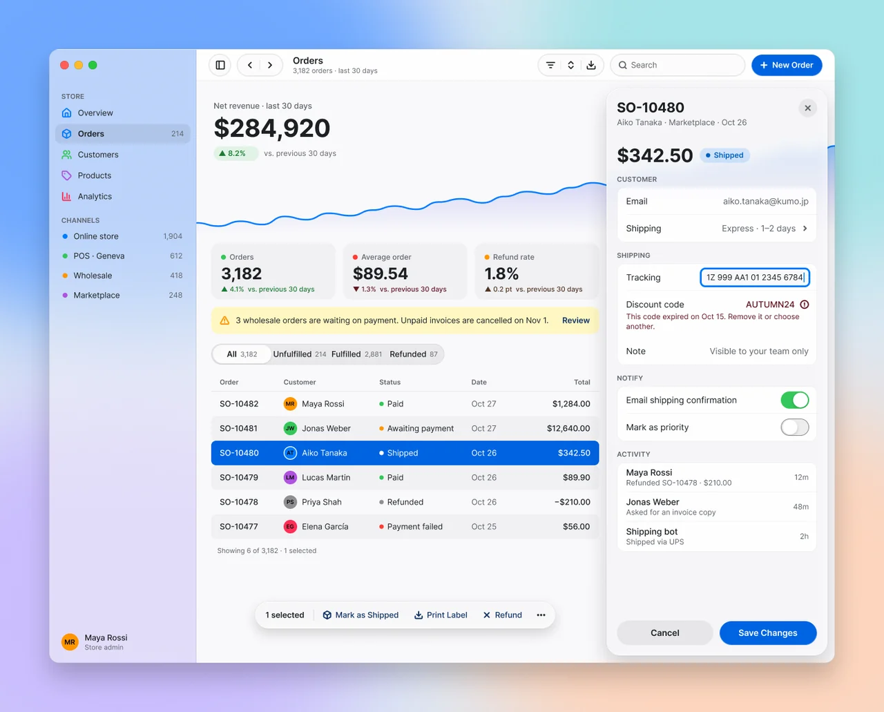
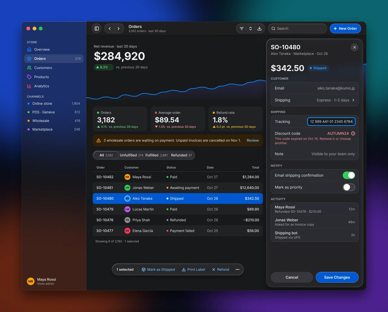
macOS 27 Liquid Glass over a real desktop: a translucent edge-to-edge sidebar, kit-recipe glass toolbar groups, and a lensing inspector sheet and selection bar floating over opaque content.
On this page
Light and dark
Liquid
Specification values · alpha
Theme values
Values: Colors
| Property | Value |
|---|---|
card | #f9f9fb |
card-dark | #18191b |
muted | #f0f0f3 |
muted-dark | #212225 |
surface-raised | #ffffffd1 |
surface-raised-dark | #2b2e36c7 |
fg | #1c2024 |
fg-dark | #edeef0 |
muted-fg | #60646c |
muted-fg-dark | #b0b4ba |
primary-text | #113264 |
primary-text-dark | #70b8ff |
success-text | #2a7e3b |
success-text-dark | #71d083 |
warning-text | #4f3422 |
warning-text-dark | #ffca16 |
warning-subtle | #fff7c2 |
warning-subtle-dark | #302008 |
destructive-text | #641723 |
destructive-text-dark | #ff9592 |
material-track | #7575801f |
material-track-dark | #7575803d |
material-fill-strong | #ffffffd1 |
material-fill-strong-dark | #2b2e36c7 |
liquid-primary-default | #0063e1 |
liquid-primary-default-dark | #0058d0 |
liquid-primary-fg | #ffffff |
liquid-primary-fg-dark | #ffffff |
liquid-primary-text | #0066cc |
liquid-primary-text-dark | #409cff |
liquid-material-glass-sidebar | #f3f3f694 |
liquid-material-glass-sidebar-dark | #1c1c1f85 |
liquid-material-glass-control | #fbfbfb |
liquid-material-glass-control-dark | #2c2c2e |
liquid-material-glass-sheet | #f5f5f7b8 |
liquid-material-glass-sheet-dark | #262629cc |
liquid-material-glass-float | #f7f7f8b8 |
liquid-material-glass-float-dark | #2c2c2eb2 |
liquid-toolbar-scroll-edge | #ffffffd9 |
liquid-toolbar-scroll-edge-dark | #1e1e1ed9 |
liquid-toolbar-hairline | #0000000f |
liquid-toolbar-hairline-dark | #00000099 |
liquid-sidebar-selection | #00000012 |
liquid-sidebar-selection-dark | #ffffff1a |
liquid-effect-outline | #e3e3e6 |
liquid-effect-outline-dark | #00000099 |
liquid-effect-side | #f2f2f2 |
liquid-effect-side-dark | #0000004d |
liquid-effect-specular | #ffffffe5 |
liquid-effect-specular-dark | #ffffff24 |
liquid-accent-system | #007aff |
liquid-accent-system-dark | #0a84ff |
liquid-border-ring | #007aff |
liquid-border-ring-dark | #0a84ff |
liquid-border-input | #86868b |
liquid-border-input-dark | #8e8e93 |
liquid-switch-on-track | #34c759 |
liquid-switch-on-track-dark | #30d158 |
liquid-tag-green | #34c759 |
liquid-tag-green-dark | #30d158 |
liquid-success-text | #1e7b34 |
liquid-status-shipped-fg | #005fbe |
liquid-status-shipped-fg-dark | #409cff |
liquid-info-bg | #e8f1fd |
liquid-info-bg-dark | #17304f |
liquid-window-close | #ff5f57 |
liquid-window-minimize | #febc2e |
liquid-window-zoom | #28c840 |
Values: Typography
| Property | Value |
|---|---|
hero.fontFamily | Inter |
hero.fontSize | 40px |
hero.fontWeight | 700 |
hero.lineHeight | 48px |
hero.letterSpacing | -0.015em |
amount.fontFamily | Inter |
amount.fontSize | 30px |
amount.fontWeight | 700 |
amount.lineHeight | 36px |
amount.letterSpacing | -0.015em |
kpi.fontFamily | Inter |
kpi.fontSize | 26px |
kpi.fontWeight | 700 |
kpi.lineHeight | 32px |
kpi.letterSpacing | -0.015em |
sheet-title.fontFamily | Inter |
sheet-title.fontSize | 22px |
sheet-title.fontWeight | 700 |
sheet-title.lineHeight | 28px |
sheet-title.letterSpacing | -0.015em |
window-title.fontFamily | Inter |
window-title.fontSize | 15px |
window-title.fontWeight | 600 |
window-title.lineHeight | 18px |
window-title.letterSpacing | -0.005em |
row.fontFamily | Inter |
row.fontSize | 14px |
row.fontWeight | 400 |
row.lineHeight | 18px |
row.letterSpacing | -0.004em |
body.fontFamily | Inter |
body.fontSize | 13px |
body.fontWeight | 400 |
body.lineHeight | 17px |
body.letterSpacing | -0.004em |
emphasis.fontFamily | Inter |
emphasis.fontSize | 13px |
emphasis.fontWeight | 600 |
emphasis.lineHeight | 17px |
helper.fontFamily | Inter |
helper.fontSize | 12px |
helper.fontWeight | 400 |
helper.lineHeight | 16px |
helper.letterSpacing | 0.003em |
caption.fontFamily | Inter |
caption.fontSize | 11px |
caption.fontWeight | 600 |
caption.lineHeight | 14px |
caption.letterSpacing | 0.03em |
data.fontFamily | Inter |
data.fontSize | 13px |
data.fontWeight | 500 |
data.lineHeight | 17px |
data.fontFeature | "tnum" 1 |
Values: Radii
| Property | Value |
|---|---|
none | 0px |
field | 7px |
row | 8px |
item | 10px |
group | 12px |
platter | 14px |
window | 16px |
sheet | 22px |
full | 9999px |
Values: Spacing
| Property | Value |
|---|---|
desktop-margin | 80px |
sheet-gap | 12px |
sidebar | 240px |
toolbar | 52px |
control | 36px |
content-inset | 24px |
stack | 12px |
row | 40px |
grouped-row | 44px |
Values: Component recipes
| Property | Value |
|---|---|
window.backgroundColor | {colors.card} |
window.rounded | {rounded.window} |
window.width | 1280px |
window.height | 1000px |
sidebar.backgroundColor | {colors.liquid-material-glass-sidebar} |
sidebar.width | 240px |
sidebar-dark.backgroundColor | {colors.liquid-material-glass-sidebar-dark} |
sidebar-item-selected.backgroundColor | {colors.liquid-sidebar-selection} |
sidebar-item-selected.textColor | {colors.fg} |
sidebar-item-selected.typography | {typography.emphasis} |
sidebar-item-selected.rounded | {rounded.item} |
sidebar-item-selected.height | 32px |
toolbar-scroll-edge.backgroundColor | {colors.liquid-toolbar-scroll-edge} |
toolbar-scroll-edge.height | 52px |
toolbar-group.backgroundColor | {colors.liquid-material-glass-control} |
toolbar-group.textColor | {colors.fg} |
toolbar-group.rounded | {rounded.full} |
toolbar-group.height | 36px |
toolbar-group-dark.backgroundColor | {colors.liquid-material-glass-control-dark} |
toolbar-group-dark.textColor | {colors.fg-dark} |
button-prominent.backgroundColor | {colors.liquid-primary-default} |
button-prominent.textColor | {colors.liquid-primary-fg} |
button-prominent.typography | {typography.emphasis} |
button-prominent.rounded | {rounded.full} |
button-prominent.height | 36px |
button-prominent-dark.backgroundColor | {colors.liquid-primary-default-dark} |
button-prominent-dark.textColor | {colors.liquid-primary-fg-dark} |
kpi-platter.backgroundColor | {colors.muted} |
kpi-platter.textColor | {colors.fg} |
kpi-platter.typography | {typography.kpi} |
kpi-platter.rounded | {rounded.platter} |
kpi-platter.height | 92px |
kpi-platter.padding | 14px 16px |
banner.backgroundColor | {colors.warning-subtle} |
banner.textColor | {colors.fg} |
banner.rounded | {rounded.group} |
banner.height | 44px |
banner.padding | 0 14px |
segmented-track.backgroundColor | {colors.material-track} |
segmented-track.rounded | {rounded.full} |
segmented-track.height | 34px |
segmented-track.padding | 2px |
segment-thumb.backgroundColor | {colors.material-fill-strong} |
segment-thumb.textColor | {colors.fg} |
segment-thumb.typography | {typography.emphasis} |
segment-thumb.rounded | {rounded.full} |
segment-thumb.height | 30px |
table-row-zebra.backgroundColor | {colors.muted} |
table-row-zebra.textColor | {colors.fg} |
table-row-zebra.typography | {typography.body} |
table-row-zebra.rounded | {rounded.row} |
table-row-zebra.height | 40px |
table-row-selected.backgroundColor | {colors.liquid-primary-default} |
table-row-selected.textColor | {colors.liquid-primary-fg} |
table-row-selected.rounded | {rounded.row} |
table-row-selected.height | 40px |
table-row-selected-dark.backgroundColor | {colors.liquid-primary-default-dark} |
table-row-selected-dark.textColor | {colors.liquid-primary-fg-dark} |
selection-bar.backgroundColor | {colors.liquid-material-glass-float} |
selection-bar.textColor | {colors.liquid-primary-text} |
selection-bar.rounded | {rounded.sheet} |
selection-bar.height | 44px |
selection-bar-dark.backgroundColor | {colors.liquid-material-glass-float-dark} |
selection-bar-dark.textColor | {colors.liquid-primary-text-dark} |
inspector-sheet.backgroundColor | {colors.liquid-material-glass-sheet} |
inspector-sheet.textColor | {colors.fg} |
inspector-sheet.rounded | {rounded.sheet} |
inspector-sheet.width | 360px |
inspector-sheet-dark.backgroundColor | {colors.liquid-material-glass-sheet-dark} |
inspector-sheet-dark.textColor | {colors.fg-dark} |
grouped-group.backgroundColor | {colors.surface-raised} |
grouped-group.rounded | {rounded.group} |
grouped-row.textColor | {colors.fg} |
grouped-row.typography | {typography.row} |
grouped-row.height | 44px |
grouped-row.padding | 0 15px |
switch-on.backgroundColor | {colors.liquid-switch-on-track} |
switch-on.rounded | {rounded.full} |
switch-on.width | 46px |
switch-on.height | 28px |
switch-off.backgroundColor | {colors.material-track} |
switch-off.rounded | {rounded.full} |
switch-off.width | 46px |
switch-off.height | 28px |
Read YAML values and notes
Plain text
version: alpha
name: Liquid
description: 'macOS 27 Liquid Glass over a real desktop: a translucent edge-to-edge sidebar, kit-recipe glass toolbar groups, and a lensing inspector sheet and selection bar floating over opaque content.'
colors:
  # Resolved from the NetScript Figma library, Light and Dark windows, Theme mode "Glass" (the
  # seed of Liquid's own mode).
  # Keys are the --ns-* suffix from each variable's code syntax.
  card: '#f9f9fb'
  card-dark: '#18191b'
  muted: '#f0f0f3'
  muted-dark: '#212225'
  surface-raised: '#ffffffd1'
  surface-raised-dark: '#2b2e36c7'
  fg: '#1c2024'
  fg-dark: '#edeef0'
  muted-fg: '#60646c'
  muted-fg-dark: '#b0b4ba'
  primary-text: '#113264'
  primary-text-dark: '#70b8ff'
  success-text: '#2a7e3b'
  success-text-dark: '#71d083'
  warning-text: '#4f3422'
  warning-text-dark: '#ffca16'
  warning-subtle: '#fff7c2'
  warning-subtle-dark: '#302008'
  destructive-text: '#641723'
  destructive-text-dark: '#ff9592'
  material-track: '#7575801f'
  material-track-dark: '#7575803d'
  material-fill-strong: '#ffffffd1'
  material-fill-strong-dark: '#2b2e36c7'
  liquid-primary-default: '#0063e1'
  liquid-primary-default-dark: '#0058d0'
  liquid-primary-fg: '#ffffff'
  liquid-primary-fg-dark: '#ffffff'
  liquid-primary-text: '#0066cc'
  liquid-primary-text-dark: '#409cff'
  liquid-material-glass-sidebar: '#f3f3f694'
  liquid-material-glass-sidebar-dark: '#1c1c1f85'
  liquid-material-glass-control: '#fbfbfb'
  liquid-material-glass-control-dark: '#2c2c2e'
  liquid-material-glass-sheet: '#f5f5f7b8'
  liquid-material-glass-sheet-dark: '#262629cc'
  liquid-material-glass-float: '#f7f7f8b8'
  liquid-material-glass-float-dark: '#2c2c2eb2'
  liquid-toolbar-scroll-edge: '#ffffffd9'
  liquid-toolbar-scroll-edge-dark: '#1e1e1ed9'
  liquid-toolbar-hairline: '#0000000f'
  liquid-toolbar-hairline-dark: '#00000099'
  liquid-sidebar-selection: '#00000012'
  liquid-sidebar-selection-dark: '#ffffff1a'
  liquid-effect-outline: '#e3e3e6'
  liquid-effect-outline-dark: '#00000099'
  liquid-effect-side: '#f2f2f2'
  liquid-effect-side-dark: '#0000004d'
  liquid-effect-specular: '#ffffffe5'
  liquid-effect-specular-dark: '#ffffff24'
  liquid-accent-system: '#007aff'
  liquid-accent-system-dark: '#0a84ff'
  liquid-border-ring: '#007aff'
  liquid-border-ring-dark: '#0a84ff'
  liquid-border-input: '#86868b'
  liquid-border-input-dark: '#8e8e93'
  liquid-switch-on-track: '#34c759'
  liquid-switch-on-track-dark: '#30d158'
  liquid-tag-green: '#34c759' # light delta-pill tint at 12% opacity
  liquid-tag-green-dark: '#30d158'
  liquid-success-text: '#1e7b34' # light green deltas; dark deltas bind core success-text
  liquid-status-shipped-fg: '#005fbe' # Shipped pill label and dot: 4.57:1 on its tint
  liquid-status-shipped-fg-dark: '#409cff'
  liquid-info-bg: '#e8f1fd'
  liquid-info-bg-dark: '#17304f'
  liquid-window-close: '#ff5f57'
  liquid-window-minimize: '#febc2e'
  liquid-window-zoom: '#28c840'
typography:
  hero: {
    fontFamily: Inter,
    fontSize: 40px,
    fontWeight: 700,
    lineHeight: 48px,
    letterSpacing: -0.015em,
  }
  amount: {
    fontFamily: Inter,
    fontSize: 30px,
    fontWeight: 700,
    lineHeight: 36px,
    letterSpacing: -0.015em,
  }
  kpi: {
    fontFamily: Inter,
    fontSize: 26px,
    fontWeight: 700,
    lineHeight: 32px,
    letterSpacing: -0.015em,
  }
  sheet-title: {
    fontFamily: Inter,
    fontSize: 22px,
    fontWeight: 700,
    lineHeight: 28px,
    letterSpacing: -0.015em,
  }
  window-title: {
    fontFamily: Inter,
    fontSize: 15px,
    fontWeight: 600,
    lineHeight: 18px,
    letterSpacing: -0.005em,
  }
  row: {
    fontFamily: Inter,
    fontSize: 14px,
    fontWeight: 400,
    lineHeight: 18px,
    letterSpacing: -0.004em,
  }
  body: {
    fontFamily: Inter,
    fontSize: 13px,
    fontWeight: 400,
    lineHeight: 17px,
    letterSpacing: -0.004em,
  }
  emphasis: { fontFamily: Inter, fontSize: 13px, fontWeight: 600, lineHeight: 17px }
  helper: {
    fontFamily: Inter,
    fontSize: 12px,
    fontWeight: 400,
    lineHeight: 16px,
    letterSpacing: 0.003em,
  }
  caption: {
    fontFamily: Inter,
    fontSize: 11px,
    fontWeight: 600,
    lineHeight: 14px,
    letterSpacing: 0.03em,
  }
  data: {
    fontFamily: Inter,
    fontSize: 13px,
    fontWeight: 500,
    lineHeight: 17px,
    fontFeature: '"tnum" 1',
  }
rounded:
  none: 0px
  field: 7px
  row: 8px
  item: 10px
  group: 12px
  platter: 14px
  window: 16px
  sheet: 22px
  full: 9999px
spacing:
  desktop-margin: 80px
  sheet-gap: 12px
  sidebar: 240px
  toolbar: 52px
  control: 36px
  content-inset: 24px
  stack: 12px
  row: 40px
  grouped-row: 44px
components:
  window: {
    backgroundColor: '{colors.card}',
    rounded: '{rounded.window}',
    width: 1280px,
    height: 1000px,
  }
  sidebar: { backgroundColor: '{colors.liquid-material-glass-sidebar}', width: 240px }
  sidebar-dark: { backgroundColor: '{colors.liquid-material-glass-sidebar-dark}' }
  sidebar-item-selected: {
    backgroundColor: '{colors.liquid-sidebar-selection}',
    textColor: '{colors.fg}',
    typography: '{typography.emphasis}',
    rounded: '{rounded.item}',
    height: 32px,
  }
  toolbar-scroll-edge: { backgroundColor: '{colors.liquid-toolbar-scroll-edge}', height: 52px }
  toolbar-group: {
    backgroundColor: '{colors.liquid-material-glass-control}',
    textColor: '{colors.fg}',
    rounded: '{rounded.full}',
    height: 36px,
  }
  toolbar-group-dark: {
    backgroundColor: '{colors.liquid-material-glass-control-dark}',
    textColor: '{colors.fg-dark}',
  }
  button-prominent: {
    backgroundColor: '{colors.liquid-primary-default}',
    textColor: '{colors.liquid-primary-fg}',
    typography: '{typography.emphasis}',
    rounded: '{rounded.full}',
    height: 36px,
  }
  button-prominent-dark: {
    backgroundColor: '{colors.liquid-primary-default-dark}',
    textColor: '{colors.liquid-primary-fg-dark}',
  }
  kpi-platter: {
    backgroundColor: '{colors.muted}',
    textColor: '{colors.fg}',
    typography: '{typography.kpi}',
    rounded: '{rounded.platter}',
    height: 92px,
    padding: 14px 16px,
  }
  banner: {
    backgroundColor: '{colors.warning-subtle}',
    textColor: '{colors.fg}',
    rounded: '{rounded.group}',
    height: 44px,
    padding: 0 14px,
  }
  segmented-track: {
    backgroundColor: '{colors.material-track}',
    rounded: '{rounded.full}',
    height: 34px,
    padding: 2px,
  }
  segment-thumb: {
    backgroundColor: '{colors.material-fill-strong}',
    textColor: '{colors.fg}',
    typography: '{typography.emphasis}',
    rounded: '{rounded.full}',
    height: 30px,
  }
  table-row-zebra: {
    backgroundColor: '{colors.muted}',
    textColor: '{colors.fg}',
    typography: '{typography.body}',
    rounded: '{rounded.row}',
    height: 40px,
  }
  table-row-selected: {
    backgroundColor: '{colors.liquid-primary-default}',
    textColor: '{colors.liquid-primary-fg}',
    rounded: '{rounded.row}',
    height: 40px,
  }
  table-row-selected-dark: {
    backgroundColor: '{colors.liquid-primary-default-dark}',
    textColor: '{colors.liquid-primary-fg-dark}',
  }
  selection-bar: {
    backgroundColor: '{colors.liquid-material-glass-float}',
    textColor: '{colors.liquid-primary-text}',
    rounded: '{rounded.sheet}',
    height: 44px,
  }
  selection-bar-dark: {
    backgroundColor: '{colors.liquid-material-glass-float-dark}',
    textColor: '{colors.liquid-primary-text-dark}',
  }
  inspector-sheet: {
    backgroundColor: '{colors.liquid-material-glass-sheet}',
    textColor: '{colors.fg}',
    rounded: '{rounded.sheet}',
    width: 360px,
  }
  inspector-sheet-dark: {
    backgroundColor: '{colors.liquid-material-glass-sheet-dark}',
    textColor: '{colors.fg-dark}',
  }
  grouped-group: { backgroundColor: '{colors.surface-raised}', rounded: '{rounded.group}' }
  grouped-row: {
    textColor: '{colors.fg}',
    typography: '{typography.row}',
    height: 44px,
    padding: 0 15px,
  }
  switch-on: {
    backgroundColor: '{colors.liquid-switch-on-track}',
    rounded: '{rounded.full}',
    width: 46px,
    height: 28px,
  }
  switch-off: {
    backgroundColor: '{colors.material-track}',
    rounded: '{rounded.full}',
    width: 46px,
    height: 28px,
  }
Overview
- Thesis: macOS 27 Liquid Glass over a real desktop. Glass is used only for navigation and controls (sidebar, toolbar groups, inspector sheet, selection bar, segmented thumb). Content stays opaque, and the wallpaper shows through the glass.
- Signature moves:
- Desktop under glass. The 1280×1000 window (radius 16) sits 80px inside a 1440×1160
wallpaper of five LAYER_BLUR 180 blobs. The 240px edge-to-edge sidebar is
liquid-material-glass-sidebar(58% light, 52% dark) with a 60px backdrop blur, so the wallpaper tints the navigation. - Specular rims. The sheet, the selection bar and the segmented thumb carry a 1px linear-gradient stroke (white 100→25→75% light, 34→5→18% dark), a 1px top inner highlight, a 20px inner glow and stronger lensing (refraction 0.55, depth 22, dispersion 0.25).
- Kit-recipe toolbar. 36px glass groups on a 52px hard scroll edge:
#FBFBFBfill, 0.5px outline, ±0.75px side shading, no drop shadow. A blue prominent capsule ends the toolbar.
- Desktop under glass. The 1280×1000 window (radius 16) sits 80px inside a 1440×1160
wallpaper of five LAYER_BLUR 180 blobs. The 240px edge-to-edge sidebar is
- Anchor: Apple macOS 27 / iOS 27 Liquid Glass, measured from Apple's macOS 27 Figma kit (see Sources). Taken: measured geometry and the toolbar-item recipe. Kit facts are applied as local corrections to the NetScript proportions. A faithful reproduction of the kit is the separate macOS 27 theme (planned, #2443). Not copied: SF Pro, SF Symbols, wallpapers, kit components. Expo's studies influenced "glass on navigation only" and the detached sheet.
- Family: Platform. Best for: pro desktop apps, inspectors, media and asset tools. Avoid
for: content-heavy reading and dense data entry; suggest
cupertinoorstudio. - Feel: luminous, spatial, current. It should look like the current macOS.
Colors
- Ground and surface ladder. Wallpaper (light
#6fa8ff,#9fe3e6,#ffd3b8,#c7b6ff, white; dark#1b4ddb,#0b8a94,#6a2bc2,#d9480f,#0a1230) → glass sidebar → opaque contentcard#f9f9fb/#18191b→ platters and zebra rowsmuted#f0f0f3/#212225→ floating glass (sheet 72% / 80%, selection bar 72% / 70%). - Accent policy.
liquid-primary-default#0063e1/#0058d0fills only the selected row, New Order and Save Changes, each with white text. Inline actions (Review, Mark as Shipped, Print Label, Refund) areprimary-text. Sidebar selection is grey (liquid-sidebar-selection, black 7% / white 10%), never blue, as in the macOS 27 kit. - Status colours. Status is a 7px dot plus a word. Dots and channel markers use the
scheme-correct Apple system hues through
liquid-tag-*: light#34c759,#ff9500,#af52de,#ff3b30,#8e8e93; dark#30d158,#ff9f0a,#bf5af2,#ff453a,#8e8e93. Green deltas useliquid-success-text#1e7b34in light andsuccess-text#71d083in dark; other deltas usedestructive-textandwarning-text. The banner iswarning-subtle. - Dark design notes. Dark glass is a smoky tint. The sheet is
#262629at 80%, the bar#2c2c2eat 70%, the sidebar#1c1c1fat 52%. Rims drop to 34→5→18% white. Top highlights drop from 90% to 22%. Outlines turn to black 60% (liquid-effect-outline). Primaries get darker (#0058d0), never paler. No white slab, white perimeter or white outer shadow.
Typography
- Family. Inter (OFL) stands in for SF Pro, which loads in Figma but renders blank from the
Plugin API. Code stack:
Inter, -apple-system, BlinkMacSystemFont, "SF Pro Text", system-ui. SF Pro is never embedded. #2414 decides whether the system face comes first. - Scale (literal in Figma, not bound to Theme
type/*). Hero 40/48 Bold −1.5%. Amount 30/36 Bold. KPI 26/32 Bold. Sheet title 22/28 Bold, all −1.5%. Window title 15/18 Semi Bold −0.5%. Grouped rows 14/18 −0.4%. Body and table 13/17 −0.4%, the macOS body size. Helper 12/16 +0.3%. Captions 11/14 Semi Bold: uppercase +2% (sidebar) and +3% (sheet), title case +0.3% (table headers). - Weights. Numbers and titles are Bold. Selection and captions are Semi Bold. Order IDs, totals and actions are Medium. Everything else is Regular.
Layout
- Desktop. 1440×1160; the window at (80, 80).
- Window. 1280×1000, radius 16. Sidebar 0–240. Content 240–1280. Toolbar band 52 across the content.
- Toolbar (y8, 36 tall). Sidebar toggle circle at x260. History group (back/forward, 75 wide). Title block. Spacer. View group (filter, sort, export, 108). Search capsule 220. New Order 116. Traffic lights are 14px at x18/41/64, y19, centred on the 52px row (kit pitch 23).
- Content column x264, 632 wide. Hero 0–300 (revenue plus an area chart bleeding the full 1040). KPI platters (3×203, 12 gap) at y316. Banner y420. Segmented y480. Table y528 (header 30, rows 40). "Showing 6 of 3,182 · 1 selected".
- Inspector sheet 360×924 at x908, y64: 12px from the toolbar, the right edge and the bottom. 17px inner inset. Sections 14px apart. Actions pinned to the bottom.
- Selection bar 489×44 at y900, floating over the content's bottom.
- Density.
Comfortable, set explicitly on both windows.
Elevation & Depth
Depth comes from material rather than shadow. Three glass weights sit over one opaque content plane.
| Layer | Recipe (CSS) | Who |
|---|---|---|
| Desktop | Wallpaper blobs filter: blur(180px) |
Behind the window |
| Window | border-radius: 16px; box-shadow: 0 22px 48px #00000038 (dark #00000087); 0.5px inner outline black 14% / white 16% |
The app window |
| Sidebar glass | background: var(--ns-liquid-material-glass-sidebar); backdrop-filter: blur(60px); inset 0 1px 0 white 90% / 22%; 1px trailing edge black 8% / white 12% |
Sidebar only |
| Scroll edge | background: var(--ns-liquid-toolbar-scroll-edge); backdrop-filter: blur(6px); border-bottom: 1px solid var(--ns-liquid-toolbar-hairline) |
The 52px toolbar band |
| Control glass | background: var(--ns-liquid-material-glass-control); box-shadow: 0 0 0 0.5px var(--ns-liquid-effect-outline), -0.75px 0 0.25px var(--ns-liquid-effect-side), 0.75px 0 0.25px var(--ns-liquid-effect-side), inset 0 1px 0 #ffffffe5 |
Toolbar groups, search |
| Float glass | Fill (-glass-sheet or -glass-float); backdrop-filter: blur(28px) (sheet) or blur(18px) (bar); border: 1px solid; border-image: linear-gradient(white 100%, 25%, 75%); box-shadow: 0 0 0 0.5px #00000014, 0 16px 40px #0000002e (bar 0 8px 24px #00000029), inset 0 1px 0 #ffffffe5, inset 0 0 20px #ffffff52 |
Inspector sheet, selection bar |
| Thumb glass | material-fill-strong, gradient rim, 0 1px 4px #0000001f |
Segmented thumb |
- Lensing: Figma
GLASSrefraction 0.55, depth 22, dispersion 0.25, light 0.90 at −50° on float and thumb glass; 0.35 / 12 / 0.15 / 0.85 on toolbar controls. CSS has no refraction. It ships as an SVG displacement filter where supported, otherwise as blur only. Runtime proof is pending in #2419. - Content (hero, platters, banner, table) has no material and no shadow.
Shapes
- Concentric: window 16; toolbar items full pills (36 → radius 18). Sheet and selection bar 22. Groups 12, inset 17px inside the sheet, with rows inset 15px inside the group. Rows 8. Fields 7. Platters 14. Banner 12. Sidebar items 10. The segmented track and thumb are pills (17 / 15).
- Strokes: 0.5px window and kit outlines; 1px group strokes (black 6% / white 10%); 1px grouped-row dividers (black 8%); 1.5px white ring on the selected avatar.
Components
| Component | Liquid variant and anatomy | States in Figma |
|---|---|---|
| Buttons | Prominent capsule 36 (liquid-primary-default, 1px white 35% stroke, inner highlight). Sheet actions 40 tall, radius 20: Cancel material-track, Save liquid-primary-default with white text. Bar actions 32, radius 16, primary-text icon plus label |
Rest |
| Toolbar groups | 36 tall, kit control glass, icon-only (sidebar, back/forward, filter/sort/export) | Rest |
| Search | 220×36 capsule, control glass, magnifier plus "Search" | Rest |
| Segmented control | 380×34 pill, material-track 12% plus 1px black 6%; thumb 95×30 float glass; label 13/17 (Semi Bold selected) plus an 11/14 count in muted-fg |
Selected / rest |
| Table | Header 30 (11/14 Semi Bold muted-fg, black 8% bottom rule). Rows 40, radius 8, zebra on even rows. 22px circular avatar disc in the scheme's Apple hue (light #ff9500, #34c759, #007aff, #af52de, #8e8e93, #ff2d55; dark #ff9f0a, #30d158, #0a84ff, #bf5af2, #8e8e93, #ff375f) with 9/12 black #000000 initials. Status dot plus word. Total right-aligned Medium |
Rest / zebra / selected |
| KPI platter | 203×92, radius 14, muted; 8px dot plus 12/16 Medium label; kpi value; 11/14 Medium delta with ▲/▼ (green deltas: liquid-success-text light, success-text dark) |
Rest |
| Hero | 40/48 value, a 24px delta pill (light: liquid-success-text #1e7b34 on liquid-tag-green #34c759 at 12%; dark: success-text #71d083 on the green tint), area chart #0a84ff 42% → #5e5ce6 16% → 0 with a 2.5px line |
Rest |
| Banner | 44 tall, radius 12, warning-subtle, 16px alert icon, one line, a "Review" action |
Rest |
| Nav item | 32 tall, radius 10, 17px colour-tinted icon, 13/17 label; selected = grey liquid-sidebar-selection plus Semi Bold. Channel rows 30 with an 8px dot and a count |
Rest / selected |
| Inspector sheet | Header (22/28 title, 13/17 subtitle, 30px close circle), amount 30/36 plus a status pill, grouped sections, pinned actions. No grabber. The "Shipped" pill's label and dot use liquid-status-shipped-fg (#005fbe / #409cff) on the 14% accent tint, 4.57:1 light; see Accessibility |
Rest |
| Fields | 176×28, radius 7, card fill. Focus is a solid 3px liquid-border-ring band (#007aff / #0a84ff): a 1px inside stroke plus a 2px solid ring (spread 2, radius 0), no translucent halo. Rest (not drawn): a 1px liquid-border-input edge |
Focus only |
| Invalid row | Label plus AUTUMN24 in destructive-text Medium plus an alert icon, then a 12/16 helper |
Error |
| Switch | 46×28, 24px white knob (0 2px 6px 18% plus 0 0 1px 8%); on liquid-switch-on-track (#34c759 / #30d158); off material-track with a 1px inside liquid-border-input edge (#86868b / #8e8e93) |
On / off |
| Selection bar | Floating 44px float-glass island: "1 selected", divider, Mark as Shipped, Print Label, Refund, More | Rest |
| Dialog | Not drawn. Use the inspector sheet recipe on <dialog> with radius 22 |
Pending in #2416 |
Do's and Don'ts
- Do keep the NetScript proportions (240 sidebar, 632 content, 360 sheet). Apply kit facts as local corrections. Rebuilding the layout from the kit produces the macOS 27 theme, not Liquid.
- Don't apply a 34px-window / 72px-toolbar template.
- Do put glass only on navigation and controls; content stays opaque (Apple materials guidance).
- Do put a desktop wallpaper behind the glass, never a flat page (GUIDELINES §5).
- Do keep sidebar selection grey and the toolbar items flat, with no drop shadow.
- Do put white text only on
#0063e1/#0058d0(5.42 / 6.35:1). Never on#0a84ff(3.65:1). - Do keep the colourful avatars: scheme-hue discs with black
#000000initials (light minimum 5.08:1 on#af52de, dark minimum 5.76:1 on#0a84ff). Don't put white initials on them (2.02–3.65:1), and don't swap them for a pastel template. - Do give editable fields and off-switch tracks a 1px
liquid-border-inputedge ≥3:1. The off track edge measures 3.59:1 light / 4.28:1 dark. - Do draw focus as a solid 3px
liquid-border-ringband (1px inside stroke plus a 2px solid ring), never a translucent halo: 3.98:1 light / 3.83:1 dark against the group. - Do keep tinted labels ≥4.5:1 at their actual composite. Light green deltas use
liquid-success-text#1e7b34(4.69:1 on the platter, 4.62:1 on the 12% green pill). - Do set the "Shipped" pill's label and dot in
liquid-status-shipped-fg(#005fbelight,#409cffdark) on the 14% accent tint: 4.57:1 light, 4.53:1 on the darkest pill tint. Never useliquid-primary-text#0066ccthere; it measures 4.10:1. Don't recolour the selected row's white label. - Do design dark as smoky glass with darker tints, dim rims and a darker blue. Never use a white perimeter or white shadow.
- Don't reuse Cupertino capsules or grouped cards. Keep the two themes visually distinct.
Iconography & Imagery
- Lucide (ISC) as an SF Symbols stand-in. 17px nav icons tinted per destination; 16px toolbar and
banner glyphs; 15px bar actions in
primary-text; 13–14px chevrons and close glyphs. - Avatars: circular, 22px (table) and 28px (account), scheme-correct Apple-hue fills with black initials (see Do's and Don'ts).
- The wallpaper is required: five blurred colour fields. Never use an Apple wallpaper or a photo with trademarks. Charts: one area chart with a gradient fill and a 2.5px line.
Motion & States
- States are pending in #2416 and runtime checks in #2419. Intended physics:
- glass lensing intensifies on press (the GUIDELINES "state physics" for Liquid);
- the segmented thumb and selection bar slide with a spring of about 300ms;
- the sheet presents from the trailing edge;
- hover adds
liquid-state-hover-overlay(black 6% / white 8%).
- Reduced motion (proposed): cross-fade instead of slide. Reduced transparency (proposed): glass
becomes opaque
liquid-surface-*, outlines kept. Neither variant is drawn yet.
Accessibility
Contrast ratios are measured on exported pixels.
| Pair | Light | Dark |
|---|---|---|
White on liquid-primary-default |
5.42:1 | 6.35:1 |
muted-fg on the sidebar glass composite |
#60646c/#e3e2f7 4.66:1 |
#b0b4ba/#18254f 7.12:1 |
| Green delta on a platter / delta pill | liquid-success-text #1e7b34 on #f0f0f3 4.69:1; pill 4.62:1 |
success-text #71d083 8.37:1; pill 6.89:1 |
"Shipped" status pill, liquid-status-shipped-fg on the 14% accent tint |
#005fbe on #cbdff9 4.57:1, 4.53:1 on the darkest tint #c9def9. liquid-primary-text #0066cc measures 4.10:1 here |
#409cff (passes) |
Avatar initials (black #000000) |
5.08:1 (#af52de) to 9.55:1 (#ff9500) |
5.76:1 (#0a84ff) to 10.39:1 (#30d158) |
Focus: 3px solid liquid-border-ring band |
#007aff 3.98:1 vs the group; 3.82:1 vs the field |
#0a84ff 3.83:1 vs the group; 4.82:1 vs the field |
Off-switch track edge (liquid-border-input) |
#86868b/#fefefe 3.59:1 |
#8e8e93/#2a2c32 4.28:1 |
- Hit targets: toolbar 36, rows 40, grouped rows 44, bar actions 32.
- RTL: mirror the sidebar, toolbar order, traffic lights and sheet side.
NetScript Mapping
| Layer | Value |
|---|---|
| Figma Theme mode | Liquid, its own mode in Theme B (set B), still seeded from Glass's values. Liquid's distinct values live in liquid/* and in literals |
| Base gray × accent | Radix slate × blue, via the Glass seed values (the frames resolve Base gray Neutral / Base accent Ink by default) |
| Density | Comfortable (explicit) |
| Flavor | n/a |
data-theme |
liquid |
| Language roles | liquid/*: 54 roles, --ns-liquid-*. The current design binds primary/default, primary/text, material/glass-{sidebar,control,sheet,float}, toolbar/{scroll-edge,hairline}, sidebar/selection, effect/{outline,side}, window/{close,minimize,zoom}, accent/system, border/ring, border/input, tag/{green,orange,purple,red,gray}, switch/on-track, success/text (light only) and status/shipped-fg (both schemes) |
- Roles pending in #2414. These values are still literal in Figma:
- the pink avatar hue
#ff2d55/#ff375f, which has noliquid-tag-*role yet; - the black avatar initials
#000000; - white labels and knobs, which move to
liquid-primary-fg; - hairlines (black 6–18% / white 10–28%), which need roles;
- the on-accent rims (white 30–35%) and the selected-avatar ring (white 90%);
- type and radii, because Liquid's mode still holds the
Glassscale, which belongs to Cupertino. - Green deltas bind
liquid-success-textin light and coresuccess-textin dark; #2414 picks one role.
- the pink avatar hue
- Status. Values come from the NetScript Figma library. Role registration, fonts and
tnumare tracked in #2414, component states, focus and reduced transparency in #2416, and runtime checks such as glass compositing, selection-bar occlusion and sheet motion in #2419.
Sources
- Measured from Apple's macOS 27 Figma kit: window radius 16; sidebar 240; toolbar 52; "Scroll
Edge Effect - Hard" blur 6; window controls 14px at x219/242/265 (pitch 23), 19px below the
toolbar top; toolbar items 36 with a 28px inner button; the item recipe is fill
#fbfbfb, 0.5px spread#ebebeb, ±0.75px#f2f2f2, no drop shadow. - NetScript deviations from the kit: outline
#e3e3e6(not#ebebeb); an addedGLASS(0.35), a 1px black 10% stroke and a top highlight on toolbar items; sidebar blur 60 (the inspected kit sidebar instance exposes no blur effect; the kit's canonical sidebar blur remains unverified). - Links: Apple Design Resources, Meet Liquid Glass, Get to know the new design system, Expo: Maps-style sheets.
- Not copied: SF Pro, SF Symbols, Apple wallpapers, kit components.
- Fixture content is invented: Northwind, every name, order, amount, channel split (1,904 / 612 / 418 / 248), tab counts (3,182 / 214 / 2,881 / 87), the revenue series and the 48m Jonas Weber activity entry.