Pixel
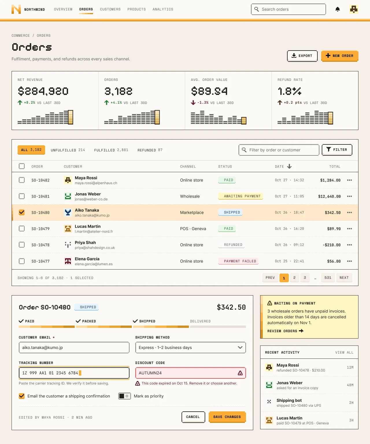
A NetScript-amber pixel language with Ore UI physics: banded amber stripes, stepped 2px-grid corners, Pixelify Sans numbers and Space Mono labels, and keys that sit on a 4px lip and press flat.
On this page
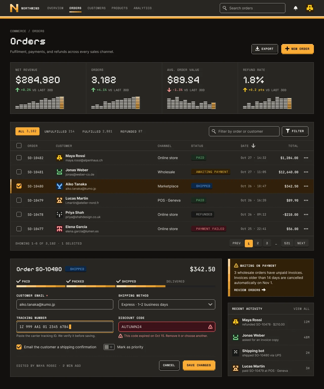
Light and dark
Pixel
Specification values · alpha
Theme values
Values: Colors
| Property | Value |
|---|---|
bg | #f4efe6 |
bg-dark | #12100e |
card | #fcfaf6 |
card-dark | #1b1916 |
surface-raised | #fcfaf6 |
surface-raised-dark | #282623 |
muted | #f1f0ef |
muted-dark | #222221 |
container | #e8e0d3 |
container-dark | #222221 |
selected | #ffeacb |
selected-dark | #31200b |
fg | #21201c |
fg-dark | #eeeeec |
muted-fg | #63635e |
muted-fg-dark | #b5b3ad |
border | #dad9d6 |
border-dark | #3b3a37 |
input-border | #82827c |
input-border-dark | #7c7b74 |
control-ink | #21201c |
control-ink-dark | #7c7b74 |
frame-ink | #21201c |
frame-ink-dark | #494844 |
ring | #12100e |
ring-dark | #ffc474 |
primary | #faab35 |
primary-dark | #faab35 |
primary-hover | #e79c27 |
primary-hover-dark | #ffba59 |
primary-fg | #12100e |
primary-fg-dark | #12100e |
primary-subtle | #ffeacb |
primary-subtle-dark | #31200b |
primary-text | #9c681a |
primary-text-dark | #ffc474 |
success-text | #2a7e3b |
success-text-dark | #71d083 |
success-subtle | #e9f6e9 |
success-subtle-dark | #1b2a1e |
warning-text | #4f3422 |
warning-text-dark | #ffca16 |
warning-subtle | #fff7c2 |
warning-subtle-dark | #302008 |
info-text | #113264 |
info-text-dark | #70b8ff |
info-subtle | #e6f4fe |
info-subtle-dark | #0d2847 |
destructive-text | #641723 |
destructive-text-dark | #ff9592 |
destructive-subtle | #feebec |
destructive-subtle-dark | #3b1219 |
destructive-fg | #ffffff |
destructive-fg-dark | #ffffff |
band-1 | #ffdba2 |
band-2 | #ffc673 |
band-3 | #ffb245 |
band-4 | #eda12e |
band-5 | #d38e22 |
pixel-lip-primary | #d38e22 |
pixel-lip-primary-dark | #d38e22 |
pixel-highlight-primary | #ffdba2 |
pixel-highlight-primary-dark | #ffc673 |
pixel-lip-secondary | #e8e0d3 |
pixel-lip-secondary-dark | #12100e |
pixel-face-secondary-hover | #f4efe6 |
pixel-face-secondary-hover-dark | #322f2b |
pixel-destructive-face | #ce2c31 |
pixel-destructive-face-dark | #ce2c31 |
pixel-lip-destructive | #a8222a |
pixel-lip-destructive-dark | #a8222a |
pixel-focus-gap | #21201c |
pixel-focus-gap-dark | #12100e |
pixel-recess-shade | #8a75502e |
pixel-recess-shade-dark | #00000073 |
pixel-tag-lip-success | #94ce9a |
pixel-tag-lip-success-dark | #12100e |
pixel-tag-lip-warning | #e9c162 |
pixel-tag-lip-warning-dark | #12100e |
pixel-tag-lip-info | #8ec8f6 |
pixel-tag-lip-info-dark | #12100e |
pixel-tag-lip-neutral | #cfceca |
pixel-tag-lip-neutral-dark | #12100e |
pixel-tag-lip-danger | #f4a9aa |
pixel-tag-lip-danger-dark | #12100e |
Values: Typography
| Property | Value |
|---|---|
display.fontFamily | Pixelify Sans |
display.fontSize | 40px |
display.fontWeight | 600 |
display.lineHeight | 48px |
kpi.fontFamily | Pixelify Sans |
kpi.fontSize | 40px |
kpi.fontWeight | 500 |
kpi.lineHeight | 48px |
heading.fontFamily | Pixelify Sans |
heading.fontSize | 24px |
heading.fontWeight | 600 |
heading.lineHeight | 32px |
body.fontFamily | Inter |
body.fontSize | 14px |
body.fontWeight | 400 |
body.lineHeight | 20px |
strong.fontFamily | Inter |
strong.fontSize | 14px |
strong.fontWeight | 700 |
strong.lineHeight | 20px |
label.fontFamily | Space Mono |
label.fontSize | 12px |
label.fontWeight | 400 |
label.lineHeight | 16px |
label.letterSpacing | 0.6px |
label-strong.fontFamily | Space Mono |
label-strong.fontSize | 12px |
label-strong.fontWeight | 700 |
label-strong.lineHeight | 16px |
label-strong.letterSpacing | 0.6px |
caption.fontFamily | Inter |
caption.fontSize | 12px |
caption.fontWeight | 400 |
caption.lineHeight | 16px |
data.fontFamily | JetBrains Mono |
data.fontSize | 13px |
data.fontWeight | 400 |
data.lineHeight | 18px |
data.fontFeature | "tnum" 1 |
Values: Radii
| Property | Value |
|---|---|
none | 0px |
step | 2px |
notch | 4px |
Values: Spacing
| Property | Value |
|---|---|
unit | 2px |
lip | 4px |
topbar | 64px |
band-stripe | 10px |
page-x | 40px |
section | 32px |
card-padding | 20px |
form-padding | 24px |
control | 40px |
tab | 32px |
row | 56px |
Values: Component recipes
| Property | Value |
|---|---|
button-primary.backgroundColor | {colors.primary} |
button-primary.textColor | {colors.primary-fg} |
button-primary.typography | {typography.label-strong} |
button-primary.rounded | {rounded.notch} |
button-primary.height | 40px |
button-primary.padding | 0 18px 4px 16px |
button-primary-lip.backgroundColor | {colors.pixel-lip-primary} |
button-primary-lip.height | 4px |
button-hero-highlight.backgroundColor | {colors.pixel-highlight-primary} |
button-hero-highlight.height | 2px |
button-outline.backgroundColor | {colors.surface-raised} |
button-outline.textColor | {colors.fg} |
button-outline.typography | {typography.label-strong} |
button-outline.rounded | {rounded.step} |
button-outline.height | 40px |
button-outline-dark.backgroundColor | {colors.surface-raised-dark} |
button-outline-dark.textColor | {colors.fg-dark} |
button-destructive.backgroundColor | {colors.pixel-destructive-face} |
button-destructive.textColor | {colors.destructive-fg} |
button-destructive.typography | {typography.label-strong} |
button-destructive.rounded | {rounded.notch} |
button-destructive.height | 40px |
tab-selected.backgroundColor | {colors.primary} |
tab-selected.textColor | {colors.primary-fg} |
tab-selected.typography | {typography.label-strong} |
tab-selected.rounded | {rounded.step} |
tab-selected.height | 32px |
page-key.backgroundColor | {colors.pixel-face-secondary-hover} |
page-key.textColor | {colors.fg} |
page-key.typography | {typography.label} |
page-key.rounded | {rounded.step} |
page-key.height | 32px |
field.backgroundColor | {colors.surface-raised} |
field.textColor | {colors.fg} |
field.typography | {typography.body} |
field.rounded | {rounded.step} |
field.height | 40px |
field.padding | 0 12px |
field-dark.backgroundColor | {colors.surface-raised-dark} |
field-dark.textColor | {colors.fg-dark} |
tag-paid.backgroundColor | {colors.success-subtle} |
tag-paid.textColor | {colors.success-text} |
tag-paid.typography | {typography.label} |
tag-paid.rounded | {rounded.step} |
tag-paid.height | 24px |
tag-paid.padding | 0 8px 2px |
tag-paid-dark.backgroundColor | {colors.success-subtle-dark} |
tag-paid-dark.textColor | {colors.success-text-dark} |
row-selected.backgroundColor | {colors.selected} |
row-selected.textColor | {colors.fg} |
row-selected.height | 56px |
row-selected-dark.backgroundColor | {colors.selected-dark} |
row-selected-dark.textColor | {colors.fg-dark} |
kpi-panel.backgroundColor | {colors.surface-raised} |
kpi-panel.textColor | {colors.fg} |
kpi-panel.typography | {typography.kpi} |
kpi-panel.rounded | {rounded.none} |
kpi-panel.padding | 20px |
notice.backgroundColor | {colors.warning-subtle} |
notice.textColor | {colors.fg} |
notice.rounded | {rounded.none} |
switch-on.backgroundColor | {colors.primary} |
switch-on.textColor | {colors.primary-fg} |
switch-on.rounded | {rounded.step} |
switch-on.width | 44px |
switch-on.height | 24px |
switch-off.backgroundColor | {colors.muted} |
switch-off.textColor | {colors.control-ink} |
switch-off.rounded | {rounded.step} |
switch-off.width | 44px |
switch-off.height | 24px |
Read YAML values and notes
Plain text
version: alpha
name: Pixel
description: 'A NetScript-amber pixel language with Ore UI physics: banded amber stripes, stepped 2px-grid corners, Pixelify Sans numbers and Space Mono labels, and keys that sit on a 4px lip and press flat.'
colors:
  # Resolved from the NetScript Figma library, Theme mode "Pixel", Light and Dark schemes.
  # Keys are the --ns-* suffix from each variable's code syntax.
  bg: '#f4efe6'
  bg-dark: '#12100e'
  card: '#fcfaf6'
  card-dark: '#1b1916'
  surface-raised: '#fcfaf6'
  surface-raised-dark: '#282623'
  muted: '#f1f0ef'
  muted-dark: '#222221'
  container: '#e8e0d3'
  container-dark: '#222221'
  selected: '#ffeacb'
  selected-dark: '#31200b'
  fg: '#21201c'
  fg-dark: '#eeeeec'
  muted-fg: '#63635e'
  muted-fg-dark: '#b5b3ad'
  border: '#dad9d6'
  border-dark: '#3b3a37'
  input-border: '#82827c'
  input-border-dark: '#7c7b74'
  control-ink: '#21201c'
  control-ink-dark: '#7c7b74'
  frame-ink: '#21201c'
  frame-ink-dark: '#494844'
  ring: '#12100e'
  ring-dark: '#ffc474'
  primary: '#faab35'
  primary-dark: '#faab35'
  primary-hover: '#e79c27'
  primary-hover-dark: '#ffba59'
  primary-fg: '#12100e'
  primary-fg-dark: '#12100e'
  primary-subtle: '#ffeacb'
  primary-subtle-dark: '#31200b'
  primary-text: '#9c681a'
  primary-text-dark: '#ffc474'
  success-text: '#2a7e3b'
  success-text-dark: '#71d083'
  success-subtle: '#e9f6e9'
  success-subtle-dark: '#1b2a1e'
  warning-text: '#4f3422'
  warning-text-dark: '#ffca16'
  warning-subtle: '#fff7c2'
  warning-subtle-dark: '#302008'
  info-text: '#113264'
  info-text-dark: '#70b8ff'
  info-subtle: '#e6f4fe'
  info-subtle-dark: '#0d2847'
  destructive-text: '#641723'
  destructive-text-dark: '#ff9592'
  destructive-subtle: '#feebec'
  destructive-subtle-dark: '#3b1219'
  destructive-fg: '#ffffff'
  destructive-fg-dark: '#ffffff'
  band-1: '#ffdba2'
  band-2: '#ffc673'
  band-3: '#ffb245'
  band-4: '#eda12e'
  band-5: '#d38e22'
  pixel-lip-primary: '#d38e22'
  pixel-lip-primary-dark: '#d38e22'
  pixel-highlight-primary: '#ffdba2'
  pixel-highlight-primary-dark: '#ffc673'
  pixel-lip-secondary: '#e8e0d3'
  pixel-lip-secondary-dark: '#12100e'
  pixel-face-secondary-hover: '#f4efe6'
  pixel-face-secondary-hover-dark: '#322f2b'
  pixel-destructive-face: '#ce2c31'
  pixel-destructive-face-dark: '#ce2c31'
  pixel-lip-destructive: '#a8222a'
  pixel-lip-destructive-dark: '#a8222a'
  pixel-focus-gap: '#21201c'
  pixel-focus-gap-dark: '#12100e'
  pixel-recess-shade: '#8a75502e'
  pixel-recess-shade-dark: '#00000073'
  pixel-tag-lip-success: '#94ce9a'
  pixel-tag-lip-success-dark: '#12100e'
  pixel-tag-lip-warning: '#e9c162'
  pixel-tag-lip-warning-dark: '#12100e'
  pixel-tag-lip-info: '#8ec8f6'
  pixel-tag-lip-info-dark: '#12100e'
  pixel-tag-lip-neutral: '#cfceca'
  pixel-tag-lip-neutral-dark: '#12100e'
  pixel-tag-lip-danger: '#f4a9aa'
  pixel-tag-lip-danger-dark: '#12100e'
typography:
  display: { fontFamily: Pixelify Sans, fontSize: 40px, fontWeight: 600, lineHeight: 48px }
  kpi: { fontFamily: Pixelify Sans, fontSize: 40px, fontWeight: 500, lineHeight: 48px }
  heading: { fontFamily: Pixelify Sans, fontSize: 24px, fontWeight: 600, lineHeight: 32px }
  body: { fontFamily: Inter, fontSize: 14px, fontWeight: 400, lineHeight: 20px }
  strong: { fontFamily: Inter, fontSize: 14px, fontWeight: 700, lineHeight: 20px }
  label: {
    fontFamily: Space Mono,
    fontSize: 12px,
    fontWeight: 400,
    lineHeight: 16px,
    letterSpacing: 0.6px,
  }
  label-strong: {
    fontFamily: Space Mono,
    fontSize: 12px,
    fontWeight: 700,
    lineHeight: 16px,
    letterSpacing: 0.6px,
  }
  caption: { fontFamily: Inter, fontSize: 12px, fontWeight: 400, lineHeight: 16px }
  data: {
    fontFamily: JetBrains Mono,
    fontSize: 13px,
    fontWeight: 400,
    lineHeight: 18px,
    fontFeature: '"tnum" 1',
  }
rounded:
  none: 0px
  step: 2px
  notch: 4px
spacing:
  unit: 2px
  lip: 4px
  topbar: 64px
  band-stripe: 10px
  page-x: 40px
  section: 32px
  card-padding: 20px
  form-padding: 24px
  control: 40px
  tab: 32px
  row: 56px
components:
  button-primary: {
    backgroundColor: '{colors.primary}',
    textColor: '{colors.primary-fg}',
    typography: '{typography.label-strong}',
    rounded: '{rounded.notch}',
    height: 40px,
    padding: 0 18px 4px 16px,
  }
  button-primary-lip: { backgroundColor: '{colors.pixel-lip-primary}', height: 4px }
  button-hero-highlight: { backgroundColor: '{colors.pixel-highlight-primary}', height: 2px }
  button-outline: {
    backgroundColor: '{colors.surface-raised}',
    textColor: '{colors.fg}',
    typography: '{typography.label-strong}',
    rounded: '{rounded.step}',
    height: 40px,
  }
  button-outline-dark: {
    backgroundColor: '{colors.surface-raised-dark}',
    textColor: '{colors.fg-dark}',
  }
  button-destructive: {
    backgroundColor: '{colors.pixel-destructive-face}',
    textColor: '{colors.destructive-fg}',
    typography: '{typography.label-strong}',
    rounded: '{rounded.notch}',
    height: 40px,
  }
  tab-selected: {
    backgroundColor: '{colors.primary}',
    textColor: '{colors.primary-fg}',
    typography: '{typography.label-strong}',
    rounded: '{rounded.step}',
    height: 32px,
  }
  page-key: {
    backgroundColor: '{colors.pixel-face-secondary-hover}',
    textColor: '{colors.fg}',
    typography: '{typography.label}',
    rounded: '{rounded.step}',
    height: 32px,
  }
  field: {
    backgroundColor: '{colors.surface-raised}',
    textColor: '{colors.fg}',
    typography: '{typography.body}',
    rounded: '{rounded.step}',
    height: 40px,
    padding: 0 12px,
  }
  field-dark: { backgroundColor: '{colors.surface-raised-dark}', textColor: '{colors.fg-dark}' }
  tag-paid: {
    backgroundColor: '{colors.success-subtle}',
    textColor: '{colors.success-text}',
    typography: '{typography.label}',
    rounded: '{rounded.step}',
    height: 24px,
    padding: 0 8px 2px,
  }
  tag-paid-dark: {
    backgroundColor: '{colors.success-subtle-dark}',
    textColor: '{colors.success-text-dark}',
  }
  row-selected: { backgroundColor: '{colors.selected}', textColor: '{colors.fg}', height: 56px }
  row-selected-dark: { backgroundColor: '{colors.selected-dark}', textColor: '{colors.fg-dark}' }
  kpi-panel: {
    backgroundColor: '{colors.surface-raised}',
    textColor: '{colors.fg}',
    typography: '{typography.kpi}',
    rounded: '{rounded.none}',
    padding: 20px,
  }
  notice: {
    backgroundColor: '{colors.warning-subtle}',
    textColor: '{colors.fg}',
    rounded: '{rounded.none}',
  }
  switch-on: {
    backgroundColor: '{colors.primary}',
    textColor: '{colors.primary-fg}',
    rounded: '{rounded.step}',
    width: 44px,
    height: 24px,
  }
  switch-off: {
    backgroundColor: '{colors.muted}',
    textColor: '{colors.control-ink}',
    rounded: '{rounded.step}',
    width: 44px,
    height: 24px,
  }
Overview
- Thesis: a pixel language in NetScript amber with Ore UI component physics. It uses discrete amber bands, stepped corners on a 2px grid, pixel-font numbers, mono labels, and keys that sit on a lip and press flat. It should look like a game launcher without copying one.
- Signature moves:
- Banded amber. Five 2px bands (
#FFDBA2 → #FFC673 → #FFB245 → #EDA12E → #D38E22) form the 10px stripe under the top bar, the 4px bar on the selected row, the brand mark, the KPI chart's latest column and the fulfilment progress. They are never a smooth gradient. - Keys on a lip. Every pressable control is a stepped key on a 4px lip (
pixel-lip-primary= band 5 under amber,pixel-lip-secondarysand under paper). Pressing drops the face 4px and removes the lip. Fields and unchecked boxes are recessed with a 2px inner shade. - Type by role. Pixelify Sans sets the title and KPI values. Space Mono sets uppercase labels and buttons. JetBrains Mono sets order IDs, dates and totals. Inter sets reading text.
- Banded amber. Five 2px bands (
- Anchor: the pixel idea from the Mistral brand (banded gradient, cream ground, mono labels), used as a pattern only. Pixel has its own amber palette and copies no brand colours. Secondary: 8bitcn/ui (MIT) for stepped borders, and Minecraft Ore UI for component physics (lips, pressed keys, recessed inputs). Not copied: Mistral's M or cat marks, ALTMistral, Mistral's sampled hexes; Mojang fonts, textures, the green/stone palette and logos.
- Family: Expressive. Best for: games, playful products, creator and community tools, hobby
dashboards. Avoid for: formal finance, legal and medical; suggest
studioorfiligrane. - Feel: warm and playful.
Colors
- Ground and surface ladder. NetScript paper: canvas
bg#F4EFE6/#12100E. Panelssurface-raised#FCFAF6/#282623. Muted wells#F1F0EF/#222221. Selected rowselected#FFEACB/#31200B. Panel frames are 1pxframe-ink(#21201Clight,#494844dark). Interactive perimeters usecontrol-ink/input-border. - The palette is fixed. Soft amber
#FAAB35(OKLCH hue 72) with#12100Eink text. Paper#FCFAF6/#F4EFE6/#E8E0D3. Dark#12100E/#1B1916/#282623. Do not retune it toward Mistral orange or toward brown. - Accent policy. Amber fills the primary and hero keys, the selected tab, the current page key,
a checked checkbox, the on switch, the focus ring and the block cursor. Bands appear only as
signals (stripe, selection bar, latest chart column, progress). Links use
primary-text. - Status colours. Tags put
*-textlabels on a*-subtlefill and sit on a 2px tone lip. Red is an error role here: Destructive keys (pixel-destructive-face#CE2C31), "Payment failed" and the invalid field. Beyond that, the NetScript Utility rule "red only in the logo and errors" does not constrain Pixel. - Dark design notes. Grounds are warm near-black, not neutral black. Panels lift to
#282623. Decorative frames dim to#494844; interactive perimeters stay#7C7B74. Tag lips turn warm near-black. The amber primary stays amber with ink text (9.89:1). It is a saturated accent kept on purpose, not an inverse slab.
Typography
- Families (all OFL, Google Fonts): Pixelify Sans (
font/heading,font/kpi), Space Mono (font/label), JetBrains Mono (font/data), Inter (font/sans). - Scale (Theme mode
Pixel). Title 40/48 Pixelify Sans SemiBold ("Orders"). KPI 40/48 Medium. Heading 24/32. Body 14/20 Inter. Strong 14/20 Bold. Labels 12/16 Space Mono, +0.6px, uppercase (Bold on buttons, the active nav item and form labels). Data 13/18 JetBrains Mono (Bold for totals); dates 12/16. - Rules. Set Pixelify Sans only at 24 and 40px (the editor header is 24). The editor amount is
JetBrains Mono Bold 24. Set
font-synthesis: none; never synthesise bold. Uppercase only Space Mono labels. Body copy stays Inter for readability.
Layout
- Frame. 1280×1537. Top bar 64 (
surface-raised, padding 0 40, gap 32): banded "N" mark plus NORTHWIND, five uppercase nav items with a 4px indicator, search field 260×40, a pixel bell, a 32px identicon. A 10px band stripe sits below. - Content. Padding 40 sides, 40 top, 48 bottom; sections 32 apart. Header: breadcrumb, title, description, then Export and New order (40 tall).
- KPI strip. One 1200×204 panel framed in
frame-ink, split into four 300px cells byborderrules. Padding 20, label → value → delta → 190×58 block chart. - Orders table. A 1200 panel: toolbar 73 (tabs 32, filter field 280×40, Filter key), header row
40 with a
frame-inkrule, rows 56 withborderdividers, a pager (Prev, 1, 2, 3, …, 531, Next). Columns 52 / 112 / 402 / 132 / 196 / 132 / 112 / 44. - Bottom row. Order form 836 (padding 24, sections 24 apart) beside a 340 side column: the notice (150) and recent activity (290), 24 apart.
- Density.
Comfortable, set explicitly. Stepped geometry, icon pixels, major offsets (lips, pressed travel, stepped corners) and bands sit on the 2px grid. The 1px panel frames and table rules and the 13px data type are documented exceptions to that grid. Every edge still lands on a whole pixel.
Elevation & Depth
No blur and no soft shadows (shadow/* is transparent, blur 0). Depth is drawn with extruded
pixels.
| Level | Recipe (CSS) | Who |
|---|---|---|
| Flat | 1px frame-ink frame, no depth |
Panels: KPI strip, table, form, notice, activity |
| Key (rest) | Face plus a 4px lip: box-shadow: 0 4px 0 var(--ns-pixel-lip-primary) (outline keys: inner lip var(--ns-pixel-lip-secondary) inside a 2px control-ink stepped edge) |
Buttons |
| Hero | Key plus inset 0 2px 0 var(--ns-pixel-highlight-primary) |
New order |
| Pressed | Face drops 4px: transform: translateY(4px) (positive y, downward); the lip collapses (box-shadow: none); the outer hit area is unchanged |
All keys |
| Raised tab | Face on a 2px lip | Selected tab, a checked checkbox, tags (tone lip) |
| Pressed page key | No lip, face 2px lower | The current page key |
| Recess | inset 2px 2px 0 var(--ns-pixel-recess-shade) inside a 2px stepped edge |
Fields, unchecked checkbox, off switch track |
| Focus | 2px pixel-focus-gap ring, then a 2px stepped amber ring outside it (fields: the 2px edge turns control-ink, then a 2px gap, then the amber ring) |
Every focusable control |
Build stepped corners as clip-path: polygon() notches (4px on 40px keys, 2px on tags, tabs and
24px controls) or as stacked hard box-shadows. Use no fractional transforms; animate with
steps().
Shapes
radius/*is 0 everywhere. Corners are cut as pixel steps: filled keys lose a 4×4 square; outlined controls draw a 2px edge with a 2×2 step pixel; tags, tabs, the checkbox and the switch use a 2px notch.- Lines are 2px for interactive edges and 1px for panel frames and table rules. Icons and identicons sit on a 2px grid.
Components
| Component | Pixel variant and anatomy | Drawn states |
|---|---|---|
| Button | Kinds Primary, Hero, Outline, Destructive, Ink (text/fg face, surface-raised label). 40 tall: a 36px face plus a 4px lip, 16/18 padding, a 16px pixel icon, Space Mono Bold 12 uppercase |
Rest, hover, pressed, disabled, focus (Ink: Rest only) |
| Tabs | Tab: Space Mono label plus a JetBrains Mono count; selected = amber face on a 2px lip. Page keys: mini keys on a sand lip; current page = pressed amber | Selected / unselected for both kinds |
| Field | 40 tall, a 2px input-border stepped edge, a 2px recess shade top and left, Inter 14 value. Focus: control-ink edge, amber ring, 8×18 amber block cursor. Error: destructive edge and destructive-subtle fill, triangle glyph, helper |
Rest, focus, error, disabled |
| Checkbox | 20px. Unchecked: recessed well. Checked: amber, popped up on a 2px lip, ink tick | Both |
| Switch | 44×24. Off: recessed muted track, "O" mark, 16px control-ink knob left. On: amber track, "I" mark, 16px ink knob right |
Both |
| Tag | 24 tall, 2px tone lip, Space Mono 12 uppercase *-text on *-subtle: PAID, AWAITING PAYMENT, SHIPPED, REFUNDED, PAYMENT FAILED |
Five statuses |
| Table row | 56 tall: checkbox, JetBrains Mono ID, a 28px identicon plus name and email, channel, tag, mono date, Bold total, dots. Selected = selected fill plus a 4px band bar |
Rest / selected |
| KPI cell | Space Mono label, Pixelify value, an arrow plus a Space Mono delta, a block chart (muted-fg blocks; the last column banded with a 2px outside fg silhouette) |
Rest |
| Notice | warning-subtle panel, 8px banded bar on the leading edge, pixel triangle, Space Mono Bold title, Inter body, a REVIEW ORDERS link with an arrow |
Rest |
| Nav item | Space Mono 12 uppercase; active = Bold fg plus a 4px banded indicator |
Rest / active |
| Top bar | 64 tall, then the 10px band stripe | — |
| Progress | Four segments of 2px-band blocks (Paid, Packed, Shipped, Delivered); the undone segment is flat neutral. Done labels Space Mono Bold with a tick | — |
| Dialog | Not drawn. Use <dialog> with a frame-ink frame, stepped corners and an ink scrim |
Pending in #2416 |
Do's and Don'ts
- Do treat the Ore UI physics (lips, pressed keys, recesses) as a refinement of the pixel language. Keep its layout, palette and type roles.
- Don't copy Mistral. Use the pixel idea with Pixel's own amber palette and copy no brand colours: no M or cat mark, no ALTMistral, no sampled Mistral hexes.
- Don't copy Minecraft. Take only the physics: no Mojang fonts, textures, green/stone palette or logos.
- Don't retune the amber
#FAAB35toward Mistral orange or toward brown. - Do run bands as discrete 2px steps, never a smooth gradient.
- Do keep stepped geometry, icon pixels, major offsets and bands on the 2px grid. The documented 1px panel frames and table rules and the 13px JetBrains Mono data type are allowed. Use no half pixels anywhere.
- Do keep chart silhouettes outside the bands so the bands stay whole.
- Do give status tags room for their full uppercase label (196px status column).
- Do keep dark interactive perimeters at
control-ink/input-border#7C7B74, never white. This includes the focused field's inner perimeter. - Do pair every amber focus ring with its 2px ink gap: amber alone is 1.84:1 on paper.
- Don't add soft shadows or blur. Depth comes only from lips and recesses.
- Don't use Pixelify Sans for body text or at off-grid sizes.
Iconography & Imagery
- A custom 16px pixel icon set on a 2px grid (18 icons: home, box, user, tag, chart, search, bell, plus, check, up, down, chevron, dots, alert, download, filter, x, arrow). Icons are single-colour and inherit the text colour.
- Identicons replace photos: 28px (32 in the top bar) symmetric pixel glyphs on a tinted square
(
warning-subtle,info-subtle…). The Shipping bot uses a neutral glyph. - Charts are block charts on the 2px grid. The brand mark is a banded pixel "N" for the fictional Northwind, not a real logo.
Motion & States
- Drawn states: button rest, hover (Primary darkens to
primary-hover; the Outline face changes topixel-face-secondary-hover), pressed (the face drops 4px,translateY(+4px), and the lip collapses; the outer hit area is unchanged), disabled (flatmutedface,borderedge,muted-fglabel) and focus. Field rest, focus, error and disabled. Tabs, page keys, checkbox and switch on/off. - Runtime (#2419): a press is instant or 2
steps(); the switch knob jumps in 2–3 steps; no easing curves. Reduced motion: no knob travel; the state swaps instantly.
Accessibility
| Pair (measured) | Light | Dark |
|---|---|---|
| Ink label on amber key | 9.89:1 | 9.89:1 |
White on the Destructive face #CE2C31 |
5.21:1 | 5.21:1 |
Tags (lowest: PAID #2a7e3b/#e9f6e9) |
4.54:1 | ≥ 7.08:1 |
muted-fg on panel |
5.79:1 | 7.20:1 |
Field edge input-border on panel |
3.71:1 | 3.55:1 |
Off-switch knob control-ink on track |
14.32:1 | 3.75:1 |
| Focus: ink gap / amber ring on panel | 15.64 / 1.84:1 | ring 7.86:1 |
- Known weaknesses (open):
- the Outline (secondary) focus gap merges with the outline's own ink edge;
- the light hover lip is faint (
#E8E0D3against#F4EFE6, about 1.2:1; dark lip#12100Eagainst#2826231.26:1); - the Ink kind has only a Rest variant;
- the status tag's 6px dot sits below its fill and never paints.
- Hit targets: keys 40, tabs 32, rows 56, checkbox 20 inside a 52×56 cell.
- RTL: mirror the row band bar, arrows and the tab order; bands stay horizontal.
NetScript Mapping
| Layer | Value |
|---|---|
| Figma Theme mode | Pixel |
| Base gray × accent | Sand-family neutrals and the amber primary come from the Pixel mode's own ramps (the designs resolve Base gray Neutral / Base accent Ink by default) |
| Density | Comfortable (explicit) |
| Flavor | n/a |
data-theme |
pixel |
| Language roles | pixel/*: 13 Scheme roles, --ns-pixel-*: lip/{primary,secondary,destructive}, highlight/primary, face/secondary-hover, destructive/face, focus/gap, recess/shade, tag/lip-{success,warning,info,neutral,danger} |
- Band roles (pending in #2414). The bands bind the primitives
color/band/1…5directly. Their code syntax is--ns-band-*, not the--ns-color-*that GUIDELINES gives for primitives. Semantic band roles (for examplepixel/band/1…5) are pending in #2414. Until they exist, the primitive binding is a documented exception and cannot ship in component CSS. - Paints. The Light and Dark designs bind every solid paint to a variable. There are no literal paints.
- Status. Values come from the NetScript Figma library. Contrast ratios in Accessibility were
measured on rendered pixels. Band roles, fonts and
tnumare tracked in #2414; the Ink kind's states, the dialog and the tag dot in #2416; stepped motion, keyboard behaviour and DPR crispness at 1.25× and 1.5× in #2419. Runtime behaviour is unproven until #2419.
Sources
- Mistral brand (mistral.ai/brand): the pixel pattern only (banded gradient, cream ground, mono labels). Not copied: the M and cat marks, ALTMistral, Mistral's sampled hexes.
- 8bitcn/ui (MIT): stepped borders.
- Ore UI (minecraft.wiki/w/Ore_UI): component physics only (lips, pressed keys, recessed inputs). Not copied: Mojang fonts, textures, the green/stone palette and logos.
- Invented fixture content: Northwind and its banded N mark, every name, email, identicon and order, the KPI block-chart series, "Edited by Maya Rossi · 2 min ago", the fulfilment steps.