Terminal
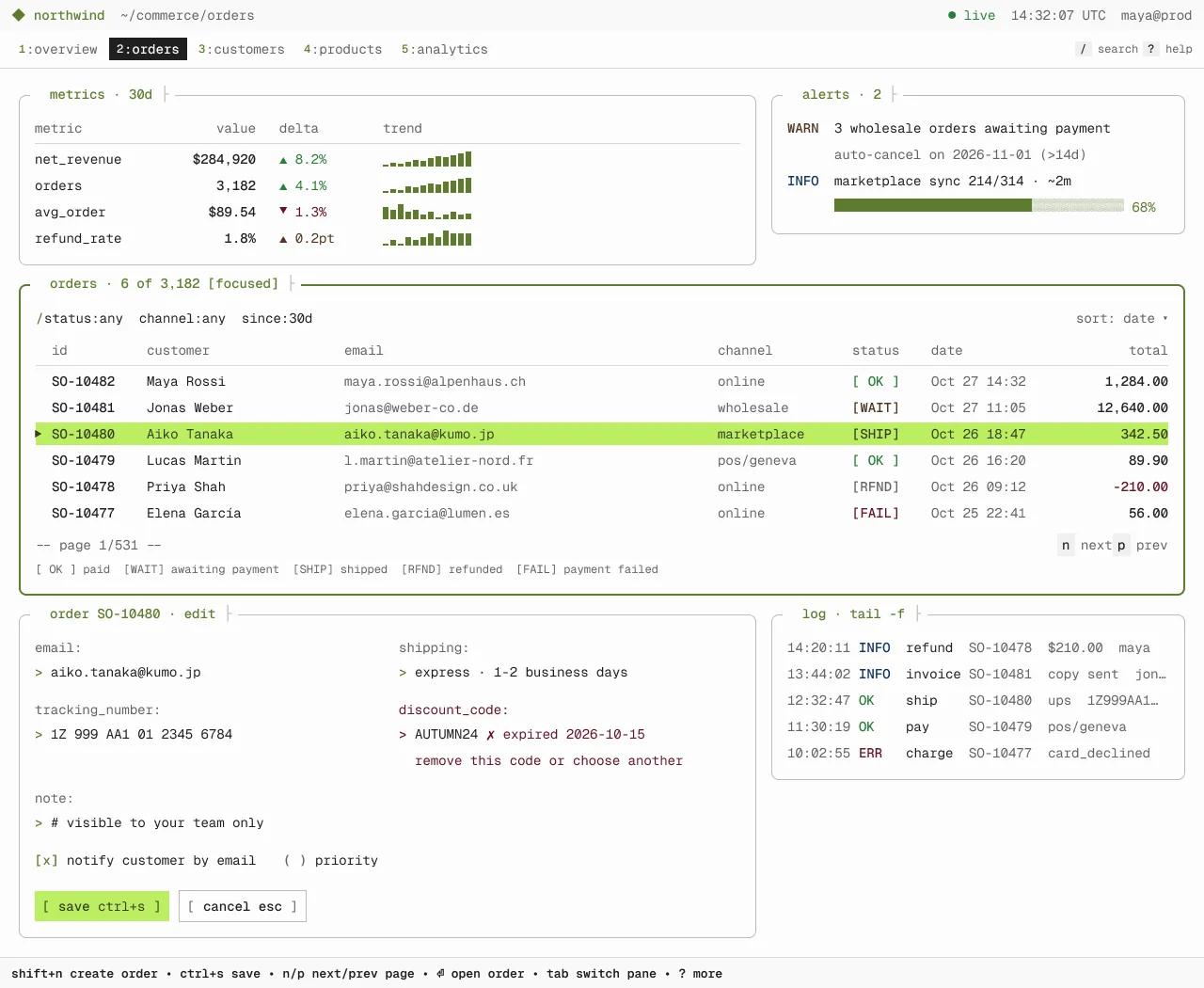
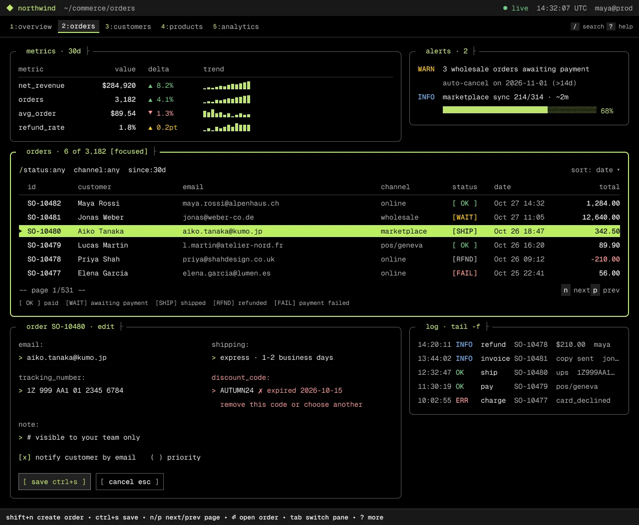
A Charm-style TUI on a character grid. Rounded Lip Gloss panes, one Geist Mono 14/24 scale, bracketed keys and an inverse lime selection bar.
On this page
Light and dark
Terminal
Specification values · alpha
Theme values
Values: Colors
| Property | Value |
|---|---|
bg | #fcfcfc |
bg-dark | #000000 |
surface | #f9f9f9 |
surface-dark | #191919 |
card | #ffffff |
card-dark | #111111 |
muted | #f0f0f0 |
muted-dark | #222222 |
hover | #f0f0f0 |
hover-dark | #222222 |
selected | #eef6d6 |
selected-dark | #1f2917 |
fg | #202020 |
fg-dark | #eeeeee |
muted-fg | #646464 |
muted-fg-dark | #b4b4b4 |
fg-subtle | #646464 |
fg-subtle-dark | #b4b4b4 |
inverse-fg | #fcfcfc |
inverse-fg-dark | #111111 |
border | #d9d9d9 |
border-dark | #3a3a3a |
border-strong | #bbbbbb |
border-strong-dark | #606060 |
input-border | #838383 |
input-border-dark | #7b7b7b |
ring | #5c7c2f |
ring-dark | #bdee63 |
primary | #bdee63 |
primary-dark | #bdee63 |
primary-hover | #b0e64c |
primary-hover-dark | #d4ff70 |
primary-fg | #37401c |
primary-fg-dark | #111111 |
primary-text | #5c7c2f |
primary-text-dark | #bde56c |
success-text | #2a7e3b |
success-text-dark | #71d083 |
warning-text | #4f3422 |
warning-text-dark | #ffca16 |
destructive-text | #641723 |
destructive-text-dark | #ff9592 |
info-text | #113264 |
info-text-dark | #70b8ff |
Values: Typography
| Property | Value |
|---|---|
grid.fontFamily | Geist Mono |
grid.fontSize | 14px |
grid.fontWeight | 400 |
grid.lineHeight | 24px |
grid.letterSpacing | 0px |
grid-strong.fontFamily | Geist Mono |
grid-strong.fontSize | 14px |
grid-strong.fontWeight | 500 |
grid-strong.lineHeight | 24px |
grid-strong.letterSpacing | 0px |
chrome.fontFamily | Geist Mono |
chrome.fontSize | 14px |
chrome.fontWeight | 400 |
chrome.lineHeight | 20px |
pane-title.fontFamily | Geist Mono |
pane-title.fontSize | 14px |
pane-title.fontWeight | 500 |
pane-title.lineHeight | 20px |
help.fontFamily | Geist Mono |
help.fontSize | 13px |
help.fontWeight | 600 |
help.lineHeight | 20px |
keycap.fontFamily | Geist Mono |
keycap.fontSize | 12px |
keycap.fontWeight | 500 |
keycap.lineHeight | 16px |
legend.fontFamily | Geist Mono |
legend.fontSize | 12px |
legend.fontWeight | 400 |
legend.lineHeight | 20px |
Values: Radii
| Property | Value |
|---|---|
none | 0px |
pane | 8px |
Values: Spacing
| Property | Value |
|---|---|
ch | 8.4px |
line | 24px |
xs | 4px |
sm | 8px |
md | 12px |
lg | 16px |
xl | 20px |
2xl | 28px |
Values: Component recipes
| Property | Value |
|---|---|
pane.backgroundColor | {colors.bg} |
pane.textColor | {colors.fg} |
pane.typography | {typography.grid} |
pane.rounded | {rounded.pane} |
pane-dark.backgroundColor | {colors.bg-dark} |
pane-dark.textColor | {colors.fg-dark} |
pane-dark.typography | {typography.grid} |
pane-dark.rounded | {rounded.pane} |
table-row.textColor | {colors.fg} |
table-row.typography | {typography.grid} |
table-row.height | 24px |
table-row-selected.backgroundColor | {colors.primary} |
table-row-selected.textColor | {colors.primary-fg} |
table-row-selected.typography | {typography.grid} |
table-row-selected.height | 24px |
table-row-selected-dark.backgroundColor | {colors.primary-dark} |
table-row-selected-dark.textColor | {colors.primary-fg-dark} |
table-row-selected-dark.typography | {typography.grid} |
table-row-selected-dark.height | 24px |
key-primary.backgroundColor | {colors.primary} |
key-primary.textColor | {colors.primary-fg} |
key-primary.typography | {typography.grid} |
key-primary.rounded | {rounded.none} |
key-primary.height | 32px |
key-primary-dark.backgroundColor | {colors.muted-dark} |
key-primary-dark.textColor | {colors.primary-text-dark} |
key-primary-dark.typography | {typography.grid} |
key-primary-dark.rounded | {rounded.none} |
key-primary-dark.height | 34px |
key-default.textColor | {colors.fg} |
key-default.typography | {typography.grid} |
key-default.rounded | {rounded.none} |
key-default.height | 34px |
key-default-dark.textColor | {colors.fg-dark} |
key-default-dark.typography | {typography.grid} |
key-default-dark.rounded | {rounded.none} |
key-default-dark.height | 34px |
key-hint.backgroundColor | {colors.muted} |
key-hint.textColor | {colors.fg} |
key-hint.typography | {typography.keycap} |
key-hint.height | 16px |
tab-selected.backgroundColor | {colors.hover} |
tab-selected.textColor | {colors.fg} |
tab-selected.typography | {typography.chrome} |
tab-selected.height | 26px |
tab-selected-dark.backgroundColor | {colors.hover-dark} |
tab-selected-dark.textColor | {colors.fg-dark} |
tab-selected-dark.typography | {typography.chrome} |
tab-selected-dark.height | 26px |
status-line.backgroundColor | {colors.surface} |
status-line.textColor | {colors.muted-fg} |
status-line.typography | {typography.chrome} |
status-line.height | 32px |
status-line-dark.backgroundColor | {colors.surface-dark} |
status-line-dark.textColor | {colors.muted-fg-dark} |
status-line-dark.typography | {typography.chrome} |
status-line-dark.height | 32px |
help-bar.backgroundColor | {colors.surface} |
help-bar.textColor | {colors.fg} |
help-bar.typography | {typography.help} |
help-bar.height | 33px |
status-ok.textColor | {colors.success-text} |
status-ok.typography | {typography.grid} |
status-fail.textColor | {colors.destructive-text} |
status-fail.typography | {typography.grid} |
prompt-field.textColor | {colors.fg} |
prompt-field.typography | {typography.grid} |
prompt-field.height | 50px |
Read YAML values and notes
Plain text
version: alpha
name: Terminal
description: A Charm-style TUI on a character grid. Rounded Lip Gloss panes, one Geist Mono 14/24 scale, bracketed keys and an inverse lime selection bar.
colors:
  # Resolved from the NetScript Figma library for the Light and Dark Orders screens.
  # Theme = Signal (the seed of Terminal's own mode), Density = Compact. Keys are the --ns-*
  # suffix.
  bg: '#fcfcfc'
  bg-dark: '#000000'
  surface: '#f9f9f9'
  surface-dark: '#191919'
  card: '#ffffff'
  card-dark: '#111111'
  muted: '#f0f0f0'
  muted-dark: '#222222'
  hover: '#f0f0f0'
  hover-dark: '#222222'
  selected: '#eef6d6'
  selected-dark: '#1f2917'
  fg: '#202020'
  fg-dark: '#eeeeee'
  muted-fg: '#646464'
  muted-fg-dark: '#b4b4b4'
  fg-subtle: '#646464'
  fg-subtle-dark: '#b4b4b4'
  inverse-fg: '#fcfcfc'
  inverse-fg-dark: '#111111'
  border: '#d9d9d9'
  border-dark: '#3a3a3a'
  border-strong: '#bbbbbb'
  border-strong-dark: '#606060'
  input-border: '#838383'
  input-border-dark: '#7b7b7b'
  ring: '#5c7c2f'
  ring-dark: '#bdee63'
  primary: '#bdee63'
  primary-dark: '#bdee63'
  primary-hover: '#b0e64c'
  primary-hover-dark: '#d4ff70'
  primary-fg: '#37401c'
  primary-fg-dark: '#111111'
  primary-text: '#5c7c2f'
  primary-text-dark: '#bde56c'
  success-text: '#2a7e3b'
  success-text-dark: '#71d083'
  warning-text: '#4f3422'
  warning-text-dark: '#ffca16'
  destructive-text: '#641723'
  destructive-text-dark: '#ff9592'
  info-text: '#113264'
  info-text-dark: '#70b8ff'
typography:
  grid: {
    fontFamily: Geist Mono,
    fontSize: 14px,
    fontWeight: 400,
    lineHeight: 24px,
    letterSpacing: 0px,
  }
  grid-strong: {
    fontFamily: Geist Mono,
    fontSize: 14px,
    fontWeight: 500,
    lineHeight: 24px,
    letterSpacing: 0px,
  }
  chrome: { fontFamily: Geist Mono, fontSize: 14px, fontWeight: 400, lineHeight: 20px }
  pane-title: { fontFamily: Geist Mono, fontSize: 14px, fontWeight: 500, lineHeight: 20px }
  help: { fontFamily: Geist Mono, fontSize: 13px, fontWeight: 600, lineHeight: 20px }
  keycap: { fontFamily: Geist Mono, fontSize: 12px, fontWeight: 500, lineHeight: 16px }
  legend: { fontFamily: Geist Mono, fontSize: 12px, fontWeight: 400, lineHeight: 20px }
rounded:
  none: 0px
  pane: 8px
spacing:
  ch: 8.4px
  line: 24px
  xs: 4px
  sm: 8px
  md: 12px
  lg: 16px
  xl: 20px
  2xl: 28px
components:
  pane: {
    backgroundColor: '{colors.bg}',
    textColor: '{colors.fg}',
    typography: '{typography.grid}',
    rounded: '{rounded.pane}',
  }
  pane-dark: {
    backgroundColor: '{colors.bg-dark}',
    textColor: '{colors.fg-dark}',
    typography: '{typography.grid}',
    rounded: '{rounded.pane}',
  }
  table-row: { textColor: '{colors.fg}', typography: '{typography.grid}', height: 24px }
  table-row-selected: {
    backgroundColor: '{colors.primary}',
    textColor: '{colors.primary-fg}',
    typography: '{typography.grid}',
    height: 24px,
  }
  table-row-selected-dark: {
    backgroundColor: '{colors.primary-dark}',
    textColor: '{colors.primary-fg-dark}',
    typography: '{typography.grid}',
    height: 24px,
  }
  key-primary: {
    backgroundColor: '{colors.primary}',
    textColor: '{colors.primary-fg}',
    typography: '{typography.grid}',
    rounded: '{rounded.none}',
    height: 32px,
  }
  key-primary-dark: {
    backgroundColor: '{colors.muted-dark}',
    textColor: '{colors.primary-text-dark}',
    typography: '{typography.grid}',
    rounded: '{rounded.none}',
    height: 34px,
  }
  key-default: {
    textColor: '{colors.fg}',
    typography: '{typography.grid}',
    rounded: '{rounded.none}',
    height: 34px,
  }
  key-default-dark: {
    textColor: '{colors.fg-dark}',
    typography: '{typography.grid}',
    rounded: '{rounded.none}',
    height: 34px,
  }
  key-hint: {
    backgroundColor: '{colors.muted}',
    textColor: '{colors.fg}',
    typography: '{typography.keycap}',
    height: 16px,
  }
  tab-selected: {
    backgroundColor: '{colors.hover}',
    textColor: '{colors.fg}',
    typography: '{typography.chrome}',
    height: 26px,
  }
  tab-selected-dark: {
    backgroundColor: '{colors.hover-dark}',
    textColor: '{colors.fg-dark}',
    typography: '{typography.chrome}',
    height: 26px,
  }
  status-line: {
    backgroundColor: '{colors.surface}',
    textColor: '{colors.muted-fg}',
    typography: '{typography.chrome}',
    height: 32px,
  }
  status-line-dark: {
    backgroundColor: '{colors.surface-dark}',
    textColor: '{colors.muted-fg-dark}',
    typography: '{typography.chrome}',
    height: 32px,
  }
  help-bar: {
    backgroundColor: '{colors.surface}',
    textColor: '{colors.fg}',
    typography: '{typography.help}',
    height: 33px,
  }
  status-ok: { textColor: '{colors.success-text}', typography: '{typography.grid}' }
  status-fail: { textColor: '{colors.destructive-text}', typography: '{typography.grid}' }
  prompt-field: { textColor: '{colors.fg}', typography: '{typography.grid}', height: 50px }
Overview
- Thesis: the Orders console as a Charm-style terminal UI. Every glyph sits on a 1ch × 24px character grid. Panes are rounded Lip Gloss boxes with titles set into the border. The keyboard is the primary interface.
- Signature moves:
- One character grid for every table, log and metric (marker 2ch, id 12ch, customer 25ch, …) and one Geist Mono 14/24 scale. No proportional type.
- Lip Gloss panes: 8px-rounded 1px boxes with inset titles
┤ orders · 6 of 3,182 [focused] ├. The active pane (the one containing focus) gets a 2px lime border, never a glow. - Inverse-video lime selection with a
▶marker, bracketed keys[ save ctrl+s ]and akey desc • key deschelp bar.
- Anchor: Charm Lip Gloss v2 and Bubbles v2 (MIT), plus the lazygit panel model (MIT: active and
inactive border colours, selected-line background). Taken: rounded border boxes, the help-bar
grammar, the prompt
>, block cursor, dim descriptions, status words. Not copied: Charm's logos, mascots and CharmTone palette. Warp's theme schema is a token-format reference only (AGPL code not used). - Family: Developer.
- Best for / avoid for: developer tools, ops and support consoles, power-user admin, anything keyboard-driven. Avoid consumer and first-run experiences, and touch-first screens.
- Feel: fast and exact, like lazygit applied to orders.
Colors
- Ground and surface ladder. Dark is the reference scheme: canvas
bg-dark#000000, status line and help barsurface-dark#191919, key fills and the selected tabmuted-dark#222222. Light:#fcfcfccanvas,#f9f9f9bars,#f0f0f0keys and selected tab. - Accent policy. Lime is the only accent:
primary#bdee63fills the selected row (inverse video) and the light Save key;primary-text(#5c7c2f/#bde56c) is used for pane titles, the brand, prompts>, tab indices and checked boxes;ring(#5c7c2f/#bdee63) draws the focused pane and the selected-tab underline.
- Status colours. Status is a bracketed word, never a chip:
[ OK ]success-text,[WAIT]warning-text,[SHIP]info-text,[FAIL]destructive-text,[RFND]muted-fg. Log levels use the same roles (INFO,OK,ERR,WARN). - Dark design notes. The lime selection bar is the only light slab. The dark Save key is a
#222222key with a#7b7b7b1px edge and lime#bde56ctext; the selected tab is#222222with a lime underline. Secondary columns are dimmed tomuted-fg.
Typography
| Role | Size / line | Weight | Used for |
|---|---|---|---|
| grid | 14/24 | Regular 400 | Every table cell, log line, prompt value, legend body |
| grid-strong | 14/24 | Medium 500 | Values, totals, metric figures |
| chrome | 14/20 | Regular | Status line, tab labels |
| pane-title | 14/20 | Medium | Brand, tab label, pane titles |
| help | 13/20 | SemiBold 600 | Bottom key-hint bar |
| keycap | 12/16 | Medium | Tab indices, inline key caps |
| legend | 12/20 | Regular | Status legend under the table |
- One family: Geist Mono (OFL). Fallbacks:
"Geist Mono", "JetBrains Mono", "IBM Plex Mono", ui-monospace, monospace. The fallback must cover box drawing (U+2500–257F) and the glyphs◆ ● ▶ ▲ ▼ ✗ ⏎ •. - Hierarchy comes from dim / normal / medium, not size. Tracking is 0 on the grid so columns stay exact.
- Terminal's Theme mode, seeded from
Signal, setsfont/sansto Geist, but Terminal does not use it.
Layout
- Character cell: 1ch = 8.4px (Geist Mono 14px advance), line box 24px. Every fixed column is a
whole number of ch; each table has at most one flexible
minmax(0, 1fr)track for the remainder. - Chrome: status line 32 (padding 6/12, gap 16), tab line 43 (padding 8/12, gap 4, 1px
borderrule), content padding 28/20/20/20 with 20px between pane rows and 16px between panes, help bar 33 (padding 6/12, 1px top rule). - Panes: padding 22/16/16/16 (the extra top clears the inset title), line gap 4 for text panes. Row A: metrics 784 + alerts 440. Orders pane 1240 wide, focused. Row B: detail editor 784 + log 440.
- Orders grid:
grid-template-columns: 2ch 12ch 25ch minmax(0, 1fr) 17ch 10ch 18ch 12chat Geist Mono 14/24: marker, id, customer, email (the flexible track), channel, status, date and total (right aligned). The fixed tracks are 96ch (806.4px). Resolve the email track from the final content box of the Orders pane (the 1240px pane) after subtracting padding, borders and gaps. A resolved pixel width is not a reusable track token. Never shrink the type or clip a column to force the arithmetic. Every row reserves the marker cell. Header row inmuted-fg, then a 1pxborderrule; rows 24 tall. - Other grids: metrics 16ch / 12ch right / 3ch gap / delta / trend fill; alerts with a 6ch level
column; log 9/6/8/10ch plus fill, single-line truncation with
…. - Density: Terminal sets Density
Compact(control 32, row 44) but binds no Density variable; the 24px line box governs.
Elevation & Depth
Terminal uses no shadow, blur or tint. As in Lip Gloss and lazygit, depth comes from border weight and colour:
| Level | Recipe (CSS) | Applied to |
|---|---|---|
| Ground | background: var(--ns-bg) |
Canvas and pane interiors |
| Bar | background: var(--ns-surface) |
Status line, help bar |
| Pane | border: 1px solid var(--ns-border-strong); border-radius: 8px |
Inactive panes |
| Active pane | border: 2px solid var(--ns-ring) plus [focused] in the title |
The pane that contains DOM focus (:focus-within); this is pane styling, not a focus indicator for the control inside |
| Selection | background: var(--ns-primary); color: var(--ns-primary-fg) |
Selected row, inverse video |
Pane titles sit on a bg-filled frame (padding 0/6) over the top border, framed by ┤ ├ in
border-strong.
Shapes
- Only panes are rounded (8px, the Lip Gloss
Roundedborder). Keys, tabs, keycaps, the selection bar and the progress bar are square. - Theme values
radius/control6,radius/input6 andradius/badge4 belong to the shared Signal mode and are not used by Terminal. - Strokes: 1px pane borders, rules and key edges; 2px for the focused pane and the selected-tab underline.
Components
| Component | Variant used | Anatomy and states |
|---|---|---|
| Key (button) | Terminal/Key Primary, Default, Hint |
Primary: [ save ctrl+s ], padding 4/8, lime fill in light. Dark Save: #222222 fill, 1px #7b7b7b edge, #bde56c text (see NetScript Mapping). Default: 1px border-strong outline, brackets in fg-subtle, [ cancel esc ]. Hint: 18×16 muted keycap + muted-fg description. |
| Prompt field | Terminal/Prompt field Default, Focus, Error |
A real, keyboard-reachable text control. label: in muted-fg on one 24px line, > value on the next with the prompt in primary-text; 8×16 block cursor in primary on the field that has DOM focus, so it is absent while focus is in another pane. The block cursor styles the caret; it never replaces the control's visible focus indicator. Error: label and prompt in destructive-text, ✗ expired 2026-10-15, repair helper on the next line indented past the prompt. |
| Check / radio | Terminal/Check |
[x] in primary-text, [ ] in muted-fg; (•) / ( ) for single choice. |
| Tabs | Terminal/Tab |
1:overview: index in primary-text, label in muted-fg. Selected: hover fill, fg text, 2px ring underline. |
| Table row | Frames Row — * |
24px line on the shared grid. Selected: full-width primary bar, primary-fg text, ▶ marker. Negative totals -210.00 in destructive-text. |
| Status | Terminal/Status Ok, Wait, Ship, Fail, Refund |
Six-character bracketed word, colour by role; a legend line explains the codes. |
| Metrics | Pane metrics · 30d |
Right-aligned values, ▲/▼ deltas, 12 block trend bars per line. |
| Notice | Pane alerts · 2 |
WARN / INFO level column, message, 68% sync bar (lime fill, dithered remainder). |
| Log | Pane log · tail -f |
Time, level, verb, id, detail; one line each, truncated with …. |
| Top bar / nav | Status line + tab line | ◆ northwind ~/commerce/orders … ● live hh:mm:ss UTC maya@prod; numbered tabs; / search ? help keycaps. |
| Help bar | Key hints |
shift+n create order • ctrl+s save • n/p next/prev page • ⏎ open order • tab switch pane • ? more. The tab switch pane hint is provisional: the keyboard map in #2416 must specify how pane switching dispatches without taking Tab away from normal control-to-control navigation. |
| Dialog | Not drawn | Anchor: a composited Lip Gloss layer with a double border. Pending in #2416. |
Hover, pressed, disabled and the editor-focused variant are not drawn yet; they are pending in #2416 and #2419.
Do's and Don'ts
- Do put every cell on the character grid and reserve the marker column on every row, so the selected row cannot shift columns.
- Do keep one 14/24 scale across panes and dim secondary columns. Symptom to avoid: panes that are hard to read, with inconsistent columns and layout.
- Do keep the TUI tidy: rounded panes, consistent 22/16/16/16 padding, 20px gaps. Symptom to avoid: a screen that looks like raw terminal output.
- Do show the active pane (the one containing DOM focus) with a 2px
ringborder and a[focused]suffix, and list only that pane's keys plus global keys in the help bar. The pane border is pane styling; each focused control still shows its own visible focus. - Do keep every editable prompt, check and key reachable by keyboard, in a logical order. Give each composite (table, tab line, log) a documented way in and out; use roving focus only inside composites that call for it (tabs, lists, table rows). Never suppress native control focus.
- Do give global commands modifier keys (
shift+n,ctrl+s) and keep⏎for the focused pane. Labels on keys must match the help bar ([ save ctrl+s ]). - Do explain status codes with a legend and put repair text directly under the invalid prompt.
- Don't make the selected tab or the primary key a pale slab in dark. The lime selection row is the one intentional inverse surface.
- Don't add shadows, glows, gradients or proportional fonts.
- Don't use colour as the only status signal; every status is a word.
- Don't break the grid with fractional widths; size fixed columns in ch and give the leftover
space to one
minmax(0, 1fr)track.
Iconography & Imagery
- No icon set. Use Unicode glyphs from the mono font:
◆ ● ▶ ▲ ▼ ✗ ⏎ •and box drawing┤ ├ ─. Check coverage in the fallback stack. - Charts are built from characters: block trend bars and a block progress bar with a dithered remainder.
- No avatars, photos or illustration.
Motion & States
- Anchor behaviour: spinners and cursors are frame-stepped; use
steps()timing, never easing. Nothing is animated in the design files; runtime behaviour is pending in #2419. - Active pane and DOM focus are separate. DOM focus moves between individual controls as on any
web page: every editable prompt, check and key is reachable by keyboard and shows a visible focus
indicator. The pane that contains DOM focus is styled as active (2px
ringborder,[focused]). The selection bar stays on the selected row when the pane is no longer active. - Composites: each table, tab line and log documents its entry and exit route (for example
Tabin and out, arrows inside). Roving focus is allowed only inside composites that call for it (tab lists, list and table rows), never across a pane of independent fields. - Pane switching (
tab switch panein the help bar) is provisional until the keyboard map in #2416 specifies its dispatch. Never suppress native control focus to imitate a TUI. The static designs show the active-pane styling only; keyboard behaviour stays unproven until #2419. - Reduced motion: no cursor blink, no spinner; show a static
…. - Proposed dark hover for keys:
#2a2a2a(gray/d/4). Not drawn; pending in #2416.
Accessibility
| Pair | Light | Dark |
|---|---|---|
fg on bg |
15.88 | 18.10 |
muted-fg on bg |
5.77 | 10.13 |
primary-text on bg |
4.67 | 14.59 |
Selected row primary-fg on primary |
8.14 | 14.00 |
Focused pane ring on bg (2px) |
4.67 | 15.57 |
| Dark Save: label on fill / edge on canvas / edge on fill | — | 11.05 / 4.96 / 3.76 |
Status words (success/destructive/info text) |
4.94 / 12.12 / 12.30 | 11.05 / 9.97 / 9.99 |
The dark Save colours are measured on rendered pixels: fill #222222, edge #7b7b7b, label
#bde56c; the edge measures 3.7588:1. The other ratios are (token) arithmetic.
- Inactive pane borders (
border-strong1.87:1 light) are decorative containers; the active pane meets 3:1. The active-pane border is not a substitute for a control's own focus indicator. - Keyboard: every editable prompt, check and key must be reachable and operable by keyboard (WCAG 2.1.1) in a meaningful order (2.4.3). Proof is pending in #2416 (keyboard map) and #2419 (runtime); a static design cannot show it.
- Hit targets: keys 32–34 tall; tabs 24–26 (pointer use is secondary; the keyboard path is primary).
- RTL: not meaningful for a TUI grid; mirror the pane layout only. Pending in #2419.
NetScript Mapping
| Layer | Value |
|---|---|
| Figma Theme mode | Terminal, its own mode in Theme B (set B), still seeded from Signal (same name and lime primary as the Studio Signal flavor). In Terminal and in the Studio Signal flavor, the dark primary must not be a pale slab |
| Base gray × accent | Neutral × Ink by default; the Theme mode, seeded from Signal, supplies gray and lime directly |
| Density | Compact (set explicitly; no Density variable bound) |
| Flavor | n/a |
data-theme |
terminal |
| Language roles | none |
- Dark Save key: dark draws the primary key as a
#222222fill with a#7b7b7bedge and#bde56ctext, while light Save stays a lime fill. No scheme-aware role covers this yet, so the key binds the primitivesgray/d/3,gray/d/10andlime/d/11. In dark these equalsurface/muted,border/inputandprimary/text, which the YAML uses. A scheme-aware key role (name owned by code) is pending in #2414. - Status. Values come from the NetScript Figma library. Names are provisional until the token
export in #2414, which must take Terminal's values from its own mode, not from
Signal. The editor-focus variant, hover, pressed and disabled keys, and the keyboard map including pane-switch dispatch are pending in #2416. Width behaviour at 960px with pinned id and total columns, and keyboard proof, are pending in #2419.
Sources
- References: Charm Lip Gloss v2 and Bubbles v2 (
charm.land, MIT), lazygitdocs/Config.md(MIT), Warp custom-theme schema (docs only). What is taken and what is not copied is listed under Overview → Anchor. - Demo content: "northwind",
maya@prod, orders SO-10477…SO-10482, customers, emails, amounts, metrics, alerts, log lines, the 214/314 sync count and the AUTUMN24 code are invented demo data from the shared Orders fixture.